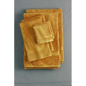
Happy Hallowe’en! These vintage postcards are AWESOME!

979722730_b08e51745a.jpg

Hallowe’en is my absolute favorite holiday. I’m going vintage tonight, of course! I picked up a groovy Mama Cass mumu at an estate sale recently…kind of Peter Max style…all polyester.What fun! 

Meanwhile, if you’re a flickr user, run right over to riptheskull’s collection of vintage postcards. They are FABULOUS. If you’re not on flickr yet, it’s easy and free to sign up.

Happy Hallowe’en, stay safe!
911244420_7bfba6ed3e.jpg

50s kitchen flashback design: Color riot!

flashback-kitchen-oct-30.jpg
This week’s flashback kitchen is a riot! Takeaway design tips:  

1. Well, the color combo’s of course. Similarly deep hues of pink, orchid/lavender and blue. Note how the pink is picked up throughout, to keep your eye “dancing” through the kitchen.

2. The display shelves built into the soffit are extraordinary. This would take some doing, but you can see how it is possible. The class looks to be rimmed in chrome – and don’t miss the can lights tucked into the shelves. Wow!

3. The window treatment – a bamboo style shade but incorporating the colors throughout the kitchen, really ties things together. I am adding this type of shade to my research list; stay tuned.

4. Notice how they have built out the corner with drywall, then tiled it – rather than trying to fit the cabinets together. This is a great solution if you’ve got the steel cabinets but not the corners. It also adds visual dynamism.

5. The blue tiles appear to be glass, rather than ceramic or steel. Glass tile was used during this period, especially in bathrooms.

6. Note the cabinets here are both pink and orchid colored. In reality – this fixture is really a Refrigerator! Companies like GE made refrigerators to fit like wall cabinets. You can still find these now and then, I presume they can be renovated. This goes on my list for the future, too…

7. And last, notice how the floor is relatively neutral, it appears to be cream edged by the cabinets, and a beige edged by black in the center. Clearly, grounding this color riot kitchen into more earthy floor colors is wise. However, they have not totally chickened out by making the floor all one color. I think it really works.

Toilets for a 50s retro bathroom

I could name every toilet at 100 yards, when I was in the market a few years ago. As with everything, I searched endlessly to find a model to replicate the original 50s toilets in my 3 bathrooms. Alas, most everything was “Victoriana on steroids.” Ultimately, I chose Kohler Wellworth, which was streamlined, simple & with good flush ratings(!)

I am very happy. I ordered white, with a chrome handle, and white toilet seats also with chrome attachments. Also: “NO!” to one-piece or elongated, you must get “two-piece, round bowl.” And as I mentioned, this model has done well in testing, as there can be issues with these low flow models. I think Congress is considering the issue. I am serious!

There are other options out there – from Gerber and Toto – that also get good ratings and which have a similar, simple design. I approve.

Finally, if you’re doing a 60s bathroom retro renovation, the one piece elongateds fit fine in there. In fact, I love them as part of a suite of grey fixtures, as one example.

Bathtubs fit for a 50s style bathroom

After what seems like a couple of days of more lighthearted posts, I turn to that most serious of subjects: Bathtubs! Every house needs at least one bathtub and to be honest, I’ve not seen a lot of classic mid century homes that have built-in showers rather than baths. On occasion, yes, and then they are quite small.

I did tons of searching when we retro reno’d our three baths, and I settled on Kohler cast iron, even though the tubs I replaced were steel. I like the solidity. I used a 5’ Dynametric (blue tub, below), and am completely happy, it’s very nice. You can also get this one 6” longer, which is great to consider if you’ve got the room – and the height!

I also think that the smaller Seaforth 54” is sweet; the Villager, their value model is just fine, and I would LOVE to see someone install the corner-model Mayflower. I think this would be SO 50s and great, for example, in a girl’s bathroom!
Kohler also has some good colors to consider, I’ve shown them in some of the photos. Honestly, I don’t think they are perfect matches for 50s hues, but they are directionally correct if you’ve got the inclination. Personally – I used all white fixtures in all three baths – and tiled my wall in Olympia Maple Leaf tile, which had the 50s shades that I wanted. See previous posts.
Tomorrow: Toilets! Don’t get too excited, now.

This url starts on page 11…scroll to the bottom…then onto page 12 to see the models I talk about:

Link

Vintage kitchen transfers: today’s eBay pick

These vintage embroidery transfers are awesome. As you can tell by most of my listings, I am a “cheap and cheerful” retro renovation enthusiast, not into stark and austere. Why not live with color color color! These are adorable, and I love them for the packaging alone! I could also see using them to create invitation cards for a Tom Collins-soaked soiree.

Recreate yesterday’s 50s style kitchen

Today: Modern day products to recreate yesterday’s flashback kitchen. My finds include:

  • Formica microdot laminate in yellow.
  • Wilsonart brushed yellow laminate.
  • Sherwin-Williams Pink Flamingo Paint from the Suburban Modern palette.
  • Armstrong’s Marmorette (true linoleum) sheet flooring in Green Parrot.

Pretty cool! If this kitchen wouldn’t make you happy – nothing would!