Skip to primary navigation
Skip to main content
Skip to footer
Search
Home
Kitchens
Bathrooms
Blog
Exterior
Other Rooms
Decorate
The “Museum”
Be Safe/Renovate Safe
Search
Search
Retro Renovation
Remodel & decorate in Mid Century Style
Home
Kitchens
Bathrooms
Blog
Exterior
Other Rooms
Decorate
The “Museum”
Be Safe/Renovate Safe
Home
/
Archives for May 2008
Archives for May 2008
50s dining room – decorating gone haywire
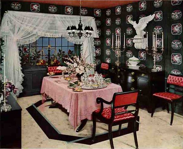
50s meets the Gilded Age — not my favorite look
#1 choice for a retro refrigerator: Sub-Zero
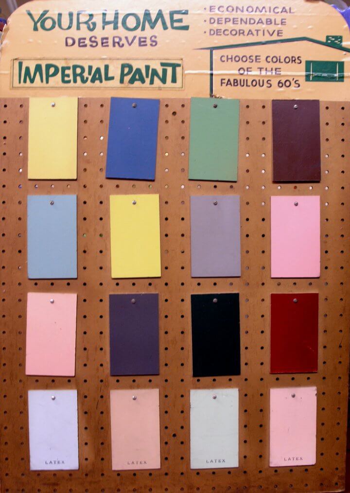
Mid century paint colors: Painting your 60s ranch home (and more) – a retro palette, courtesy Ronn
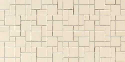
Retro bathroom tile flooring — 3 awesome new choices from Daltile
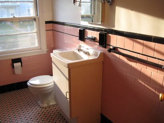
Trish and her two-family 50s house in Woonsocket, RI
Amy and her San Diego bungalow kitchen
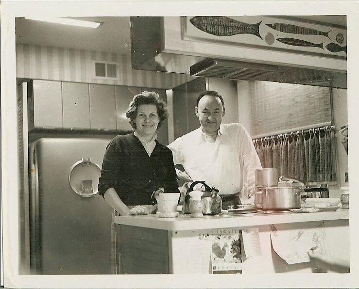
Ellen’s search to recreate her parents’ Crosley kitchen
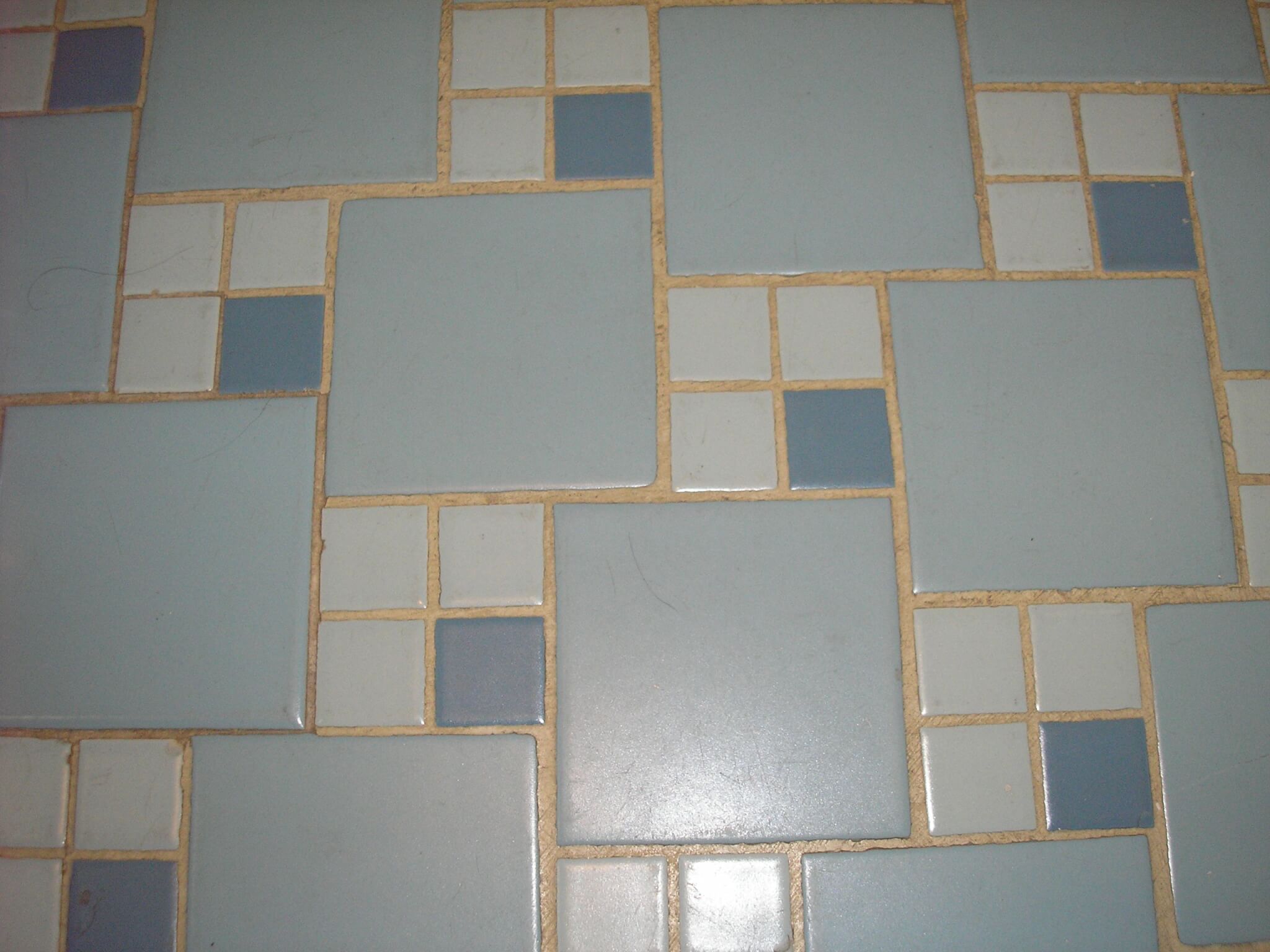
Replicating Alice’s blue 50s bathroom tile floor
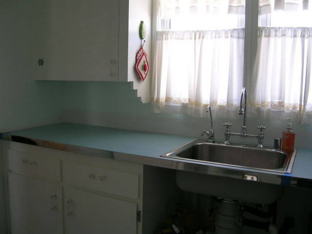
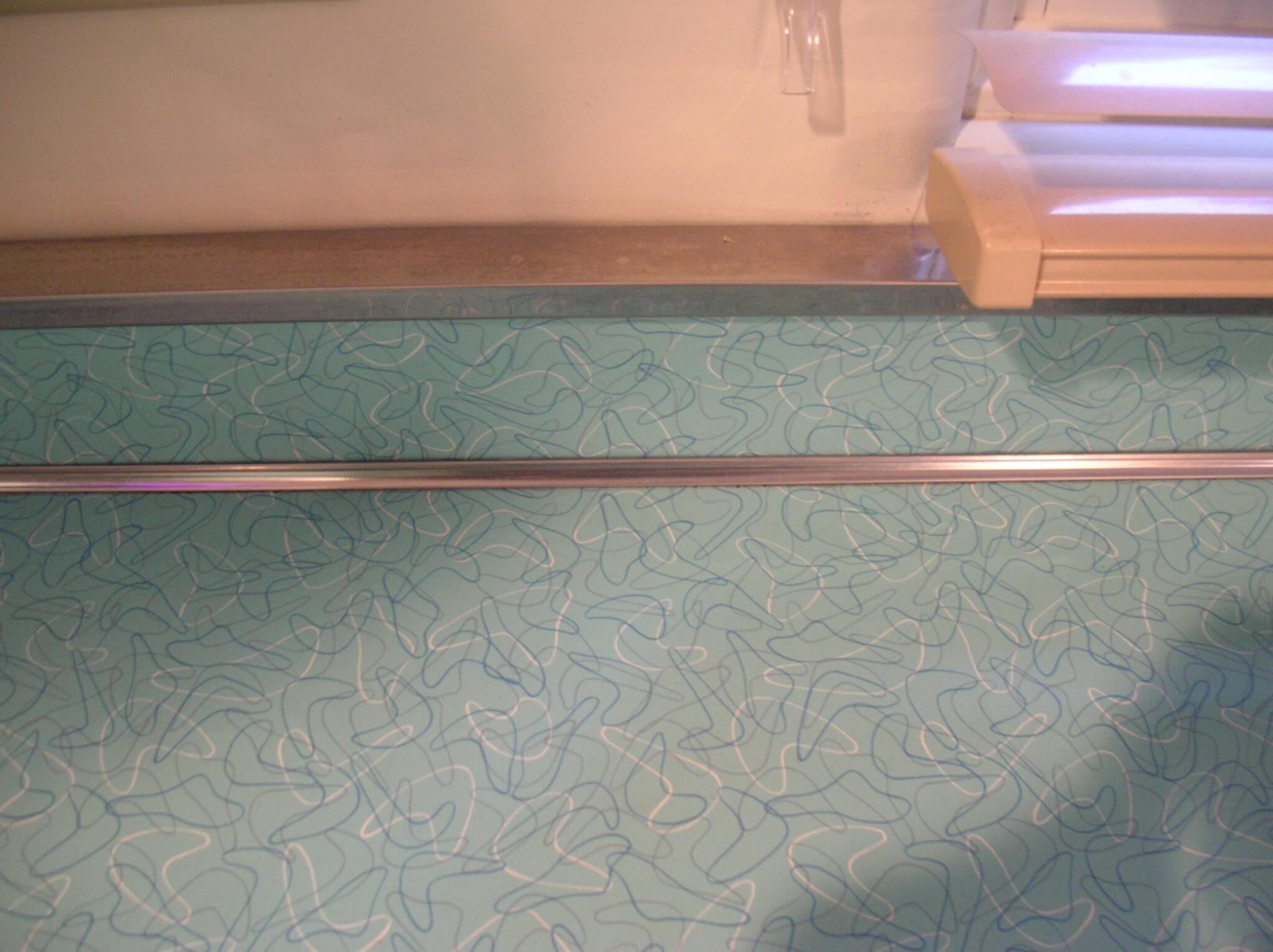
Stainless steel metal edging for your laminate countertop
Flashback kitchen design: This 50s Youngstown kitchen earns its stripes