Skip to primary navigation
Skip to main content
Skip to footer
Search
Home
Kitchens
Bathrooms
Blog
Exterior
Other Rooms
Decorate
The “Museum”
Be Safe/Renovate Safe
Search
Search
Retro Renovation
Remodel & decorate in Mid Century Style
Home
Kitchens
Bathrooms
Blog
Exterior
Other Rooms
Decorate
The “Museum”
Be Safe/Renovate Safe
Home
/
Archives for June 2008
Archives for June 2008
Estate sales: Exhilarating — and horrifying
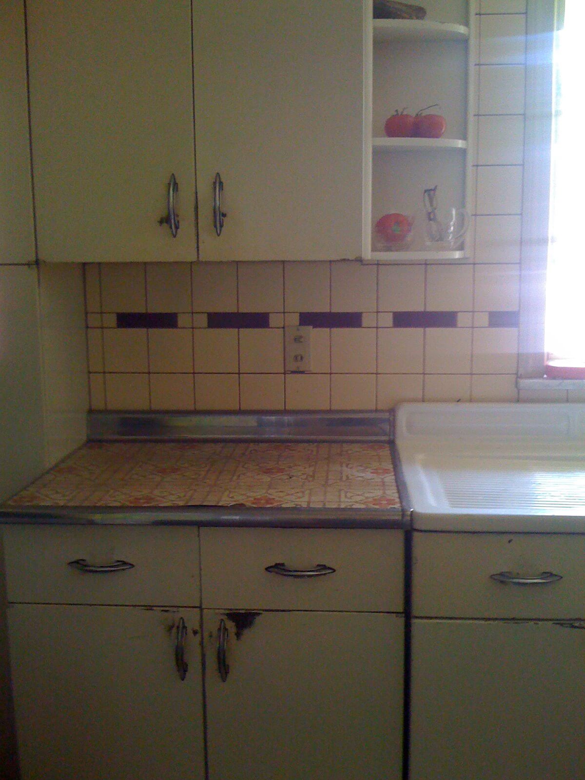
Ideas for Catherine’s 1948 retro kitchen
Let’s help Catherine retro-renovate her 1948 Ohio ranch
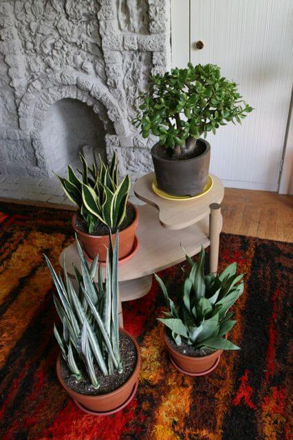
Retro house plants – ideas from Troy
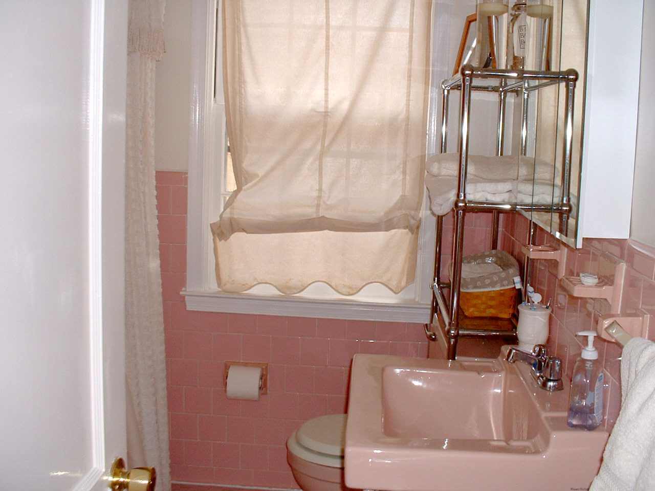
Should I keep my pink bathroom?
Saturday: Sunshine, estate sales and 50s neighborhoods
Where to get hinges for metal kitchen cabinet doors?
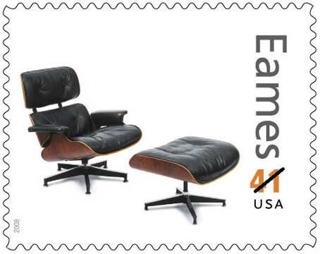
Load up on the Eames stamps available beginning today
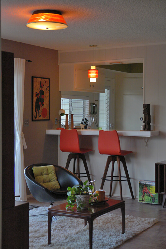
Living Vicariously Mondays – today with L.A. Greg and his beautifully restored 1962 contemporary
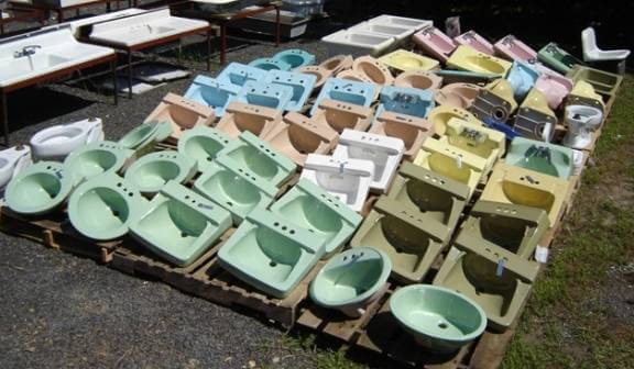
Where can I find a replacement tank for my pink toilet?
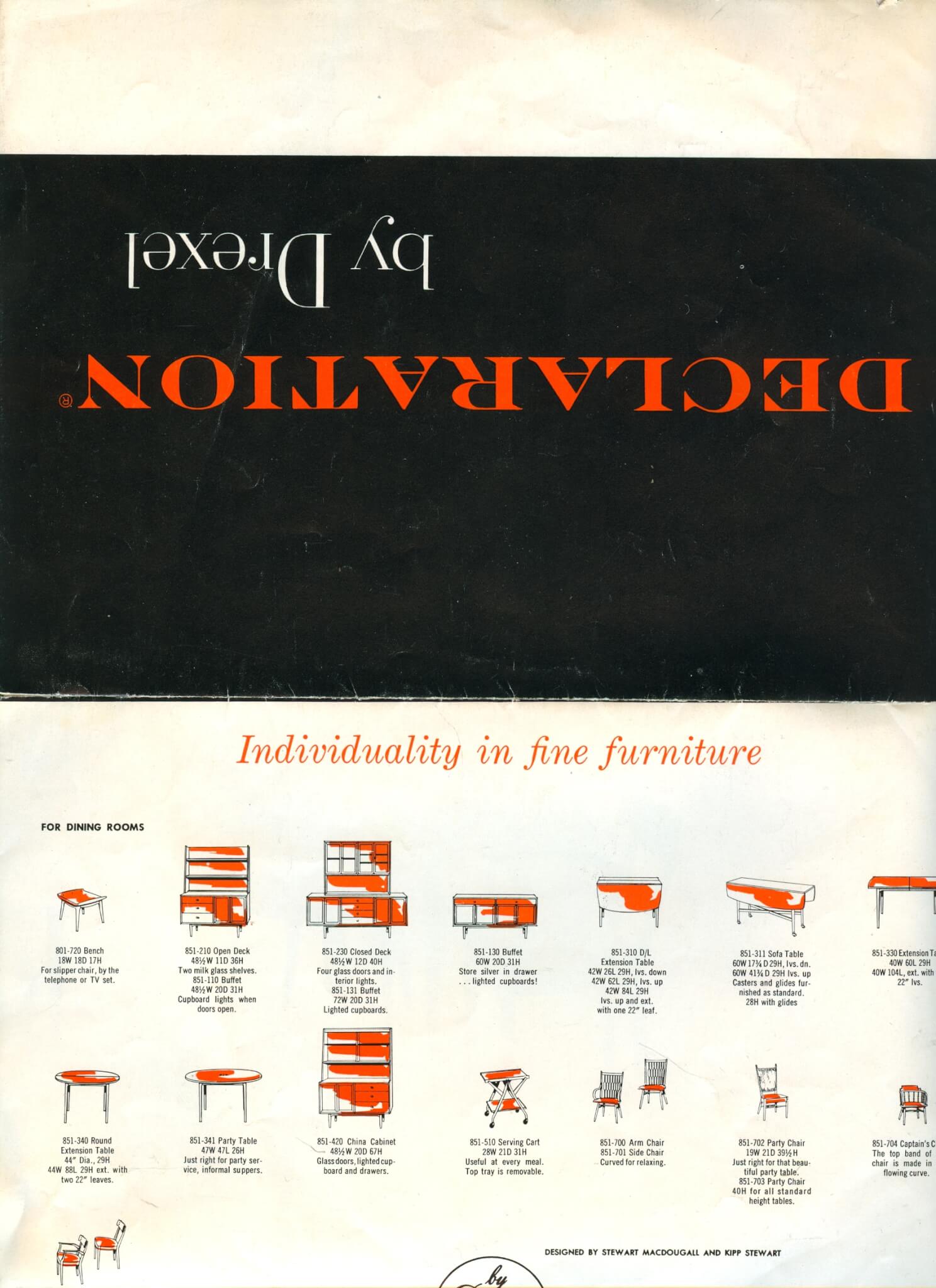
Vintage Drexel Declaration furniture – Catherine sends us a gorgeous brochure
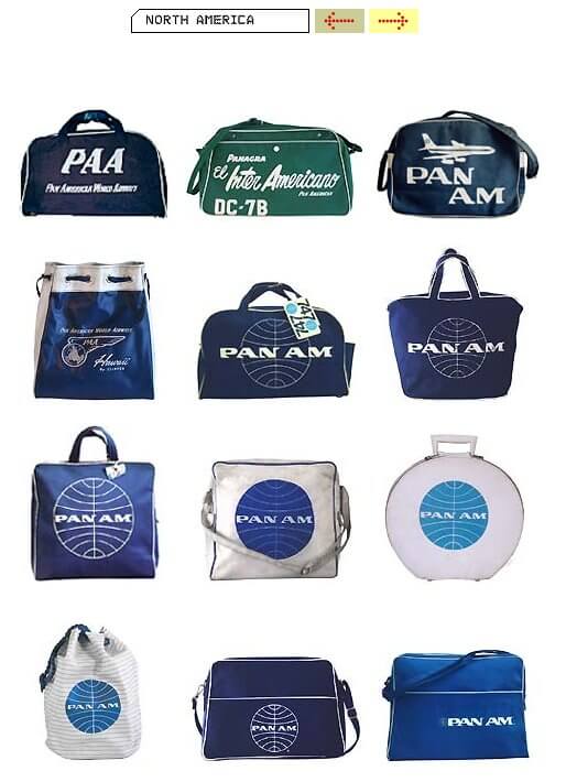
Troy’s fabulous, like I mean fabulous, collection of vintage airline travel bags
Page
1
Page
2
Go to
Next Page »