Glamorlux Nancy’s 1959 pink bathroom

Glamorlux aka Nancy is a new reader, who sent these darling photos of her 1959 pink hall bathroom. She didn’t have to be on the blog too long to know how to get my attention!

Hi Pam,

Just wanted to introduce myself. My husband and I are restoring a 1959 split-level house back to its original mid-century glory. Luckily, most of the original fixtures and features were never updated – including a pink bathroom! We are gathering the materials to re-do our kitchen. It has the original Textolite “golden beige twilight” countertops, however, they are worn and don’t have the metal banding, which we like the look of. So, we just ordered the Formica Aqua Boomerang laminate through The Home Depot (where a 3′ x 10′ piece is only $56!). Thanks to you, we also ordered the ss metal banding from Dave Sanders.

Read on, and see 10 photos in all —> Heck yeah there is more →

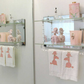
Ohio Catherine’s vintage kitchen and bathroom come together…and she tests some of Bradbury & Bradbury’s new wallpapers

I heard from Ohio Catherine recently – remember her adorable ranch…and all her Drexel furniture? Catherine has continued to work on her vintage steel Youngstown kitchen — pulling together the extra pieces she needs — as well as her pink bathroom — including checking out Bradbury & Bradbury wallpaper to go-with:

hey pam!

i got a few samples from bradbury today.  i love all the grey in the sunnyside up for the kitchen! and in the bathroom, i thought i would like the googie better, but after i put them up on the wall i’m leaning toward the atomic doodle. what do you think? :-D

the youngstowns in the pictures are my newest addition, before we tore them out of an old house about an hour from here.  someone contacted me via my wanted ad on craigslist and told me they wanted them out of the house so he could remodel.  they need a lot of cleaning, stripping, and painting!! but i have my corner piece!  i cringed when i saw you posted my youngstown handles on your ebay picks, because i NEED them!! haha!!
and lastly i sent a picture of my chambers sitting in the garage!
thanks for all your suggestions, LOVE your site!!

Thanks, Catherine. You have your own Tag now! I agree – that Atomic Doodle wallpaper up against your classic Mamie pink tiles looks fantastic. But I am not so sure about the Sunnyside in the kitchen. Even though I think I recommended it – I tend to think the grid of the wallpaper alongside the grid of your tiles is not the perfect combo. So…I consulted Steve Bauer of B&B to see what he thought. He also had some great advice for wallpapers going into a bathroom:

Pam,

Thank you for taking the time to help Catherine and asking for our opinion! You mentioned “Atomic Googie” looking fabulous, but I didn’t know if you meant our “Atomic Doodle” or “Googieland”, but hey, I think they are both terrific in that incredible bathroom! I would recommend however that we seal the paper, (which is not expensive) if the bathroom produces a lot of moisture. She can ask for that through our Customer Service if she places an order.

As far as “Sunnyside”, it is probably the least grid-like pattern of the four Post War papers (when you compare them on our site) but it might pose some competition with her terrific tilework. Some of the reds we matched for these papers in the paper are actually values of “carmine”, a sort of wine red color used frequently in late 40′s and early 50′s papers rather than a primary red as it may appear in the photos. They definitely appear lighter however than the deeper maroon in her tile.

Does she have a breakfast nook off the kitchen? If so, she could paint the walls in the kitchen a light pearl gray to harmonize with her cabinets and use our “Scallop Trim” at the top of the wall, (the one with silver in it like the cabinet handles) and use “Sunnyside” in the nook with the “Trim” above that (!) The nook would then be a beautiful compliment to the kitchen without the two competing. If those options don’t sound appealing to Catherine she could always try to find a vintage paper through some of your links (?).  From the tiny portions I could see it looks like a terrific vintage kitchen! I wish her the best!

I hope this offered something in the way of assistance to you and Catherine. We are always glad to help. Thanks again!
Steve

Thanks, Steve!

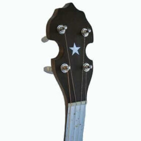
Jeff is on the lookout for gold speckled laminate countertops — he uses them for banjo finger boards!
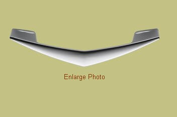
This week I heard from Jeff, who uses vintage speckled laminate for his banjo finger boards. I just think that is so cool… you know I am part Kentuckian. P.S. Can someone tell me how to get the accent mark over the ‘e’, as in lame’ … as I am dying to write lame’ laminate? Heck yeah there is more →

The Museum of Modern Art takes an historical look at prefab homes

Photo from Lustronconnection.org, a terrific Lustron site.

Photo from Lustronconnection.org, a terrific Lustron site.

National Public Radio recently did an interesting report on the Museum of Modern Art’s exhibit, Home Delivery — all about the history — and now, re-emergence of interest in — pre-fab housing.

Interesting – because yet again, another example of living small’s growing appeal. At least in some quarters… Heck yeah there is more →

Recreate this lovely green laminate kitchen from 1959

Following up on Monday’s exciting post about the Arpa USA palette of solid-color laminates, let’s take a look at how to use this material to recreate this 1959 Ma Bell kitchen. It would be oh-so-easy! Elements include:

  • Laminate cabinetry using Arpa’s “Jardin” colorway.
  • Cabinet pulls: Rejuvenation’s new midcentury “sharp arch”, in satin chrome
  • Countertops are also laminate – I like Arpa’s “Off White” but there are 4 whites that could work – Off White, Snowbound, Dover White and Downy — that you can eyeball in your kitchen – and test adjacent to your appliances.
  • On the floor, I’d put Armstrong’s faux-brick vinyl sheet, Saguaro in birch white
  • And if you can scrounge them up — this kitchen also deserves a pink stovetop, built-in ovens, and even fridge…
  • If you can’t find pink or don’t want vintage -  the Sub-Zero with appliance white panels and the old-style vent at the top, makes for a mighty fine authentic mid mod look. Pair it with a vintage range.
  • For a sink – stainless steel from Elkay, they have lots of great designs straight from the era.

How to clean a Saarinen tulip table and chairs

Remember San Francisco Troy from this post about his vintage airline bag collectionhis house plants…and his Drexel Declaration? He’s back – with tulip table talk…and Troy, you now earn your own Tag :) Ooh, two smileys in one post. Perky enough for you?

Hi Pam! Still hooked on your site – keeps getting better and better!

Your kitchen is legendary. You’ve incorporated a bit of everything amazing from the 40s thru the 60s. Big fan! I especially dig your choice of a Saarinen tulip set which I find refreshingly unexpected. I’ve always wanted a set of my own. Until…

I picked up a set of vintage Knoll tulip chairs in an estate sale – single owner, original sales receipt even! Score! They are in great condition but are in dire need of a good cleaning. Can you or any of your readers advise how best to bring these beauties back to life? I’ll attack them with soap and water, but beyond that??? The “Retro Renovation” furniture edition. ;-)

You’ve *almost* convinced me to move to Des Moines what with all your amazing time capsule features.

Later -troysf

So…I prompt Troy for the story, of course! —> Heck yeah there is more →