


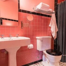
Feast your retro eyes on the 1939 color harmony guide from Kroehler, one of the largest furniture manufacturers back in the day. That smart devil Missouri Michael found it on ebay — it’s still in its original crinkled cellophane wrapper (!) — won it for $2 with no competition, and posted it on his blog. Drats and double drats. It should have been miiiiiiine. My search terms are failing me. Good news, Michael very graciously gave me permission to show the color chart here, too. Remember my recent post on 1940s decorating style? Colors like the ones above are synonymous with the era: Jewel tones with strong Hollywood-glamour contrasts…As well as sweet and sunny kinda-grayed-out pastels. Also: Notice the cheery prints recommended for window treatments. You can read more about Michael’s find — and also access a larger version of this color chart — over on his wonderful blog, Cul-de-sac Shack. Thank you, Michael!


Elena says
Thanks for sharing – this is very inspirational! Love the dusty rose/coral print combo.
Jenny says
I’m in desperate need of someplace that sells retro looking flooring to go in my original 50’s kitchen. Any suggestions???
Jenny
pam kueber says
Jenny – go up to the blue navigation bar… Find PRODUCTS… Kitchens… flooring.
Kathy says
Thanks so much for posting these! Forties, forties, forties!!
jkarrigan says
great find
Dix says
I love those colors together!
Mel Kolstad says
Oh, how fabulous. I’m off to Ebay right now, to see if I can snag on of these beauts myself – that is, unless you beat me to the punch, Pam! 😀
Michelle Teall says
Thanks for sharing, this is lovely and inspirational!
handyandy says
Oh, woe is me, I need that color guide badly! I need to hold that honey yellow sample up to my barkcloth curtains. ……whimper, whimper…….
gavin hastings says
I love these colors!
And in relation to the previous postings about colors: I believe that what “looked good” in previous decades was quite different to what we consider harmonious today.
Availability was also a problem. Kem-Tone paint was the runaway favorite of the 1940’s and made in 10 colors….yup, 10 colors. Pick one….