

 Interior design in the 1960s featured colors that were bright, plentiful and not afraid of to play with contrast… but you sure can see the 1970s sneaking up, even by 1966. Goodness — look at this pink perfection confection basement rumpus room — one of 16 bedrooms, kitchens, living rooms and other spaces featured in my 1966 Sherwin Williams paint brochure. In particular, I want to marry those Eames style chairs — and look: There are matching bar stools, too. I think I’ve seen the dinette before… my memory is vague… it may be the bestest ever. But I say that every time I see another cool dinette, don’t I? I also love some of the colonial-modern living rooms in this brochure… and I am now incited to get me some mid mod wig stands — notice them peeking out here and there. What is that all about? The women’s falls and other hair pieces that were so popular in the 60s? Oh, I have some of those picked up from estate sales. Kind of gross, but I have a high tolerance for gross when it comes to vintage.


To view the slide show, click on the first thumbnail. Once it’s enlarged, click on the arrow below to move forward or back. You can start the slide show from any spot…


Cynthia says
Great images! I want that orange kitchen, too. Actually, just about any orange room would do it for me…I am currently (almost) as in love with the color orange as I am with my husband…
Speaking of husbands…do you think that’s a master bedroom in the 4th image (the green room…)? Ummm…could those beds be any *further* apart? 😉
Cindy says
Oh Pam! I always get new ideas from you! These homes are so comfortable to walk into…maybe that’s because I grew up in the 60s…or because they’re just great design!
I’ve used beautiful colors in my house and it warms the place up. The open living areas and kitchen are a bright cantelope color with grey and beige accents, another room is terracotta walls and it embraces you when you enter. I say be bold with color, too!
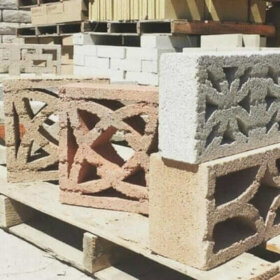
CT_Keith_MCM says
Found this website with decorative screen (Concrete) block
http://tilecoinc.com/pages/masonry_pages/M_decoscreen.html
Cara says
Wow! I am enjoying people being jealous of an orange kitchen. My poor kitchen always gets a disapproving: Oh…it’s orange…
Hmm, it looks like I need some coordinating orange walls. Now if only my cupboards were better quality and I had a fab window planter I would be set.
So many fun ideas in these brochures!
Annie B. says
Would love to see it, lucky person!
Cara says
Oh, here it is! teehee. Last winter before we moved in.
http://markandcaras.blogspot.com/2010/01/specially-requested-kitchen-photos.html
Yes, a far, FAR cry from the cute, tidy and well planned kitchen in the brochure. It’s currently only the counters but everyone always comments on its overall orange-ness. Since that’s the case I’m thinking I may as well go all out orange. The paint is easy but the built in planter and flooring may be a trickier proposition.
Gavin Hastings says
Orange AND Harvest Gold!!!!
Wonderful now and great potential!
Annie B. says
Oh, Cara. Tons of potential!! Great Harvest Gold appliances and cool counter tops. So much you will be able to do with this kitchen!! Lots of room for more orange! Thanks for sharing.
Elaine says
OK, that fireplace in pic 10 gives me a great idea! My 1964 house has a great fieldstone fireplace with no mantel and I want to add a mantel but not put holes in my fireplace. I’m calling my handyman artist friend for a consult about this.
drex says
Oh, why are we so afraid of color now? Why?
Gavin Hastings says
Because it falls into the wrong hands!
Actually, I think this is a question for an Socialogy Major. A few decades ago, I think most people looked forward to a better future and embraced new ideas a bit more openly. Nowadays…everybody is a critic.
And people aren’t afraid of color: so long as it is a red wall or a sage green wall or a gold wall.
pam kueber says
crossing the line into a warning re “making other people feel bad for their choices”. such rants only allowed on ‘resist the greige nation’ post. note: i think we are in an “anything goes” era. some folks like sage green (hey, i was into that big time in the 90s) others go color crazy. it’s a mad mad mad decorating world — precipitated by the explosion of alternatives made available by the wonderful internet
drex says
Good points both of you. I think you are right, Gavin, about people embracing the future with curious wide opened eyes. I miss that actually. I’ve made the choice to take my 1965 mod ranch back to its roots – and that includes color – bright glorious color!
And Pam – rants are good, especially yours!
pam kueber says
I think that cynics get way more press than optimists. Let’s not feed those bad vibes. Number one commenting rule of the blog: No one can be made to feel bad for their choices.
Gavin Hastings says
…ok. Sorry.
pam kueber says
🙂
Gavin Hastings says
As I was just saying to a friend yesterday…. : )
Annie B. says
Better hair through chemistry!
pam kueber says
Well, of course!
Annie B. says
I want to marry that orange kitchen (after taking down the valence). Great great great colors!
I well remember the Dynel fall. I had one; it looked like the pelt of a roadkill.
Gavin Hastings says
Annie B.
I like the valance…it is the one item in the room which could only BE from 1966! I wish I could engineer something like it in gray and black.
Annie B. says
Gavin, you are so right about the valence and ’66. It’s period-perfect and a great accent. I suppose I’m just too recticlinear to look at it every day before coffee!
Kelly LeBel says
These are FABULOUS! The green counter top in pic 11 is to die for! My house was built in 1966…. maybe I can incorporate some of these looks into it. Thanks Pam!
Ellen says
Oh my gosh, I love that rumpus room! And all these pictures! That orange kitchen! That violet bathroom! And Mr. Cleancut down there in the corner painting – what kind of outfit is that to paint in? Thanks for starting my day out with a smile.