


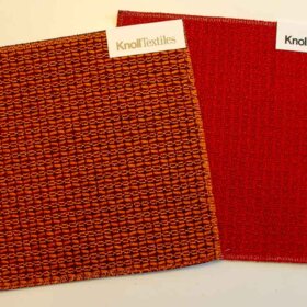
Sanderson has just today announced a brand-new line of vintage reproduction wallpapers from the 1950s. I’m uploading photos now — but want to be first on the web! BIG NEWS in our Retro Renovation world! I’m counting 9 new wallpapers, 8 new fabrics for upholstery or curtains and 3 velvets for upholstery. There are many colorways… Most patterns seem to be “documents” — straight from the archives although I think the colorways are reinterpreted for today.
Update: Alas, this was a 2011 collection and it appears no longer available. I’m going to keep this story up for our archive, though — the papers so pretty!
Meanwhile, following is a quick grab of the wallpaper patterns and some of the colorways available:


Here’s the link to their page featuring the new collection of 1950s wallpapers, upholstery and curtain fabrics, and velvets.
.

“Fifi” — oooh lala!
.


donna says
Pam! these are absolutely gorgeous! i avoid wallpaper like the plague because, when we moved into our 1965 rancher last year, every single room had some iteration of frightening 1980’s mauve wallpaper. ugh. these new Sanderson patterns, though, could change my mind! and a couple of them would blend beautifully with our new red & white marmoleum (finally getting pics to you is on the to-do list for the weekend!)
Ngare Knight says
A word of warning, once you start wallpapering your home it quickly becomes an addiction!
pam kueber says
oh yeah baby, don’t i know!
RebeccaSF says
I contacted my local store that carries this fabric, but they said it’s only available to people in the trades. There is a way around this obstacle, they said, but it will cost me! Too bad, because I’ve been looking for a really good woven cream-colored fabric for a room divider/curtain.
I’ll have my eye on ebay. Thanks for the heads-up!
pam kueber says
hmmm. i will ask the PR people
RebeccaSF says
Thank you!! I ordered fabric samples from the website – if only to torture myself over things I can’t have – and will let folks know how they look in real life.
Jane / MulchMaid says
I ordered some sample colorways of Dandelion Clocks from Sanderson (limited amount, but free, BTW) on a tip from design*sponge. They just came Monday and they are beautiful! I got fabric and one wallpaper sample. The pattern is very large, but on a big section of wall, it would be a fabulous look. Now I just have to convince DH.
Jeff says
Certainly great to see, but I think the colorways have been updated for more “modern” tastes. I find the original colorways of mid-century modern wallpapers much more subtle and workable for larger projects- many of these would only work as accent papers or used on small jobs.
pam kueber says
If I hear from the PR people (I requested more photos and a news release) I will ask about the colorways. I tend to think you are right — the colors are more in tune with today’s color trends. Still… some gorgeous stuff here.
Jeff says
Agreed! Any time current manufacturers catch up to the kool people, it’s a good day!
Now if we could get some Tiki papers……
pam kueber says
Jeff, have you seen the Bradbury tiki papers? They are pretty groovy!
Jeff says
Going right now to take a look- will report back! Thanks!
Rachel says
OooOOOoOooOoOh – these are amazing! And it looks like there is a supplier in Houston … I’ll have to check it out! I’m looking for fabric to cover our kitchen chairs. I’m with you on the Seaweed love, but I’m also swooning over the aqua colorway of Perpetua … DREAMY.
Thanks for sharing! 🙂
Nina462 says
Love them! I’m rewallpapering my Mom’s kitchen this summer – unfortunatly she wouldn’t love most of them. However there is one she might like.
I’m also looking for some fabric to redo a chair this summer – nice designs! I wouldn’t need more than 2 yards -so affordable for me.
maggie says
I can’t find a place that sells it online in the US. Whaaaaa!
pam kueber says
I think you might have to go to a real store…not sure… Did you check Sanderson’s site for a list of retailers including in the U.S.? Also, as Gavin mentioned, also watch ebay…
Mod Betty / RetroRoadmap.com says
ooooh how cool! I am definitely inspired to create some draperies for the Hacienda – thanks for sharing with us, Pam!
pam kueber says
My favourite <--note Brit spelling is definitely the Seawead, the last image in the slide show. A 1954 document...available in fabric but not wallpaper. I think the teal/orange would make lovely pinch pleat draperies for my living room/dining room -- which I need and are on my list as one of my next project. I need 64 yards, please.
Gavin Hastings says
Pam, here’s something to think and stress about:
Seaweed is a graphic print, but also a stripe….Stripes as pinch pleats can look maddening.
Normally, when making/setting pleats on a panel, the sewer would figure approx. 2 and 1/2 inches at each end, 5 pleats consisting of 5″ of fabric and 4 spaces of 5″.
25 inches of pleats and 25 inches of spaces to a 54″w piece of goods. Game over.
But with a stripe fabric such as Seaweed, and this method….some pleats are grey, some white, some pink, some a mixture of everything. It’s a crazy effect.
I have found that with a bit of calculating…..and a bit more work…Stiped draperies (esp. on a large scale) look best when all the pleats “hit” at the same mark on a design or graphic. Then, you still get the graphic look…yet all the pleats create a uniform effect across the drapery: ie. all the pleats are white, pink or grey.
Hope this makes some sense….
pam kueber says
ok no seaweed for me. thanks for the 101!
Puddletown Cheryl says
Yummy!