Help Christa choose an exterior paint color for her 1961 house
pam kueber - April 1, 2011, Updated: April 1, 2011
Retro Renovation stopped publishing in 2021; these stories remain for historical information, as potential continued resources, and for archival purposes.
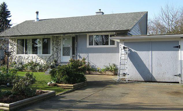
Since moving into her midcentury modest house a year ago, Christa has been having a ball updating the inside to reflect its 1961 architectural roots. Now, she’s ready to paint the outside — and has asked for ideas. Note in particular the rock wall — how to work it in? Read on for more background… then share your ideas about what paint colors she should use to freshen up the exterior of this adorable 1961 home.
Christa writes:
Hello Pam,
I’m a long time reader and admirer of Retro Renovation. When we moved in to our 1961 Vancouver Island house last April, your site provided oodles of inspiration for me!
Christa says: My husband Garrett and 5-year-old son, Emmit. Here's one from an evening last Summer, when Emmit set up his toys so that he could put on a show for them 🙂
Since moving in, I have painted almost all of the interior, save for the staircase, and completed many small projects to rejuvenate our home with a bit of colourful 1960s flair.
It’s been a ton of fun, and now that we’re cruising toward Summer, I’m anticipating painting the house’s exterior so that the outside will match the inside in pizazz. I have been browsing your paint inspiration collections, Flickr, and my own collections of vintage house magazines, and I’ve got nothing- I need your help!
I’m inclined to incorporate some aqua or seafoam, and/or mustard, burnt orange, pink, even black — really I’m all over the map and coming to a place of confusion in regards to what will actually suit the house. What will help it ‘pop’?
And what do I do with the rock wall? Does one paint any part of it, or just leave it? I feel lost. Any guidance you, or your readers could provide would be SO appreciated.
Yours in thrifty mid century modest-ness,
Christa
Christa, you have a lovely house, it just seems so idyllic. And, Vancouver Island: One of my favorite places in the world!
Readers, what do you think? What paint color(s) should Christa use to add curb appeal to her 1961 house? And, how should she deal with the rock wall facade?
Did you ever decide? Please update here with your choice if so. If not, having looked at your flicker page, I vote for the colors of the coffee mugs. The blue/teal for the house, add the green or rusty orange/brown as the pops for either trellis or window boxes, and use the 3rd color for seasonal accent items.
Sweet house. The rock wall would be set off beautifully with a medium dark gray, white and black on all the window trim, and a rich burgundy front door. Make sure the colors have a blue undertone base. Enjoy painting.
Carolsays
Your house is so cute!! I agree with Gavin to paint the house dark grey. Do not paint the rock! Use Gavin’s idea of the window box. This will downplay the rock and make it more of an interesting feature. If you think the house would look “lopsided” colorwise, then paint the garage doors the same color as the rock. This will ground the house on both sides. Put trim on the garage doors. Definitely incorporate butter yellow and white. This combo is timeless. I’m thinking bright grass green for the front door. I don’t know why, it just sounds friendly and bright for a not so sunny climate. FYI, paint choices are sooooo hard when you do it outside. Take your time and go with what you love.


 Since moving into her midcentury modest house a year ago, Christa has been having a ball updating the inside to reflect its 1961 architectural roots. Now, she’s ready to paint the outside — and has asked for ideas. Note in particular the rock wall — how to work it in? Read on for more background… then share your ideas about what paint colors she should use to freshen up the exterior of this adorable 1961 home.


Christal Anderson says
Did you ever decide? Please update here with your choice if so. If not, having looked at your flicker page, I vote for the colors of the coffee mugs. The blue/teal for the house, add the green or rusty orange/brown as the pops for either trellis or window boxes, and use the 3rd color for seasonal accent items.
Christa says
I did, actually, finally painting in Summer 2013, and have always meant to take a photo to post here, but of course have wanted to get the landscaping tidied, window boxes made, etc etc, and we had another baby, so of course none of it’s done and proper after photos haven’t happened! But, I’m super thrilled with our colour scheme and will tell you we went with Benjamin Moore Yorktowne Green for the house, Navajo Red for the door, and Navajo White for the trim. Here it is on another colour viewer pic on my Flickr. Doesn’t quite do it justice, of course 🙂 https://www.flickr.com/photos/christaface/9731020877/in/photolist-qB6x4Z-fPU2u2-fzm3Vq-9Vt1y7-9VoncJ-9VinsZ-4XUp98-4vUvqV-4vUw8n-4vYDfu-4vYDkw-4vUvxc-4vUvMa-4vUvFT-4vUvC4-4sYotz-4sYodP-4t3rK1
Julia Lindsay says
Sweet house. The rock wall would be set off beautifully with a medium dark gray, white and black on all the window trim, and a rich burgundy front door. Make sure the colors have a blue undertone base. Enjoy painting.
Carol says
Your house is so cute!! I agree with Gavin to paint the house dark grey. Do not paint the rock! Use Gavin’s idea of the window box. This will downplay the rock and make it more of an interesting feature. If you think the house would look “lopsided” colorwise, then paint the garage doors the same color as the rock. This will ground the house on both sides. Put trim on the garage doors. Definitely incorporate butter yellow and white. This combo is timeless. I’m thinking bright grass green for the front door. I don’t know why, it just sounds friendly and bright for a not so sunny climate. FYI, paint choices are sooooo hard when you do it outside. Take your time and go with what you love.