

 There are at least six different things I like about Karen’s kitchen Retro Renovation. #1: …
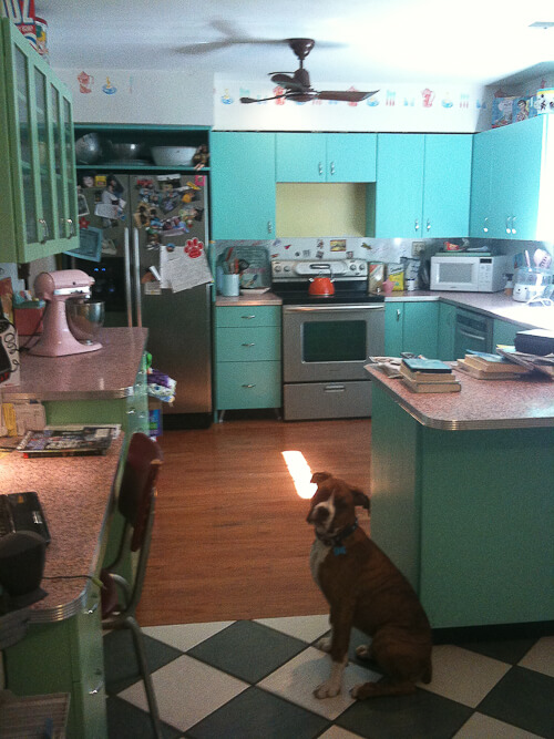
 Life is a big canvas — throw on a lot of paint! Karen had a big (kitchen) canvas to play with, so she very happily married four pastel colors — aquamarine, pistachio, pink and yellow.

The floors are more neutral — hardwood and black-and-white floor tile. The big mash up works beautifully — what a happy space! Karen explains:
This was our first house. We lived there 15 years. We have since moved from this house, although we still own it. It was a 1300 sq ft. ranch built in 1961. Small house, but fantastic open kitchen. Every other house we saw in that price range had galley kitchens.
 #2 — FABULOUS idea: The craftsman who made Karen’s wood kitchen cabinets recommended removing the clock panel from a built-in oven that had been original to the kitchen — and making it a built-in work of art. Karen said they never got the clock to work. But I am sure that’s do-able and when complete, would make the piece functional as well. Obviously, if you can re-sell vintage ovens to another person who can use them, that’s a great thing to do for both the environment and for Retro Renovation colleagues in arms. But if you can’t save ’em, “this is a great way to preserve a part of them,” Karen points out.
 #3 — The countertops are pink terrazzo. Wow! Karen lives in Florida — terrazzo-land, if there ever was one. The counters look to have aluminum edging like the kind available from RetroTrims.com. She says:
…Our guy had never worked with terrazzo before but they came out great. We picked the color and even the aggregate that was mixed in.
 Here is a close-up. Tee hee, a photo that Karen kept of a cute note written by her daughter.
 #4 — The fluted or reeded glass (I never know which is which, I think they are very similar) is great and serves the purpose to adds visual interest and light to a kitchen that has A LOT of cabinetry. (In fact, my kitchen could use some glass-front doors to break of the never-ending facade of aquamarine, scrumptious as it may be. Time to start looking methinks. Geneva did make glass front doors.)
Another design point about Karen’s long green wall of cabinets: It’s all long drawers on the bottom, which creates a long low horizonal buffet feel. And, the unit transitions from the cooking area of the kitchen into the eating area of the kitchen, with a sit-down desk at the end. This kitchen was designed very very well.

#5 – Karen had these cabinets custom-made. As a result, it was easy to add fabulous touches like modern metal legs or feet. The legs further “lighten up” the space — but mind you, the trade off is knowing there are, and always will be, dust bunnies lurking below. And #6, Karen points out that her backsplashes were made of marker board — endless fun for the kids. What a great idea!
In fact, it sounds like Karen is a creative dynamo. I asked her about her new house. She responded:
Pam,
Thanks! We are now in a custom brick ranch that was built in the ’80s. It’s 3,000 sq. feet of “blank canvas”. It’s in great shape, and we got if for @ $67 a sq. ft. All the paint is fresh but completely “oatmeal”. I’m trying to figure our my color schemes now. I definitely want to stay in the mid mod way of living.
Also, we have a nice screened-in pool and lanai. My dream would be to find a way to make the pool area mid century roadside pool “MOTELesque” out there.
I plan on making one of our guest rooms look like a motel room complete with chenille bedspread and a magic fingers coinbox decorative piece.
I also love to make paintings of the old neon signs. I’ve attached a couple for you to see.
I will be visiting your site and blog a lot for inspiration for this new house!
Thanks again!
Karen

") I also love to make paintings of the old neon signs. I’ve attached a couple for you to see.
I also love to make paintings of the old neon signs. I’ve attached a couple for you to see.Thank you, Karen. You got it goin’ on, girl!


Josie says
Gosh, this kitchen makes me smile! I love how fun it is. I also love the courage/whimsy of the colour-scheme, because narrowing down my palette is always the hardest part for me. (See I love black and white… but also mint/jadeite… and pale buttery yellow… and sometimes red… and this site has given me new appreciation for aqua….and I love the Kitchen Aid line of pink…) I’ll probably never be on Karen’s level but I LOVE to look and admire.
Nice choice of countertops, a bit different than the laminate vs. granite dichotomy you so often see.
My alreadyt semi-disastorous kitchen just got wrecked-er (already beat up, already a decade or two late for my taste, but still old, and now water-damaged, with swollen, peeling laminate and warped MDF cabinetry) so I LOVE seeing fun, creative, palette inspiring choices to inspire me to rise from the ashes.
Thank you!
Sarah says
Gorgeous kitchen! I am in the middle of an updated retro remodel of my kitchen. It used to be my Grandparents house and has so many cool late 40’s-50’s things in it, I’m just replacing what needs to be and adding counter space and a new color scheme. I MUST know where you got the Aquamarine color from and name. I’ve been searching for many months, many swatches brought home and I can not find the right one. If you could help me on this, I’ll be forever grateful! Also, love the metal trim on the countertops. We had chrome ones but, they were never caulked, so they had to go. I don’t even want to say what it looked like underneath. I was hoping to salvage them. Not possible.
pam kueber says
Sarah, have you tried the Sherwin-Williams Suburban Modern palette? Their aquamarine is spot on: https://retrorenovation.com/2011/05/31/sherwin-williams-suburban-modern-paint-collection-download-the-discontinued-brochures-here/
Carrie says
Is the pistachio green she used like the jadeite color? It coordinates beautifully so would love to know what the color name was and manufacturer. Thanks!
Jenni says
I also would love to know that pistachio paint color / manufacturer! Am getting ready to renovate a vintage travel trailer and that’s the color we want for the cabinets…easy to get greens wrong, though.
Jackie says
That is a dream kitchen!!
I really want to see those paintings–but can’t get the link to work. Help!
eudora says
Fantastic kitchen, Karen…SO inspiring. Please promise you’ll send before and afters of the pool area…your public anxiously awaits!
Susan K says
Great kitchen! There’s something about aqua that makes the whole thing smile! I’m interested in the stand-alone yellow buffet piece. Maker? Year? so cool with the cracked ice dining table & chairs!
Shelley says
Karen!
LOVE love LOVE your kitchen! We are moving to Michigan in 2 weeks into a 1910 bungalow. My kitchen colors are quite similar – turquoise and yellow…except I am using red instead of yellow. There is original black and white tile also!
Your artwork is amazing…I will check out your site.
Thanks for sharing your home. Be sure and send photos of your new place – I love all of the ideas you talked about. So fun!
Karen Dickinson says
Thanks to everyone for the comments! I have found my people! Hahaha. Lynn-O-Matic, I haven’t made prints of my artwork yet. I’ve been doing commissions for the past year. Most are acrylic on 16X20 canvas. I personalize the neon signs to the clients names and tastes. For example, the “Sheppy’s Lounge” painting was done for a friend who had a bar in her house. I’ve done everything from bowling alleys and drive-ins to hotels and motels. Here is a link to my Ovation page with my artwork.
http://community.ovationtv.com/view/displayManagePhoto.kickAction?as=16878
Thanks, again for all the nice comments!
Karen
Diane says
The combination of colors is incredibly harmonious. I can tell that she is an artist even without seeing the paintings.
Lynn-O-Matic says
Retrolicious is right! Wow, wow, and wow. I’m in awe. And now I want to tear out my own retro kitchen and have this one instead.
Karen, do you sell prints of your paintings on Etsy or anyplace? Me want!
leftofcentergirl says
Love it, just love it!