


![]()
I’m back after some more scouring of the internet and thinking about what my dream retro modern master bath might look like. Ever since I discovered that it existed, I have loved the Atomic Age collection of wallpaper from Bradbury & Bradbury, so I thought–why not put together an idea board using one of their designs as inspiration? Of course this idea board is also full of pink, because who wouldn’t want a pink bathroom in their retro ranch?
1. This wallpaper–called Googieland — from Bradbury & Bradbury is, in my opinion, super retro cool. Since pink and turquoise are a classic retro color combination, I thought it would be perfect for my retro modern master bath. I might just use it as a backdrop pattern on the vanity wall, or if I’m feeling bold, perhaps the entire room might be wallpapered. Otherwise, a light pink paint, picked from the wallpaper would complement my wallpapered accent wall perfectly.
2. White Jonathan Adler Havana wall sconces coordinate perfectly with the wallpaper. The bowtie shape is very retro and the cut out shapes on the lights echo the funky print of the wallpaper.
3. This Grundtal Mirror from Ikea – now discontinued but Ikea usually has a good variety of mirrorsat any given time — is simple and sleek. The stainless steel frame compliments the gray and chrome throughout the room and the circular shape plays well with the penny round tile and the ceiling light fixture.
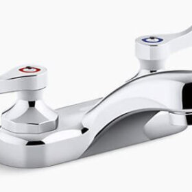
4. This faucet is very modern, but since it is a shiny chrome, it also echos the retro feel of the room.
5. I’m using this affordable custom sink/vanity top combination from St. Paul Home Products (link now gone) in all my idea boards because it is just what I want to top off my retro dresser/vanity.
6. The retro dresser that I found for $25! It has the perfect measurements and look for my retro modern master bath remodel.
7. For the floor, a 12 x 24 inch gray slate tile would help to blend the retro and modern styles. Slate was commonly used in retro decorating, though typically in entry ways instead of bathrooms, so it is a good material to chose. The gray and pink combination is also very retro appropriate. What makes it modern–the large size of the tiles.
8. This flush mount white light from West Elm (now discontinued) is modern, yet its shape is reminiscent of a classic retro piece, the Saarinen tulip chair.
9. I can’t tell you how much I want to use the starburst towel bar from Rejuvenation [alas, now discontinued]. I’ve been in love with its retro design since the first time I saw it.
10. I still have to call and verify that such a color exists, but if B&W tile has a light retro pink tile, I’m going to use it for my shower. This time I’m going for the classic 4 x 4 inch square wall tile.
11. I’d have to get samples to make sure the pinks would play well together, but I would love to have this pinky peach penny round tile on my shower floor. It echos the circular shape of the mirror and lights and also has that playful feeling that is found in the wallpaper.
This master bathroom design is not quite as luxurious as my first attempt — which I modeled after a 1957 time capsule house that Pam featured — with its stone wall, but it is just as exciting to think that my master bathroom could have all of these elements in its decor. Still, I think another idea board is in order before I make my final decision.
Which of the Kate’s two bathroom design mood boards do you like best so far — Flintstones-meet-Jetsons or Atomic 1950s?
Follow all of Kate’s stories about her
master bathroom remodel — Click here.


Sunshine says
The house we just bought, 1960, had some really terrible wallpaper all over the kitchen, including right behind the sink and stove top. The previous owner had put a piece of clear plexi glass/plastic up as a backsplash behind each and secured it with those little plastic clear things you’d use for a mirror. I didn’t even notice they were there until we’d actually moved in. But it was obvious it was meant to protect the wall paper in those sensitive areas. Is there some kind of clear coat you could put over a wall paper?
Kate says
Good idea! Hmmm. I’ll have to look into that if I choose this option. 🙂
Sarah V says
I think that both designs are great. However, if I put my practical hat on, but my big thing witht the split stone in the Flintstone one is…. how do you clean it? Wouldn’t dust etc. collect on all of the different surfaces? and since it’s rough I can’t think it’d be too easy to dust….
Just putting it out there…
Kate says
Yes, that is a concern…I suppose I might have to scrub down the wall every once in a while…decisions, decisions!
Brian T says
I prefer the Atomic to the Flintstones. The dresser comes alive with the Googieland wallpaper; it seemed intimidated by the texture and color of the stone wall. I’ve never been a fan of pennyround tiles, but a shower floor is a use of them that just might change my mind. That said, are you sure you don’t want hexagonal tiles instead? Same scale, truer to the period, angles still reflect your sconces, less grout to clean.
Linda Lucas says
I celebrate your idea of ORIGINALITY in retro design. I approach all “period” interiors from the point of view as if I were there back in the day as chief designer, not present day copier in chief. I like that you’ve addressed the function of storage and taken advantage of all your options for accessories. Unless one is doing a “restoration” of an existing space that is complete with the original fixtures, personal style and optimal spacial planning rule. Bravissima!
Karen Roche says
Hi Kate, Definitely gray floor, but consider this retro marmoleum. I put it in my pink bath and it’s really wonderful, totally retro (without the asbestos.) Check out the slate gray 😉
http://www.forboflooringna.com/Commercial-Flooring/Products/Marmoleum/MCT/