

 Reader Laurie waited more than two years to close on the house of her dreams — which was stuck in what seemed like endless foreclosure. Now that it’s a done deal, Laurie is trying to spiff up the house before moving in and unpacking all her long-collected retro goodies. Amidst all her excitement, Laurie emailed us for help with her Retro Design Dilemma: Choosing the wall color for her mostly original retro kitchen is making her lose sleep. Read on for her story, and our kitchen color ideas…
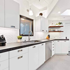
 Laurie decided to keep the original laminate counter tops (#5 on Pam’s Most Endangered List.) She also told us would be keeping the original red-and-beige checkerboard resilient floors.***See Pam’s boxed comment at the end of this article about making sure you know what materials are in your old floors.
So here’s what Laurie had to say about her Design Dilemma:
I guess my biggest question is, if I have a pink topped table with flecks of grey (chrome legs) with pink and grey chairs, and the counters are like a beige or tan color WHAT DO I PAINT MY WALLS ? My valances are going to be pretty busy, the aqua and pink ‘Whats cookin’ fabric…. We purchased white appliances from Sears. The shiny white not the ones with a texture. These are the questions I am losing sleep over! ANY advice/help is MUCH needed and appreciated. Thank you. 🙂

Kate responds to Laurie’s Design Dilemma:
 Fear not Laurie! The answer to your retro design dilemma is as easy as doodling… atomic doodling that is. Upon seeing Laurie’s kitchen, Pam immediately suggested this wallpaper from Bradbury & Bradbury called Atomic Doodle.

The colors in this wallpaper coordinate perfectly with Laurie’s kitchen. The metallic copper on the wallpaper (which reads almost as a yellow) echos the original, warm wood cabinets and tan laminate counter tops. And, the pink blends with her checkerboard floor and dinette set (which incidently was featured on Retro Renovation before — in the story about reupholstering retro dinette chairs affordably).
While Atomic Doodle does fit the color scheme of Laurie’s kitchen, I fear covering all the walls with it might be overkill — initially Laurie had worried about having too much going on in her kitchen — so instead I took a color cue from the wallpaper itself and “painted” Laurie’s kitchen with the magic of Photoshop:

 I also “moved in” Laurie’s pink and chrome dinette set so that she could get a sense of how everything would come together. I picked the light pink and the golden yellow right off of the wallpaper pattern. To add some interest, Laurie could order one roll of Atomic Doodle wallpaper and use it sparingly in small areas in her kitchen — namely as a backdrop for her small rounded shelves on either side of the window (which would be great to display vintage glassware, small dishes or even a retro salt and pepper shaker collection). Laurie mentioned having a set of chrome canisters, possibly similar to these, which will work nicely in her space.

 Keep in mind that Laurie has purchased white appliances — which will help to break up all the color and pattern that is going on in the room. Adding a new or vintage chrome rimmed clock on one of the soffits would echo all of the chrome accents in her table, counter edging and cabinet pulls.
As far as window treatments go, I’m a big fan of cafe curtains. If Laurie opts to add the little bits of Atomic Doodle wallpaper near the window, I’d keep the curtains a solid color — probably white or a coordinating yellow. Cafe curtains are relatively easy to make and install with little to no sewing involved. Heck, I made cafe curtains for my kitchen windows without sewing at all! Pam has covered cafe curtains before — in her post 15 cafe curtain designs and ideas — which is both full of ideas and information on how to make your own cafe curtains.
So there you have it Laurie, hopefully you can rest easy — well once all your moving and unpacking is done!
Do you have a room that causes you to lose sleep?
See our instructions for submitting your retro design dilemma.
Pam and I are here to help!
AND: Pam takes over for Kate here: In our email exchanges, I reminded Laurie that her that vintage floors may contain nastiness such as asbestos, and that she should consult with properly licensed professionals to determine what is in her floors and how to handle. I do not give this kind of advice on the blog… and I edit out any reader comments suggesting what others should do. Again, homeowners: Consult with properly licensed pros to determine what’s in the original materials in your particular old house and how to handle safely.


Kate H says
Love the kitchen. Tile for the backsplash is easiest to keep clean, but may not be in your budget. My neighbor (who had a similar layout) had red print wallpaper on her backsplash, which she then covered with a thin stiff plastic. That way when she spattered something, she could just wipe it off the plastic and it didn’t stain. It was cut so that it was just like a clear layer of wallpaper and it was fixed in place by screws. Alternatively, you might be able to use linolium as a backsplash.
lisa says
I love the wallpaper-behind-shelves idea. People should realize your scale is off when they view the image. The print is very small and items in front will not get lost in it.
I immediately thought “grey” when I saw this kitchen, and I found the Sherwin Williams Chip It service agreed with me. You can see the chip it made on my Pinterest page: http://pinterest.com/pin/287878601151860931/
The shade called “sawdust” has some possibilities! It also suggests a mustard color, which is an intriguing idea.
IMissLiberty says
My brother works for Bradbury and he brought me a sample of the Doodle paper in aqua/turqoise which I’m using for my colors, as well. I plan to put it on one wall which has no cabinets or countertop next to it. Because this is a hand-printed non-vinyl paper, I imagine it isn’t very scrubbable, so I would avoid any place where water or splashing is likely.
If you have soffets, that would be a great place for it.
The Photoshop picture is really helpful, but we should note that the pattern is smaller than shown, so the effect is going to be much more subtle.
JKM says
I like the idea of painting the walls but not placing wallcovering next to the windows. Any curtains that end up on the window will compete with it, minimizing its impact. Plus anything placed on the little shelves will cover it up. I sort of like the idea of putting complimentary wallcovering (something subtle with grays and pinks that’d match or blend with the curtains and dinette) on the face of the furrdown above the upper cabinets, however. Not a border – blech – but fully on the face. There doesn’t appear to be much of it and it might add a little punch. Cute kitchen overall.
Jamie D says
I vote for turquoise paint, no wallpaper. I think the wallpaper is too busy to be placed next to your fabric you’ve chosen for the curtains (assuming the link above is the same as your fabric) Turquoise contrasts with both the pink dinette set and the red tile floors very nicely. I think pink paint + pink walls + pink wallpaper is just too much pink, IMO.
Plus, I have similar birch cabinetry and turquoise looks really fantastic with them.
Patty says
Exactly what I was thinking.
Rebecca@MidcenturyModernRemodel says
I think the idea of the turquoise paint and no wallpaper is a winner as well.
Eartha Kitsch says
It’s too early in the morning for my mind to fire creatively yet but I just wanted to congratulate Laurie on her new home and her doggedness in seeing her dream through. The kitchen is beautiful as is the dinette. I hope that we get to see an after!
JKaye says
Congratulations on getting your beloved home. I have some questions — will the table and chairs actually sit in the kitchen area, or in a dining area on the other side of that peninsula? If they are in a separate dining area, do you plan to give it the same color treatment as the kitchen area?
If the table and chairs will be in a separate dining area, painting both the kitchen and dining area in pink would be an awful lot of pink.
Could you let us know if there is a dining area to help with making suggestions? Thanks.
laurnjay22@yahoo.com says
Hi, there is a seperate dining area just on other side of penninsula. I thought I sent pics of that to Kate but maybe not. The table will go there(the table in pic is superimposed there and not actually there…) 🙂
Andrea says
While the pink is eclectic, and goes with the table, I think a nice robin’s egg blue would really set everything off. JMO
laurnjay22@yahoo.com says
Pics soon to come, but I believe Robins egg blue IS the right choice, upon looking at MANY samples it is the one I LOVE!!!!! 🙂 So much WONDERFUL adivice! Thank you ALL!!!
AtomicHipster says
Hi Laurie, love the kitchen and birch wood cabinets. This looks so much like my kitchen it’s scary, I suppose contractors had basic plans that they followed for many ranches in the 50’s especially if they were in a development. I have similar cabinets, similar peninsula AND the exact black and chrome molding along the edge of my counters!!!
I’m curious what state your in, I’m in Massachusettes?
John
laurnjay22@yahoo.com says
Hi John, I am in New York actually… 🙂
AtomicHipster says
Very Cool, my home and many others in the area were built by KayVee homes. Perhaps they built in NY also.
Enjoy your new home and good luck with the retrovations!!
John
Sally Eigenraam says
Love the 8 x 8 floor tiles…..