

 Reader Kami loves the built in 1970’s hutch in her dining room because of its charming details and storage capacity — however, the hutch isn’t jiving with the rest of the room and is in need of refinishing. Kami likes the eclectic mix of 1930s -1970s furniture that came with their house, but isn’t sure how to make all of it work together in this room while also trying to achieve a “cottage feel.”

Kami writes:
Hello Pam!
I came across your site by randomly clicking through blogs that discuss renovating and styling post-WWII houses. When I arrived at your site, I found a wonderful source for information and inspiration!
Here is my story:
My husband and I are teachers and we just purchased our first home. It’s a post WWII cottage that was maintained by the original owners until they passed away. When we bought the house from the owner’s children, we were sure that we wanted to keep the integrity, charm and style of the house. As an added perk, the children threw in nearly all of the 1940s – 1970s furniture. That brings us to the design dilemma.
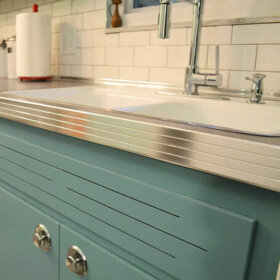
Included in these bonus pieces is a really cool built-in hutch/buffet. It’s at least nine feet long and has these really cool yellow/green plastic panels. I really like it’s functionality and form. The top of it is brown woodgrain laminate, which is super helpful when you are using the buffet to serve food because once the guests have left, it’s a simple spray and wipe cleanup with no lasting damage to the piece. The only problem is that it is painted with a faux wood grained pattern that is peeling, and has blotches of different paints all over it. The laminate is starting to peel off as well. I don’t mind that it’s brown but that particular shade looks kind of wacky with the super cool table that we received with the house. The table and chairs are in the Hepplewhite style and they are a rich mahogany brown. The walls in the room are a blue grey color, which accents the paintings and the peacock blue curtains.
I’m leaning on painting the hutch, but I have no idea what color I should choose. The panels are yellow green, the table is mahogany, the paintings are blue, the walls are grey and the wood floors are red oak. I really want to try to keep the room in the 1940s-1950s design aesthetic, but leaning towards a cottage style. If you all have any tips, I’d be really grateful.
Sincerely,
KamiP.S. We haven’t added the molding to the room yet, because it is being repaired. It will be painted white when it’s done, though.


Repeat the colors and shapes already in the room
Kami — that’s a tall order. Blending so many styles can be tricky. One trick to use when making an eclectic grouping of decor look less chaotic and more intentional is repetition of colors and shapes.

I know the obvious thought for the built-in might be to paint it white, but before you decide to pull the trigger on the white paint, consider trying to repeat the color of your wood dining table — the deep mahogany — on the built-in.
Rustoleum makes a product called cabinet transformations that Pam has mentioned several times here on the blog before. They have an extensive range of colors available — surely one would match your table — and the cabinet transformations system can be used over laminate. I think making the built-in cabinet match the dining set would help unify the room and balance the darkness of the wood around the room.
Adding a large rug under the table — like this one from Albert & Dash — would help make the space look more finished and add a medium color tone to the room — bridging the gap between light walls and dark wood. We chose this hooked rug style because you said you wanted to evoke a cottage design; you could also use a braided rug.If you are being very budget conscious — shop vintage and at estate sales… Pam says she sees rugs in both these styles — large vintage ones — very inexpensively priced where she lives at estate sales and thrift stores. In reality, the colors in your rug help set the colors for the entire room. Just make sure whatever colors you choose don’t clash with the mahogany — I would probably stick with blues, greens, yellows — which allow the reddish mahogany to stand out — instead of rugs that are predominately red or orange. The mahogany already has a warm red tone — adding too much more red to the room could make it feel too intense.
The pattern in the rug also evokes of the shapes in the yellow plastic panes of the hutch in addition to the decorative grooves on the lower doors and even the shapes of the chairs in the dining set. The cottage blue color we chose of the rug complements the artwork. Painting the small piece of wall between the upper and lower parts of the cabinet the same cottage blue color as the rug would help carry the color around the room as well as provide a high contrast backdrop for the lovely white dishes that Kami has displayed on the hutch — really allowing them to pop.
Instead of keeping the walls light grey, I suggest painting them a pale lemony yellow to echo the yellow plastic door inserts in the hutch and the gold accents around the room. The yellow also brightens up the room, helping to achieve a lighter and more airy cottage feel. Once the white moulding is installed, it will feel much more crisp. To finish off the room — especially if you want to reinforce the cottage feel — you could swap out the peacock blue curtains for fresh and airy looking white curtains. However, the peacock blue curtains would still work with this color scheme if you end up liking the more formal look.
It is possible to successfully blend varying styles and decades together in one room — through the repetition of color and shape — like I’ve done above. Repeating the same colors (mahogany wood tone, white, yellow and cottage blue) evenly throughout the room helps make the room feel cohesive, while the repetition of similar geometric shapes (rug pattern, chair back, hutch doors — even the mirror) adds interest and further unity to the room’s design.
What do you think readers?
What would you suggest to help Kami unify her dining room?


Alan says
For starters – neither piece of furniture is ever going to say “cottage” so unless you want to start from scratch, I would forget that descriptor. You can’t force them to look “cottage” and if you start painting and disassembling you are going to wind up with something that looks like you tried to mask what it is.
So….Unlike most of the other commenters on here, I would lose the table – it’s too formal and grandmas-house looking for the room and there’s nothing all that special about it – it’s a formal dining room table and it looks like hundreds of other formal dining room tables.
The hutch, on the other hand, is pretty unique and I’d make that the focus of the room
So to start, I’d find a very simple farmhouse/rustic looking table with a vaguely Mediterranean vibe. I would bring in some wrought iron too, to match the handles and trim on the hutch – either chairs or big iron candlesticks with a big rustic/Mediterranean looking bowl on the table. (I’d even try a clear bowl with marbles the same color as the yellow/green panes if you can find them)
Declutter the hutch too – take all that white china off and replace it with wrought iron or something colorful/whimsical. Put the books somewhere else too.
For wall and window, do the walls in a mustardy gold color – more Mediterranean than 70s – which would help the glass to pop and then do either dark red drapes (to keep the room more formal) or French blue (to lighten it up some) Here again, go for a black wrought-irony curtain rod and/or pull-backs
If you go for upholstered chairs or even seat cushions, I’d have those match the mustard and red-or-blue colors. Ditto the new tchotchkes on the hutch.
You need to get rid of the giant picture next to the doorway – it overwhelms the room and fights for attention with the hutch. Just a small print would work (8×10) or my temptation would be to just leave it blank. I’d lose the picture in the foreground too, though you could repurpose the frame as it’s a unique shape
Ditto the floors – the room is too small for an area rug and you don’t want to be tripping on something that blocks what appears to be the natural flow of traffic in front of the hutch.
Lots of potential there and good luck with it.
pam kueber says
I really disagree. I think that’s what’s especially special about that table — is that it’s original to the house. So sweet — “super cool” as Kami said. And hey, what’s wrong with “grandmas-house looking” — I love the grandma house look! Several rooms in my house — strive for that look — and accomplish it quite happily!
Finally: Kami asked us ideas for cottage style, so that’s what we aimed for.
Alan says
Touched a nerve there…
The table might be original to the house, but that’s not a reason to keep it. And nothing you can do to that table and that hutch are going to say “cottage” — at most you’ll get “painted to try and look like cottage”
If she really wants “cottage” the correct answer is “dump both pieces and start from scratch”
I don’t follow your logic Pam: the people Kami bought the house from were not professional decorators. They weren’t even Kami’s grandparents, which might have been a reason to keep the table. Some random old people had a table and hutch that didn’t match, why do you feel Kami is obligates to repeat their mistake? Better to fix the mistake than to perpetuate it.
What’s wrong with “grandma’s house look” is that the hutch is not “grandma’s house look” – it’s Brady Bunch House look. So you’re trying to mix both styles and neither is working.
I stand by my original point: Kami has a very cool and unique hutch in that room. She should use that as a starting point and decorate around it. Why hobble herself by forcing the inclusion of random pieces of furniture the previous owners bought? The key to most artistic success is editing.
pam kueber says
I quote Kami:
“…the super cool table that we received with the house.”
She likes the table. She wants to keep the table. That is our starting point.
I don’t agree with the word “mistake” and, certainly not, “random old people.” Yes, you are certainly touching a nerve with that one!
I adore the idea that people are trying to work with existing furnishings that have some longtime connection to their house. I am totally of the cheap and cheerful (and save yer money for real emergencies like your retirement) school and love a challenge to make lovely interior spaces out of hand-me-downs. It’s totally do-able.
All that said, I apologize for not being more diplomatic in response to your first comment. Yet, here I am squabbling again. You may defend your point — and I will try my darndest not to try and have the last word! 🙂
Jay says
Pam, Im laughing but in my case, it’s not Granma’s house it’s more like Mom & Dad’s house. The formal table and chairs are apropriate for the house style. The hutch is not an original feature to when the house was built. But it’s there and if Kami likes it that’s what counts. What a shame the room does not have built in corner cabinets w/glass doors. That would really spell “cottage”
lynda says
As you can see there are tons of opinions. It really just depends on what your vision is and what your budget will allow. You can decide if you want more of a cottage look with just a nod to the 70’s, or you can decide you want to leave it authentic 70’s. If you really want the 70’s, find a new 70’s dining set with a Mediterranean look on Craigslist. If you want mix and match, paint the hutch so it looks like a built-in original to the house and make the table the star of the room. Maybe a new linen drum shade light fixture and the more contemporary fabrics at the windows and on the chair seats would suit you. Their are lots of ideas out there if you look for them. There truly is no right or wrong way to decorate. It just has to make you happy!
Jay says
oops, I thought I was replying w/Brian and Nina.
Sara says
I think I would paint it. You’d have endless options for color and the built-in could still be a focal point in the room, but wouldn’t be over-powering. It does kind of scream 70’s and I think you could really tone that down with paint. If it were a different wood tone or didn’t have quite so much 70’s specific style to it, I would keep the wood. But in this case, I think it’s going to be hard to mix the style elements without having the 70’s vibe take over. Paint could really change that. I just re-painted my 1950 kitchen cabinets a greenish-blue color and they look even better that I was anticipating (although I have to add, if you paint, I would not recommend a certain brand of paint from Home Depot that’s named after a famous woman…the flat paint is nice but the enamels are weird and very hard to work with!). I love the idea of replacing the laminate with cork or butcher block which you could try to match to the table color. Good luck and have fun! Sounds like you got a great house!
Anita McKelvey says
The owner has very nice collection of furniture and objects. I wouldn’t mess with any of the furniture by repainting or making other significant alterations. Restoration, yes. Maybe the furniture needs to be repurposed and to another area of the house? The hutch might work better in the living room or family room, for instance? Lynn’s right about taking out the table leaves to reduce the size of the table. I don’t think the artwork on the corner wall works with this room with this layout. It might work better in another location in the home…perhaps the wall where the hutch is now? The chandelier swag also needs to go.
Leslie says
I love the suggested rug. Wow! I liked the original curtains, not sure they would go with the rug. I like the yellow wall color suggested too. I h*** [edited] the light fixture, would go with one that wasn’t bright brass but then I don’t like bright brass in general. Maybe one that matches the greenish glass in the hutch and the hardware color on the handles. Maybe something like this: http://www.lightingdirect.com/maxim-mx-2774-tuscan-5-light-up-lighting-chandelier-from-the-via-roma-collection/p351076
lynda says
You could try to just paint the light fixture with a metallic paint. Rustoleum has plenty of choices. You could replace the chain if it is too hard to paint. You might even find chandelier shades for the lights to give the fixture a new look. If it is some fabulous Baldwin Brass fixture or something, you probably should just replace it and sell the old one.
Jay says
I agree as well. The dining room has a split personality. One side is 70s Mediteranean, the other 1940/50 formal. The hutch is overwhelming the room. I would paint it to match the wall color and replace the green panels with glass.
pam kueber says
I agree — I think you could easily repaint the brass light fixture to take it down the Cottage road.
Brian T says
You are aiming for “cottage” but your hutch is doing almost everything possible to aim for “Mediterranean,” which was a much more popular style in the era when this house was furnished.
The main problem lies in the green panels’ color, texture and shape, all of which say rustic Mediterranean. See if you can replace them with plain clear glass. (If you don’t want that much visibility for whatever you store there, substitute clear reeded glass in all or some of the upper doors.) This would give you more flexibility with color for the rest of the room and would eliminate an out-of-kilter distraction.
The hardware (especially the lower handles) is also more Mediterranean than cottage. If you do paint the hutch, you could fill screw holes and switch to simple round knobs in ceramic or nickel or gold. Steer clear of black or anything with a hand-hammered texture, which would drag you back toward Mediterranean.
If you can refinish the “wood” surfaces to match the table more closely, great, but the peeling and the laminate make me doubt it’s possible. Paint the “wood” parts in whatever white/off-white color you are using for the molding around the door to the left of the hutch. Especially because it’s built in, the hutch will then recede into the background instead of looming over the room, and your dining table will become the star.
I would recommend finding a wallpaper with matching fabric available, in a tiny country print, not too many colors. Even something basic like a “dotted Swiss” pattern would do, or something resembling an all-over calico print. Use the wallpaper as a “backsplash” (and inside the cabinets if you want), and use the fabric to make curtains or a valance, and a generous supply of napkins or place mats.
nina462 says
I agree & am glad someone else mentioned it. Remove the green glass panels. You can replace with clear glass or even punched tin or chicken wire if you want a country feel.
Eartha Kitsch says
I’ve got no advice but just wanted to say that I LOVE that hutch!
Marta says
Great built in, but it does make the room seem long and narrow. I’d love to see it painted the same color as the walls so it sinks in. That would put the emphasis on the beautiful table. You can paint the built-in’s laminate top the same color with the proper paint. It would be just as durable. I think painting the built-in white would retain the long/narrow feel albeit on a lesser note, whereas matching it to the wall color would, especially if the woodwork is white, would make that feeling disappear.
Adding some accessories around the room that echo the plastic panels would knit everthing together nicely. It would be awesome to find a similar/matching plastic panel to make a flat tray for the center of the table. I don’t think I’d do a runner on the built-in, as that would bring back the long narrow thing. I’d do an odd number of separate shapes instead, like three mats that replicate the shape of the elements in the plastic panel, but sized so the top of the built-in shows all the way around them. Taking that a step futher, if you sew, you could make placemats for the table in the same shape.
You are so lucky to have a dining room that big!
maria says
I LOVE the hutch. How about using a piece of clear glass on the counter top and you could slide whatever you like underneath it (maybe as you change your window coverings to reflect the seasonal shift in the weather) also, I agree with using green tones to update the entire hutch, and helping to accent the door panels, along with brass hardware to match the cool light. To add some interest, I might try fabric-covered panels for the back splash, that could be removed, and again, they could match the counter top or contrast…endless possibilities.
Great room overall.
Thanks
lynda says
Glass could be a great idea with a paper collage or a retro fabric. Neat pictures from the era, or even shots of the family that lived in the house might look good under the glass. There is a way to just use a black and white copier but use a buff colored paper and you get a nice sepia look to the pictures. Even your own family pictures could have an “old” look that way. Maybe just a darker glaze the color of the table would look good on the cabinet and would minimize the dings–that are part of the history of the cabinet.