

 In this week’s Retro Design Dilemma, reader Jeanne is asking for ideas to decorate her beautiful vintage knotty pine bedroom. She wants tips on colors to paint the angled ceiling, along with ideas for window treatments and nightstands to match her beautiful Broyhill Brasilia bedroom set.
Jeanne’s full letter:
Hi Kate,
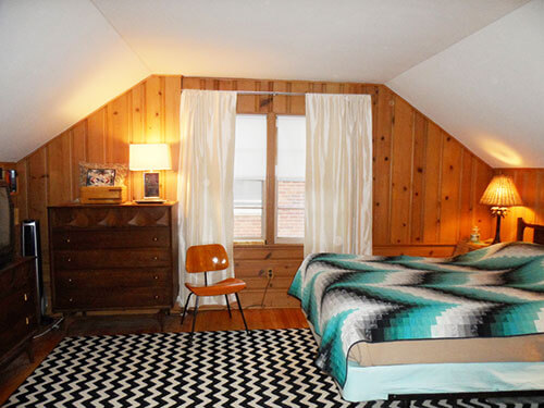
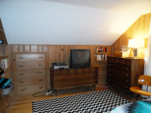
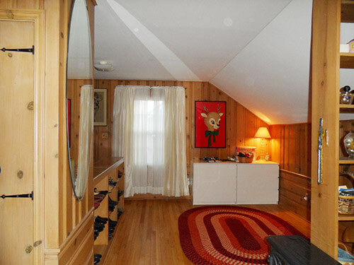
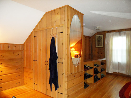
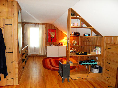
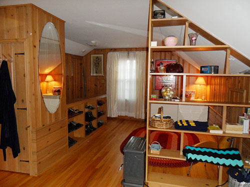
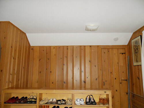
Here’s my knotty pine bedroom. I live in a story-and-a-half brick bungalow built in 1952. The upstairs is finished in knotty pine and is one large, open room. It has two sections, one which I use as my sleeping/bedroom area and the other is sort of a dressing, open area. The only thing I did before moving in, was have the hardwood floors refinished with three coats of polyurethane applied because I figured I’d never do it once I moved in.
I’m the second owner of the home. The widowed “woman of the house” passed away and her two sons (who grew up in the home) sold it to me (in 2008). I assume that the sons used the upstairs as their bedroom, because there are two sets of built-in drawers built into the kneewall/attic space – one on each side of the bedroom. The cool thing about the house is that the kitchen was custom remodeled around 1960 and the bathroom was remodeled in 1964. Everything is original to these remodel periods, except a year ago I stripped all the wallpaper in the bathroom (even on the ceiling) and repainted and wallpapered.
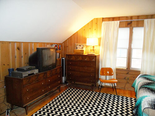
Two braided rugs were left in the bedroom when I moved in. I decided that I don’t really want to use them in the bedroom and have replaced the one on my bed side with the chevron rug (although I’m rethinking that decision but will use it for now). I plan on replacing the braided rug on the dressing area side eventually. I was thinking a solid color, depending on what color(s) I paint the room.
Plus, my biggest challenge will be painting the ceiling area above the stairway (above the shoe shelves in the photo). I don’t think I can do a precision paint job using roller extensions and may have to hire someone for that area. A friend told me about using a “plank” but there is no way that I will be standing on something suspended above the stairs and I do not own one of those fancy ladders than transforms into scaffolding.
My goals for the room are:
• Paint the ceiling and walls (hope to do this between Christmas and New Year when I’m off work)
• Possibly paint the shoe shelves (backs only) and open shelf unit
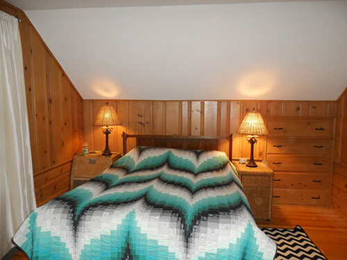
• Find nightstands – either Brasilias to match my bedroom set* or possibly something modern from IKEA that I can mount on the wall. I don’t believe I have enough space for two full sized nightstands.
• New lighting – possibly something that mounts on the wall or turquoise ceramic vintage lamps.
• I’m not attached to the window treatments and will be re-thinking those as well. I saw some aqua velvet (not to be confused with “Aqua Velva”) curtains at IKEA (not sure if they still have them) or I also have some barkcloth drapes that I started cutting up to make valances. They are a cream background with turquoise and red tropical floral pattern.I went to school for and was a graphic designer/art director for about 20 years before switching to the account side of the advertising business. Yet, I have the hardest time trying to decide on something for myself. Just like the shoemaker’s children who have no shoes – either that or I have commitment issues. 🙂
* I found my Brasilia set on Craigslist and got it for $450 (Queen headboard, dresser with mirror and chest)! I’m still thrilled about it!

 I’m the second owner of the home. The widowed “woman of the house” passed away and her two sons (who grew up in the home) sold it to me (in 2008). I assume that the sons used the upstairs as their bedroom, because there are two sets of built-in drawers built into the kneewall/attic space – one on each side of the bedroom. The cool thing about the house is that the kitchen was custom remodeled around 1960 and the bathroom was remodeled in 1964. Everything is original to these remodel periods, except a year ago I stripped all the wallpaper in the bathroom (even on the ceiling) and repainted and wallpapered.
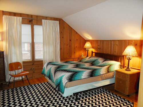
 The ceiling and angled walls are white. A flat white. This is my dilemma. I really love aqua. I would love to paint the room light aqua. Do I just paint the angled walls and leave the ceiling white? Do I paint the angles AND ceiling aqua (the same color) or should I paint the ceiling one shade and the angles another for contrast? I’m open to a darker teal as well. I’m not sure if that would be too dark, or would make the room enveloping and cozy.
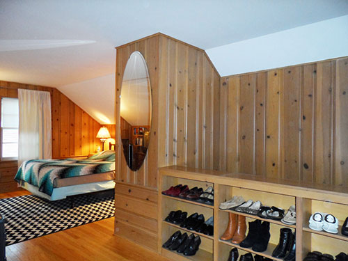
Thanks, Jeanne, for all this great information, and the photos. What a beautiful space — the knotty pine looks like it is terrific quality! We’ll be back at noon — with some ideas!
Readers, what do you think Jeanne should do?
Thanks to everyone who commented with suggestions or was able to tune in (or join in — that’s you Larry) live for our Google Hangout. Below are the three solutions that Pam and I came up with for Jeanne’s knotty pine bedroom.

Pam here: We know that Jeanne prefers aqua, but I wanted to show this first mood board — knotty pine and rust — to principally show how starting with your curtains — or, another complex colored textile — can be a great starting point to choosing colors for any room. In this case, I had these vintage rust and orange curtains on hand. I found them at the Goodwill and, well, have been hoarding them for some future project. I love how the rusty tones meld with the honey amber of the knotty pine walls and the oak floor. I found a braided rug in the same tones from Capel — I would make it big… I suggest a buttery yellow coverlet that picks up one of the colors in the curtains, on Wayfair.com…. and even would spray paint the traverse rod a hammered iron color to coordinate the rod with the knotty pine hardware used elsewhere in the room.
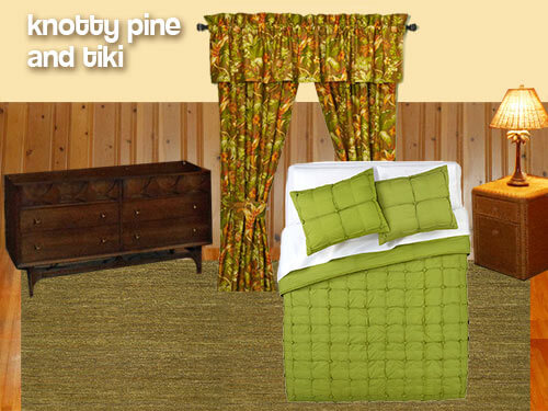 When I saw Jeanne’s knotty pine in combination with the Broyhill Brazillia and her tropical palm tree lamps, I immediately thought — tiki. I wanted to try to use what Jeanne already had in the room and make it work together. The Brazilia design reminds me of an up close view of a carved wood tiki figure and the knotty pine is reminiscent of a close up view of bamboo — perhaps like the bamboo that often lines the front of tiki bars. Even Jeanne’s existing natural wicker end table has a tiki feel to it because of its natural texture. I first found these Tommy Bahama Tropical Harvest window curtain panels (now gone from website) at Bed Bath & Beyond. They have a lot of the same warm brownish orange color that is already present in the wood floor and knotty pine walls. I picked out the acid green from the leaf design on the curtain and found this limey green bedspread (now gone from website) from CB2, which has a great modern texture instead of being just a solid block of color. For a rug, I chose this greenish hand woven Amesbury Jute Rug from Overstock.com, which also adds some earthy texture — that reminds me of a grass skirt — to the room without calling too much attention to itself. To finish off the room, painting the walls and ceiling a light, buttery cream — pulled from the curtains — will warm up the walls without competing with the knotty pine walls or any of the other elements in the room.
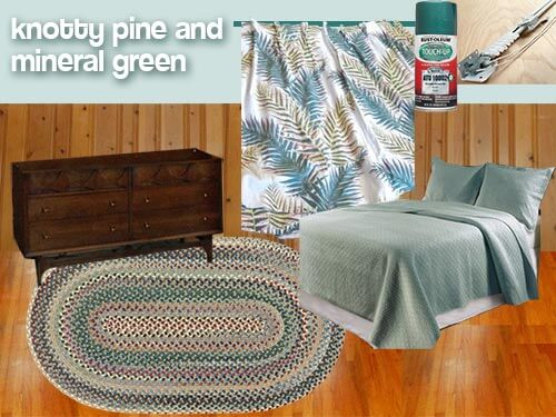 Pam back: Mood board #3 heads into the aqua-ish territory that Jeanne likes. However, as we discuss in more detail in our video, Kate and I are concerned that a strong aqua will be too clashy with the knotty pine… it may be too “competitive” with all the orange in the kp. But, we think that if you tone the aqua down somewhat — lighten it and grey it out, then the values of both colors will be harmonious. The color of this coverlet set from Garnet Hill is called “mineral green”, and I think that it would work. The blue/green in the vintage curtains (now sold) spotted for sale by ebay seller private screening are a darker version of the mineral green. I found another Capel braided rug that seems to have the right colors — all the colors from throughout the room. Pick up the stronger colors in the rug for your accents. For example, the Arcadia Green of the spray paint for the traverse rod.
So there you have it. Lots of ideas, Jeanne — we hope we helped, rather than just confuse you. For sure: Your room already is beautiful — that knotty pine is dreamy — and versatile. We’re… jealous… because we don’t have this room in our own house to decorate! Let us know what you decide — many thanks for sharing!


JKaye says
Hi. I apologize for being so late to comment but it’s the first chance I’ve had. I just have a couple of suggestions that have less to do with color choices and more to do with where and how to place the color.
First off, whatever color you choose for the walls and ceiling, be it aqua or some other color, I suggest that you use a lighter shade of the color on the ceiling, and a darker shade of the same color on the walls. The two different shades will help create some drama and make the ceiling seem to be higher, and at the same time will keep the two surfaces linked. I saw this approach done on a room featured in a magazine but it was awhile ago so I can’t remember which magazine. But, it was really effective.
Secondly, I love both the furniture and the walls, but not really next to each other. I am thinking that you should use panels of fabric behind the dressers and headboard, rather than on the windows. Then, on the windows, use a very simple treatment that fits inside of the window frame, some sort of plain ivory Roman shade or blinds or some sort. I think a print like the mineral green gray one with the ferny print would look great, made up into a flat panel the width or a little wider than the furniture, would look great and would really make the furniture stand out. Yes, it would cover up some of the knotty pine, but, not so much that the knotty pine would disappear. The knotty pine that showed would seem even more special. A solid bedspread would then be good, such as is shown in a couple of the photos above.
I like the black and white rug, but, if it doesn’t work with the bedspread or fabric you choose, will it fit in the dressing room side?
I wouldn’t paint any of the wood, be it walls, room divider or whatever. It just looks in such good shape and not too orange-y or dark, as sometimes happens over time.
Thanks for letting us comment on your delightful upstairs.
Jim says
Hi Jeanne. My favorite color is also aqua. If you love aqua, there’s something you’re going to have to accept: aqua does not like dark wood or dark colors. Only on rare occasions do they get along. You have the perfect room for aqua, but I think the Broyhill, although quite beautiful, is coming between you and your favorite color. Look at some Paul Mccobb furniture, you’ll instantly know why you don’t want to paint the room divider. His furniture was made for aqua. See his dinnerware, Contempri (mint green and… aqua!). (See also Canonsburg Temporama). Also, you might try to introduce aqua in other ways before painting. If you paint the ceiling an aqua, even a light aqua, you won’t be able to bring in more aqua objects without it possibly being too much. Right now the only aqua in the room is on the bedspread, but it seems to be fighting for it’s life against the black zig-zags in the beadspread and on the rug. How about an aqua rug instead? Or a bedspread that’s solid aqua? Before going through the pain of painting, you might try to bring in as many aqua objects as possible and see if that was enough.
Jeanne says
Thanks for the input, Jim. I think you’re right about the Broyhill and also using some solid aqua in a rug and/or bedspread. I am considering moving the Broyhill to my main floor “guest” room – which I recently did in ivory, with ivory pinch pleats. It wouldn’t get my daily use, but would be showcased nicely. That leaves me with the dilemma of finding another dresser for my bedroom and queen sized headboard.
pam kueber says
Hey, I think you can make the Broyhill work in the room!!! If you have a set of furniture like this — enjoy it every day, personally! One idea: In your drapery fabric, also make sure there is a dark brown to tie in the Broyhill. You can do it, Jeanne!
Jim says
I would try Heywood-Wakefield or Paul Mccobb or something in blonde wood or a danish teak. If you want to be really daring you can try some simple unfinished furniture and paint it aqua. I’ve seen some awesome aqua furniture that would undoubtedly make a splash in your room. You can google to get some ideas.
Janet in CT says
Pam, I liked your suggestion of the little round table with a cloth over it as a cheap nightstand but I can go one further on that. Being in the furniture business for many years, often people couldn’t fit or couldn’t afford a second nightstand or it was a close-out and we only had one. I would always recommend that very solution with one tweak. There are “drum” table around in second hand stores, which offer storage underneath either in open shelves or doors. I found a beautiful old mahogany one with an inset embossed leather top, one drawer, and a shelf in it that passes all the way through. It previously served as a bedside table but in this house is now serving as our TV stand. It is lovely with a round tablecloth on it and a lace topper, but a shame to cover it up! These tables can be found cheap, and much sturdier than the simple ones you see, not to mention giving you storage too, something I always need more of. I am a hoarder too, and my husband and son hate it! I am like my mother; I can’t throw anything out! On the lighter side – when we cleaned out her house, there were three paper bags full of socks in her bedroom. They were each labelled – “Good Socks”, “Holey Socks”, and “Not so Holey Socks”.
pam kueber says
Great idea, thanks! Yes, “unfashionable” antique furniture can be found cheap cheap cheap – and so very often it is fantastically made! And your Socks story: Priceless!
tammyCA says
Reading through the comments I am wondering why some suggest to extend the curtains across the entire window walls. That would not only cover up the fabulous paneling but take up room for some piece of furniture. The more I look at the photos the more I love your room. All the different angles and built-ins & bookshelves (boy, do we have books)…I could see a cushy little armchair right next to them. All we got is square boring box rooms – no character there.
tammyCA says
Just found this coziness on flckr: http://www.flickr.com/photos/catskillsgrrl/3960649414/in/photostream/
Jeanne says
Thank you tammyCA! I agree that I can raise the curtain rod up to the ceiling for height, but in reality I cannot extend the width of the curtains that much. I can only extend the rod to width of the ceiling (before the angles start). And there is one problem on the left side of the window – the wall on the left side protrudes a few inches out (probably because the chimney is on that side) so I’d have to rig something up to extend the rod on the right side to make it level across.
Jeanne says
Man-o-man, Pam. You have a bunch of fantastic readers with great, detailed, thoughtful and creative ideas!
BungalowBILL says
My town is filled with post war capes and many of my friends growing up had rooms like this. In these type of rooms the only place where an adult can walk is down the center. If the bed was placed under the windows you’d have to walk hunched over the length of the bed to get into it. There isn’t enough head room on the sides to walk upright. I think the bed is best placed where is.
Janet in CT says
You are so right! My niece has a room exactly like this one in her forties cape which she purchased a year ago. She says they had twin beds on each side, as previously mentioned here, when she looked at it. Hers even has a built-in cedar closet, something you rarely if ever see in a new home. Her dining room has mid-height knotty pine paneling in it too, and the original pin-up lamps, which she likes, bless her heart, are almost all black wrought iron with milk glass hobnail shades. She has a terrific green and black bathroom too, with built-in clothes hampers. I would have bought that house in a blink myself!
pam kueber says
All of these reader comments are fantastic! Thank you, everyone!!!
Jeanne says
They ARE fantastic! So many great ideas and advice! And thank YOU Pam and Kate for featuring my bedroom! It is a bit overwhelming, but I am coming away with better direction (painting both ceiling and angled walls, plus not painting the shelves) and plenty of options to consider.
I love the three mood boards that you put together. I do like the “granny” room – it really does pull together the style and colors perfectly – but it’s not the exact direction I wanted to go. Thank you for offering the drapes, though. 🙂 I am taking your aqua advice to heart and re-thinking that – but it still may work depending on finding fabric inspiration. I really love Kate’s tiki idea and colors, though! I love that green color. I think you’re right about starting with fabric, drapes or some sort of textile inspiration piece.
Thank you so much, again! Everyone had great ideas. I also think it may have helped others who have knotty pine in their homes and to think of how the rooms are used (kitchen vs bedroom as Kate mentioned).
I’d say this was a success! 🙂 I realize the Danish modern Brasilia is not the perfect choice for a knotty pine BR, but maybe if I spread the pieces out a bit it and/or add some painted pieces it may make a different. So much to think about……!!
lynda says
Last thought–maybe you could use the Ikea malm for nightstands.
http://www.ikeahackers.net/2011/05/bedroom-malm-nightstand-and-pax-tv.html You could paint them a color.
lynda says
If you decide to keep the rug, type in the words black and white chevron rug on Houzz for some ideas of colors and fabrics that mix nicely in a contemporary room. I think the chevron rug, white spread, and some aqua could make a fresh and different room. I am also of the opinion that you can mix up the decades a bit and come up with something new and just right for you. If you do a Google image search with the same words as above, there will be a lot of room pictures too. I think a lot of the ikat or medallion prints would mix nicely with the chevron rug. I have found some nice fabrics at Fabric Guru at a discount.Your room really is a very nice space. Best of luck. Also, some of those nice glass lamps that Pam featured would look beautiful. https://retrorenovation.com/2012/08/08/blenko-glass-table-lamps-from-1947-1963-to-be-reintroduced-by-rejuvenation-this-fall/
Christa says
Well, this looks like fun! Nice room.
I would caution against teal walls/ceiling in this space. The knotty pine is a strong element, and a bright or bold color would also be strong and would compete with the eye. Together I think it would be too much visual stimulation — not calming for a bedroom. Use your teal and aqua as the ACCENT on things like the bedding, lampshades, and to paint the back of the shoe shelving.
For the walls and ceiling, if it were me I would do a neutral silvery taupe, something like Silver Fox for the walls and Abalone for the ceiling. Those paint colors from Benjamin Moore have a lot of pigment in them that seems to coordinate really well with warm wood colors. I would get the eggshell finish. A little reflected light in there would be nice.
I would try to find a retro print for the curtains – something with a neutral background and with the pattern in teal/aqua. One thing about the curtains – you should mount the curtain rod so that it is right up at the ceiling, and goes all the way across that section of wall. By stopping a few inches from the ceiling and a few inches on each side, it is making the whole room look much smaller. Trust me on this one.
I would not try to find matching Broyhill nightstands. Get something simple and small – you could get some plain IKEA nightstands — and paint them the same teal as your shoe shelves.
I would not paint any of the actual shelves, that would break up the space. They work well with the walls as they are.
I like a braid rug with knotty pine, but I like the chevron that you got too. It’s fun to mix it up.