

 It’s been a while since there’s been an update on my retro modern master bath remodel — for good reason — much vintage hunting, thinking and planning has been going on. The more I thought — the more the realization that I was leaning towards a retro pink bathroom with a touch of modern instead of a 50/50 split sunk in. While the clean lines of a modern styled bathroom are pleasing, nothing has been making me happier than all the finds sent my way via the Retro Decorating Gods. It was becoming apparent that my house was sending messages via Ebay and the ReStore — and wanted me to be true to 1962. I’ve finalized the list of products I’m planning to use, what do you think of my design? –>
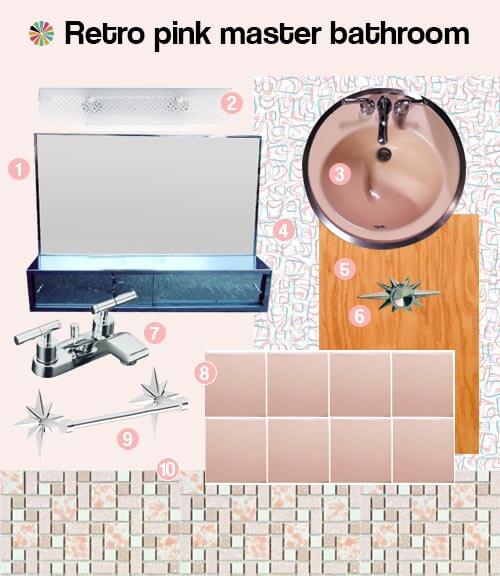
1. Vintage mirror/medicine cabinet combo. This is the real deal — heavy and well constructed. I actually have two identical mirrors like this now. The first was bought on Ebay — cost was $100 delivered. A few weeks later — another in slightly worse shape showed up at my local Restore — and was mine for $25 (just call me a vintage mirror hoarder). I’ll probably have to get new mirrored doors cut at my local glass shop, but still — two old mirrors are much less than the cost of the same size new Commodore style mirror from Nutone — which will run you $275 (now discontinued but check out this Cosmetic box (affiliate link) — pair it with a mirror and you’re good to go. Of course I’ll only use one of them for this bathroom, but it is nice to have a backup or another to use when I finish the basement bath.
2. Bath bar light. I’ve decided that a bar style light will work best in my master bath — especially with the mirror. Currently the 24 inch Nuvo Lighting U channel light with diamond pattern (discontinued but there are proxies out there) is the fixture of choice.
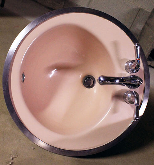 3. Vintage Pink American Standard Sink — recently found on Craigslist for $25. Incredibly it is an exact match with the wall tile.
4. Boomerang Laminate countertops. Our recent story — 24 colors of boomerang laminate available today — made me consider this as a countertop option. A sample of “Retro Pop” and “Glacier” are on their way from Heffrons.com.
5. Oak wood vanity. Since all of the wood in my 1962 ranch is oak with a pecan stain — including the current original vanity — why shouldn’t it retain this original style feature? At first I considered using a dresser as a vanity — a candidate was found — but ultimately, the dresser in question was a few inches too long for the space. Since then — after much research — I’ve decided to built my own vanity. Wish me luck!
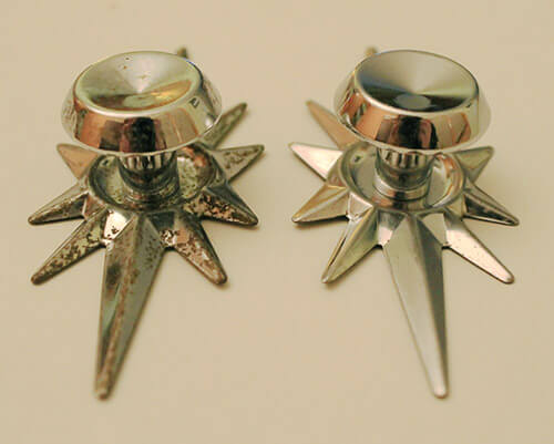
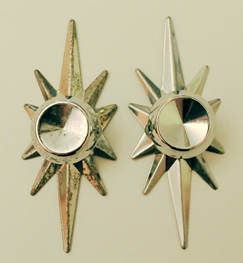
6. Vintage Amerock chrome starburst backplate and knobs. Let the drooling begin — I won five of these on Ebay (they weren’t cheap, but are so cool) and with the help of my new favorite cleaning product (story to come, we’re trying to get the MSDS), I got them shiny like new — on left is what they originally looked like after being salvaged from a gutted house — on right is what they look like now.
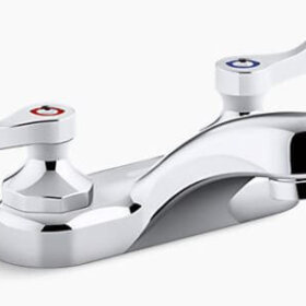
7. Kohler Taboret low arch bath faucet. Since my vintage mirror has a protruding medicine cabinet, and the vintage sink is a four inch spread — this low arch bath faucet from Kohler will work wonderfully. The design is modern with a vintage feel — I dig it. It is a little more costly that I was hoping for — but I am not 100% committed to this faucet — something similar would also be great for my bathroom remodel.
8. Pink 70W tile from B&W tile.
9. Rejuvenation Starburst towel racks (now discontinued) From day one, these have been the towel bars for me.
10. University Pink floor tile from Merola/Somer Tile.
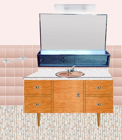
Are you wondering how all of this will come together? Above is a little mock up of the type of bath cabinet that I’m planning to construct. It will be situated between the outer wall and wall separating it from the shower instead of free standing as shown in the picture. This retro modern bathroom vanity has the look of a dresser, but will be constructed in place — as a custom built in. The legs will be coming from TableLegs.com. To save myself — a novice carpenter — too much stress, interior drawer boxes will be purchased pre-made.
I plan to tile all the walls — instead of just the inside of the shower as originally planned — and am on the fence about using all pink wall tiles (as shown above) or “trimming” the pink tiles on the top with white (as show below). What do you like best?
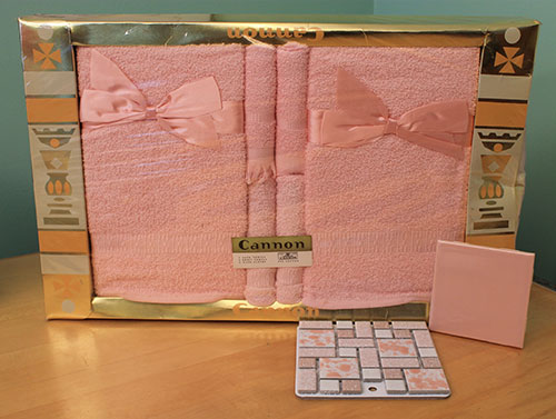 If all of the above awesome vintage finds weren’t enough — looky what else I have — a perfectly matched set of NOS Cannon bath towels, hand towels and wash cloths.
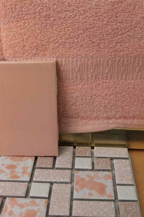 They couldn’t be a closer match to the tiles. The idea to track down vintage towels came to me after reading Pam’s story about vintage towels — and yes, they are a little smaller than I am used to — but they are perfect for the bathroom. Larger supplementary towels can also be found later.
So there you have it — with the key decisions made — my retro modern master bathroom remodel has become retro with a dash of modern. All of the current selections are making me very happy — which signals to me that it is time to start getting quotes, looking into permits, psyching myself up for another big project and ordering massive amounts of tile. Pam has also reminded me to take care when planning any demolition to ensure I consult with a properly licensed professional about what’s in the vintage layers of my “old” bathroom, so I’ll be doing that, too.


J D Log says
Kate this is so much more better then your original plan. This is a bathroom that I could live with. To break up the pink I liked Jay’s idea of black bull nose tile. I would go with vintage blue towels as well for contrast. The only thing I am bit uncertain of is the taps reminds me of the hospital or the dentist which they use with their elbows.
Keep up the good work, looks like your research is now paying dividends
deb says
Love it all! I’d put a white bull nose on top of the pink on the wall…
Jay says
Looking Good! Go with all pink wall tile. Monochromatic is more mod looking. If desiring a retro look, go with a contrast shade of dark pink, black or maroon bullnose tile. Sounds like you have a great plan!
MikeD says
Think you have a good plan there. Solid choices.
I would do the white bull nose tile. It will break the up the pink a little bit and add some detail for the eye. Maybe also consider a white tile trim at the floor or the decorative strips below the bull nose? Just something more to break things up a bit. How high up the wall are you going with the tile?
-Mike
Kate says
I’m going up just as high as the tile currently is — I think I measured 54 inches.
pam kueber says
Regarding the bullnose trim tiles: How is your other bathroom done? Does it have other-color trim tiles? If so, I’d do white trim in this bathroom, too, because you know me, all about the matchy-matchy. I personally like the way that white trim makes the color of the field tile pop all the more. But, this is all personal preference — either way is “right” and “authentic”!
Kate says
In all the bathrooms in my house, the bullnose tile matches the main wall tile color. Two out of three bathrooms (current master and green and white hall bath) have a few contrasting squares randomly in the tile design — Green bath is white salt & pepper tile with a few green tiles mixed in and master is maroon tile with a few peach mixed in. The other bath (laundry room) is all the same tile.
pam kueber says
ok. then do the pink match. problemo: solved! yes, by ’62 the trend may well have been: away with the contrasting bullnose.
linda h says
Waiting anxiously for the story on your favorite new cleaning product. Have some drawer knobs that need attention.
Nancy says
Excellent choices and this room is going to be so much fun for us to actually watch come to life! I have to vote for matching pink bullnose tile as it adds to the sleek and clean feel of the space. There will be a lot else (all good!) going on and the continuation of the pink will be a restful respite. The white in the counter top, floor tiles, light cover and linens will be just enough to accent off of the pink.
Think about perhaps using some of your floor tiles to create a shower niche. Ana White has a website where she posts easy building plans for DIY furniture for the masses. Check out everything she and her followers have built and posted pics of on the site. There is sure to be something you could adapt for your vanity.
It’s not even my bathroom – but I’m excited just the same!
Janet in CT says
I am with Nancy and like the idea of pink bullnose. And do yourself a favor and don’t use white grout on the floor. It is beautiful for a short while and then it looks dirty and is so difficult to clean (for us old folks with bad backs anyhow). I would go with light gray grout. I love everything you chose! Great job! As for finding vintage towels, grannies tended to save those gift sets. My gramma and aunt lived together and had boxes of them they never opened! And heaven forbid if one of us grimy kids reached for the fancy towels they hung up for show! We got our little hands slapped!
pam kueber says
yes: nix white grout on floors. go with grout the color of cement — that’s my 2 cents.
Kate says
Yes! No white grout on the floor for me. I’ve learned my lesson (in my last house) about white on floors. Never again!
When the time comes, I’ll have to do a test between grey grout and beige grout — the floor tiles are pink white and beige, wonder if the beige (if dark enough) would show dirt more than grey????
wendy in st louis says
For your grout, I highly recommend Custom Building Products #380 – Haystack. When I installed 700sf of tile two houses ago, my tiler recommended it for that “color of cement” look. It does NOT look that way on the card. I got samples of it and the one I chose, and did a test board by gluing pieces of broken tile to scrap plywood, then grouting. My tiler was right….after letting it cure for a day or so, Haystack was the perfect cement color.
color card: http://www.homedepot.com/hdus/en_US/DTCCOM/HomePage/Brand_Pages/Custom_Building_Products/Docs/Grout_Card.pdf
Whatever you choose, definitely do a test board as described above. It is amazing what color grout actually dries to. Had I used my choice, it would have looked bad….my pick dried with a decidedly peach tone. yech.
I love all of your choices, and that countertop is in the running for my kitchen. I am ordering a sample soon. Almost forgot to mention that I agree with not using a white bullnose, but do consider a plain white liner near the top – above or below the first full tile.
George says
If money were no object and I could have my choice of a big modern mansion with all the trimmings that we see on TV these days, I’d choose this instead…by a mile.
JKaye says
Hi Kate. Those are great choices, and seem to work really well together. I love the shade of pink, which looks slightly peachy. My favorite part is the floor tile. I am only ho hum regarding the white bullnose. I keep thinking about sizzle strips, since seeing them in Mike and Lindsey’s bathrooms in recent posts. I saw a white sizzle strip with a gold design in a house for sale last year, and it was so pretty. But, using all pink tile with a pink bullnose would be very clean and sophisticated. What fun for you, making such choices. Good luck!
Kate says
Thanks JKaye! I did think about adding some of the sizzle strips that Pam found on Ebay last week — however I decided that the sizzle strips were not what my house wanted. I’m trying to let my house be my guide whenever I come to a design decision that I’m unsure of. All the bathrooms in the house are quite plain as far as the tile goes. The whole feel of the house is pretty streamlined 1960s. If I had a 1950s house, I would have been all over the sizzle strips, but ultimately, I didn’t feel they were right for my bathroom project — which is too bad because they are AWESOME! 🙂
Lisa says
i saw those strips last week and jumped on them for my mid 50s ohio ranch kitchen. i plan on white subway tile the wall behind the sink and range, and using the sizzle strip in it as an accent. cant believe i found something so nice on e bay! Next i have to find a decent recessed medicine cabinet for the bathroom.
pam kueber says
YAY! Be sure to send us photos when you are done with your project!
Shara says
You know what would be cool in the plain pink section above the tiles? Doing the same starburst pattern that is on the pulls in Silver or white paint. I have seen this done before in vintage bathrooms, I think even on the Retro Renovations website. It adds a little character to the room and brings the pulls into the entire room design.
lynda says
Kate, this is perfect. Aren’t you glad you were patient and found just the right elements? I think I would add the white bullnose tile around the top of the wall because you will probably use white towels in the bath for everyday use. I love white towels. They are easy to keep clean and they have a spa look to them. The white trim and the towels will be part of the color scheme. The pink towels can sort of be the decoration so they will last …. forever! Good luck on your carpentry job! Does Ikea have any oak cabinets right now? I know some use the above the refrigerator cabinets to create a floating vanity. Or you could look at other cabinet manufacturers above the refrigerator cabinets. (24″ deep) If you use the legs, just make sure you protect the bottoms of the legs with something to protect them from wicking water. Maybe the acrylic chair glides you tap in would work. I think a floating cabinet would be nice too and easier to clean the floor.
RangerSmith says
I second Lynda’s comments: white bullnose & some white towels. Oddly, white towels are the easiest to keep clean and of course they never fade so they last longer. Use some bleach and they stay bright. Yikes, I sound like I’m channelling Helpful Hints from Heloise. Anyway, this is going to be a great looking, authentic & functional bathroom, good job Kate!