

 You know I like to collage. In my last class, I learned about collage’s opposite: Décollage. As I understand it:
- To collage — is to build up layers, artfully letting the various layers show through, for effect.
- To décollage — is to strip away layers, artfully leaving bits of each layer showing, for effect. Originally, decollage was a “happy accident” — like the beauty of layers of torn posters on a city wall. Later, it was pursued as an art form of its own.
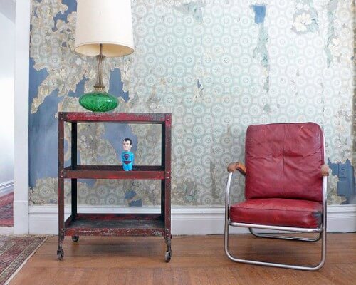
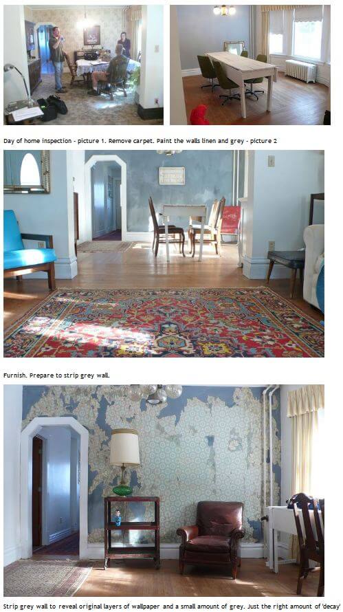
In our collage class, we experimented with purposeful décollage — we would add layers, then sand away. It is so satisfying to sand away! I loved this effect in our little works of art — and I love the effect, large scale, on the wall of Andre’s living room, above. Andre’s didn’t just strip wallpaper to achieve this life-after-the-apocalypse beauty — he painted, then stripped. Again: Purposeful décollage.
Andre, who featured this story on his blog A Beautiful Revolution, gave me permission to show his process here:
 I discovered Andre’s walls, because Andre draws “doodles” for my friend Margaret’s blog, A Way to Garden. He has written several books. What an interesting person. I asked him why he did his living room wall this way. He said:
We are very interested in creating what we refer to as a ‘bohemian decay’ look. We sell many rugs that are worn – i think the trend is now to have a rug that looks like it has been walked on for a hundred years and i think that same line on thinking applies to the original wallpaper – it tells a story, lots of stories about those who were here before us.
This blog — Retro Renovation — is about the “retro”. But there are no prescriptions about how to do it. Can Décollage… Detritus… Decay… make for… Decorating? Sure. In fact, Andre’s Bohemian Decay does not seem too far from Shabby Chic or plain old junk yard style on the Decorating Continuum. I totally understand the aesthetic — raw patina is interesting and can be very beautiful, once you get your head around the idea.
And you know I like vintage wallpaper. ‘Most any way it’s served up.
Thank you for sharing, Andre!


Joan St. Doll says
I’m glad to see I share something with such a creative mind. While ripping off paneling on my 100 year-old home, I came upon various wallpaper. I’d stop in mid-discovery. Once when I did reach the plaster, I found in pencil a man’s name. Was he the plasterer or the wallpaper hanger?
Thank you for placing this article below a current post. I’m new here and love your sensibility!
Rick S says
I think it has a beauty due to the layer below the new paint being exposed. In that way it tells more of a story than if someone ordered 3 different wallpaper patterns and created a “story”
After growing up in a 1896 house that for years had walls being repaired and similar appearance I can say “not for me”. Somethings you live with you don’t want to revisit.
rick
Jay says
Oh yes, that’s exactly what my mom says; she despises shabby chic and distressed goods in shops. And don’t get her started on people’s love of outhouses.
Rick S says
Jay,
your mom sounds just like mine. ” I don’t need to reminisce about outdoor bathrooms”. No chamber pot/pitcher and bowl sets for my mom.
I think that is why so many early bathrooms had shiny ceramic tile. They are nothing like rough pine boards in a unheated outhouse.
rick
Ed says
Someone once commented to my grandmother that, with ten kids, it must have been quite the chore to clean the bathroom. She replied that she’d have gladly cleaned the bathroom, if they’d had one.
pam kueber says
Yikes!
Diane in CO says
This is so provocative a project and there are such thoughtful comments and interesting discussion about it — art should incite such ponderings.
I love this wall the more I look at the photos. Remember the wallpaper mural in the dining room of yesterday’s Storybook Ranch? Well, for me this is doing the same sort of accent wall – but is a treatment with more layers of meaning, more richness, more beauty, is more expressive of the owner and certainly more interesting.
The decollage is more organically “the wall” not something just stuck on the wall. 🙂
karen says
This is interesting and beautiful, and I am attracted to it in the same ways that I am attracted to photos of Detroit decay (http://www.nytimes.com/slideshow/2011/08/21/arts/design/08212011_DETROIT_SS.html?ref=design)
and Cuban decay (http://www.apartmenttherapy.com/cubas-recycled-149705)
Yet. As a deliberate “finish” treatment to the walls of an otherwise affluent person, it makes me a little uncomfortable. It seems to have somehow co-opted authentic poverty. But… I also think it’s lovely!
pam kueber says
Hmmmm, you make an interesting point, karen, but aren’t “shabby chic” and “junk yard style” and heck even “retro renovation” inauthentic in their own way? I’m not sure what to call “authentic” or “inauthentic” when it comes to decorating. It ALL seems to me to be… a self-selected projection into the world. As in… “All the world’s a stage, and all the men and women merely players…”
karen says
Yes, I agree. And the word “authentic” is so problematic!
I think my feeling comes down to found-object vs. distressed-object. I love vintage & antique, in all states of condition, including disrepair. And I also really appreciate quality reproduction. But I’ve always been uncomfortable with distressed finishes, and faux-wear of any kind. It just seems odd. (Don’t get me started on distressed jeans! ha ha.)
Yes, “a self-selected projection into the world”. I like it.
pam kueber says
I hear what you’re saying.
I think my perception of this issue was altered by the fact I learned about this in collage class. It was a bonafide art technique.
Hehe, I remember the 80s and 90s when people were putting in new hardwood floors (ripping out all the wall-to-wall-carpeting-on-plywood-substrates from prior decades’ construction) and then going around the new wood floor and beating it with chains and using layers of stains to get an aged finished.
It’s all a pendulum. Marketers push it on us. But we do it to ourselves, too. We want The New Look.
Jay says
Well, it’s an interesting concept but it reads too true to life to me – both parents grew up in the depression. This just strikes me as down at the heels and contrary to post-war mid century idealism.
Diane in CO says
I don’t think this project has a bit to do with Mid-century Modernism; rather Pam was offering it as an example of “decollage” — and in fact, Shabby Chic which she mentions is not particularly “retro” and certainly not mid-century either. Kind of a late ’80’s thing (‘nuf said).
The vintage wallpaper is what makes this a loosely-defined “retro renovation” – at least that’s my take.
pam kueber says
yes, that’s about right. hey, 1980s is coming on “retro” soon!
Also, I want to clarify, that I don’t ever want anyone to feel like I’m saying there is a “prescription” for what to do with your house. That said, the philosophy of this blog — my philosophy — comes from a (1) thrifty/cheapskate attitude combined with a (2) preservationist attitude. The biggest example: If think that if you need to renovate a kitchen or bath, it makes a lot of sense to do it in a way that’s harmonious with your old home’s fundamental, original architecture. Big projects are expensive; they’re going to be “dated” no matter what you think; they might as well be “dated” to their “original date” so the whole house makes sense. That’s the core philosophy. ON THE OTHER HAND: Cheapskate in me recognizes that Decorating is much easier to change. Not so much money to change. Go for what floats your boat.
pam kueber says
And… We are very fortunate that the “retro” in “Retro Renovation” gives us pretty wicked awesome latitude in terms of eras and design styles can write about. I like to keep you all guessing!
andre says
Thank you all for your kind words
dIane in co – there is no label in the chair, but when we searched for a similar look Norman Bel Geddes name came up. The reason we bought and kept this chair was because at some point it was in a professors – teachers office and whoever sat in it, wrote ‘naughty words’ on the arm and so we knew it was the chair for us.
Diane in CO says
LOL!
Thanks for checking the chair; mine is clearly labelled on the support. Here is a webpage that if you scroll down a bit, has 2 chairs sitting in the grass – that’s the chair I have only in different colors. I LOVE this pair!
http://art-deco-designers.blogspot.com/2009/10/norman-bel-geddes.html