

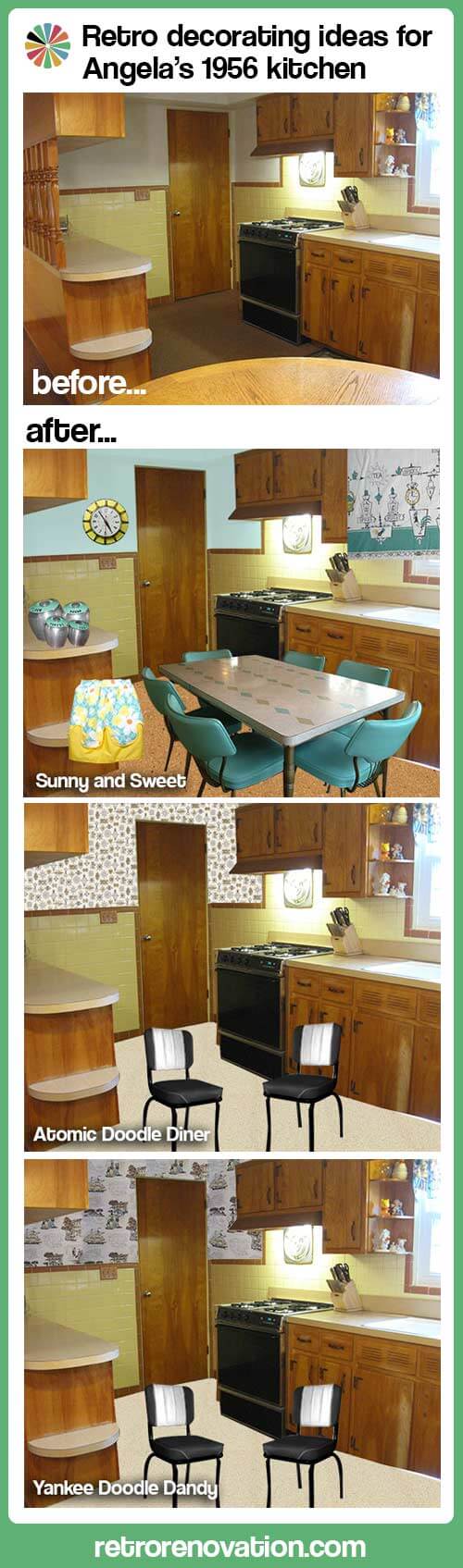
 Angela’s 1956 kitchen is a charmer — and today she wants our help with paint, flooring and retro decorating ideas to make it the happiest family space possible. Yes: It’s Retro Design Dilemma time — let’s hear what you think she should do with this space.
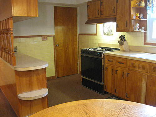

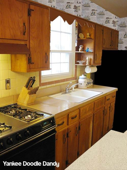
Reader Angela’s 1956 home was in original condition when she and her family bought it from the original owners in 2005. Since then, the family of five has been working to retain the original details, while putting their personal stamp on the house one room at a time. Angela kept the original tiles in the bathrooms and also wants to keep the original yellow and brown tiles in the kitchen. But, she’s looking for our help with retro decorating ideas that will make sense given this color palette. She wrote:
Hi Pam and Kate,
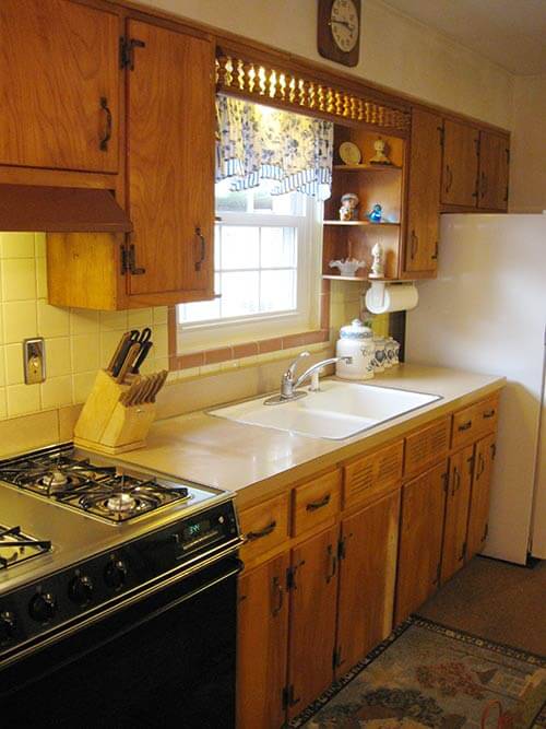
My name is Angela and my husband, Jim and our three sons have lived in our 1956 ranch since 2005. We lived in our “starter” home for 17 years and when we outgrew that house, we found this one. We doubled our living space and got a great deal, it was an estate sale and the previous owners never had children and did not change a thing since the house was built. It was truly a “time capsule house”. We have updated every room in the house and saved the kitchen for last because I just don’t know what to do with it! We kept the original tiles in the bathrooms, so I would like to keep the tile in the kitchen, even though I really don’t like yellow tile and brown trim, but it is in very good condition, so I can’t see ripping it all out. We are also going to keep the plywood birch cabinets. I bought a wood cleaner and they cleaned up very nicely. I had to use a wood bleach on some of the cabinets to get rid of nasty black stains that I assume are from the metal handles and water over the years. I plan on rubbing on a stain to blend in with the rest of the cabinets and then putting a coat of poly on them to protect them. As far as the copper handles and hinges, going to take them off and spray paint them black and put them back on.
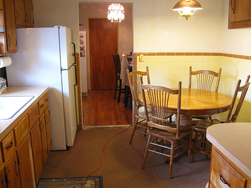
Where my table is in the corner, I was thinking of getting a L shaped bench with a square table and 2 chairs on the other sides. One other thing, I will not be putting the wooden dowels on the island back up, they also match the “valance” that is across the top of my window. I would like to have a shaped wood valance like I have seen in other mid-century homes. Maybe I can find a reader who will trace an outline of theirs so my hubby can make me one!
So, here is my question, what color should I paint the top half of my walls, and what kind and color of floor should I go with? I would like a floor that is low maintenance and kid friendly..(I have two teenage boys, soon to be three!) I wanted to go with a granite counter top in a dark color, but we may just go with Formica that looks like stone because of the cost and the low maintenance.
Any advice you could give me would be greatly appreciated!
Angela
Thank you, Angela — what a happy space!
Kate’s retro decorating ideas for Angela’s kitchen — Sunny and Sweet
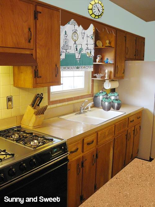 Angela mentioned that she wasn’t a fan of the spindled valance over the sink — and I agree. Substituting the spindles for one of the scallop designs available from Randall Manufacturing — from Pam’s story — Scalloped wood molding — 6 ready made designs for retro cornices — would be a great solution. Angela mentioned changing out the countertops for a dark granite or laminate that looks like dark granite. I would not recommend doing this — adding dark countertops in the kitchen will make it feel darker — and I quite like the laminate counter tops that she currently has — which look to be a beige linen pattern. If those counter tops are in acceptable condition, I would not touch them. However — there will be an issue if Angela is removing the wooden spindles from the curved section of counter top — as this removal will leave square holes in the laminate. To solve this problem — Angela could either try to carefully patch the holes with something — wood, another laminate, cork — or have just the top of that counter redone in a laminate that coordinates with the original counters. If the laminate is in bad shape — I would choose a light colored laminate style — perhaps in the light beige, white or tan family.
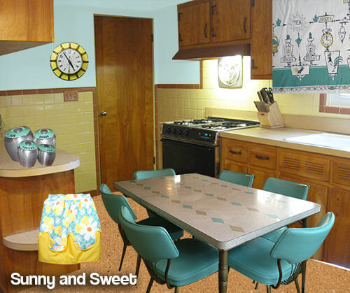 When it comes to the walls, I would make the space cheery by painting the upper part of the walls a light aqua. To tie in this new color — a rectangular dining set with a light topped table and aqua chairs like the set above — submitted from a reader in our vintage dinette uploader — would add some cheery color to the room. One of the short ends of the table could be placed up against the wall, creating a booth-like set up that would still allow for 5 chairs to be placed around the table. For the floor, a medium colored cork tile — like this natural colored cork from Home Depot (link now gone) — would not show dirt and would stand up to all the foot traffic. Then it is just a matter of bringing in some cute vintage accessories in aqua and yellow to complete the look (update: links now gone):
- Vintage turquoise aluminum Kromex Canisters from Ebay seller cat01150
- A cheery retro yellow clock like this one from Ebay seller amazingstuffllc
- A vintage 1960s Floral print apron from Ebay seller jezebeltree
- Using vintage tea towels or a table cloth, such as this vintage teal and gold patterned table cloth from Ebay seller stored_treasures would work great to make custom cafe curtains for the area around the window.
Pam’s retro decorating ideas for Angela’s kitchen — Atomic Doodle Diner

You know me, when it comes to adding color and pattern to a vintage kitchen, I am a ginormous fan of using wallpaper. And happily today, due to the dramatically increased popularity of mid century modern and modest decor, you can find an abundance retro wallpaper patterns both vintage and new — see all our stories in the Wallpaper Category.
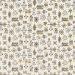
In my first mood board, above, I immediately thought of Bradbury & Bradbury’s Atomic Doodle wallpaper in Taupe. You’ll need to order a sample to check in the real environment of the kitchen, but I think the color ways and design of this wallpaper pattern would be nifty in this kitchen. The Doodle is a googie pattern – so it would inject some space age into this traditional space, which I think is just fine. Also, that looks like a really nice stove — you lucked out there. For wallpaper, I would try to find a pattern that picked up on the strong graphic of the black in the room. For the floor, I thought of 6′ wide sheet — the Corlon pattern (alas, now seemingly discontinued) that reader Nancy recommended in this story. Mind you, I have not seen this terrazzo-mimic flooring live, but it looks like an excellent possibility for our retro houses. I liked the light look of the Limestone colorway with your kitchen, at least online. Finally, you will see in this first mood board, I thought to paint the fridge black — or buying a counter top depth fridge in black — or a Big Chill fridge, even — to coordinate with the stove. And, I like the idea of painting the coppertone hardware black. Again — going “graphic” usually appeals to me.
Like Kate, I would not spend money to change the counter tops. In “humble” mid century kitchens like this, I think “humble” materials like laminate just seem so much more appropriate that luxe granite (or faux luxe granite). I recently created a new page all about retro kitchen design, in which I talk more about this issue. In addition, your laminate counter tops sound like they are in excellent shape. And, while I do not have data to prove it, I really think the “old” laminate was stronger and more durable that today’s laminate. Also, the beige color is so perfectly neutral — so easy to decorate with.
Sources for Pam’s first mood board above:
- Bradbury & Bradbury Atomic Doodle wallpaper in Taupe
- Armstrong Corlon flooring in Limestone (link now gone)
- Counter depth French door refrigerator in black
- Diner chairs from Heffron’s in black
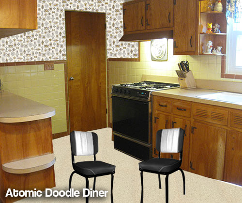 Above: I love your idea of a booth — or even a small round diner-style table. I might go for black and white — you could even pipe in some yellow! One thing, though, I would not choose a unit that seemed too “big” or else it might looked jammed into the space. Getting the right scale will be important to making this work, aesthetically. You can see, I chose smallish chairs to spotlight. However, depending on the size of your three teenage boys, you might choose to go bigger — for comfort. Make it comfortable space where everyone wants to hang out — first and foremost!
Disclosure reminder from Pam: My recommendations include some products from current advertisers (Bradbury & Bradbury, Hannah’s Treasures, Heffron’s and Big Chill.) While I am grateful for our advertisers, my including their products in mood boards like this are not included as part of their advertising deal. They did not and do not pay for me to write about them or include their products in these stories; there is no quid pro quo for editorial coverage. Read here about how we make money on the blog..
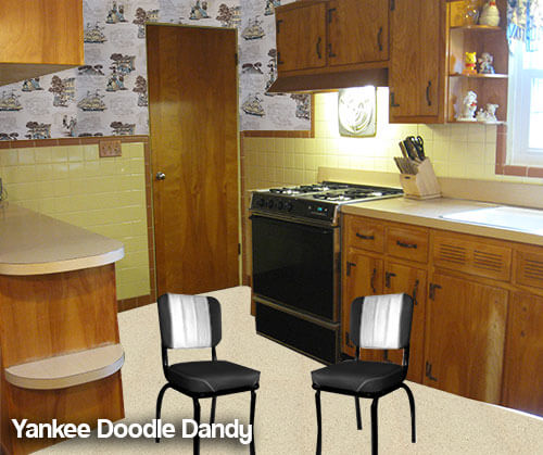
Pam’s second mood board of retro decorating ideas for Angela’s kitchen — Yankee Doodle Dandy
Same idea as above, except this time, I found a kitschy 1950s vintage wallpaper from Hannah’s Treasures. It looks like it has all the right colors (interestingly — including the same blue that Kate chose for her paint color… blue and yellow work well together, it’s clear)… appropriate graphic punch… the scale looks right… and it’s a homey hoot.
 So there are our ideas…
Readers — what are your paint, flooring and retro decorating ideas for Angela’s kitchen?


Kelly Wittenauer says
Hi Angela,
Yes, replace the table & chairs with the L-shaped booth. We included one when we built our current house and it’s the most popular place to sit, unless it’s warm enough for the screen porch. My dad & his wife had one in a previous home and everyone would crowd in there, rather than sit at the dining room table just 6 feet away!
Patty says
How about a shade of blue on the walls walls and vinyl that looks like hardwood and matches the hardwood I see in the next room.
You could also paint the walls a minty green.
You have a nice, neat kitchen!
Angela says
yes, I like your idea of a shade of blue on the walls. I thought about extending the wood floor in the next room into the kitchen..but it is pergo and needs to “float”. I don’t know how to address the gap you have to leave next to the walls since my tile goes down to the floor.
Patty says
That’s one reason to look at the wood look sheet viny. I’ve seen it installed and it’s beautiful.
Ranell Morris says
Angela,
Love your kitchen. You could pick another major color you do like, (red, green, aqua, orange, any color you think compliments the yellow) maybe get a fabric for the curtains and banquette that has a tiny bit of yellow. Trust your judgement, you did the bathrooms and they reflect your personality. That’s what makes it your home. I would love to see pics of your bathrooms and living area as well. you have an awesome home!!!!
Blessings, Ranell
Chad D says
Well, I’d encourage you to paint the hardware last, after you get everything else the way you want it. Spray painting will be easy to do any weekend with good weather, but maybe you’ll end up liking them as they are.
As for color, I think a complementary color, some shade of blue, would work nicely. The yellow looks to be fairly soft, so I think you could introduce a second color without overloading the room. I would keep it light so it doesn’t fight with all the stained wood, but any color that you like (and that looks good with yellow) should make it more to your taste.
Jamie D says
As far as spray painting hardware, I’d recommend against it. We spray painted hinges in our last home so they would match the new knobs we put on the cabinets, and although it looked great at first, it didn’t hold up to constant use. The paint eventually started chipping off.
I do agree with doing everything else in the room first and then seeing if you can live with the hardware as-is. And if not, go ahead and replace the pulls. I know the expense can add up, but it can really change the look of a room for relatively little money. It’s like jewelry for your cabinets.
Teresa says
What a cute kitchen, Angela and how wonderful you wish to preserve all the original features. The first words that popped into my head when I saw your photos, “Betty Draper’s Kitchen!”
http://www.womansday.com/home/decorating-ideas/mad-meninspired-home-decor-91346
That colonial style was very popular mid-century. I love how the vintage blue formica countertops with the aluminum edging really liven up the space. Vintage inspired wallpaper like Betty’s on the wall AND the soffits would help raise the ceiling. Vintage copper jello molds on the wall… wrought iron trivets on the counter, vintage cafe curtains….
Another popular mid century kitchen design that would complement your rustic wood cabinets was termed Pennsylvania Dutch.
http://fredashive.blogspot.com/2011/04/fabric-friday-vintage-kitchen.html
This is a more colorful and rustic style compared to the colonial but the colors would go nicely with your yellow/brown tiled walls and backsplash.
Problem with granite countertops… they scream 2001, plus they are indestructible so your husband will never see a rationale for replacing or updating. 🙂 I know, I have them myself.
The floor, like the counters, I would choose a vintage inspired linoleum tile. Maybe a checkerboard style in muted colors?
I agree with removing the valance and countertop posts. Keep an eye out online…I see salvaged or repro ones offered all the time. Removing those posts will make that entire counter more usable as well.
Your breakfast nook idea is spot on… I remember Sears carried one in the catalog for YEARS…
nina462 says
Thanks for the link to MadMen design.
Janet in CT says
First off, Angela, I love your kitchen! My 1958 ranch had the same copper handles and a wagon wheel lamp with copper shades. I think the tiles are fantastic, especially framing the window, and I am happy to hear that you are keeping them. I am lousy at designing but I can tell you what I would do. First off, I would put up wallpaper. Hannah’s and the other vintage wallpaper places have some lovely ones and you don’t have an awful lot of wall to cover with that tile going halfway up. I think it would really make the kitchen jump and paint just wouldn’t do anything for it. I would put in a checkerboard floor to match the wallpaper colors. I had the same idea as you, to take those island posts out except for one at each end. And most importantly, I would put a formica shelf on that far side of the island with stools – you seem to have the perfect space for it. I had that in my last house and that is where my son always preferred to eat. Looks like you can get three over there. So either add a shelf or extend/overhang the island countertop. I would keep the copper handles with the copper ceiling fixture but of course that is your choice and the black is nice too, but then maybe match the lamp to them. That is what they seemed to do back then. I can see painting the handles black to match the stove. Oh, almost forgot – it looks like your fridge has the tab on the lower door to change the doors around so it doesn’t open up towards the wall. I would do that right away so it opens to the counter tops! My house had a stainless cooktop and oven as did my mother-in-law’s next door. We both got coppertone to match the handles and it was stunning but I doubt you want to update the appliances to stainless as was popular back then (I like the black stove), and besides, that was done way back in the 70’s. I see you have a clock on the soffit – so fifties and glad you kept the look and that you are keeping those wonderful cabinets too! These are my ideas which are probably as outdated as am I, but I am sure others will have plenty of great ideas to contribute too.
AnnWesleyHardin says
Oh and PS — it looks as if you might have room to make that island into a breakfast bar. All you’d need is a wider counter!
Sherree says
I love this cozy kitchen! Aqua, pink or green would all work for paint colors. I think you are right to take off the spindles; the counter could then be used from both sides and much more handy for entertaining. If you are keeping the copper light fixture I would keep the cabinet hardware copper. Boomerang laminate counters that pull in the wall color along with yellow and / or brown would look good. A retro or vintage stove and fridge would look great, too. Maybe in brown, aqua or pink. You can find lots of vintage or retro fabric w/ browns and yellows for curtains or a valance.
AnnWesleyHardin says
What a great kitchen! Honestly, I think all it needs is a third color. Perhaps a blue and yellow linoleum floor, bluish counter and pale blue walls, for example. Or you could add orange, green, red…almost any color you prefer. Good luck! It’s gonna be gorgeous!
Chris says
Angela — what a cute kitchen! If I were you, I’d be doing the same thing… wanting to keep and use as much as possible, but also wanting to amp up the color a bit. Luckily, it’s so very neutral, you can almost do whatever you want! What is your favorite color? Do you have a color that just makes you feel really happy, down to your toes? Whatever that color is, I’d go get some paint sample color cards in a variety of tone of that color, and see which tone goes best with the color and light in your kitchen. Every color comes in so many different shades — I’m sure you could find the perfect blue — or green — or red — or whatever!
Another thought would be to look through your collection of retro goodies. (That is assuming, of course, that you are like so many of the rest of us and have a super stash of old treasures — that may or may not ever see daylight!) 🙂 Maybe you have a fun plaster wall plaque, or a picture or canister — maybe even a fun printed dishtowel. You could pull some colors from there.
I can’t wait to read what everyone else suggests! Love your kitchen and kudos to you for embracing what you have!