

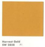
Alas, it has now become a cliche, this time of year, for all manner of manufacturers doing business in the color arena to declare their Color of the Year. As a result, I am now evolving to dislike this tradition — seems to me yet another way that marketeers are trying to convince the mass of America to dislike what they already have for grass that is greener (or purpler, or whatever). Nonetheless, I will give this a try for at least one more year. My annual Color of the Year selection is a bit of a different stripe: I like to show how colors of bygone days are just fine, very pretty, thank you very much. So, for 2014, our Retro Renovation Color of the Year is one of the most disparaged of vintage colors: Harvest Gold. I like this color very much. This is a wonderful color. Phlew on you, marketeers and interior design fascionistas, who try to convince us that harvest gold is h***** and d**** and must be banished in favor of (the baloney you are trying to sell us today). Above: Formica selected a harvest gold shade for both the walls and carpet in this 1966 advertisement. See how harvest gold plays so nice with others? Above: Maribeth’s kitchen came with a harvest gold dishwasher.
Harvest Gold as we know it catches fire in 1967
I have not done all the historical research to back this statement up, but: I believe that what we now call harvest gold — a somewhat muddy lightish gold — has always been a popular color in home decorating. A tarnished brass is not too far off from harvest gold. And before polymer lacquer was invented, brass tarnished. Linen takes on a lovely gold patina, all the more so when it oxidizes.
Gold has the effect of bringing a bit of yellow sunshine into a room. I think of it as a neutral. I have a harvesty gold wall to wall carpet in my basement, which has cherry paneled walls and overall, an early American feel, and it is a wonderful, warm base for the space. My bedroom walls are gold.
Of course, today we associate the color Harvest Gold with the 1970s, when it became a very popular as a color for kitchen appliances, in particular.
Important history of Harvest Gold for kitchen appliances: According to reader Patrick, who has done a lot of research on appliance colors, GE introduced the color Harvest (never officially know as Harvest Gold) in 1967 Spring 1968. “This color along with Avocado,” he said, “catches on like wild fire and is offered until circa 1984.”
In an updated comment (originally posted in comments, below), Patrick says:
General Electric introduced the color Harvest (GE never called it Harvest Gold) in the Spring of 1968 and soon other manufacturers followed suit. In 1976 all the appliance manufacturers picked a standardized color palette to begin being offered in 1977. Prior to this decision the colors offered by one manufacturer did not exactly match the colors that an other manufacturer offered, ergo if you wanted to mix and match appliance brands your only choice was to pick white so the colors would be harmonious. At the end of 1976 General Electric started running a campaign introducing its New Naturals color palette in home magazines of the day. The new colors were Harvest Wheat, Fresh Avocado, Coffee, Onyx, Snow White, and a new color called Almond……. Harvest Gold as it became known was offered into the mid 80’s.
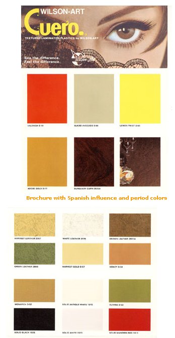 Above: Wilsonart put this color on to laminates in the late 1960s, although I squinty squinty cannot see what they named this color.
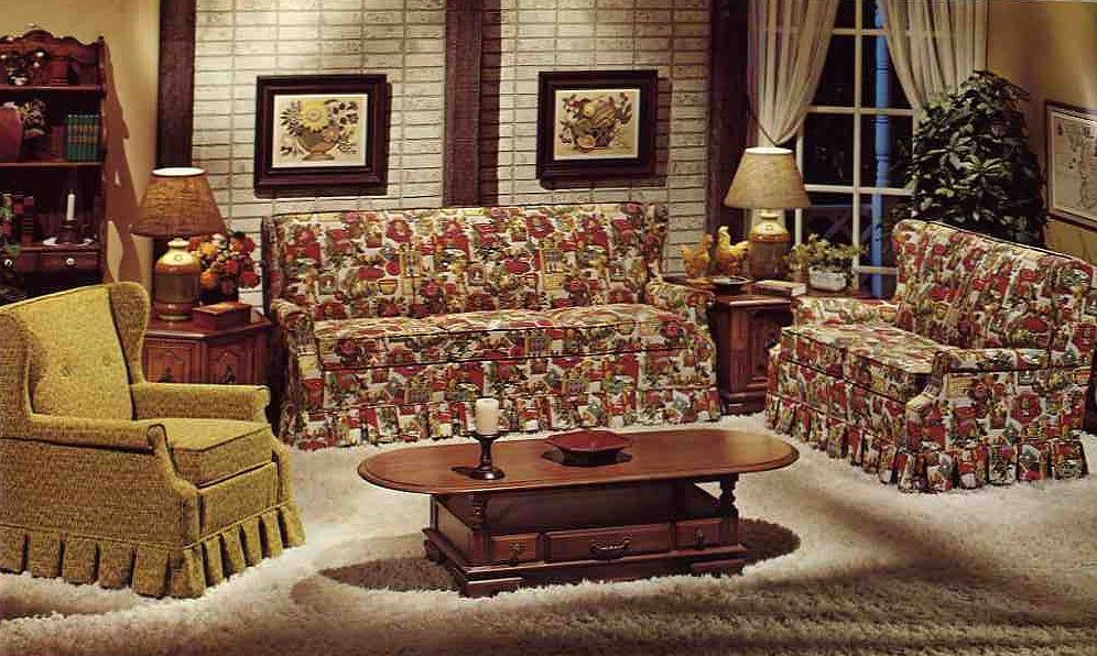
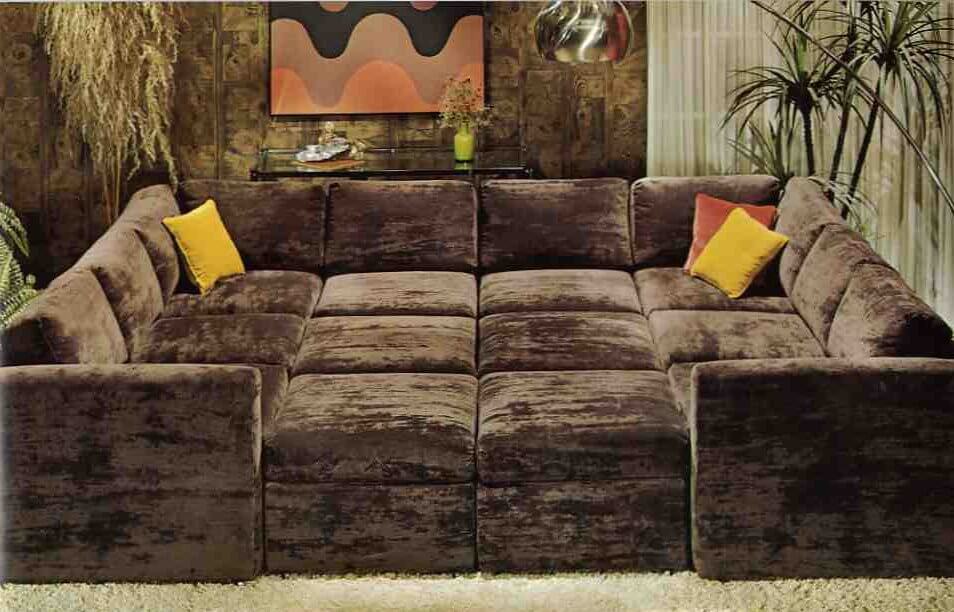 Above: The color was popular on upholstery and as an accent color in earth-toned interiors popular in the 1970s. But HEY, pretty much this same color can be found on sparkly frieze upholstery back in the 1950s, too. Okay, maybe the old gold has a little less green in it, but it’s darn close. Both photos from: 10 Kroehler sofas from 1976.
Why did Harvest Gold fall from favor?
In a consumer-driven society, these big color trends eventually collapse under the weight of their own popularity. Actually, it’s a testament to the fact that through the 1980s, we were so less consumer-driven that color trends like harvest gold even lasted as long as they did. Today, I think that the color cycles of what’s “in” and what’s “out” are turning faster and faster. Beware buying according to trends!
Disclaimer
I love all colors.
I am saying “harvest gold” in a wide sense. Warm golds and even yellows that tend toward the warm gold — like ripened cornfields… the leaves on sugar maples in the fall… and Sting’s mesmerizing fields of gold:
Do you use this color in your house today?


Marjie says
Though I don’t consider myself a particular fan of Harvest Gold, I have to admit that my house trends towards that or a similar shade in that family.When we finished our back porch into a 3 seasons area complete with large windows to see outside and tongue n groove pine siding for the interior surfaces (btw, used fruitwood stain on walls and white on ceiling), the tile that looked best was a speckled gold w/ light orange w/ antique white and we found super suede to upholster the window cushions in a shade that the store called beige but it really is a gold shade(it isn’t remotely beige or tan).It looks very neutral w/ the warm pine walls.I hope to find some print to do the seat cushions for the chairs in that room but haven’t started that hunt yet.Shades of light “gold” or muted yellows just really brighten up the mood of a room. I just look for nice colors and don’t let old labels like harvest gold get to me…..maybe the harvest gold of yesterday is the soft butternut of today….hmmmmm
jeanne says
When I first got married in 1977, we inherited my ex-husband’s grandmother’s harvest gold stove and refrigerator (so they were a few years old by that time). I wallpapered one kitchen wall with a brown-on-white giant cane patterned wallpaper on the top half and brown paneling on the bottom. Our living room/dining room had gold shag carpet. Long live gold!
Delaine Zody says
I still have my harvest gold oven and cooktop with tile to match: http://dkzody.wordpress.com/2013/10/30/kitchen-aid/
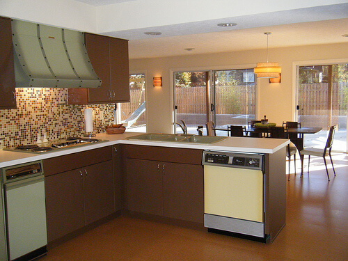
I LOVE harvest gold and wish I could get a refrigerator and dishwasher again in that color so my 70s kitchen would be a match once again.
Marjie says
You can get appliances powder coated to match.
Allison says
wait– how?
Joe Felice says
Back in the day, Denver Buick did quite a business painting peoples’ appliances in its body shop. They would pick up your appliance, take it apart, paint it, reassemble it and return it. I was young then, and don’t know how much it did cost, but it must have been a good price, because lots of people were using the service. But I am not aware of any body shops that would (or could) do this today. Please point us in their direction.
Anne-Marie says
Beautiful kitchen. I love the cabinets and stove. Very nice.
Delaine Zody says
Thanks. We are the second owners of the house, been here for 33 years, and I orange-oil those cabinets twice a year. Same with bathroom cabinets and front door.
oh Holland says
Not for reasons of taste, but harvest gold and avocado never graced the decor of my youth. In the late 50s we did however have a fabulous, big coppery-brown (think “root beer” with a touch of shimmer) fridge. Closely resembled Big Chill’s square cornered, flat face Retropolitan, with its bottom freezer drawer. Would adore root beer colored appliances today … and how they’d harmonize with harvest gold!
Susan says
I have an ever growing collection of Harvest Gold Tupperware. I love it. It started when I found a NOS spice rack at a local op shop.
I went to a Tupperware party earlier this year where they asked you to bring your oldest piece. A number of people bought their Harvest Gold which they gave to me when they found I collected it. None of them liked it.
Sandra says
The color is fine, but I’ll never use it: it makes me look jaundiced, on the edge of liver failure, sickly, etc. it brings out my freckles in a bad way and, in short, clashes with my coloring.
Is it shallow to want colors that bring out the healthy tones in my skin?
Mary Elizabeth says
Of course not! Why do you think we like pink bathrooms? As Pam and Kate have pointed out, they make us look “glowy.” I, too, don’t use too much of the gold colors for the same reason you don’t. So I would go for highlights of harvest gold–sofa pillows, curtains, etc.–rather than vast expanses of gold carpet and walls. The appliances would look fine to me, as I don’t pose in front of them for photos.
And I got rid of all the yellow fluorescent lights in my house, too.
nina462 says
While not my favorite color – it is acceptable. My recollection of this color – it was the color of our “naughty chair” where we had to sit for time outs. Of which, I still have the naughty chair – soon to be recovered, if I ever get the time. (It was in the garage & has mouse damage to the fabric, so it has be be redone – not because of the color.)
Pam – did you ever get the package I sent you? Sure hope so!
Jody says
We painted our kitchen “Edgy Gold” by Sherwin Williams. We love it! however a friend came to visit and asked when we were going to paint the kitchen… hahaha.
Mary Elizabeth says
Jody, I refer you to the open forum “How to Respond to Social Backlash” on this site, Oct. 18th of this year. You’re just a little too edgy for your friends. Think of it this way–the paint job you did was so professional looking they thought it was the original job the builders did. 😉
JKaye says
I have used “Quiet Veranda” by Behr as a living room wall color. I found it to be a pleasing old gold color.
Kate says
The 1980 ranch I grew up in had a kitchen with dark wood trim, dark cabinets, faux butcher block counter tops and harvest gold appliances (fridge, dishwasher, stove, range hood). I’ll have to email mom and ask her if she can find any pictures…
Robin, NV says
My parents bought a house in 1984 that had been built in 1982. All of the kitchen appliances were harvest gold – proof that the color was popular for quite a while. I suspect that it actually had more staying power than the other 60s/70s colors like avacado, chocolate brown, and bittersweet. When we moved in 1986, we took the harvest gold fridge with us and kept it until about 1994 or so. All our other appliances were white and I remember disliking it because it didn’t match. I appreciate the color now but it was definitely “out” in the 90s.