


 About a year ago, Diane bought a lovely 1960 ‘granny ranch’ in Florida. She’s been having fun decorating the original pink bathroom with vintage goodies from her mother’s collection, but now she is having problems deciding on a paint color for this kitschy space. She hopes Pam and me — and our wonderful readers — can help. Retro Design Dilemma time!
 Diane’s request (edited):
Hey Pam & Kate, I have a design dilemma for you. We bought a 1960 “granny ranch” a year or so ago in Florida with some money my late mother left us — as an investment and also in part to honor her and give me a place to put many of her vintage things with which I wasn’t yet ready to part (yes, I unashamedly claim the title of sentimentalist & vintage hoarder!)
Now I am trying to figure out what to do with the walls of my pink tiled bathroom there — paint, or maybe wallpaper?
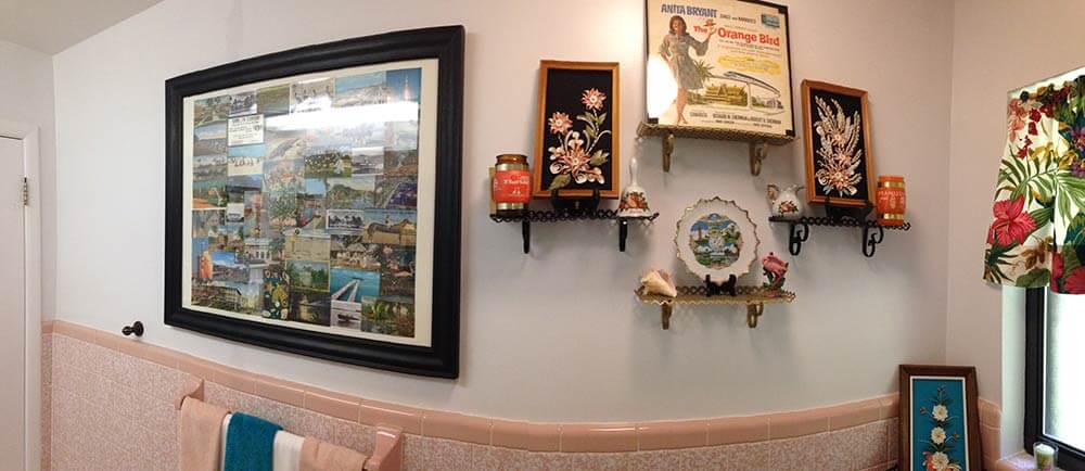
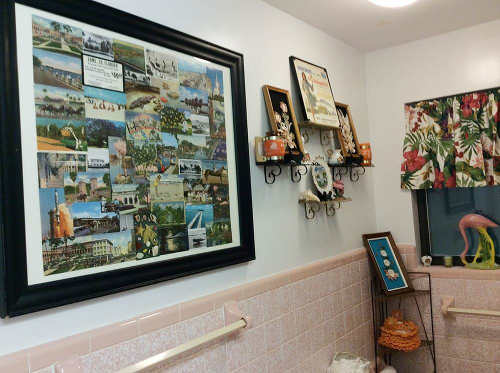
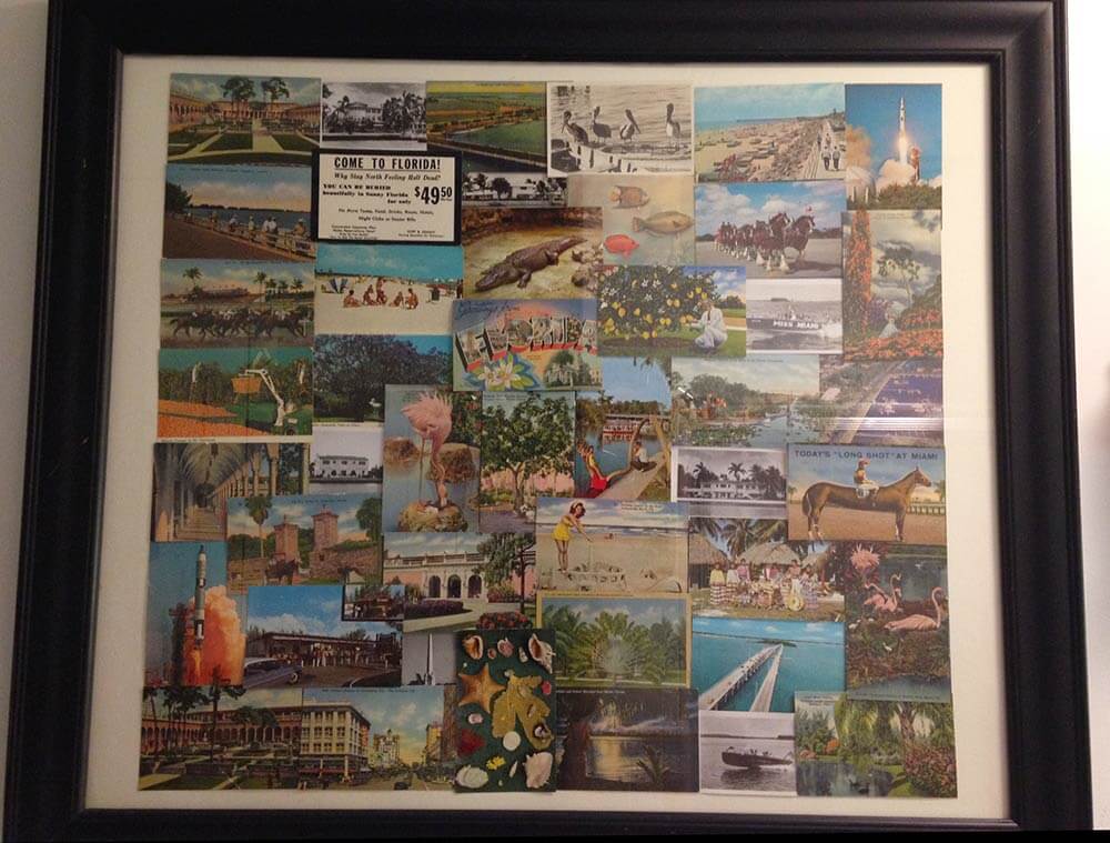
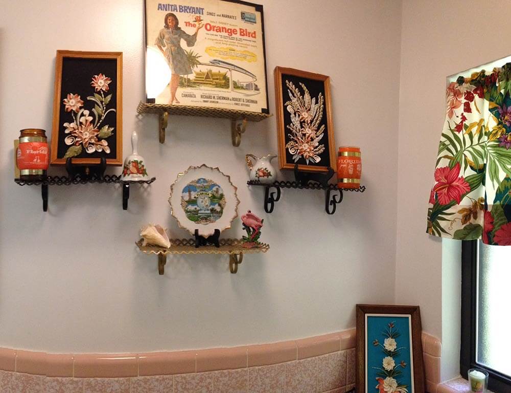
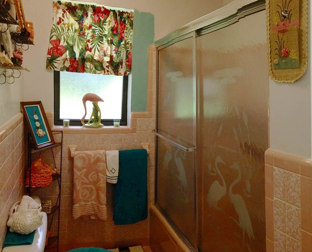
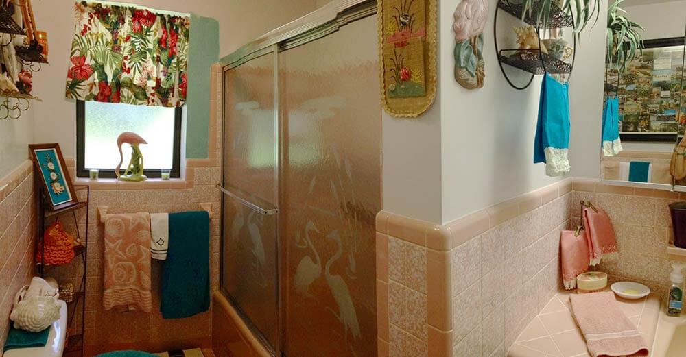
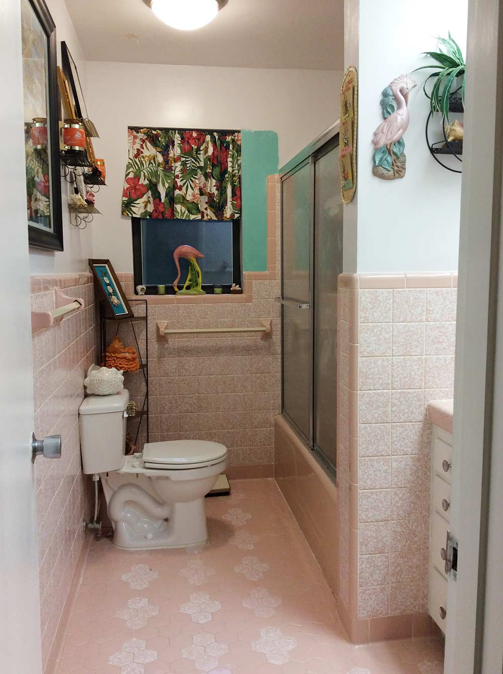
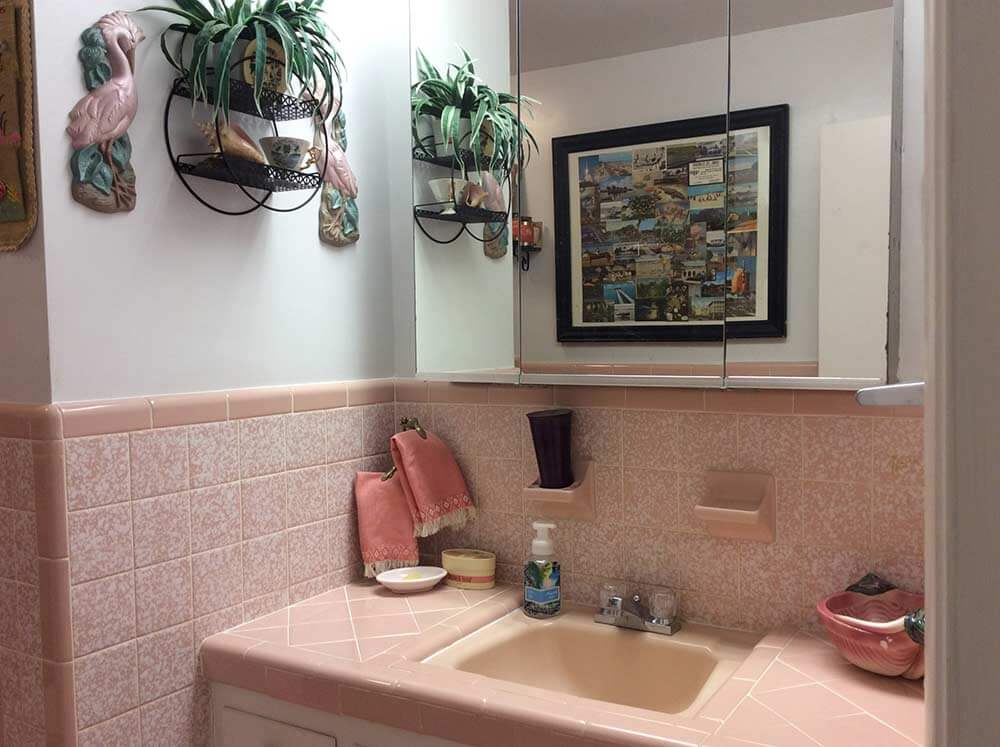
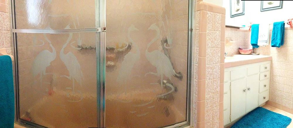
I am going with a kitschy florida theme for the decor, spring boarding off of the vintage etched flamingo shower doors and a huge homemade collage I put together of old florida postcards from family members dating from the 40s, 50s & 60s, which I had discovered among my late mother’s things.
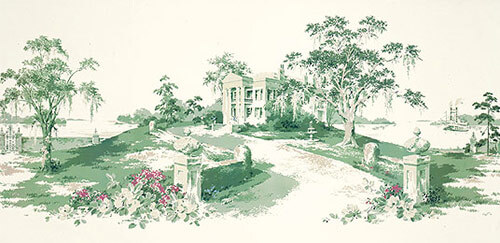
I am also thinking about using the great vintage wall paper mural “Magnolia Hill” (which I bought from your recent link to Steve’s wallpaper & blinds recently) in the hallway off of the bathroom.
- There are still some of this murals left, read our story — Thibault wallpaper murals in 11 designs
Anyway, I had initially thought that a contrasting color of Sherwin Williams “Holiday Turquoise” from their Suburban Modern collection would be just the ticket for the bathroom walls. However now, after applying a small swath of it on the wall, I am having second thoughts. Just the one coat seems to make the room appear darker — I’m worried what a second coat might do! Think you or your readers might be able to help me out with some suggestions? I’m open & up for almost anything! Much thanks!
Ok readers — what should Diane do with the walls in her vintage pink bathroom? Wallpaper? Paint – and if so, what color?
Kate’s ideas for decorating this pink bathroom:
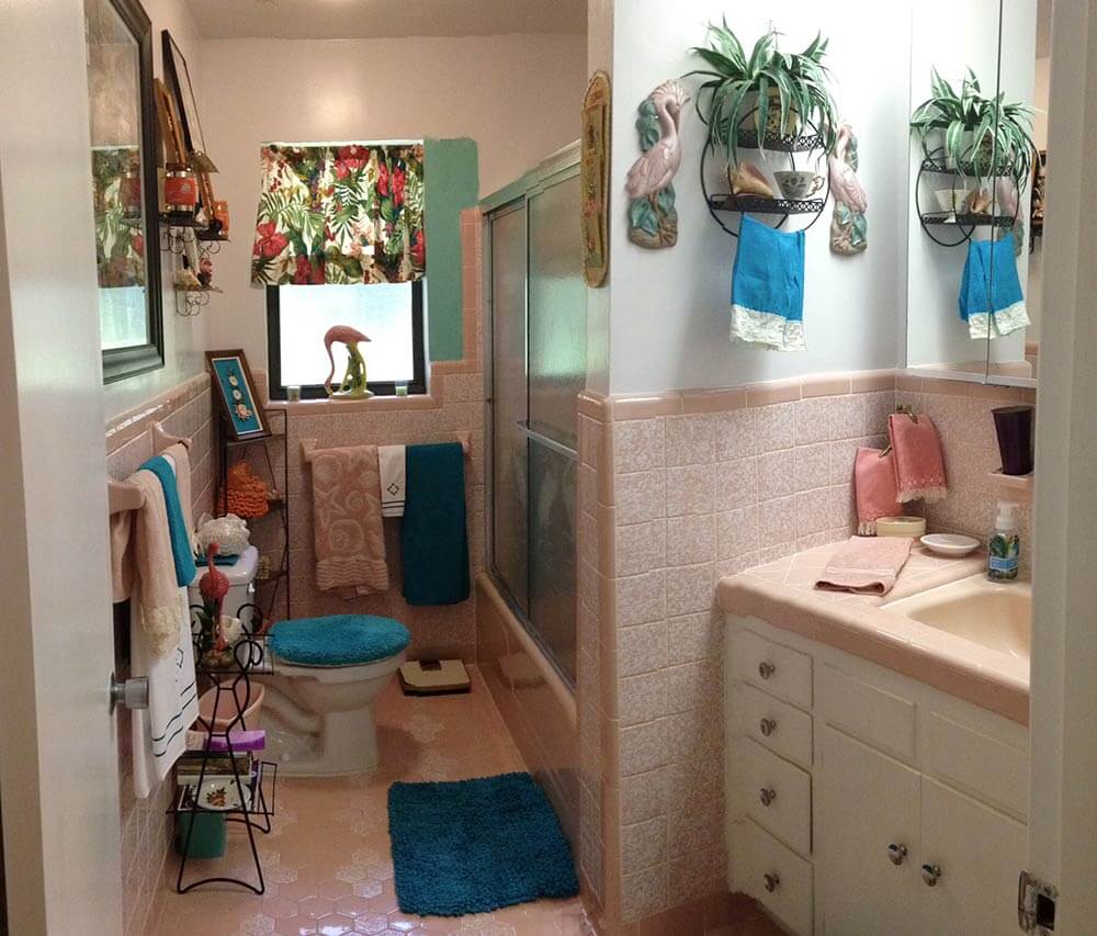
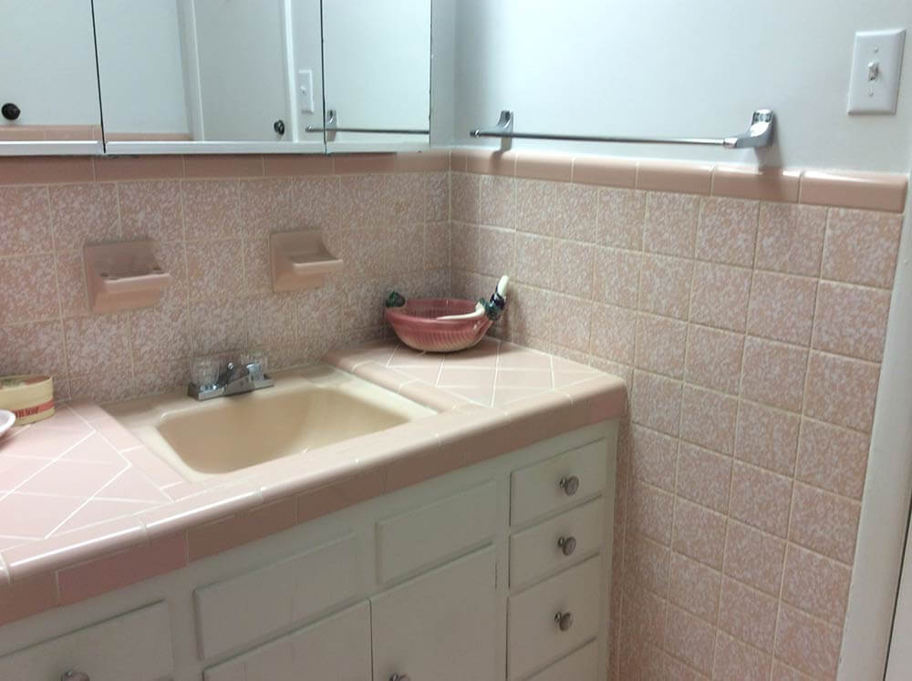
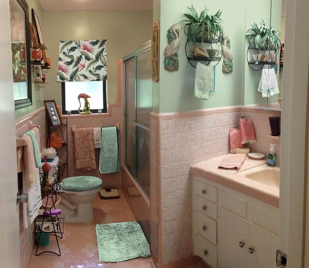
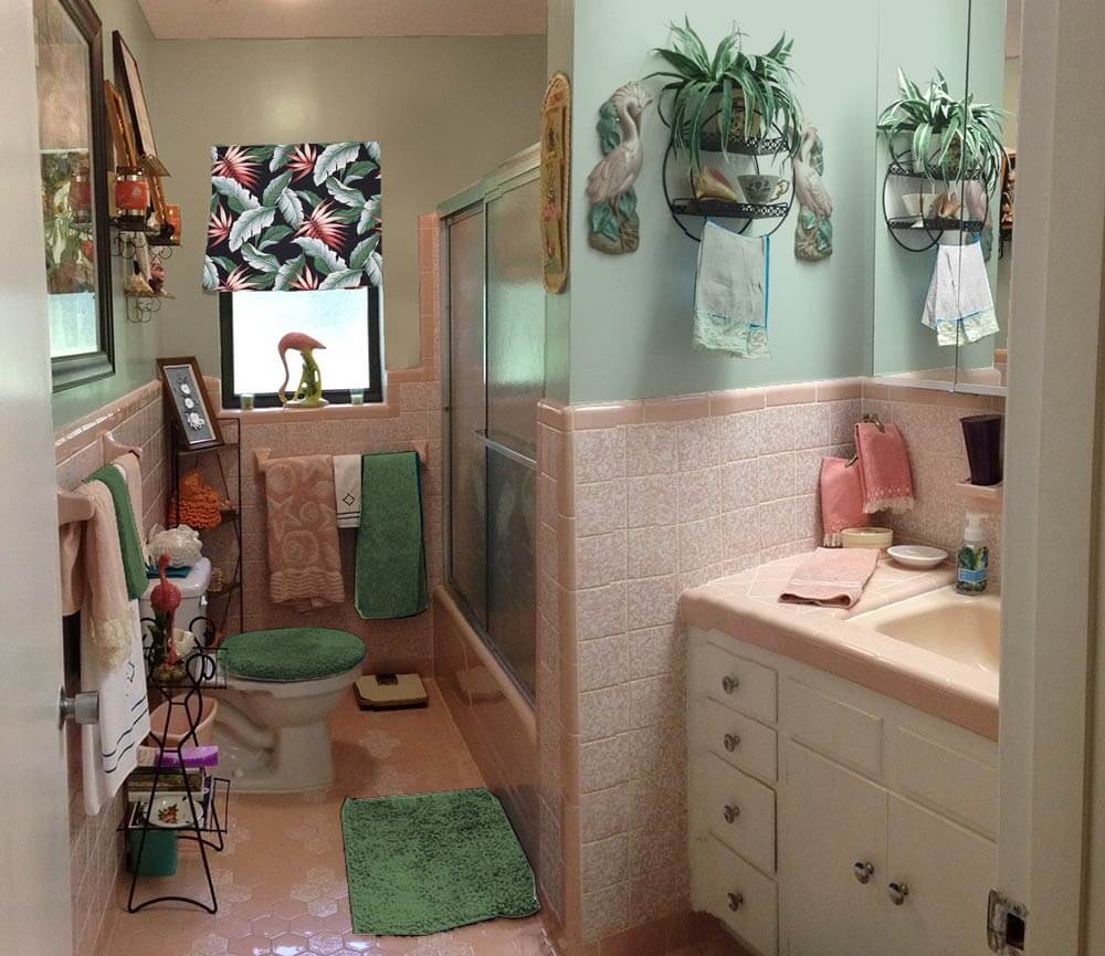
My first thought when taking a peek into Diane’s 1960 pink bathroom — after I ooohed and awwwed over that gorgeous original tile — was that the deep teal blue towels, bath mat and toilet seat cover weren’t quite right for the space. Because they are so saturated with color, and much darker than most of the other decor in the room, the steal too much attention away from the fun, kitschy vintage accessories and delightful original tile. Also, because there is already a lot going on in the small space, simplifying the color scheme will help unify the space overall. For this same reason — that is, so much wall decor, both Pam and I agree you can skip the wallpaper — paint is the answer and yes, a real color will be better than off-white, grounding the wall decor better.
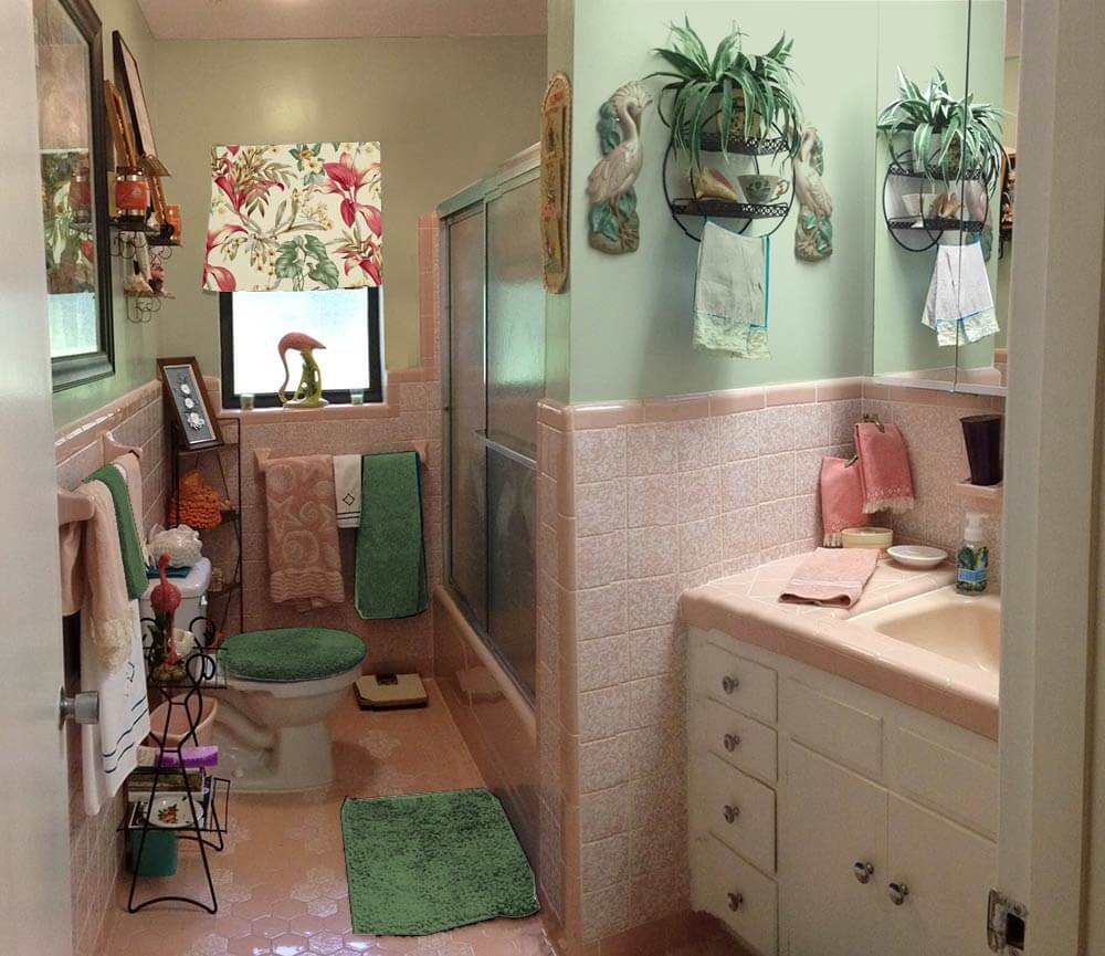
 Above — First, I tried using the Sherwin Williams ‘Holiday Turquoise’ paint that Diane was contemplating, which looks much better with matching turquoise accessories instead of the deep teal towels.
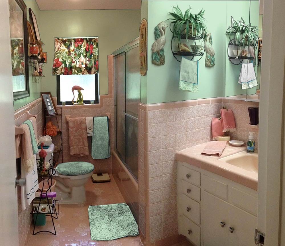 Next, I tried a light green paint, pulled from the tropical print barkcloth curtain on the window. I think this color works well in the space without making it feel too dark overall because it helps harmonize the tropical barkcloth printed window curtain and complements the pink. Pink is basically light red and the complementary color of red is green — a combination that is very pleasing when done correctly. Adding a similar shade of green towel, bathmat and toilet seat cover helps disperse the green around the room.
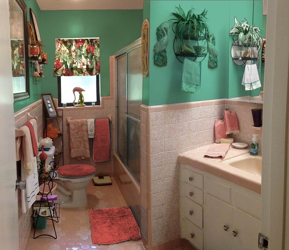 Alternately, if Diane wants to add some major kick to the space, choosing a deeper teal green would create a tropical, ‘vintage miami’ feel in the space. Adding red bath towels and accessories help make the barkcloth curtain pop and make visual sense in the room.
Pam’s additional suggestions:
 I very much agree with Kate’s key suggestion — that the royal blue linens are detracting from making this beautiful bathroom come together beautifully. I would take her suggestions even one step further and say: Change out the curtain. I think it would be relatively easy and inexpensive to find a similar, tropical styled fabric — but one that is in pink and green or blue pastel tones rather than the stronger primary tones of your current tones.
For example, above: Kate photoshopped Diamondhead Fabric’s Molokini (Sage) cotton bark crepe into the window and oooooh, I quite like how it looks. The pink really makes this pop. Then, choose paint colors and towels from the fabric itself. In general, I really like it when the field color of a fabric and the wall color are the same. Of course: You will probably want to get a real sample of the fabric first to test.
 Above: Diamondhead’s Akaka (Natural) also has pink tones. I am less thrilled about this curtain, because of the natural field. In any case, we included it so you could get another idea of how a pink pastel-based fabric could look.
Of course, you can also look for vintage fabric. Living in Florida, you could probably find 50 different options with one trip to a local antique mall, I bet!
Finally, in response to many readers who suggested a more neutral paint color — a grey or ivory or lighter shade of the pink — I very much agree those could work too — and again, would coordinate the wall color with the field color of your window treatment. Honestly, ‘most any color could work done with a deft hand. That said, I think — and I think that Kate agrees — that you can make shades of aquamarine or green or blue work just fine — in particular because this is a kitschtastic Florida space where, hey, less is not more — more is more! We all respond to color differently — so do what sings to you! Paint is relatively cheap — it’s the perfect medium with which to take some chances… to push some design limits!
Good luck, Diane, and let us know how it turns out!
 UPDATE — Above:Pam asked me to make a mock up with the Diamondhead Fabrics Molokini (black) cotton bark crepe fabric suggested by commenter James of the Woods — looks pretty good!


Onawa Rock says
I have the blue version of that tile, complete with the solid border! My house is 1941 though. Would this be a late 50s/early 60s renovation I wonder? I have photos if anyone knows and can help.
Teresa says
Sherwin Williams paint has a LV and a number on its color swatches. Like “LV 60” It is the light reflective value. The lower the number, the less dark the room will appear. Even colors that appear light or neutral to the eye can suck all the light out of a room leaving it dark if the LV # is high. I’m sure other brands have this info too but I use SW and they were kind enough to point it out to me after using a gorgeous gold color that appeared light but made the room terribly dark. Good luck!
Teresa says
Uh oh ! It’s late and I stated it backwards. Correction: The scale goes from 0 (absorbs all light) to 100 (reflects all light).
pam kueber says
i’m confused…
Joe Felice says
Teresa is correct. All manufacturers list the LRV. The lower the number, the “darker” the color, and the higher the number, the “lighter” the color, basically. There is even a little machine that looks like a large pen that you can scan the surface, and get the LRV of the color. Some manufacturers even have a tool that can tell you the name of the color, so that you can match it, like they do at the store.
Geronimom says
Ok – so on a whim, I decided to put my original turquoise colored towels/accessories back into the bathroom and Voila! Who knew turquoise & that shade of green would work SO well together?! It even pulls out the turquoise in that tropical valance. I’m REALLY starting to like the look now :-). Bright, vivid, kitschy & fun! This color may stick around longer than I originally thought 🙂 Unfortunately, that green color really doesn’t photograph so well… I’d say it’s more like a mix between a Granny Smith apple & Bartlett pear kinda green… Not as muddy looking as it appears in the pictures I have – thankfully! I need a different shade of green for the towels under the window, but yeah, surprisingly, this *could* work for me! Here are some pics w/ the turquoise towels put back in – be aware that they do look a lot darker in the photos than they actually are: http://smg.photobucket.com/user/DianeLu/slideshow/Pink%20and%20green%20bathroom/Pink%20and%20turquoise%20bathroom
Joe Felice says
Since you “toned it up” with the green walls, the dark turquoise towels don’t seem so out-of-place. The addition of some chartreuse towels as accents helps bring it all together, in my opinion, including the curtain.
pam kueber says
ok but i still think you need to pull everything together in the window treatment