

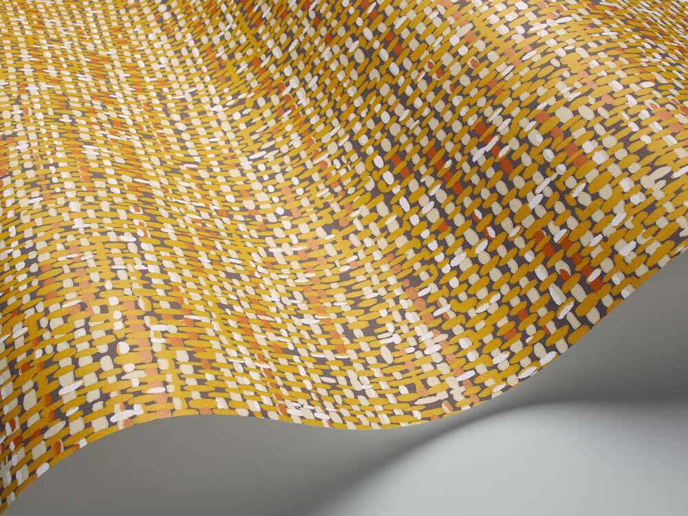
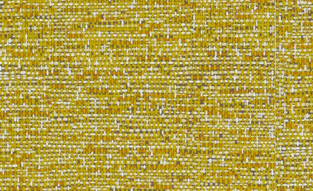
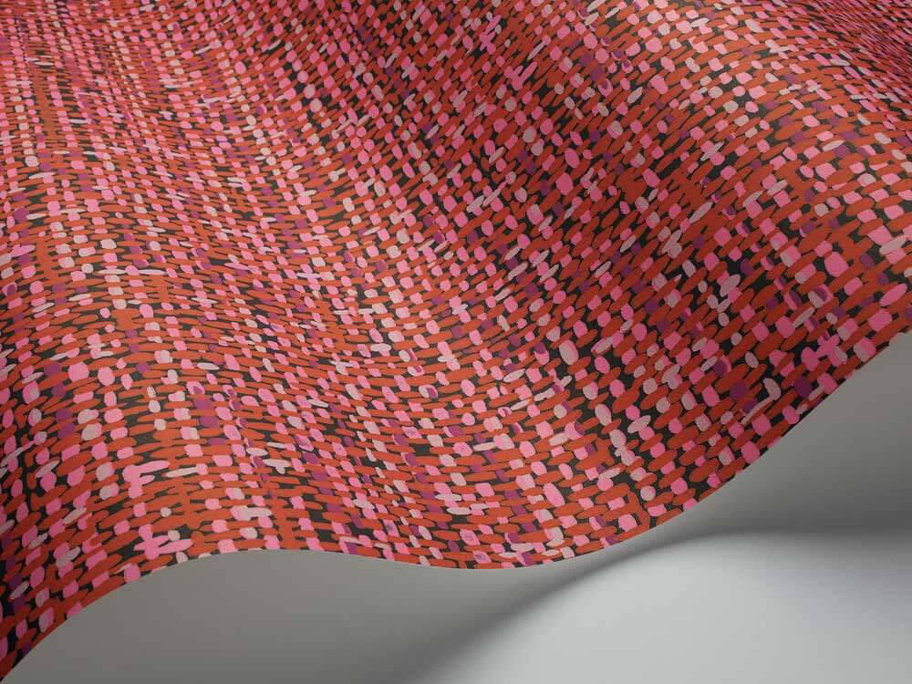
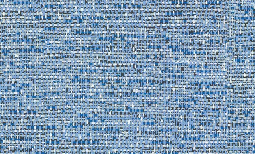
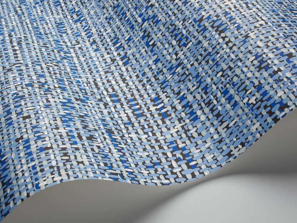
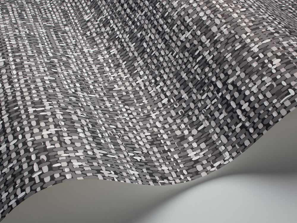
 Cole & Son’s line of tweed wallpaper comes from a 1950s document print — it’s an authentic vintage design — and we love it. It seems to read like a cartoonish grasscloth or linen — not a bad thing in our book, at all — because it makes for a delightful mix of sophisticated + whimsical all at the same time. There are 6 color ways ranging from soothing neutral to bold red, gold and blue.
Update: Since this story was originally published in 2014, this product appears to be discontinued. I will leave the story up, though, for history.
From the description on the Cole & Son website:
Foundation Tweed
A stylish, vintage wallpaper design from the 1950’s. A colourful pattern that incorporates a tweed texture on a solid background, this design would suit a feature wall for maximum impact. Colour-ways include White, Brown, Black & White, Yellow & Orange, Blue and Red. Colours shown on-screen may vary from the original wallpaper, we therefore recommend ordering a sample to view the true colours. We recommend that you use Cole & Son Tub Paste.
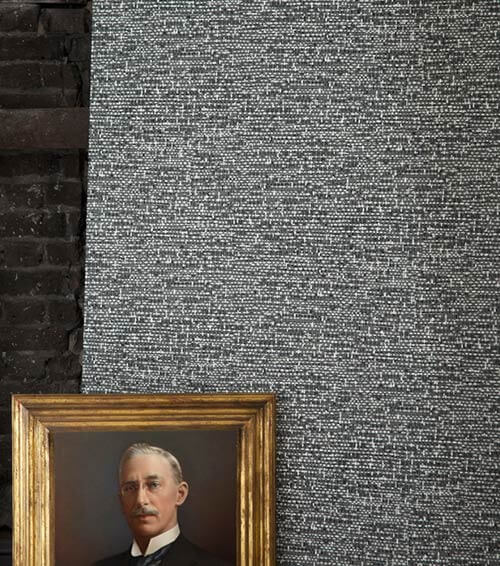
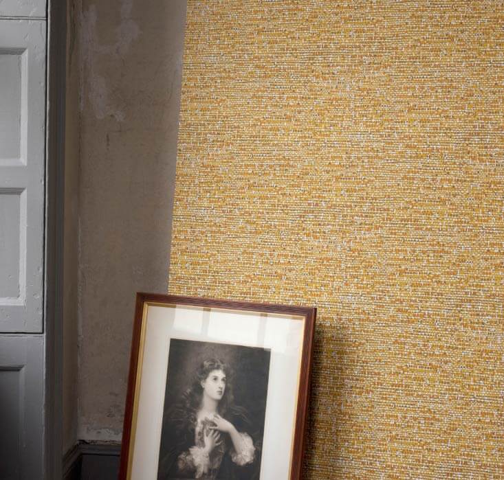 This wallpaper pattern would be a great ‘starter wallpaper’ for those timid about putting too much pattern on their walls. From a distance, the tweed reads more like a texture — like grasscloth or matting — than a print. The fact that it’s not to literal a representation — it’s an illustration — a sort of chubby representation — makes it all the better. Wallpaper is its own medium — we like it best when it is not photographic. At the same time, this design is not so scream-y that you can’t layer it. Au contraire – what a fabulous backdrop for art and tchotchkes of all sorts. Pam says she LOVES this wallpaper!

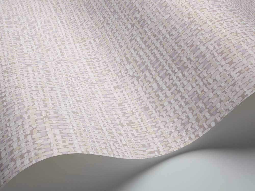

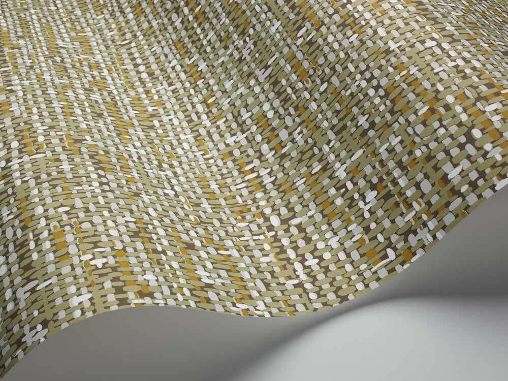
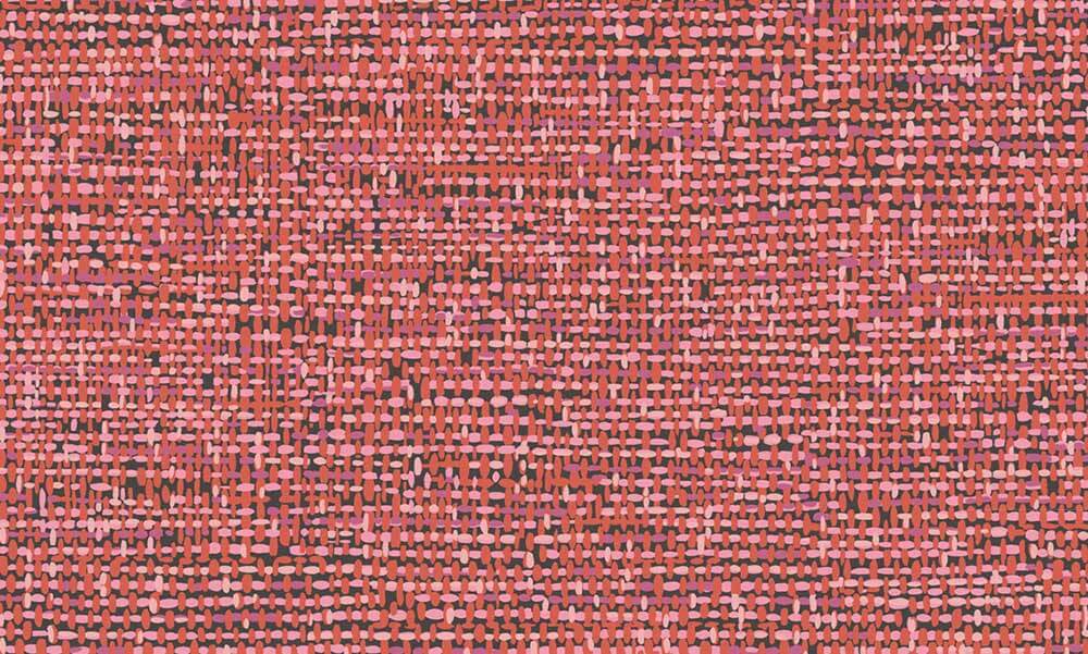 The color ways offered would work well in a retro home. I’m especially fond of the yellow/orange and the vibrant red/pink combo, but the white is a calming neutral if your are searching for a more understated look.


 What do you think readers? Would you use tweed on your walls?


Marguerite says
I love this paper. My parents had our living room (circa 1960) done in a pale green tweed and the adjoining hallway had one of those coordinating mural print types with pastoral scenes all over it. It really was cozy and striking at the same time!
Mary Elizabeth says
Yes, Marguerite, we had that too in my house growing up! The color was more of a mint green than the green shown here, and I put it up with my dad–one of our first major joint projects. The mural that came with it was snow-peaked mountains and forest. We put that up in the family room over the fireplace and built in bookcases. I think I am leaning towards the tweed because of the nostalgia of working on the family home and my first house with my dad. 🙂
Terri says
I like it
Joe Felice says
The print actually looks like real woven texture, and gives a 3-D appearance. This, too, was more ’70s, wasn’t it? Along with grass cloth, bamboo, cork and leather (for our wealthy devotees).
pam kueber says
Nope, original 1950s design, Cole & Son says. Linen was a popular laminate pattern – so why not for wallpaper, too! Grasscloth = popular starting in the 1950s, I’d guestimate.
Linda Haas says
Love this look! Making me think about changing SOMETHING!!! Lovin the grays, and the yellows, and…