

Do you need to choose colors for your bathroom, but aren’t sure where to start? After our recent miniseries we pulled our methods into an easy-to-scan infographic. Our formula can be applied to virtually any bathroom with any color of tile and fixtures. And really, it can be used in virtually any room that has you frozen in your decorating track.
A foolproof guide to choosing bathroom colors – successfully
We’ve distilled all of our bathroom decorating advice into five easy steps + tips on how to add more light, understand visual gravity and Pam’s 60-30-10 rule for choosing colors.
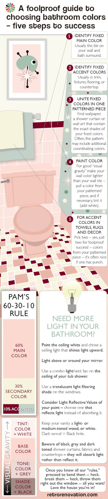
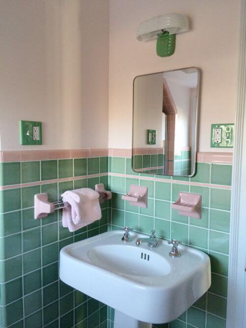
1. Identify your main fixed color:
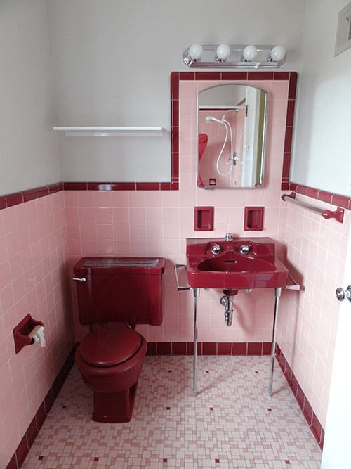
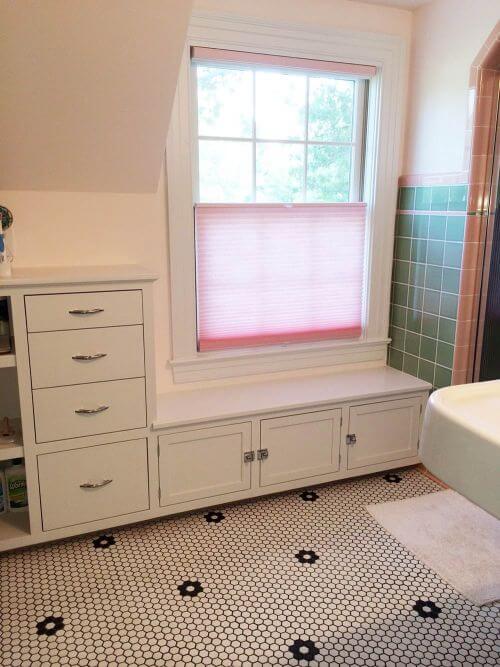
First, you need to determine your main fixed color. This will likely be the color of the existing wall tile in your bathroom, since it likely covers more than half of the total wall surface in the space. You can “play it up” or try to “play it down,” but you can’t get around it. Your floor tile and/or bathroom fixtures may also be this color. Basically, your main fixed color is the color that is the most prominent color of the elements in the room that are attached and not easily changed.
2. Identify fixed accent colors that you need to take into account:
If you have other fixed colors (in lesser proportions than your main fixed color) in your bathroom, they must be taken into account. Fixed accent colors often are found in fixtures, bullnose and floors. If so, these likely must be a part of your overall palette.
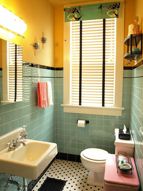
3. Unite fixed colors in one patterned piece:
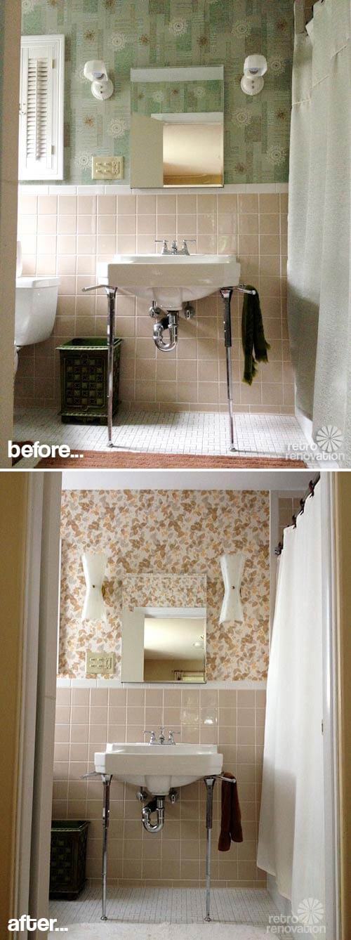
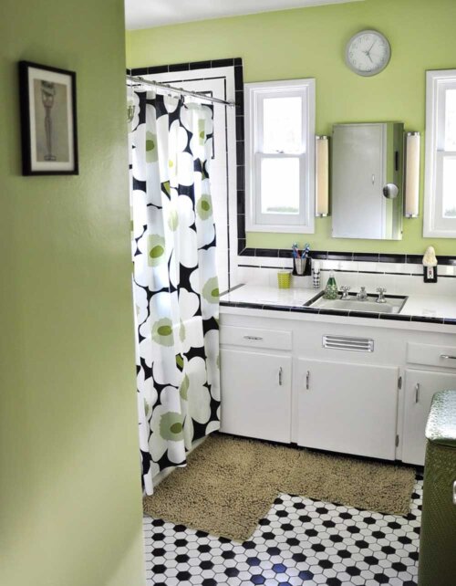
Now that you have identified your main color and your secondary color, it is time to unite these two (or more) colors into a patterned piece that will help pull the room together and can even help you determine an accent color or two for your room. You’ll want to find wallpaper, a shower curtain or wall art that contains all the colors you will use in your bathroom.
Ideally, the pattern will include the exact shade(s) of your wall tile, colors of any other tile in your bathroom and then, additional colors that the pattern designer collected. The good thing about finding a patterned piece is that it likely already reflects effective color combinations chosen by a professional designer. Within this pattern, the designer will have selected other colors that go well with your fixed colors. Note, it is possible to have pattern in two places (such as wallpaper AND shower curtain) — but we’re not going to go into that, because this is a “foolproof” guide. Suffice to say: If you start layering patterns, study up.
Meanwhile, even within our foolproof guide:
Be cautious of: Grids — Since the wall and floor tile are already strong grid designs in the room, you’ll have to be wary of adding yet another grid. Too many grids can make the room feel forced, uncomfortable to the eye and even cage-like. It is generally more foolproof to choose a wallpaper or shower curtain design with a more free form pattern that is not too geometric to avoid the overuse of grids in the space.
Be cautious of: Scale — Another aspect to consider when choosing a patterned piece is scale. Vintage bathrooms are typically small spaces, so for foolproof design success, avoid overpoweringly large patterns — that is, unless you are consciously going for a bold graphic look. [For bold graphic ideas, see our 99 pink bathroom designs — we show plenty of ways to do this.] Scale is also important when choosing wall art for a small bathroom. Typically the wall tile in vintage bathrooms covers more than half of the available wall space, leaving relatively small sections of wall for hanging art. A large piece of art that takes up all the available wall space may make the space feel claustrophobic; a grouping of smaller pieces with some space around them can provide something interesting to look at without making it feel forced. Edit.
4. Choose a paint color
If you are not going to use wallpaper in your bathroom, you’ll need to choose a paint color that works with your color scheme. Once you have found your patterned piece — art or shower curtain — take it into your bathroom so you can see it alongside your tile, flooring, etc. Pull one color from the shower curtain or art for the paint color for your walls. You can use this color exactly as seen on the patterned item — or add white to tint it lighter, black to shade it darker, or both black and white to tone it somewhere in between. Beware of going too dark, though — See our discussion of “Visual Gravity.”
If you’ve chosen wallpaper, use the same process to choose a color from the wallpaper for your shower curtain, or use a neutral (we like soft whites). Pam always looks at the “field” color of the wallpaper first to consider for a shower curtain color — this can result in lovely harmony.
- When choosing a paint color, don’t forget to determine the Light Reflective Value of your paint color
- And more on Light Reflective Values of paint — from Kate’s house
5. Use accent colors in the accessories
Next, what is a “third” color from your patterned piece that you can use sparingly as an accent throughout? This is a good place to be contrast-y (go opposite your field tile) for visual dynamism aka “pop”. Use this color for… accents like towels, rugs, maybe a valance or café curtain or soap dish. But don’t overdo it, or it’s no longer an accent – see Pam’s 60-30-10 rule.
 Pam’s 60-30-10 rule
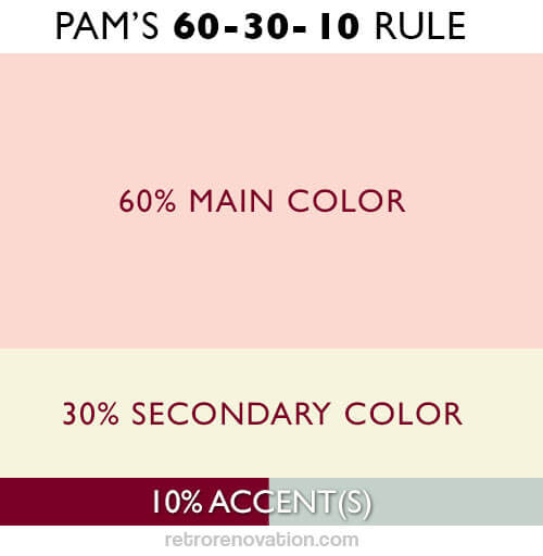
When it comes to application of distinct colors, think 60-30-10. That is:
- 60% your main color (e.g. usually the color of your wall tile)
- 30% secondary color (paint color or field color of wallpaper)
- 10% accent color (for foolproof success, limit to just two accent colors. And, here’s the easiest place for successful contrast)
Towels and rugs: Use your main color, your secondary color, your accent colors – mix and match.
Decorations on the wall: Color also should relate to your overall color scheme. Group in odd numbers, make sure you use the “white space” around them to frame them effectively.

Visual gravity:
Visual gravity refers to the feeling that the decor in a space is ‘grounded.’ “Visual gravity” is comfortable to us. Lighter colors up high, deepening darker as you do down. Just like in the world: Sky is light, trees are medium, ground is dark — we feel grounded, safe. If in doubt, use this principle for your bathroom design too. That is, beware dark bold colors on walls above pastel tile unless you are consciously going for that topsy-turvy effect; and, beware of entering the room when you have a hangover.
Other things to consider
Are your fixed colors warm or cool?
This is actually a whole ‘nother big topic in and of itself, but in short: Are the fixed main and secondary colors in your bathroom both warm (pink, yellow) or cool (blue, green) colors — e.g. ‘Red is hot, blue is not’? Or, do they combine a warm and cool color scheme? Take this into account when you are choosing an accent color and deciding on a wall color. If your bathroom is predominantly cool, adding small warm accents can really make the accent color pop off the cooler background, whereas if your accent color is also a cool color, the accessories and art you choose will have less of a visual impact because they mesh more closely with the color temperature of the space. If your bathroom has a window that gets a lot of warm afternoon light and you want to make it feel visually cooler, you can add cool colors to the space, whereas if your bathroom always feels cold, adding some warmer colors can help it feel more comfortable and cozy. Note: Chrome is cold and actually a contrast for most vintage bathrooms which tend to be warm even if they are “neutral” example: warm grey, warm white, etc.
Need more light in your bathroom?
- Painting the ceiling white and shining a ceiling light, centered in the bathroom, up onto it helps to reflect the light all around the room, giving it the feeling of being filled with light.
- Putting lighting above or framing your mirror has a similar light bouncing affect.
- Add more light in your tub or shower area by putting a combo light/vent fan on the ceiling over your tub shower, which will help light up this small, enclosed space. Remember to put your vent fan on its own switch and add a timer!
- On your window, use a translucent light filtering shade (like a pleated shade) that can deliver privacy but still radiate the natural light coming in from outdoors. Make sure it is easy to pull up and down — use it! Another solution: Put frosted/privacy glass in your window — or use the stick on privacy film — to let in the most light possible while maintaining privacy.
- Get to know the Light Reflective Values of your paint choices. For your walls, choose a paint color that reflects light, not absorbs it.
- Keep your bathroom vanity a light- or medium-toned wood, or white. Dark wood=black hole.
- Similarly, beware of black, gray and dark-toned everything — tile, floors, shower curtains, fabrics, countertops – they will absorb light rather than reflect it.


Alice says
I have a pink and black bathroom built in 1956. I’ve come to appreciate its campiness, but it’s very worn out. The pink tile floor is set in something that looks like cement. The grout on the floor and wall tiles are very dirty and aged-looking despite having been scrubbed countless times. Is there a treatment to improve the look? We replaced the vanity with a light gray/cream-colored one with a similarly colored granite sink which actually made the pink tiles seem less aged compared to the white sink that was there. Thanks for any feedback you may have!
Pam Kueber says
Hi Alice, on questions like this it’s recommended to consult with professionals. Good luck!
Devin says
Hello
I have pale yellow tile. I really won’t to do a “modern retro” type feel. I am doing the floor (Wich is a slightly different shade of plan yellow tiles) with a bold black and white pattern tile to give it a modern touch yet a nod to older fashion as well. I just can’t put my finger her on wall color. I’m thinking a mint maybe. Then adding some pink as accent and black would probably be the second accent and use it in the hardwear and stuff. My tile does not have accent to it and I’m actually considering cutting vynil ( I do vinyl work as my side hustle) to give it even more of the retro feel and tile in the black accent. Does that sound like it would achieve my desired look.?
Pam Kueber says
Hi Devin, it sounds like you are having fun! My first reaction is: As described in the story, “find your pattern”. It could be a shower curtain, or window curtain, or patterned towels/rugs, artwork, or my favorite: wallpaper. The pattern should have your base colors in it — the wall and floor tile colors. From the colors on the pattern, you can then choose other accent colors, including possibly the wall.
One other thought: Choose a paint that is a tint of your wall color. This idea might fit with your ‘bold’ floor plan. Tint = base color plus white.
Good luck.
Sandra says
I always put a Solatube centered above the sink/vanity. It’s the best light, and lights the whole bathroom. You can get them with a light and/or exhaust fan built in, if you need them.
susan says
I have salmon/peach-ish colored bath fixtures and the wall tile is white-ish with a row of tile matching the bath fixtures. I am confused about what I should do with the wall color above the tile. Another white above the wainscote tile seems boring.
Jen says
If you’re doing a kitchen and won’t contrasting cabinets and wall–which would be the 60%–the walls or the cabinets?
At least in my kitchen, I have pink cabinets–lowers and uppers on one side, only lowers on the other (retrofitting…), one wall that will have no cabinets on it. So, maybe the wall color would be dominant?
pam kueber says
Yes I think you can calculate this mathematically 60-30-10 is my rule, which of course can be broken as soon as you understand it !
Trish says
So, I really hate the pink/maroon bathroom, but we are going to sell the house soon. What are people going to like as buyers? I don’t want to change it, just update it and make it look nice.
Penny says
What a GREAT article – and what fabulous comments too.
I’m trying to match up paint for a bathroom with “speckled oatmeal” color tiles (on counter top too), with rich burgundy color tile trim. (A beautiful 50s tile job BTW)
Fixtures white. Privacy glass bathtub doors so no shower curtain needed. A window (over the bathtub) for natural light. Walls and ceiling are painted a yellowish cream semigloss (ugh).
For quite a while I have been trying to find the right shade of “oatmeal” paint (my best description) for the walls and maybe ceiling. I really don’t want to go with white.
Advice needed: Should I maybe go with white? Or?
Should my pull-it-all-together patterned piece be the (plastic ) curtain at the window?
(Boy do I sympathize with all of you out there who are trying to find the right shade of paint.)
pam kueber says
I would continue looking for the correct shade of oatmeal-colored paint. I fear that true-white would not show off your other colors to their best.
Is your plastic curtain patterned? Does it contain all the colors in your tile exactly? If so, sure. If not, no. Find a patterned fabric that contains the colors of your tile and white fixtures exactly.
All that said: It’s hard to say exactly without seeing it. See our pink mood boards for ideas — at least one (pink and white) of them features white fixtures.
Dianne says
Thank you for this article! I am still stumped for my bathroom however because the tile is a pale yellow with an odd brownish grey trim. The only patterns I have found with yellow and grey have white as third color. Am I doomed to have white walls?
Kathy says
Red orange and turquoise popped in my head, or perhaps colbalt blue or a purple. Many old art deco travel posters used these sort of colors, as did the Post-impressionists. A striking piece of art as well as a fabric can be a source of inspiration, and travel poster art is readily available in reproduction, even as ceramic plaques and such that could work in a bathroom. Another possibility is brightly painted pottery from Morocco or Turkey, or European folk art or 60s-70s commercial art. Lots of possibilities, but I think you need strong clear color to bring the yellow to life.