

Persnickety Pink: When working with Wilsonart to design our new collaborative collection, Retro Renovation® by Wilsonart® — the pink colorway — “Retro Renovation® First Lady Pink” — was arguably the most difficult to get just right. While in Las Vegas, we learned from the Wilsonart team that indeed, reds are super tricky, because of how inks interact or some such.
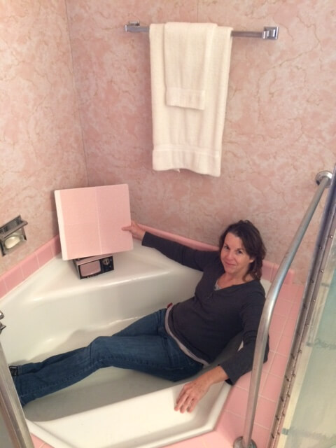
At one point during product development, when were pulling our hair out over trying to get this colorway “just right,” we asked our key Wilsonart contacts if they could take samples in-progress on into the pink-stravaganza bathroom at the Ralph Sr. and Sunny Wilson House – the home built by Wilsonart’s founder in 1959. The goal: to compare our possible samples next to real deal laminates from back in the day so’s we could all pick.
Designer Beth Randolph — yes, that’s her in the photo — went above and beyond – and right into the original “Cinderella bathtub” – to compare two finalist alternatives. Beth sent this photo to Kate and me to memorialize the testing and wrote:
“We looked at a couple of versions at the Wilson House,” she said, “One version looks great with the tub tile, another version looks really good with the vanity. I’ll send you chips of both.” ????????
Notice Beth’s emoticons, this is how we were all feeling at this point:
We went with the more coral-y pink. Tee hee, thank you, Beth and Andrea!


Mary Elizabeth says
Thanks for doing all this work to create a laminate that works for all of us in Retro Land! My house is basically “done,” but I’m still trying to figure out how to use one of the new colors in a new project.
RAnderson says
Pink is a very difficult color indeed. We couldn’t match up the Pink toilet in the bathroom of our 1955 house with our new tub or sink, so we had to replace it with white (anyone need a pink toilet?)
Ya’ll’d love the Pink 1957 Lincoln that we had up until a couple years ago, it was more Salmon pink than Pepto pink… I’d post a pic but am not sure how to or if it’s allowed 🙁
Now we’re working on a ’58 Oldsmobile, when it’s all done it will be either Desert Glow Pink or Heather Lilac 🙂
Joe Felice says
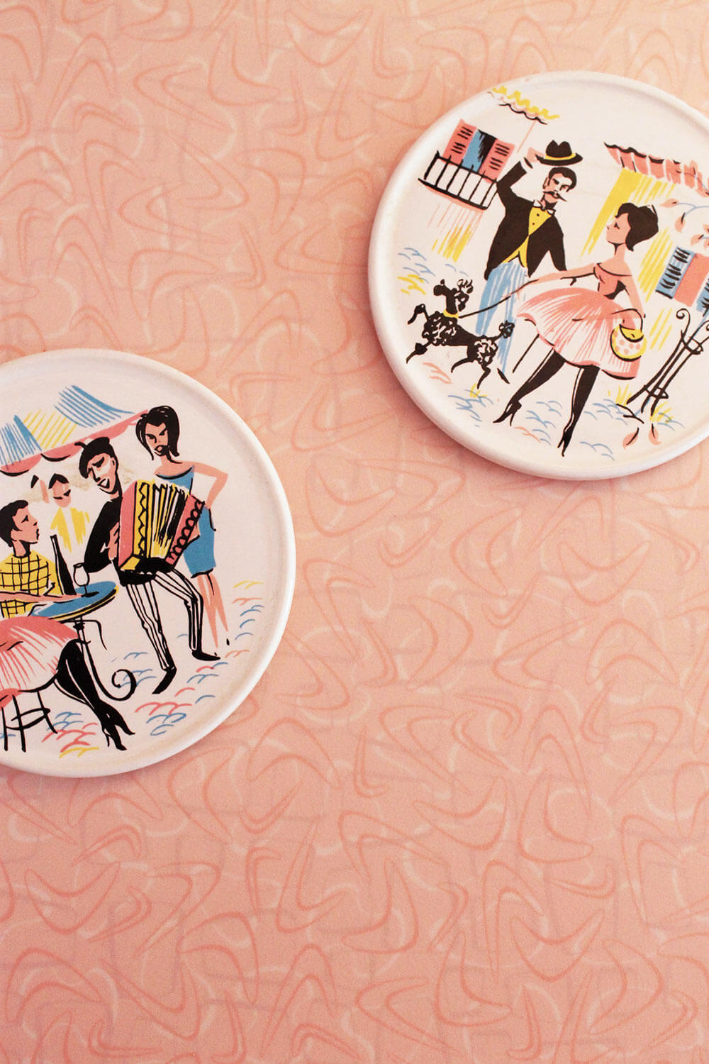
Any color can be tricky to get just right for a particular purpose and setting. And the appearance of the color changes with lighting (especially), sheen, and with the accents and trim. Just try working with aqua and turquoise! As I discovered while doing the diner, there are many subtle variations of each. Finally, I just said “The heck with it.” And decided that they all did not need to match perfectly, just coordinate with each other. You are correct that pinks are tough, due to the red in them. For one like I who doesn’t like red, getting the right pink is difficult. Greens and yellows can be tough, too, because the intensity of those colors can really shout out at you once you get them on a surface. Coral is tough, because it has to be just-the-right shade between orange and salmon/pink, and magenta is tough because it is right between red and plum.
Kathy says
Love the photo–is either sample the one you ended up with? I particularly like the pink because the color is perfect and the boomerangs aren’t too contrasty. I would have liked a deep coral, almost red, version too, if you ever do it again.
I was wondering, is that a laminate tub surround? Does the bathtub have a shower in it?
Bobbie says
Wow – really loving this pink boomerang. Wish these laminates would have been available when I did my kitchen…maybe someday (she said, wistfully).
Pinks are so difficult. When I did my bathroom, the pink for the walls was the most difficult thing to get right. So many other aspects were made easier due to the help from your blog (reminds me, I’ve been meaning to send you some photos!). But the pink was hard, it was either too rosy, too pepto, too nursery, or too blah. I wasn’t afraid to go bold since a good portion of the wall has wainscot. I finally went with a Benjamin Moore shade called Authentic Pink, which grew on me, and I now LOVE – but I must confess to having days spent looking at the wall wondering if Mamie would approve ;-). I know she would approve of the pink you have here!
Robin, NV says
This is why you always order samples. Not all pinks are created equal. Or any other color for that matter.
I would love to hear more about the development of your laminates – the technical aspects of developing the colors, specifically.
pam kueber says
We’ll do more on this in the near future. The mood/design boards are on their way back to my house — 66 lbs of them, I see from the online manifest. Ouch!
I will say, it was tricky: Field color/square color/googie color/boomerang color. All in layers and needed to harmonize into overall effect Kate and I were going for [I wanted to see those boomies floating on top, with ‘motion from squares and eights below; field color had to be just right and all elements overall creating the right color harmony]. Design first done on the computer. Then printed. Then compared to mood boards. Rework if necessary. Lather rinse repeat until Wilsonart thought they had a contender/contenders. Then laminate the paper. Did the colors change? Go back to Step one. Once laminate samples were thought to be contenders… send to Pam and Kate. They then did the Mrs. Blandings thing. Any single change to the boomie color or the field color or even the squares or eights could change the entire overall look. On the pink, we strugged with get the field and boomies just right so’s the whole thing wouldn’t go too pepto. Back and forth continued til we got it “right” or “close enough” to “right” that we would not go completely insane. I need to diagram this!
ineffablespace says
Most of the pink bathrooms in this area are of the warmer, fleshier, more beige. (I guess the more coral as well).
One of the hesitations I had about putting in a pink bathroom to replace the long gone pink powder room my house had (I found pink-beige floor tiles in some demolition rubble thrown into the joist space below the powder room), was finding the appropriate pink tile to go with the fixtures.
This became a moot point when Kohler dropped Innocent Blush fixtures (I wanted everything to match, including tub), but the problem with most tiles is that they were a much cooler, maybe blue-undertoned pink that I don’t like so much, and does not look good with the warmer pinks. I find the tile in the Wilson house, and the pink floor tiles that used to be available through Daltile to be too Pepto-Bismol for my own comfort — particularly with the Kohler.
I think the warmer pinks are complementary to most skin tones while the Pepto-Bismol shades can make many skin tones look sallow. I think this could be important if you were going to put make up on in that bathroom
pam kueber says
I think Kate loves her pink B&W tiles — https://retrorenovation.com/2013/12/30/kates-pink-bathroom-reveal-photos/
Nanette and Jim, too — https://retrorenovation.com/2014/09/24/mamie-pink-bathroom-build/
Not pepto — corally undertones!
ineffablespace says
Oh, I agree about the B&W tile, not Pepto and not too saccharine.
pam kueber says
It’s on my bucket list to do a bathroom with these! If that doesn’t work out… to line the tomb.
tamiam@socal.rr.com says
About persnickety pinks..awhile back I painted a bedroom pink that I thought was a soft warm pink & after I did I was surprised & bothered that it felt “cool” or stark. Then this week I hung some different curtains, pink linen fabric I got at an estate (yeah, pink on pink) and lo & behold the room, the walls changed into the cozy warm hue I was originally going for. The previous curtains were sheer white with pink flowery ones that let in lots of light so I just didn’t put 2 & 2 together, but these new linen ones bathe the room in a lovely glow & make me happy.
pam kueber says
Yup. Such is the arduous work of putting colors together!
Paul says
Hi Pam. May I suggest you build a half-bath in your basement if you have the room? You won’t have to look for a pink bathtub, and pink toilets and sinks are always easy to find at the ReStore. Also, you won’t need too many pink tiles, because the room will be small.
(Yes, I’m the same Paul who is building the blue bathroom.)
pam kueber says
I already have a full bath in the basement. It has PEACH tiles! Couldn’t find pink when I did it about 10 years ago. Now I know!