

 There’s no doubt about it — yellow is just one of those happy, sunny colors that can instantly brighten a space. It is no surprise then, that midcentury bathrooms, which already featured smile-inducing pastels like pink, green and blue, would also be bathed in sunny yellow. In my research, I found that many manufacturers offered a version of Ivory that could be classified as a pale yellow, especially in the early years of colorful fixture production. By the 1950s and early 1960s, brighter yellows — such as American Standard’s ‘Manchu Yellow’ and Briggs’ ‘Autumn Yellow’ were becoming available. Let’s take a look at yellow bathroom fixtures from 1927-1963.
American Standard Yellows — Ivoire De Medici and Manchu Yellow


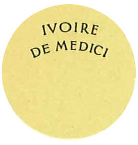
Ivory may not technically be yellow, but in my research, I found many manufacturers offering different shades of Ivory, such as American-Standard’s ‘Ivorie de Medici’ that look to be pale yellow in their catalogs. Above images: 1930 American-Standard Ivoire De Medici bathroom fixtures from the Building Technology Heritage Library.

 When it comes to ‘Manchu Yellow’ there is no question — this 1963 color is a bright, sunny, happy, unmistakable yellow.

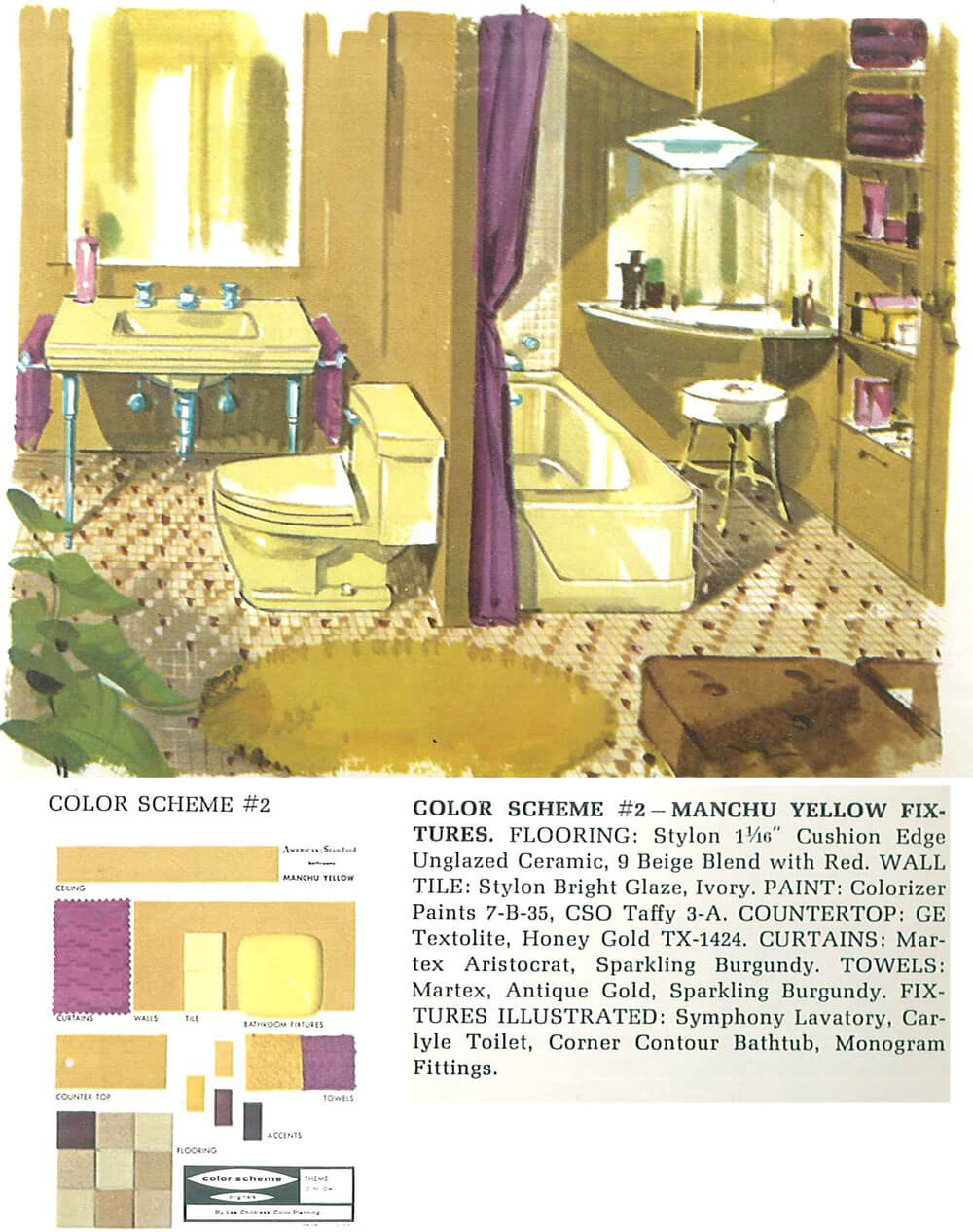
Three images above: 1962 American-Standard catalog showing Manchu Yellow fixture/ Building Technology Heritage Library.
Kohler — Old Ivory and Tuscan

A few years ago, Pam wrote about the very first year — 1927 — that Kohler offered its bathroom fixtures in colors besides white. Old Ivory — which looks like it could have been a very pale yellow — was part of that first color lineup.

Again, Old Ivory looks like a pale yellow, therefore I have classified it as such. Above: Old Ivory fixtures from a 1928 Kohler catalog from the Building Technology Heritage Library.

Above: We see Kohler’s color lineup 1936 Kohler catalog from Building Technology Heritage Library. While Old Ivory was offered, it was not one of their four most popular colors as indicated by the larger swatch size above.

Above: In this 1948 Kohler catalog / Building Technology Heritage Library, we see the whole palette for the year, which includes Ivory — though it seems they dropped the ‘old’ from the name. By 1949, Ivory was dropped from the Kohler color lineup.

 Oddly enough, even though Ivory was not in the 1950 Kohler lineup, it is possible that ‘Tuscan’ made a shift from beige to a yellowy beige. You be the judge. Above images from: 1950 Kohler catalog / Building Technology Heritage Library.
Crane — Citrus Yellow and India Ivory


In 1940, Crane offered both a creamy ‘India Ivory,’ which looks like a pale yellow, and a bright ‘Citrus Yellow,’ along with Orchid Pink, Pale Jade, Lavender and Sun Tan. Images above from: 1940 Crane catalog / Building Technology Heritage Library.

Here’s Crane’s Citrus Yellow again in another 1940 Crane catalog / Building Technology Heritage Library.
Eljer — Jonquil Yellow and Colonial Ivory
 Pam spotted some Eljer catalogs from 1939 and 1940 in the Building Technology Heritage Library that showed two shades of yellow — including Jonquil Yellow and Colonial Ivory.
Briggs — Autumn Yellow and Ivory

 The two images above show Autumn Yellow — a cheery bright hue — from the 1950s Briggs Beautyware catalog / Building Technology Heritage Library.

 The Briggs catalog shows their Ivory as slightly more beige than pale yellow. Above, two images above of Briggs’ Ivory from: A 1951 Briggs Beautyware catalog / Building Technology Heritage Library.
See our other stories about vintage bathroom colors:
- Decorating a beige bathroom: Color history and ideas from six manufacturers from 1927 to 1962
- The color green in kitchens and bathrooms sinks, tubs and toilets from 1928 to 1962
- The color pink in bathroom sinks, tubs and toilets — from 1927 to 1962
- The color blue in bathroom sinks, tubs and toilets — from 1927 to 1962


Susan says
I’ll look around, but if you can save me some time…where would I look to re-do a bath with products in 1950′ style? The old, pink tile is cracking and the bathtub is impossible to clean, but I don’t like the modern restorations that I see in area homes. Thank you!
pam kueber says
Susan, this is what my blog is ALL ABOUT: Helping you find the products you need to restore in midcentury and vintage style. #1: Get to know our categories. In this case, see Bathroom Help category near the top of the blog in Blue and all the subcategories in Orange. Best viewed on a desktop computer. (If you are on a mobile device, categories are embedded in the “hamburger” icon. Good luck.
Also to keep up with all our research, be sure to subcribe to my newsletter
Kathryn says
My 1938 house has Lemon Yellow field tile with Black Bullnose trim in the bathroom, and the same color scheme in the kitchen (albeit, in large hexagons) with a Ming Green thin trim tile about 6 inches below it…not quite mid-century, but thought I’d chime in!
pam kueber says
It sounds fantastic!!!! Yes, prewar houses had a more deco feel — higher contrast, including use of black.
Julia says
We have a small 1956 ranch with original bathrooms. Our hall/main bath is a cheery yellow with ming green accents and tub. I realized once while taking a shower that if I ever had to redesign that bathroom and could choose anything I wanted, I would probably pick a similar color combination. It is very pleasant and bright. And all the fixtures and faucets are original.
Each time I see these old ads, I lament that the ubiquitous sink legs are so difficult to find at a reasonable price these days. I can’t bear to spend hundreds of dollars (or in some places more than a thousand) on a couple legs and maybe a towel bar. I saw a DIY using copper pipes, but it would need to somehow be painted to match the chrome, and I know from experience how hard it is to simulate chrome. Maybe one day I’ll chance upon some at the ReStore.
Chad says
My parents have a kind of buttery yellow field tile in their 1951 powder room, with metallic iridescent bronze bullnose and trim tile. I’ve never seen anything like it; it looks like mica to me. I wonder if I can convince them to “restore” the space with yellowish ivory fixtures. It originally had a console sink on chrome legs and I doubt my mom would be on board with that, though she isn’t wild about the 1980’s vanity either.
Markie says
The kitchen in our 1951 house has kind of Autumn yellow sink with the gold “Daisy” pattern laminate counters. I tried a matching gold on the walls and hated it. Hubby suggested coral, as I have a lot of red accessories. I love it!
Paul - CT says
A little bit more in my Yellow Bathroom: As mentioned, I had the seat custom painted to match at a local body shop and it came out very nice! You can also see the wonderful original tile and the glorious yellow tub! (I finally figured out how to use Google Photos!)
[link does not work, Paul … – Pam]
P.S. under the lid is a different yellow because I bought one of those wonderful terry cloth seat warmers that come in many bright colors. I highly recommend them!
Paul - CT says
OK, I clicked on the shared button. Hope this works:
https://goo.gl/photos/mLuxyrTQiQwRFrAQ8
P.
Carol says
Love your bathroom Paul. It looks warm and cozy, yet clean and spacious. The wall tiles are amazing and are the main reason the bathroom looks warm and cozy. What a wonderful place to have a long bath on a cold day.
Paul - CT says
Thanks, Carol! I’m happy the linked work and you could see the picture! The wall tiles, Belgian Glass Tiles, really make that bathroom and the blue master bathroom. I cannot find anything on the internet about these tiles. They were used a lot by the builder of the house, D & D Builders in the early 1960’s. A house down the street has a pink version of these tiles that look amazing (I’ve posted a link to a photo in another thread here) and my aunt had these tiles in her house but in lavender!
best,
P
Carol says
Paul, the link isn’t here. I’ll check back later if you see this message. The tiles sort of look like old school pottery glaze in the photos, only more refined. They add so much character to the bathroom. Very uptown. How lucky you are to have 2 bathrooms with that tile. Thanks so much for the links.
Paul - CT says
Hey Carol, are you talking about the link to the other house’s pink Belgian Glass bathrooms?
If so, here is the link. You want to see photo 24 and 25, I think they are two separate pink bathrooms with the Belgian Glass tile and I love them:
http://www.trulia.com/homes/Connecticut/New_Britain/sold/574764-26-Roslyn-Dr-New-Britain-CT-06052#photo-24
Sadly, they gutted the kitchen and put in the typical granite stainless steel kitchen.
Carol says
Thanks Paul, I love the pink, it almost looks like marble. I have to say that I do prefer your yellow bathroom. It’s warm and fuzzy! Thanks for taking the trouble to post the link, I really appreciate it!
Paul - CT says
You’re welcome. Now that I figured out Google Photos, here’s a great shot of all the Belgian Glass. This was taken before the counters and sinks were replaced and cabinets repainted so please excuse the mess but the tile had been just regrouted and looks awesome:
https://goo.gl/photos/u85aaRRL4NWEWCa46
Carol says
Just beautiful Paul, thank you.
ineffablespace says
Grey and yellow are a great combination.
Did you do a Grey bathroom series for the future? Kohler at least, has offered some shade of grey for fixtures since the 1950s starting with Argent (which is greenish) through to today(where most of their colors are greyish).
My mother’s decorating books from the 1950s and a rug catalog she had from the 1950s featured a lot of grey + a color in decorating. (And she seemed to have a lot of grey dress suits and cocktail suits from that time as well, based upon pictures I’ve seen. Color pictures, not black and white pictures.)
At one time 5 or 6 of our neighborhood houses in a row had very similar floral or leaf patterned carpet (Olson carpet, I think, like the catalog). Several had grey, one had a burgundy and one a forest green maybe. All tone on tone in one of the colors, but grey seemed to be the most popular, no matter the furniture style. So it’s not just a millennium thing.
pam kueber says
I can’t remember if it’s in our lineup or not. If not, I’ll add it!
lynda says
I know you are not a fan of gray, but a friend of mine had yellow fixtures in a 70’s bath. The tile on the floor was a yellow and white mosaic. When it came time to sell her home, she painted the walls a light gray and put up a yellow and gray shower curtain. She finished it off with gray bath towels and added lime green and yellow hand towels. It really made the bath feel updated. I think the colored fixtures can be charming, but it is more practical to have white fixtures. I love to look at them!
Alison says
Deabath has an India ivory sink available on their site. They describe it as ” yellowy cream”.
pam kueber says
Thanks for that info, Alison!
Jocelan K. Tracey says
I’m not sure you have this right. I think that the colours have faded and changed over the years since the ads/promos were done. I notice that colours that are clearly lavender are called “Sparkling Burgundy” or purple that is called “Rouge” which as we know is red. I suspect that the ivory is really offwhite as it should be. On the other hand what do I know?
pam kueber says
Yes, difficult to know for sure…
ineffablespace says
The Ivory that I’ve seen in real life is pretty yellowish.
Heidi E. says
Also, I can’t help but feel designers don’t always think like the rest of us, because I have seen some very odd color names on perfectly new paint chips. My current bedroom is a pale lavender that the paint company called “Plum Ripe”, which would make me envision a dark color near eggplant. ( I was also fairly puzzled by the cheery pastel green I’m considering for my new bathroom being called “Crocodile Dream”. Crocodiles may be green, but nowhere close to a shade I’d consider for walls! Maybe they were trying to find a new way to say “Eau d’Nil”…)
Kathy in San Leandro says
I have a 1929 Standard set in my garage, waiting for me to have the money and time to redo the bath. It’s definitely yellow, so I’ve identified it as Ivoire de Medici based on Standard’s ads from the time and their description of naming the color for the aged ivory owned by the Medici family. Genuine ivory turns yellow over time. It’s not the off-white we call Ivory today.
This yellow has a tan undertone; it is not sunny, clear, citrus, butter, or harvest gold. If I were naming this color today, I would call it something like Dulce de Leche or Baked Custard.