

 Last up in our six-part series reviewing the history and timeline transformations of the most common colors used for vintage bathroom fixtures: Let’s look at the variety of gray tubs, sinks and toilets offered by a variety of manufacturers reaching back as far as 1927. Along the way, we also get great ideas about how to decorate a gray bathroom — an eminently versatile color — without going all … monotone.
American Standard: 1962 Platinum Gray
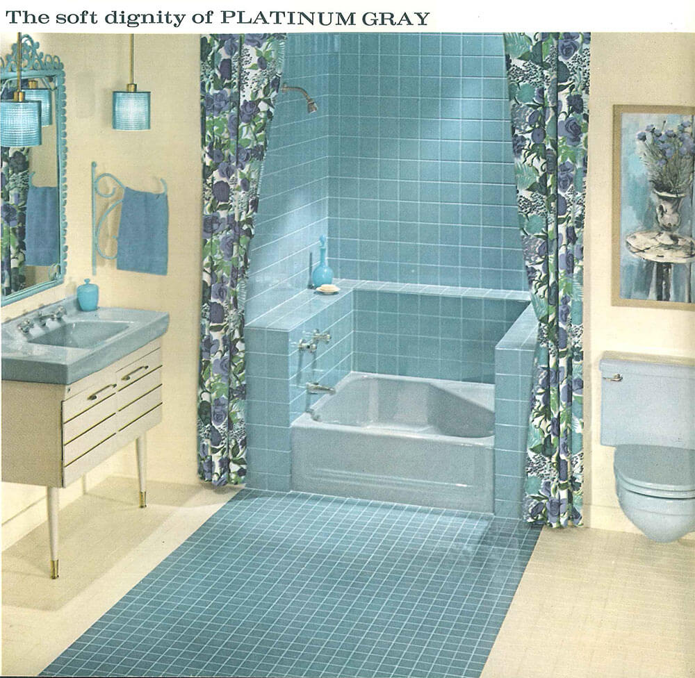 American Standard’s Platinum Gray looks fantastic when mixed with a creamy yellow and blue.
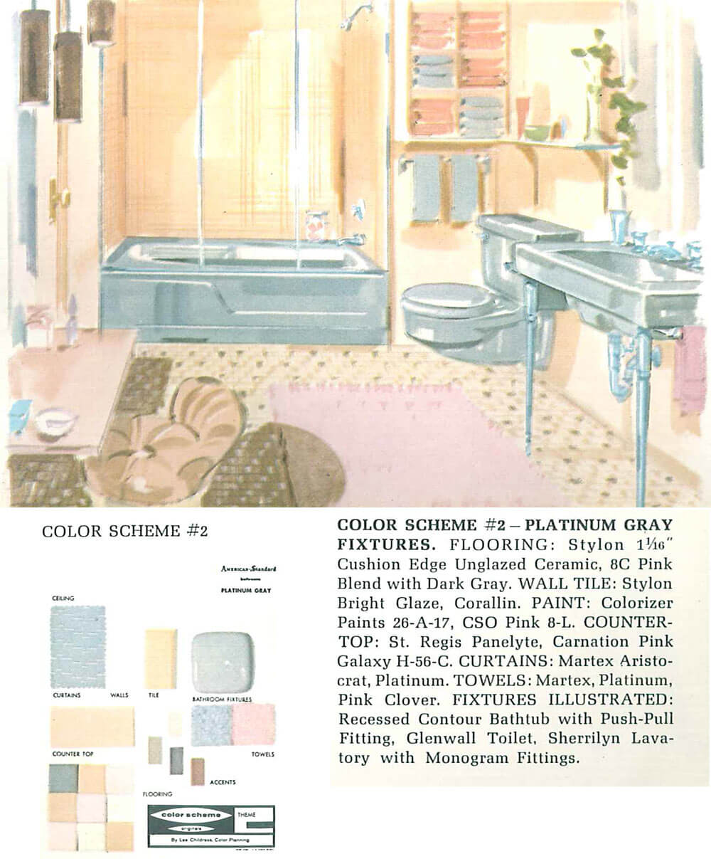 And here, they’ve mixed gray with beige, yellow and pink creating a cheery space.
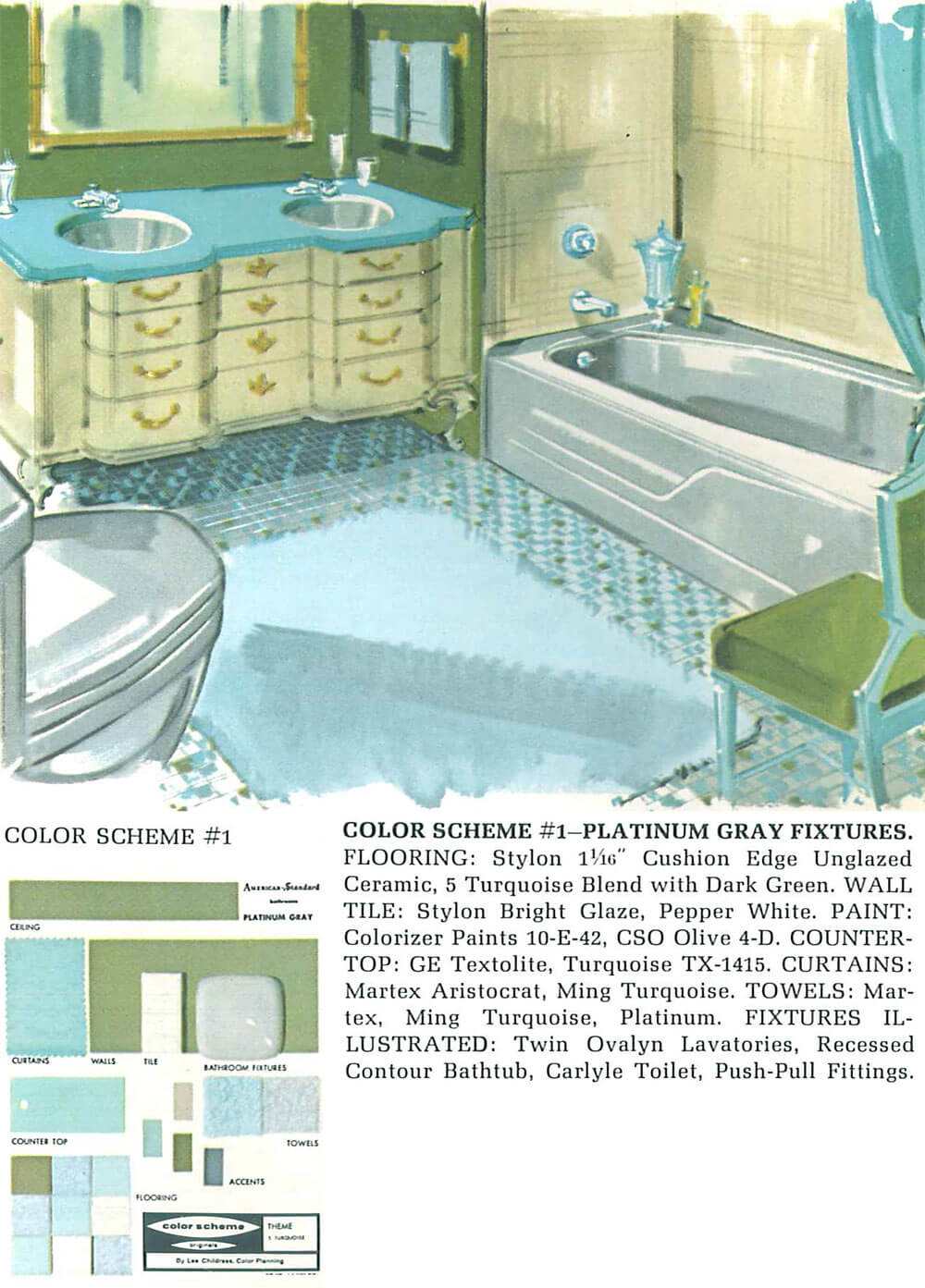
Even this richer color combination of gray with avocado green, blue and cream is anything but boring.
Three images above: 1962 American-Standard catalog from the Building Technology Heritage Library.
Kohler: 1927 West Point Gray and the 1952-1967 Argent
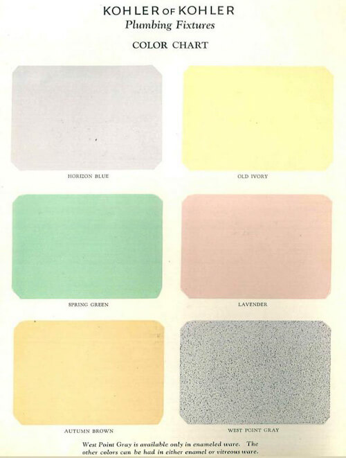 Although Kohler was the first company to start making fixtures in color back in 1927, the ‘West Point Gray’ in their original color lineup.
 ‘Argent’ was Kohler’s 1950s gray. It appears to have been quite rich in depth. Shown (above) in a 1959 catalog in the Building Technology Heritage Library, the color gets a high-contrast decorator treatment.
 In this 1961 catalog in the Building Technology Heritage Library, they pair it with 60s flower power colors — orange and green. Who’da thunk it!
Over on their extensive color timeline, Kohler says that Argent was in their lineup form 1952-1967.
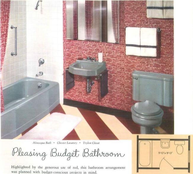
Briggs: 1950s Pearl Gray
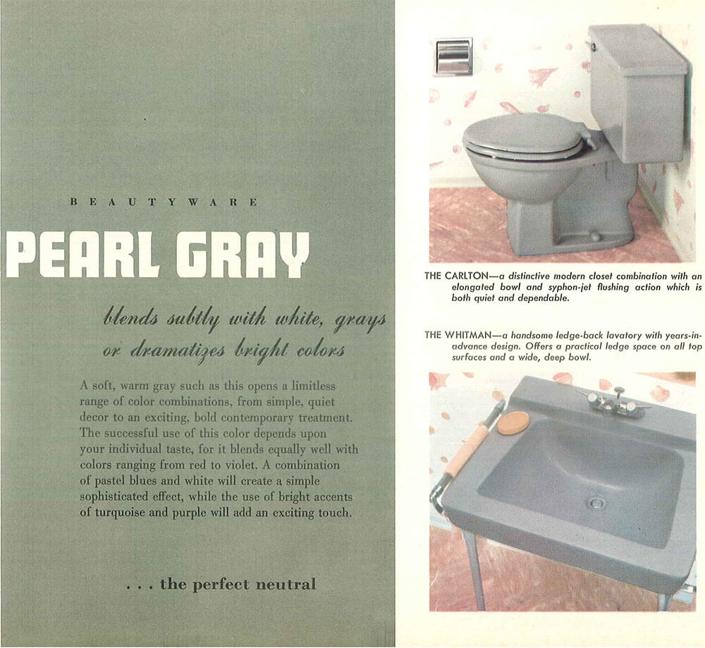
 Brigg’s Pearl Gray seems to be a darker gray than the American Standard Platinum Gray, definitely more declaratively gray with less likelihood of reflecting and taking on the hue of adjacent strong colors. When combined with white tile and rosy pink floors and accents, it looks very nice indeed — pink and gray is one of Pam’s favorite color combinations in a vintage bathroom, whenever she sees one. The two images above show Pearl Gray from the 1950s Briggs Beautyware catalog from the Building Technology Heritage Library.
AllianceWare: 1950s Grey
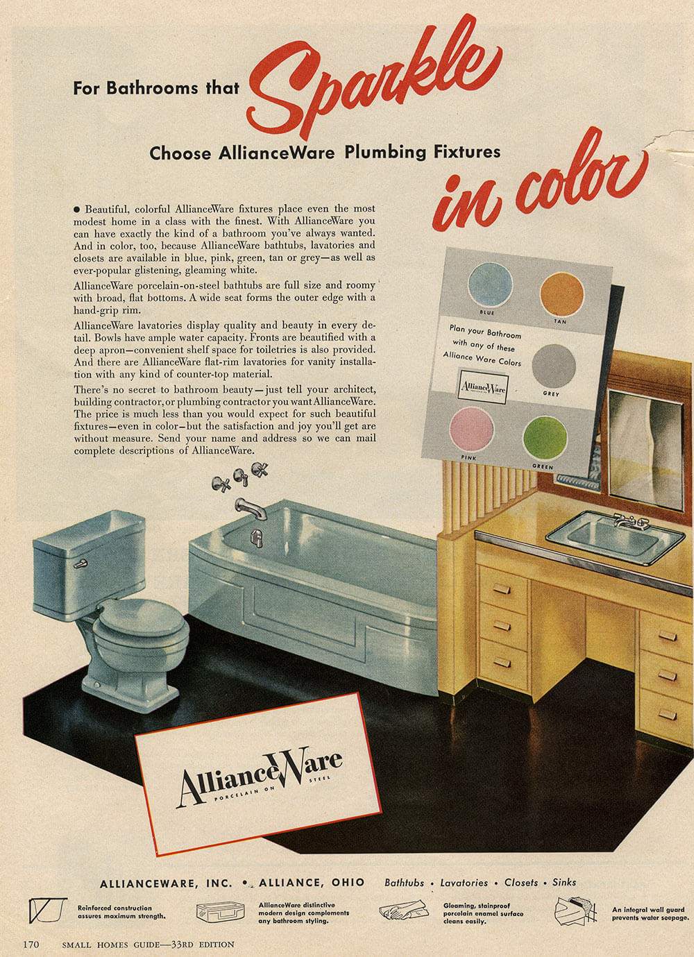
Pam found this ad for AllianceWare bathroom fixtures that includes ‘Grey’ in a 1950s Small Homes Guide. Alliance Ware kinda makes us smile, because it seems they did not have a marketing person to name their colors!
See all our stories about vintage bathroom colors:
- Decorating a beige bathroom: Color history and ideas from six manufacturers from 1927 to 1962
- The color green in kitchens and bathrooms sinks, tubs and toilets from 1928 to 1962
- The color pink in bathroom sinks, tubs and toilets — from 1927 to 1962
- The color blue in bathroom sinks, tubs and toilets — from 1927 to 1962
- Decorating a yellow bathroom: Color history and ideas from five manufacturers from 1927 to 1962


Fraught says
My 1958 grey bathroom is the most beautiful thing. So elegant. Grey wall tiles, grey toilet, grey sink with hudee ring. The floor is the small mosaic tiles in lighter and darker greys. The tub was so etched and dull, we did have it reglazed. The painter was shocked we didn’t want to go with white! No, keep it grey, we said. Our accents are crisp whites and some navy accessories.
Mike says
My paternal grandmother’s bathroom fixtures were gray. She and her then husband built their house in 1927. I have no idea if the fixtures were original, and doubt they were, but they were gray! To date, hers was the only bathroom I’ve seen with gray fixtures.
Lynne says
I am seriously considering grey tile for our upcoming master bath remodel. So much can be done with a grey base. Over the years I could use yellow, pink, blue/aqua, even orange goes beautifully with grey.
I figure the tile will long outlast any wall coverings and accessories, and grey leaves my decorating options open.
Kay says
My tub-surround is gray 4×4 with burgundy trim. I just can’t love it. Everything else in the tiny bathroom is white. I’ve struggled for years with how to keep the vintage tile but bring the overall look into this century. Anyone else? Should I:
Paint the walls a matching gray to unify the space?
Paint the burgundy trim tile (my main issue)?
Put something else gray in the room, like towels or vanity paint?
Introduce a third color? I don’t like pink, the obvious choice.
ineffablespace says
It usually doesn’t work to try to ignore one of the elements of one of these intense (by today’s standards) vintage color combinations.
I wouldn’t recommend painting the tile, particularly if you are going to paint only part of the tile. Someone may chime in and disagree, but the best I have ever seen painted tile look was “okay” and when only one color is painted over it tends to really look covered up compared to the unpainted tile–it doesn’t look particularly natural. (And I’ve seen it look bad enough that almost any color that was underneath would be preferable)
I think wallpaper would be a good way to use both grey and maroon and introduce other colors as well, if you can find one that’s appropriate.
Some of the Cole and Son papers in the vintage Fornasetti patters would probably work well but these would involve you fully embracing the color scheme instead of trying to compensate for it or downplay it. The Fornasetti papers are not for the faint of heart. (He also made umbrella stands from a cut out of a German Shepherd, he didn’t take things too seriously)
http://www.cole-and-son.com/en/collection-fornasetti/wallpaper-77/3011/
http://www.cole-and-son.com/en/collection-fornasetti/wallpaper-77/12044/
pam kueber says
Gorgeous choices for wallpaper! I agree: Wallpaper is the answer! That, or find your modern pattern in a shower curtain, then pick a wall color and decor to bring everything together. See our tutorial: https://retrorenovation.com/2015/10/05/five-steps-choose-bathroom-colors-infographic-guide/
Kay says
Interesting, because I’d never consider wallpaper in a space so tiny. It’d be way too busy! Perhaps a small, framed sample of wallpaper could serve the same function.
Honestly, I can’t see wallpaper modernizing the look at all. Harmonizing, yes, but not modernizing. It’s our only bathroom and gets a lot of steam, too.
My husband would never go for pink or anything floral, either, unless done very graphically and modern. So tempting to paint the trim black or white!!
pam kueber says
I have wallpaper in all three of my bathrooms. I am the world’s #1 fan of wallpaper. For example see: https://retrorenovation.com/2013/07/26/vintage-wallpaper-bathroom/
It can totally transform a bathroom — a wonderful product!
pam kueber says
See all these too: https://retrorenovation.com/2015/07/22/decorate-burgundy-maroon-pink-bathroom/
ineffablespace says
Also if you have a healthy budget, this paper is from Adelphi Paperhangings and I think it is a high-cotton paper so it might be pretty durable
http://www.adelphipaperhangings.com/starfish.html
pam kueber says
ooooooooh, pretty! And interesting that they stop at 1930
ineffablespace says
The focus of the company is 18th c and early 19th c document papers for museums and period restorations.
Take a look at this paper, though. The date is 1763, not 1953
http://www.adelphipaperhangings.com/pagodas.html
Kathy says
Colonial Revival was big in the 1930-50s, so I think the authentic period paper would look great. Very much in line with the “Colonial Williamsburg” look, which started in 1935.
I think burgundy and grey is a very 1930s-40s type color scheme and I think Kay could look to that period for inspiration for the shower curtain and art, and paint the walls a neutral, such as a light clear grey, or paint the vanity to match the grey tile with white walls and add color. It is important that the undertones of the greys match.
I always liked burgundy and it can be a versatile color, almost a neutral. To go more modern with it, you could try finding something bright and colorful that incorporates a bit of the grey and burgundy/maroon/plum. With a colorful print, the burgundy does not have to be an exact match as long as a related color is included and it opens up a lot of possibilities in all kinds of styles. Something like:
https://www.amazon.com/gp/product/B00HXJ4MXM/ref=pd_sbs_201_3?ie=UTF8&psc=1&refRID=A2RV9M5Z1CN8CKBSWZ8V
https://www.amazon.com/gp/product/B00W3JMNZQ/ref=pd_sim_201_4?ie=UTF8&psc=1&refRID=HNWR1ZFE8V4M8EJ9698G
https://www.amazon.com/dp/B01EB4RY4A?psc=1
https://www.amazon.com/dp/B01FZFK3OC?th=1
https://www.amazon.com/dp/B009NMERL4/ref=asc_df_B009NMERL44564318?smid=A30C47LFC7W6BF&tag=nextagcom04-20&linkCode=df0&creative=395129&creativeASIN=B009NMERL4&ascsubtag=-9150595341848808813
https://www.amazon.com/gp/product/B002X7AAJO/ref=pd_sbs_201_2?ie=UTF8&psc=1&refRID=KB5QT1Y9D2ZKYFH9MCQW
https://www.amazon.com/dp/B01IHKQYGI?psc=1
https://www.amazon.com/gp/product/B01E8DJSMA/ref=pd_sbs_201_1?ie=UTF8&psc=1&refRID=A6XA7N4H8Y01R6Y4SFRZ
https://www.amazon.com/gp/product/B01FFIQ3QG/ref=pd_sbs_201_6?ie=UTF8&refRID=KBQRCQ062TQ1W8ZGGTBE&th=1
https://www.amazon.com/gp/product/B01EG4IAES/ref=pd_sbs_201_13?ie=UTF8&psc=1&refRID=KE5AAHEM90F7XSHJNS31
https://www.amazon.com/gp/product/B01BLQ432W/ref=pd_sbs_201_18?ie=UTF8&psc=1&refRID=QT7VQFY60B47DAQ4S8BQ
https://www.amazon.com/gp/product/B013JSOR76/ref=pd_sbs_201_4?ie=UTF8&psc=1&refRID=VKBYC9CWF9EQWYQYFH3V
https://www.amazon.com/gp/product/B01HM3WBXG/ref=pd_sbs_201_3?ie=UTF8&psc=1&refRID=AMRQQMFGNSVYQQRR3YMY
https://www.amazon.com/gp/product/B014TKOPZC/ref=pd_sbs_201_54?ie=UTF8&psc=1&refRID=BAH0WZXCC7BKAYBQ267Z
Carol says
That starfish wallpaper reminds me of some barkcloth. It is awesome! I agree wallpaper is the way to go on this bathroom. Pam did a story on an art deco-ish bathroom with burgundy tile and a geometric pattern in the tile. The reader had cobbled together enough wallpaper she found in the attic to wallpaper the tub wall. The paper had a sage green background with large cabbage rose type flowers. This bathroom was the bathroom of my dreams and I am not a burgundy fan. The paper made the burgundy color so delish, that it sort of became the neutral in the room.
Carolyn says
Well, I came into the article that gray would be a neutral – then saw the “Pleasing Budget Bathroom” where it appears the gray is either the star or shares equal billing with the red!
My theory is that any time you use “natural” colors such as green, sky blue, gray, etc., they ground the scheme and are so much easier to work with. So many different directions you can go and gray is a real workhorse in this regard.
Pam, you’re funny! “Alliance Ware kinda makes us smile, because it seems they did not have a marketing person to name their colors!” They maybe only got the 8 crayon pack instead of the 64.
Barbara says
Hi Kate!
I’m adding grey, turquoise, milk chocolate brown, black and salmon colors to my 1964 bubble gum pink bathroom.
Grey is very versatile!!
THANKS Kate for the info!!
ineffablespace says
A number of other grays from Kohler followed in the 1970s-90s, and this is probably the only full-line “vintage” color that you could use to recreate a period bath from scratch with new fixtures.
Ice Grey, Cashmere, Thunder Gray and Basalt seem to be the closest to some of the older grays, and Basalt seems to be limited to sinks.
And the options are very limited in Cast Iron for tubs. I know cast iron tubs aren’t very popular, but they seem more vintage to me than acrylic , even when the acrylic tub is in a traditional shape.
Robin, NV says
I was wondering if grey is still available, thank for the info!
Mary Elizabeth says
Also, gray is a good color for not showing little-boy dirt rings and hard water mineral deposits. I agree with Pam that it is Perfect with Pink.
Ali says
I really like the gray with the colored tiles. I think that it tends to look less stark than white fixtures.
Thanks for showing us this.
Robin, NV says
Interesting, I had no idea grey was an offering back in the day.