Skip to primary navigation
Skip to main content
Skip to footer
Search
Home
Kitchens
Bathrooms
Blog
Exterior
Other Rooms
Decorate
The “Museum”
Be Safe/Renovate Safe
Search
Search
Retro Renovation
Remodel & decorate in Mid Century Style
Home
Kitchens
Bathrooms
Blog
Exterior
Other Rooms
Decorate
The “Museum”
Be Safe/Renovate Safe
Home
/
By the Decade
/
1960s & 70s
1960s & 70s
Hall-Mack Coronado bath accessories – the most popular line?
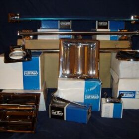
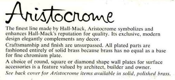
1962 Hall-Mack Aristocrome line
1964 time capsule gray bathroom
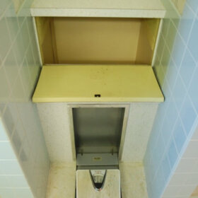
A 1964 blue bathroom with built-in Hall-Mack, NuTone, Textolite & more
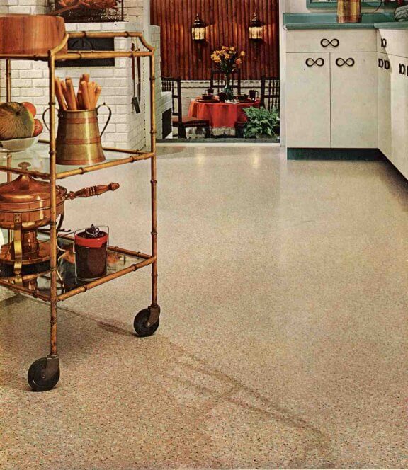
Six great 1961 interiors – floors, furniture, art, outrageous interiors and more
A Colonial-meets-Modern 1960s kitchen to make you very, very happy
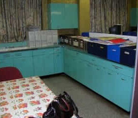
Found: 1963 aqua Geneva steel kitchen cabinets – from a cooking school run by nuns in NYC!