Skip to primary navigation
Skip to main content
Skip to footer
Search
Home
Kitchens
Bathrooms
Blog
Exterior
Other Rooms
Decorate
The “Museum”
Be Safe/Renovate Safe
Search
Search
Retro Renovation
Remodel & decorate in Mid Century Style
Home
Kitchens
Bathrooms
Blog
Exterior
Other Rooms
Decorate
The “Museum”
Be Safe/Renovate Safe
Home
/
Decorating Resources
/
accessories
accessories
Brayton Laguna Pottery Cat — now being made again by Bauer Pottery from original tooling
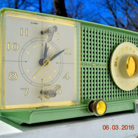
Inside the world of vintage radios with Allen Chiang of Retro Radio Farm
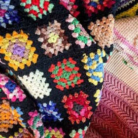
Spreading kindness
Transforming a vintage cheese tray from meh to mid mod marvelous — with Georges Briard tile
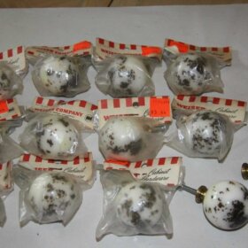
Ruth Richmond door knobs and cabinet pulls — nice stash of New Old Stock
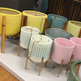
Midcentury modern planters on stands at Marshalls
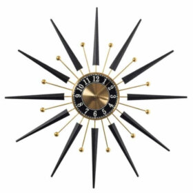
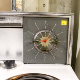
Starburst wall clock from Cracker Barrel
Howdy hygge: 11 midcentury modest home features that deliver hygge galore
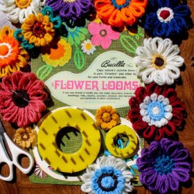
Bucilla Flower Loom flowers — wonderful!
A granite countertop tried to kill me — my Saturday trip to the ReStore
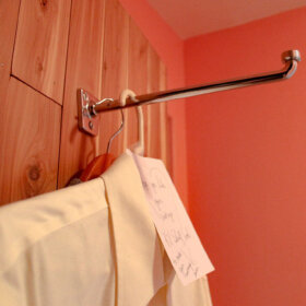
A vintage K-Venience Garment Bracket finally installed
Where to buy authentic disco balls — in 7 sizes — 12″ to 48″ — still made in the U.S. today!
Page
1
Page
2
Page
3
Interim pages omitted
…
Page
7
Go to
Next Page »