Its pink kitchens #11-20 today, as we continue to look at how the iconic color of the 50’s — “Mamie Pink” — was translated into everyday, middle-class, mid-century homes.
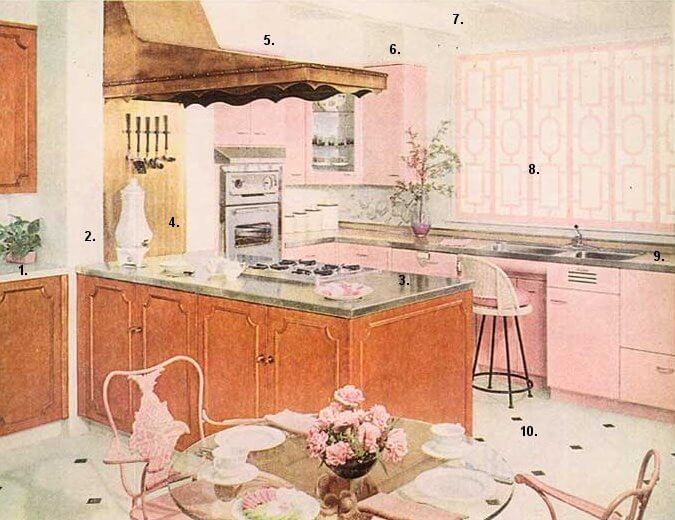
11. This 1959 GE pink+white+copper/brown kitchen is really quite snazzy, I like it a lot!:
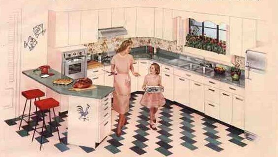
12. This one is another take on the ’49 American-Standard kitchen we saw yesterday, but ready for Thanksgiving. Sweet:
13. A classic St. Charles kitchen with some terrific design elements — another one of my all-time favorites. I used this photo for a “Flashback Design” feature last year, oops, I can’t find the un-numbered image:
14. Republic Kitchens marketed their “Prelude Pink” pretty heavily, circa 1956. A gray palette certainly gives pink a dash of elegance, don’t you think?:
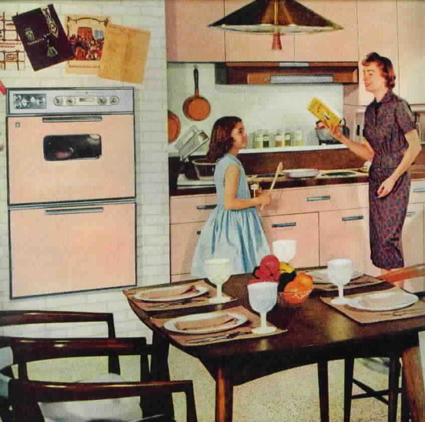
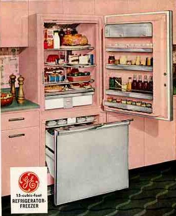
15. A 1957 GE pink kitchen. Awesome refrigerator, and note the wallpapered backsplash. If you’re going to have a pink kitchen, people, you might as well go for it the gusto!:
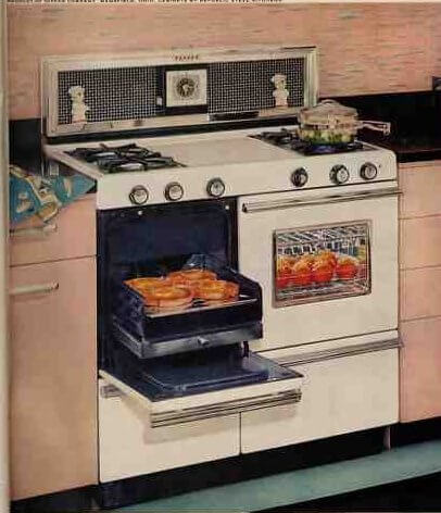
16. A 1957 ad for a Tappan stove is set with pink Republic steel cabinets. Great looking backsplash here, too:
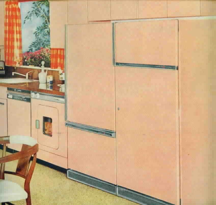
17. Another 1959 GE pink kitchen — in fact, I just noticed that this is another angle on kitchen #11, although these images were in separate places. Great fridge+fridge combo. Note how nice this soft pink looks with the orange and yellow curtains. And see the wood-grained countertops. My goodness, pink is SO versatile!
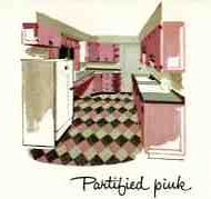
18. A teensy illustration from Curtis Kitchens. A wood cabinet company. Painted pink was de rigeur, too:
19. Not sure who made these. Pink with erin green….Hmmmm, this I’m not liking so much, and you know I rarely say that…:
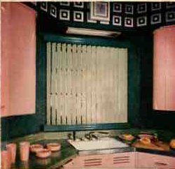
20. I believe that this is 1957, not sure of the maker. They certainly went for pink on pink on pink — Mamie would have approved. The wallpapered ceiling is growing on me — it certainly makes a big statement. And why the heck not!: