


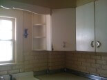
I heard from Ohio Catherine recently – remember her adorable ranch…and all her Drexel furniture? Catherine has continued to work on her vintage steel Youngstown kitchen — pulling together the extra pieces she needs — as well as her pink bathroom — including checking out Bradbury & Bradbury wallpaper to go-with:
hey pam!
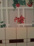
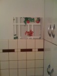
i got a few samples from bradbury today. i love all the grey in the sunnyside up for the kitchen! and in the bathroom, i thought i would like the googie better, but after i put them up on the wall i’m leaning toward the atomic doodle. what do you think? 😀
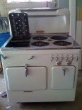
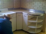
the youngstowns in the pictures are my newest addition, before we tore them out of an old house about an hour from here. someone contacted me via my wanted ad on craigslist and told me they wanted them out of the house so he could remodel. they need a lot of cleaning, stripping, and painting!! but i have my corner piece! i cringed when i saw you posted my youngstown handles on your ebay picks, because i NEED them!! haha!!and lastly i sent a picture of my chambers sitting in the garage!thanks for all your suggestions, LOVE your site!!

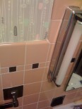
Thanks, Catherine. You have your own Tag now! I agree – that Atomic Doodle wallpaper up against your classic Mamie pink tiles looks fantastic. But I am not so sure about the Sunnyside in the kitchen. Even though I think I recommended it – I tend to think the grid of the wallpaper alongside the grid of your tiles is not the perfect combo. So…I consulted Steve Bauer of B&B to see what he thought. He also had some great advice for wallpapers going into a bathroom:
Pam,
Thank you for taking the time to help Catherine and asking for our opinion! You mentioned “Atomic Googie” looking fabulous, but I didn’t know if you meant our “Atomic Doodle” or “Googieland”, but hey, I think they are both terrific in that incredible bathroom! I would recommend however that we seal the paper, (which is not expensive) if the bathroom produces a lot of moisture. She can ask for that through our Customer Service if she places an order.
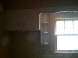
As far as “Sunnyside”, it is probably the least grid-like pattern of the four Post War papers (when you compare them on our site) but it might pose some competition with her terrific tilework. Some of the reds we matched for these papers in the paper are actually values of “carmine”, a sort of wine red color used frequently in late 40’s and early 50’s papers rather than a primary red as it may appear in the photos. They definitely appear lighter however than the deeper maroon in her tile.
Does she have a breakfast nook off the kitchen? If so, she could paint the walls in the kitchen a light pearl gray to harmonize with her cabinets and use our “Scallop Trim” at the top of the wall, (the one with silver in it like the cabinet handles) and use “Sunnyside” in the nook with the “Trim” above that (!) The nook would then be a beautiful compliment to the kitchen without the two competing. If those options don’t sound appealing to Catherine she could always try to find a vintage paper through some of your links (?). From the tiny portions I could see it looks like a terrific vintage kitchen! I wish her the best!
I hope this offered something in the way of assistance to you and Catherine. We are always glad to help. Thanks again!
Steve
Thanks, Steve!


paperboy says
Catherine, glad you’re happy with our Atomic Doodle! It looks dynamite. I would also suggest waiting for a smaller print to put against the tile. I liked the suggestion of a geometric medallion as it looks good in our original 1961 ranch kitchen, above its tile.
kitschicat says
The atomic doodle paper is fantastic in your loo, Catherine!
I miss my grandparent’s MCM quad-level that they had in Saginaw, MI. The loo that was mine when I stayed with them was pink everywhere and that wallpaper would have been amazing in there. Ahh, memories. 🙂
catherine says
thank you to everyone for your input and comments. as far as the kitchen goes, i agree that there is a better wallpaper out there. i do love the idea of grey on the walls, and i would love to find a wallpaper with this great color combination in it. femme1, my chambers is still in the garage too! i need to clean it up a bit, and install a gas line in my kitchen, but i can not wait to use it! after you suggested the chambers, i couldn’t see any other range in there. i love it!
as far as the pulls go, i am going to stick with the straight deco handles in the kitchen. i did win that lot, and believe it will be enough to finish the project (even though, as karmi mentioned, the black spacers weren’t there. maybe i can take them all off or come up with something to make it look the same). not all of the cabinets will go in the kitchen, the sink base and a couple uppers will go in my laundry room and keep their boomerang pulls.
atomic doodle seems destined to be in that bathroom. i love the metallic sparkle of the gold, and the pink is dead on! if anyone finds a wallpaper they might think would be great for my kitchen, link me to it!!
Femme1 says
So Catherine, that’s the Chambers gas range you bought? It’s beautiful and looks to be in perfect shape. I think we have the same model—a Chambers C (circa 1950)—only mine is yellow. Unfortunately it’s still in the garage awaiting some restoration! I wish I could have found one in better shape.
I have to go along with everyone about the atomic doodle—it looks great. But I don’t think the kitchen wallpaper works too well with your tile. Have you searched through Hannah’s Treasures vintage wallpaper; she has a bunch up on eBay now. I’m not so sure the colors would work with your tile, but I something like this or one of the geometric medallion prints would be cool: http://cgi.ebay.com/1950s-vintage-wallpaper-kitchen-design_W0QQitemZ220287731939QQihZ012QQcategoryZ50364QQtcZphotoQQcmdZViewItemQQ_trksidZp1742.m153.l1262#ebayphotohosting
Kitschy Kimberly says
I like the atomic doodle too. I am also loving the stove.
karmi_woolfe says
hey catherine! yes, i agree about the atomic doodle! absolutely perfect! but be careful when you buy “new” youngstown pulls — if you look on yours, you will see a little black “outline” where each side meets the cupboard. These are actually two pieces of black plastic behind the chrome pull and were not present in that auction! aren’t i something else? let me know if you found a fridge… and… if another corner ever shows up in northeast ohio, it’s mine! 🙂
nancyb says
Hi Catherine – I think the atomic doodle looks like it was made for your bathroom! And, how cool is it that Pam contacted a rep from the company to get his take on it?!
I can’t believe that those kitchen cabinets weren’t originally in your house. Are you going with the deco or boomerang pulls?