


Look at these two – “Bronwyn the Bad Visualizer” and husband Greg. I have to say: They are even cuter than the vintage pinch pleats in the background. And you know how I feel about pinch pleats. Bronwyn wrote to me … in July (gulp, I’ve been overwhelmed.) She tells me it’s also taken this long for her to get a contractor on the line – so there’s still time for us to muddle up her brains with alternatives
Hi Pam,
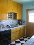
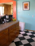
Love your website (and your love for Stephen Colbert)! My husband and I are in the midst of partially redoing a 1950’s kitchen in Culver City, California (i.e. Los Angeles). We’ve got a tiny galley kitchen with the original wooden cabinets and also black and white checker floor tiles (which we are keeping). We are definitely replacing the countertops with Formica Aqua boomerang. My first question is about backsplash. I notice that in most of the 50’s photos, the kitchen sinks usually have windows over them and therefore just a 4-inch Formica backsplash. Ours is up against a wall. We’d like to have a full backsplash because we are…well, splashy. We were thinking of putting in white tiles with some black accents to mimic the floor. Do you think tile would make sense? Would that pattern look appropriate next to the boomerang countertops? We’re trying not to be “too busy” as the kitchen is rather small and we don’t want to look too circusy in there. Any suggestions? Also, our walls are currently painted aqua and I feel that that is going to be too much if we have the aqua counters. Any good, simple, contrast ideas? Thank you so much for any suggestions.
Most Sincerely,
Bronwyn the Bad Visualizer

Of course, I asked Bronwyn more information about her house – and of course, there are some great stories. So keep reading to get to that part.
Meanwhile, regarding the backsplash:
- I discussed this with my number-one go-to source on color issues — my husband David, who has a really great eye. He has made the point that given the small size of your kitchen….that it opens into the dining room where there is more going on… that you’ve got a beautiful new Fridge coming… and the fact that you will soon have aquamarine countertops – a simple, calming-force backsplash is advisable. I looked at it from every angle (literally) with him, and agree:
- Plain, satin finish, 4x4s – running horizontally (not in diamonds as now), will allow other more important aspects of your kitchen to shine. We don’t think that even little splashes of black are advisable – the black wants to dominate too much.
- Regarding wall color, first keep the aqua that you have and see how that looks. But, for the wall, calming white might also be the best. You can add accent color in any number of ways via your accessories.
Gosh, no one will actually believe I am finally recommending: White!
So now, more from Bronwyn, who tells me that her name is Welsh, although she is not. Her father named her after a character in “How Green Was My Valley”:
Hi Pam,
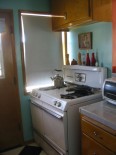
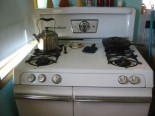
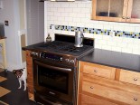
I love our stove too!! It is an O’Keefe & Merritt Stove. I believe that O’Keefe & Merritt was a big Los Angeles stove company, but alas is no more. I had the stove repaired recently and the repairman said to NEVER replace it–it would last forever.
We don’t have a pink bathroom–we have a funky green one! If you’re up for it, I actually have some tile-related questions on the bathroom too, but since I don’t want to overwhelm you, I’ll hold back unless you’re really interested…:) [ Post to come – Pam]Greg is a musician and works on scores for film and television. I…currently work at a health policy organization in an editorial capacity (that’s the shortest way to describe my job).
As for why we like retro stuff….I was born that way. Greg and I love the detail and thought of past eras. People put so much more effort into architecture, clothing, hair…anything. We love that attention and love for detail that defines Americana. Although I love the 50’s, my favorite is the 1930’s-40’s.
Also–Pam, I should have mentioned. We had those polka-dotted curtains in the dining room made when we moved in. Not sure how “authentic” looking they really are, but we just thought the that the material was cute and went for it.
As for the story….we purchased the house in 2005. Shirley had died in 2001 so there was one other owner Paula) before us. Back in 2005, the LA housing market was hot and buyers practically had to beg to buy houses. We looked at all available (10) houses on this side of LA that day. We were depressed because all of the houses in our price range were right on the side of the freeway or literally the last house before the end of the runway at the Santa Monica airport. The only house that we liked (actually loved) was this one! Paula had decorated the living room like a 1950’s beauty salon (I actually thought an old lady lived there and had a business). The house was on the market 5 days–never had an open house–and Paula had to move immediately. She had 3 offers. Right before we made our offer, Greg and I were sort of stalking the house and managed to “run into” Paula and introduced ourselves. Long story short, we eventually got the house. We found out from our agent that we didn’t even have the best offer, but Paula liked us because she knew we’d maintain the integrity of the house (i.e. not tear it down and build a McMansion)Shirley didn’t get married until she was in her 50’s so she never had kids. When she died, the neighbor sold the house and just left the dining room set with it. It just fits the room and wouldn’t make sense anywhere else. But since she has no children, Greg and I like to pretend that we are her kids!
When we moved in, we inherited the dining room set, the original blueprints, the original contract on the house (it’s about 10 pages), Shirley’s wedding album (Shirley married Ferdinand in the 1970’s), several slides with photos of the house, and Ferdinand’s extensive record album collection! We don’t know much about “Ferd” other than he LOVED music. We have his fantastic record collection–complete with his hand-typed index card filing system–of big band, Christmas music, Reader’s Digest albums, and Elvis! Last year for my birthday, Greg bought me a record player and we are known to push back the furniture and dance to Ferdinand and Shirley’s music.Bronwyn


CulverCityBronwyn says
Oops–never answered about the curtains. We had them made! Went to a fabric store and had our curtain guy make them (he was horrified by our selection). While he was at it, he re-upholstered our 1950’s kitchen chairs in with the same material. Also, the curtain rods are original to the house (we think) and are fake wood.
CulverCityBronwyn says
Hi! Thanks Pam and Everyone for the wonderful ideas! Wow–white walls….I love the obvious sometimes :).
retrotravelgirl says
Hooray…another LA house saved! Where did you find those glorious aqua curtains????
Palm Springs Stephan says
I’m going to suggest something a little different … something with more drama.
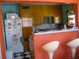
Keep the aqua painted walls. Keep the matching aqua tile backsplash above the sink. Get rid of the aqua tile countertops (though they would have to be removed VERY carefully, lest you damage the backsplash). Instead, install solid black high-gloss formica countertops with a 4″ backsplash along the base of the tiled walls above the sink. The black in the countertops will repeat the black in the floor without the overwhelming busy-ness of a B&W checkerboard tiled pattern, and it will blend beautifully with both the aqua walls and tiled backsplash and with the coral or salmon bar.
Definitely keep the stove! And perhaps replace the face-panel on the dishwasher with a white one so that it will both match the stove and pick up on the white in the floor. And I think a white dishwasher door will make the room appear larger.
Then instead of the modern white plastic waste can, get a pink or salmon colored period piece to provide that little pop of contrast.
But I’m a huge fan of white-black-aqua-pink combinations, as you can tell by my bathroom!
kristinski says
I agree to keep the aqua and see if it works out. My kitchen is aqua (fridge, stove, and soon the sink) with yellow walls and red accents. It sounds pretty bad (and maybe it is) but I got the color combo from a vintage wallpaper that I didn’t use. So, if I were you and didn’t like my aqua after I put in the aqua counter top, I’d consider a soft yellow. I’ll be anxious to see it completed.
nancyb says
Cute kitchen, even “before”. I agree with elvis, that you can run the laminate up the wall as high or low as you like. I’ve seen it over-and-over in vintage home magazines where the laminate backsplash goes all the way up to the cabinets, or up 7-10″ (instead of the usual 4″). We are using the aqua Formica in our renovation, and will be running it up 7″ (under our outlets) with metal banding to top it off.
However, tile was also widely used of course… I agree with Pam and David, that you should keep it very simple, using white and maybe a pale accent at the top edge of pale yellow or coral to match your breakfast bar. A black accent might be too heavy and also seems more 30’s-40’s to me.
Good luck,
Nancyb
elvis says
I’ll get this right yet!
I see now the modern stove is in a different kitchen shown for its backsplash.
elvis says
Great kitchen! Love the O&M stove, but I’m confused by the more modern one…or did I miss something?
How about a flat backsplash of the same boomerang laminate with the traditional narrow metal edging around it? It was a common (and economical) solution, and with the expanse of your backsplash, might also be even a quieter visual effect than the grid created by white tiles.
My husband and I are also “splashy” people and using the same formica on the countertop and walls has worked well for us. It’s so easy to clean!