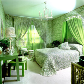
Today, nine images of 1960s bedrooms, kid’s spaces and more from my new stash of vintage Sherwin-Williams paint brochures. I’m seeing plenty of good ideas in these interiors from 1967. In particular, I love the built-in nooks… the high-contrast, graphic interiors… and the wonderful touch the interior designers have, in terms of choosing accent colors that keep your eyes dancing through the room. This is a real skill – but it can be learned by training your eye.
These rooms also have great “shapes” going on throughout. Again – graphic, but… with just the right “touch”. The person or team from Sherwin-Williams who did these 60s interior designs was very talented. And you know, I just paused and went back through the 1965 and 1966 brochures, and I don’t think it’s the same person/team… there’s a real shift, I think I’m seeing more layering, more visual complexity… 1968, 1969 and 1970 designs are coming up… we’ll see.


To view the slide show, click on the first thumbnail. Once it’s enlarged, click on the arrow below to move forward or back. You can start the slide show from any spot…