


 1960s flower power colors are ascendant in the mainstream design and decorating world. And here’s some of the latest: Kohler has teamed with Jonathan Adler and introduced four new real-colors for a narrow range of six contemporary-modern, enamel-on-cast-iron sinks.
UPDATE: Alas, now discontinued. But see our Kitchen / Sinks and Bathroom / Sinks subcategories for other possible options — there are other options out there, for now at least.
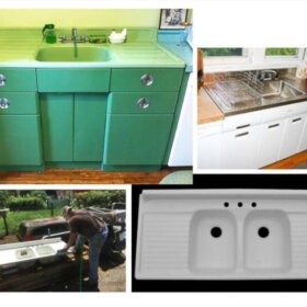
Alas, these colors are not available on the midcentury authentic, hudee-rimmed Delafield kitchen sink, or on the midcentury authentic, hudee-rimmed Tahoe bathroom sink. Even so, it’s nice to see some REAL COLOR FOR REMODELS. And, if you are doing a Modern-Retro look (rather than an authentic midcentury look), it’s good to have these choices.

Here is what Kohler says about the lineup:
For optimum color vibrancy, Kohler Co. is offering the four new colors only on six of its Kohler enameled cast iron kitchens and sinks. “The materials used in the enameling process are incredibly saturated and vibrant,” Kohler creative director Tristan Butterfield explains. “Such an exclamation of color in a space should be as rich as possible. And Kohler enameled cast iron allows us to achieve that.” The four colors are available on the following sinks, in limited quantity —>:
• Bath Sinks: Tides, Canvas and DemiLav Wading Pool
• Kitchen Sinks: Whitehaven, Riverby and Iron/Tones
Actually, I think those last two kitchen sinks — the Riverby and Iron/Tones are sort of “plain” enough that if you get the self-rimming model they get closer to “timeless” rather than “trendy” in terms of styling.
Here’s what Jonathan Adler says about the colors. Haha, this is always like reading critics’ descriptions of wine:
The following are the four KOHLER Colors Featuring Jonathan Adler:
• Greenwich Green captures the beauty of the perfectly manicured lawns of an English Estate—cultured and cultivated. “This is not dull avocado green,” Jonathan Adler says. “It’s bolder, yet timeless. So crisp and refreshing you can taste it.”
• Piccadilly Yellow evokes the riot of colors from London’s Piccadilly Circus. Exuberant and fun, a Piccadilly yellow kitchen or bathroom sink instantly fills the space with giddiness. Adler says: “There’s a very mod quality to Piccadilly yellow, especially when paired with white. It’s unexpected and will always feel fresh.”
• Palermo Blue is beautiful, serene splash of the Mediterranean Sea where it opens before the city of Palermo on Sicily. “A nice, crisp light blue is cool and refreshing,” Adler says. “Like taking a dip in the Med itself.”
• Annapolis Navy, an unconditionally classic hue, calls to mind the sailing city of Annapolis on Maryland’s Severn River. “Annapolis Navy epitomizes nautical chic. It’s such a classic color because it pairs so well with other bold colors,” he says.
Of course, I do not like that JA disses the Avocado Green. But then, I diss the greige so it’s kolor karma.


Cheryl says
Can i. get any samples of the baatthrmsinks
Pam Kueber says
I don’t think these are available any more.
See our subcategories for more options:
Kitchen Help / Sinks — https://retrorenovation.com/category/kitchen/sinks/
Bathroom Help / Sinks & Vanities — https://retrorenovation.com/category/bathroom-categories/lav-sinks/
Mary says
These sinks do not appear for sale. Is that correct
Susan says
I guess I’ll not be having a colored sink…an all white kitchen with vivid back splash and colored sink was what I so wanted never realizing the ads I’d seen were from 2012… very disappointed.
Pam Kueber says
Discontinued? But: We have other sources for colored sinks: https://retrorenovation.com/category/kitchen/sinks/
Lisa AF says
Does anyone know if these have been discontinued? The models are available on the Kohler site but these funky colors are not. I’ve found a very limited selection on other sites (e.g., Amazon, among others).
Jess says
Kohler’s site says ‘limited quantities’ in the 2012 press release so yes, I think they are discontinued. So sad, I just found these and would really like one. I found a green Whitehaven at a reseller but I don’t know about that style in my mid-mod kitchen, it looks kinda modern farmhouse-y to me. I really love the colors though. Sigh.
Alison Schmidt says
I don’t know about your monitors, but I grew up w/ Harvest Gold and Avocado green appliances and these colors are much purer and more clear. If you’ve done any color mixing, you know that gold has lots of red, brown, and black added to it. This yellow has a cool base with blue and maybe a touch of black in it. I love them, but way out of my price range!
Ethan says
Why is it so hard to find a dealer that actually can get/ stocks these sinks in these colors. It’s always so difficult to find a dealer for this kind of stuff. If it was more readily available it would be more popular. Try going to Lowes or Home Depot (which is listed as a dealer for these) and finding these sinks in these colors. I couldn’t do it. The online showroom also lists the green sink for $1295. That’s a pretty hefty price tag. The white is half that price. Why?
Ethan says
oops, I had more to say. In other decades you could readily buy different colors. So, people did. Then these companies quit making a color and forced us to buy a different color if we wanted something new. Obviously, corporations brainwashing us with advertising and availability of products makes us hate the old and have to have the new. It’s crazy. I have a passionate love for Avocado. If it were available, even for a price (maybe not 1300 for a sink) I would buy new stuff because I think it’s beautifull. But I am forced to buy white, black, bisquit (which is better) and stainless steel, yuck! I hope more colors become available to the average person in my lifetime again. I am ready for it. Alright, I’m done.
Fogkate says
Maybe it’s just my monitor, but these colors look new and fresh to me — not like avocado, et al, from the 50’s and 60’s.
Besides, is there an absolute standard for any color? What color is yellow, peach, even red?
Anyway, I love all four or these Kohler introductions, even though they’re too intense for my (often changing) tastes. I went with bisque for the kitchen 18 months ago and continue to be happy with thos very muted color.
Thanks, Pam, for such great posts!
Joe says
It’s amazing how everything old can become new again. While studying architecture and design in the late 70’s and early 80’s, Kohler was THE go-to for colorful porcelain kitchen and bath fixtures. The names are different now, but the colors are the same. Greenwich Green was AVOCADO, Piccacilly Yellow was HARVEST GOLD, Palermo Blue was probably Turquoise, and Annapolis Navy was BLUEBERRY. The industry got away from porcelain and began pushing stainless steel (for its durability and ease of cleaning); soon we were awash in a sea of almond formica countertops, stainless steel sinks, and white laminate cabinets with golden oak trim. Thank goodness we’re finally coming back to color in our homes.
Annie B. says
I am beyond thrilled to see these colors and these sinks. I’d love a huge bathtub in Palermo Blue. (Are you listening, Kohler??)