Reader Lisa is having some trouble figuring out how to make her off-center retro roman brick fireplace work for within her living room design. She initially wanted to paint the bricks white to match the built in bookshelf next to it, but her husband is a purist and prefers his brick au natural. How can Lisa make the room more aesthetically pleasing to her and still keep the natural brick for her husband? I’m thinking she was on the right track — but needs to reverse her thinking.

Lisa writes:
Hi Pam and Kate-
I love reading your blog – it’s definitely made me appreciate my 1954 rancher so much more.
I have a retro design dilemma though, and need your help! We have a Roman brick (as I understand) fireplace that sits asymmetrically at the end of our living room with a built-in shelf next to it. Previously, there was a 1980’s fireplace insert covering the fireplace, which we just removed (yay!), but now I’m not sure where to go. All the neighborhood houses have had the brick painted white or tan over the years – I initially lobbied for that option, but my husband is very anti-paint on original brick. I also read the blog on your site about staining brick, but I’m not sure if that’s the right solution for me either (is my brick too dark for that?) We recently painted the grey on the walls, which helps ‘tone down’ the red, so I’m starting to wonder if maybe I should just live with the brick the way it is – you know, ‘love the house I’m in.’ And beyond the bricks, I’m not sure what to do to the structure of the fireplace – does the asymmetrical thing work? We could cut the bricks off the side to make it centered in the space and with the hearth, add a traditional mantle and drywall above, remove the built-in in the corner – I’ve reached the point where I’m totally stuck. Help!
Our style is definitely artsy/eclectic with a little splash of collected random collected furniture thrown in (and a couple things left over from college that need to be thrown out!) Hubby is an arts and crafts furniture builder on the side, so there’s a lot of that influence in our home (I’m still waiting on a few key pieces for this room, clearly). We also have a family/extended family of artists, so we do our best to incorporate their work into our home – which is wonderful, but challenging at the same time.
Lisa


My key tip: Paint the built-in bookshelves to blend with the brick wall
Lisa — I think your fireplace is related to my house. I have probably the exact same roman brick covering 3/4 of the exterior of my retro ranch. That being said, I agree with your husband — I wouldn’t paint this brick — it is really beautiful just the way it is. Instead of painting the brick to match the bookshelf, why not paint the bookshelf to blend with the brick. By painting the bookshelf a medium brown that coordinates with your fireplace — it makes the whole wall on seem like one piece — thus reducing the off-center look. To further “center” the fireplace opening, try getting a tall plant (real or fake if you have a black thumb) to put on the other side of the room. The plant will occupy some of the “extra space” on that side of the fireplace and make the opening feel more centered.
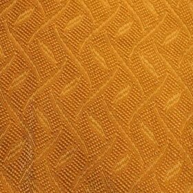
 I asked Lisa — even though she just painted the walls grey — if she would be game for Pam and me to each suggest a wall color for her living room for fun. Lisa says she is always open to suggestions, so Pam and I both set out to pick a color and also a rug for the space, keeping in mind Lisa and her husband’s love for Arts and Crafts style furniture and wanting to tone down the brick. I chose a warm creamy color for their walls (similar to Sherwin Williams Inviting Ivory) to tie in the color of the brick without bringing out the red tones. The rug I chose — found on Overstock.com — coordinates with what is already in the room and also has an Arts and Crafts feel to it.

Pam noticed that Lisa had green curtains and suggested a green from a story she wrote about Arts and Crafts paint colors — from California Paints called Jukebox. I found the green rug to coordinate with this color scheme from Shaw.
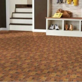
 Even if Lisa didn’t want to change the grey walls, adding a rug to the room would help pull it together and make it feel more finished. This hand tufted grey wool rug from Overstock.com would be a good option.
UPDATE– After several suggestions from readers wondering how the wall color would look wrapped around onto the bookshelf, some further “digital painting” was done and the following shows how each wall color would look if it were carried onto the bookshelf.


Lisa, I hope I’ve given you a few ideas on how to make your space feel more symmetrical — without painting your brick fireplace.