

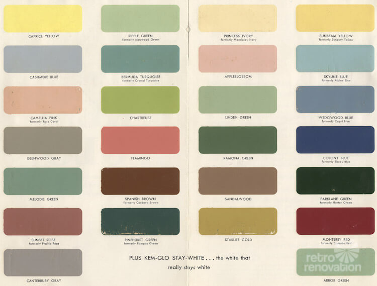
 I was poking around my files this weekend and found this palette of 1954 paint colors for Kem-Glo paints for kitchens, bathrooms and wood moldings. Kem-Glo was a brand of Sherwin-Williams. I’ve inserted the scan below as a very large file, so that you can click on it and see the colors enlarged.
This Kem-Glo palette proudly promotes its latex ease. You can replicate a number of these colors today using Sherwin-Williams Suburban Modern paint palette — our favorite, go-to mid century paint collection. Note, however, you no longer can get these brochures in the Sherwin-Williams store — but, I’ve captured the brochure in my hotlinked story.
 Along with the palette for kitchens, baths, and moldings, I had a booklet from 1955 that showed paint colors for other fooms. Above: A two-tone blue look for this room, which featured very traditional decor.
 Above: Yes, Mrs. America had mad sewing skills and made her own draperies and slip covers.
 Above: Yellow bathrooms are so… sunny. The photo is from Universal-Rundle, another of the relatively big-name manufacturers that made plumbing fixtures for bathrooms in the 1950s.
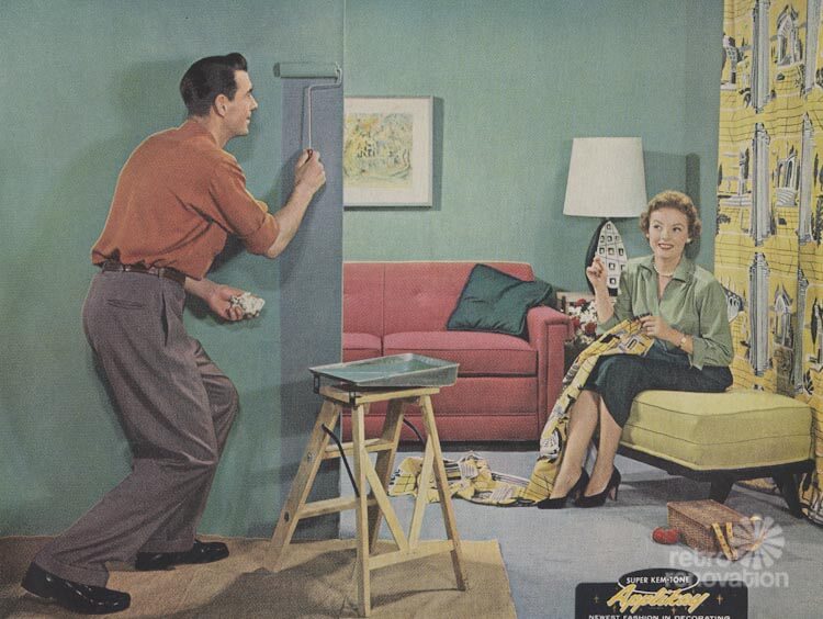
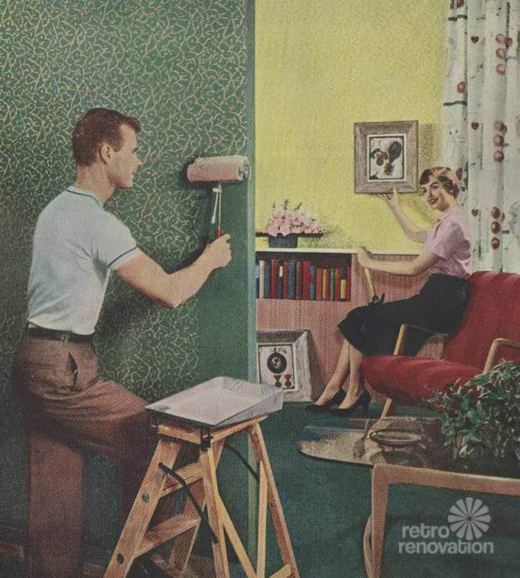
 Above: Sherwin Williams is promoting a paint technique called Applikay. It appears this involves using a special brush to create a second decorative layer, in paint.
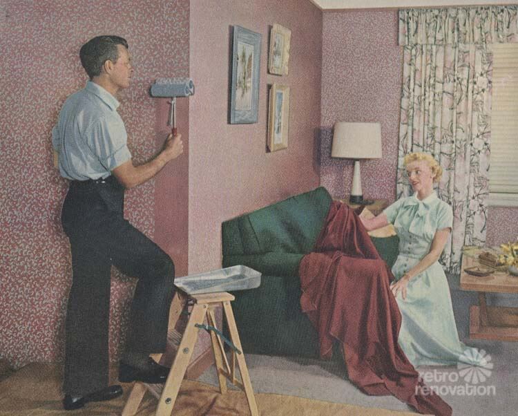
 Above: Another Applikay finish.
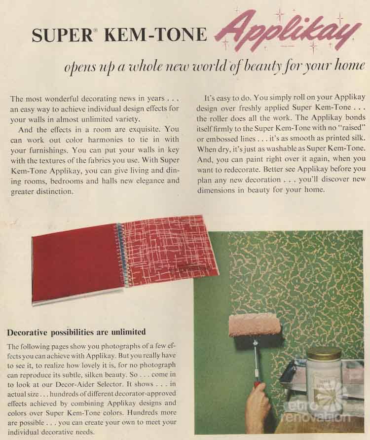
Above: Applikay, explained.
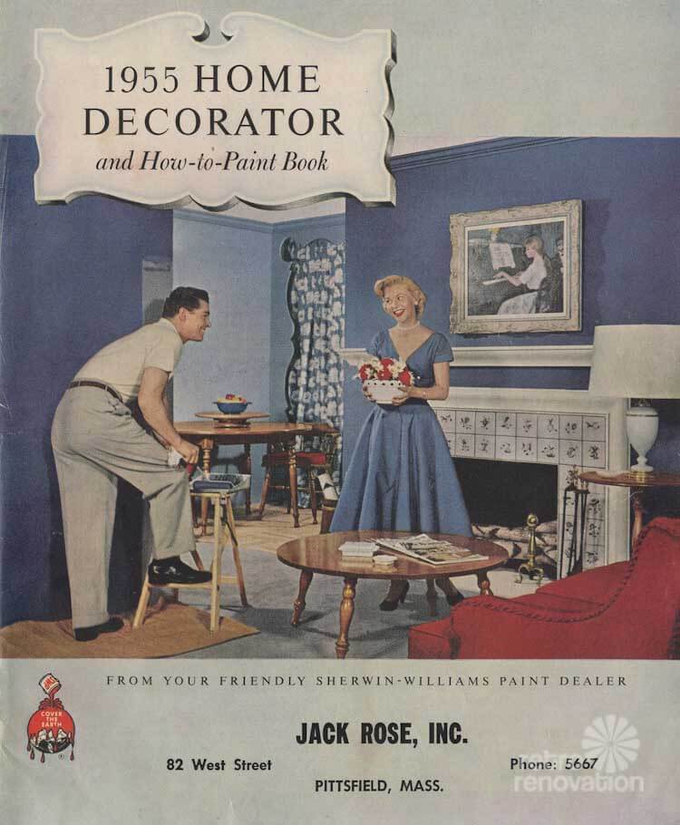
Want to consider additional historic paint collections? See my story: 20 Historic paint color collections available today.


Joe Felice says
The brochures are so quaint. Maybe they should be called “Mr. and Mrs. Clever redecorate.”
KBF says
My parents’ living room was sandalwood with turquoise accents, including a turquoise Kroehler sofa, from 1959 up until the 80s when it was updated with a then-current terra cotta and teal color scheme. I understand the kitchen had a short-lived sandalwood and yellow 1959 paint job, replaced by “celery” for most of the 60s and 70s.
Jen says
Wow. What I wouldn’t do to get my hands on an Applikay brush today!
MaryM says
Love all the comments – my first reaction to these fab ads was “aannd she is hand-sewing…in heels…and he is painting with a tiny stepladder in nice trousers!” Wow. Did ANYONE ever do those things? MY mom refinished furniture all the time in the early 60’s wearing shorts that melted in spots when her cigarette ash dropped on them – no organic cotton back then, I guess. Or anti-smoking ads:)
Tom says
I wonder if Sherwin Williams stores have any kind of cross reference chart behind the counter for older color palettes. An older store especially might have something that could translate these colors to the later numbered colors.
ChrisH says
The colors remind me of 1950s automotive colors. Not all of course, but many of them. There was a time when cars were not greige.
MarilynH says
I have a box of these old rollers in my basement if anyone is interested. I will put a price on them and put them in my Etsy store. I don’t have the holder/frame, however. The PO’s father brought these from Germany.
Carole says
Odd to look at this….because strangely (or maybe not so strangely – maybe I was guided by the house lol), my kitchen is a dark green similar to Forest, the bedrooms are somewhere between Linden and Melodie, the family room is two tones of yellow, the main color similar to Princess Ivory, and although our living room is currently blue (not as dark as the one pictured, but still blue), it’s slated for red or terra cotta, colors that echo Monterey or Sunset Rose.
A lot of people think I’m nuts painting my walls anything but white in Oregon, but we have a lot of windows, so even on dark, damp, cloudy days, light comes in, and I love my painted walls. 🙂
When we viewed this house, ten years ago, the inside and outside were painted a very drab brown. Kind of depressing in our climate honestly. When we bought it, the inside got a clean slate of white (until I could figure out what to do), the outside a dark red. We loved the outside color so much that when the house was resided last summer, we went with the same color.
We’ve loved all of the colors we’ve chosen, and ten years later, we still do. They’re very livable, very comfortable, and they still make me happy.
J D Log says
I’m glad I’m not the only who had that experience inside the house it was painted white, grey and pea soup green. Before I stripped back the paint I would choose a colour somehow I managed to match the original blue in the master bedroom, pink in the kitchen, mauve in another bedroom and green in the loungeroom