

 Here’s another set of vintage and midcentury paint colors to add to our list — the HGTV Home by Sherwin Williams ‘Vintage Finds’ paint color collection, available through Lowe’s. We first received a tip about this paint collection from reader Lisa in April, but were unsuccessful finding any information online. So I took a real-life trip to Lowe’s to look for myself. Sure enough, nestled amongst several other themed paint collections was a cheerful mix of vintage inspired paint colors.

 The photos in the ‘Vintage Finds’ brochure feature a mix of midcentury modern decor from the 1950s and 1960s. This paint collection seems to be a contemporary update to the classic, now-discontinued Sherwin Williams Suburban Modern paint collection — although if you refer to our archived chips, you can still get the Suburban Modern colors.
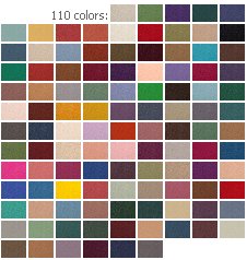
 Like the brochure’s imagery, the range of retro modern styles is reflected in the paint colors themselves. Of the 20 colors in the ‘Vintage Finds’ pallet you will find several cheery colors that evoke a 1950s and early 1960s feel — such as Refresh (aqua), Lotus Flower (light pink) and Dusty Coral… along with paint chips that speak more to the later 1960s — like Amber Wave (bright orange), Red Cent (burnt orange) and Frolic (acid green). To appeal to the mainstream trends, there are also several neutral colors like Softer Tan, Fenland and — gee, golly, ugh, this is why we call this collection a “modern” update to Suburban Modern — the collection includes a color called Perfect Greige. Note: We don’t h*** the color gray — for sure, we see gray used in midcentury homes — Pam says she adores pink and gray bathrooms, for example — it’s just the gray on virtually every surface throughout the house circa-2013 trend we continue to challenge.
 The versatile ‘Vintage Finds’ paint collection has a little something for everyone — and can be used to create looks that are modern or retro, colorful or neutral.
Mega thanks to reader Lisa for the tip!


Douglas Camin @ House on Rynkus Hill says
I’m generally good with grey range colors so long as it’s used appropriately, such as creating a palette for which to introduce other colors, textures and patterns onto.
Great eagle eye spotting this!
tammyCA says
As much as I dislike all the greige of today I realize that there was a lot of grey used in the mid-century. It was prevalent in the barkcloth fabrics, for sure. I have a ’50s/’60s Phillips Babcock vinyl footstool in a pukey putty color that I really want to change out with some aqua naugahyde I bought, so that strange greige color has been around for awhile.
I’m okay with grey if there is lots of bright cheerful colors to balance it out, its when it is all grey on grey & taupe on taupe that makes me crazy.
Debbie in Portland says
I’m not sure any of us loyal Retro Renovators find anything “perfect” about “greige”, I painted my whole house using the “Suburban Modern” and “Jazz Age” palettes a few years ago. I’m glad I hung onto the brochures from both of those.
pam kueber says
My speculation about why S-W and HGTV included these cold grays and greige in this palette: There is so much gray and greige on Americans’ walls right now, that they are eager to coordinate with that color. To be sure, the grays in this palette do not strike me as true retro. Neutrals were warm, not cold, back in the day.
Geronomom says
Nice to see more retro paint options – thanks! Fwiw, that green “Frolic” color is VERY close to the green color (SW “Gleeful”) I used in my Lilly Pulitzer style pink bathroom (featured on this site in a design delimma last fall).
I happen to actually still have paint chips of both “Frolic” (as I was also considering using it at the time), as well as the original SW “Chartreuse”. In a side by side comparison, IMO the vintage “chartreuse” color has a tad more gold in it, whereas “Frolic” is a little more green.
sherree says
Oh I love the Refresh and Dusty Coral!!! And Amber Wave! My whole house (inside and out) is done in the old Suburban Modern Collection. With my current kitchen and bath remodels I may have to go with one of these instead 🙂 Thanks for sharing.
Jess says
Thanks for sharing this updated collection! I used Sherwin Williams Suburban Modern collection to repaint the entire interior of my 1949 Victory Cottage – Holiday Turquoise in the kitchen, Pinky Beige in the living room and hallway, bedrooms in Chartreuse and Radiant Lilac, bathroom in Porcelain (and someday to be re-painted Appleblossom) and laundry/utility room in Flamingo Pink.
I was so pleased to find out that Sherwin Williams could still mix the colors from the Suburban Modern Collection even though they no longer have the paint chips. All you need to do is take in the archived chip from Retro Renovation!
pam kueber says
Yes and be sure to recall Kate’s awesome research on how to get free, 8″ x 11″ samples, which she shared in this story, along with all the Suburban Modern color codes — https://retrorenovation.com/2014/02/24/sherwin-williams-suburban-modern-paint-palette-swatches-secret/
Lynne says
I’m sorry, maybe its just me, or my ancient computer skewing the colors, but I don’t see where these colors are anywhere near vintage. Maybe in person they will be more reminiscent of what I would consider a close reproduction.
pam kueber says
I’m liking the “real colors” rather than the neutrals — with the exception of the Choice Cream, that looks like a good one.
Robin, NV says
Was loving the kitchen on the cover of the brochure until I saw the second angle showing the greige walls. “Greige” – even the word sounds unnappealing.
Peyton says
This is fantastic. Every post you do seems to always knock it out of the park. Your research and images are so detailed, accurate, visually appealing and well-written, this site really stands out. The fact that it’s all about things that I love makes me feel lucky. Thanks!
pam kueber says
Why, thank you, Peyton!
Patty says
Looked at these last week but couldn’t find a good turquoise blue. Did I miss it?
pam kueber says
Follow the links in our stories and also check our categories. Here’s the old collection, check out Holiday Turquoise: https://retrorenovation.com/2014/02/24/sherwin-williams-suburban-modern-paint-palette-swatches-secret/
Sydney says
I don’t know how bright of a turquoise you’re looking for, but I just picked a swatch from this collection for my wooden screen door last weekend. More of a robin’s egg/aqua than a really vibrant turquoise, but it’s nice. It’s called Refresh, #SW6751