

 After Pam published her story on the Light Reflective Value (LRV) of paint colors, we both started to wonder about the paint choices we had already made in our homes. Neither one of us had any knowledge about LRVs prior selecting paint colors for the interiors or our homes — and we wondered where our choices would fit on the scale. Since Sherwin Williams paint chips list the LRV of each color right there on the chip, and I have exclusively used their paint colors in my house, checking my LRVs would be a quick and easy way to see how my wall color choices affected the feeling of light on the interior of my home.
I chose all of my paint colors without having any knowledge of LRVs. All of these paint colors have been up on my walls for anywhere between two and five years, and for the most part, I like all my choices. I chose the paint colors based on a few criteria:
- The color must look nice with the original medium warm oak trim and the hardwood floors (when applicable)
- I must really like the color by itself — meaning not choose a color that would look good in the room but is not a color that I gravitate to otherwise.
With these two criteria in mind, I realized that most of the colors I was choosing were much more pastel than the colors I had chosen for my first home — a small cape cod style house that I painted in a rainbow of bold colors. The reason for this change was not my sudden dislike of bold color, but the reality that my old house had all white trim — which reflected light and looked good with just about any color — and my new house has medium oak trim with an aged, orangey cast to it. I love my medium oak trim and I feel like it is very versatile, but it did make me tone down all of my favorite color selections from the first house and use their more pale hued, brighter relatives for my 1962 ranch.
Kitchen
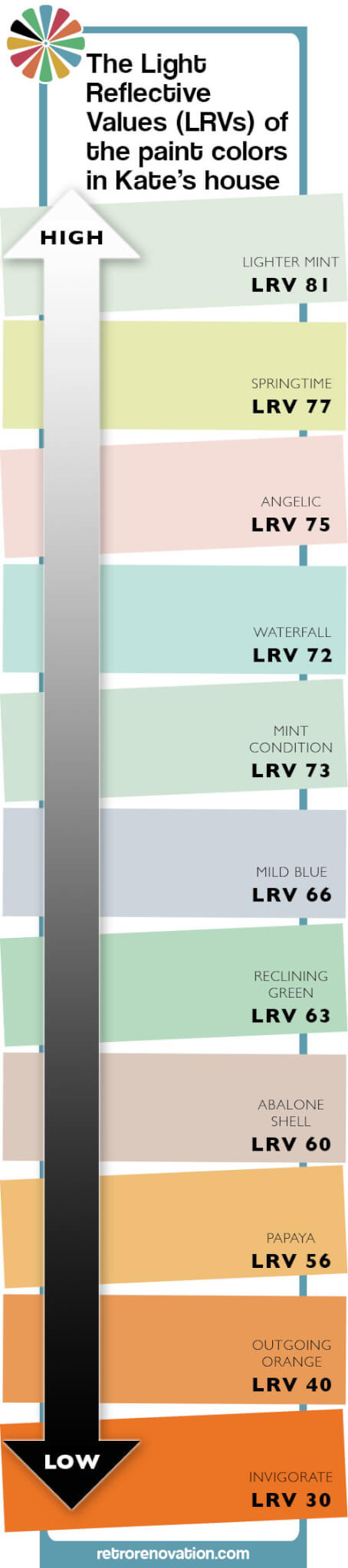
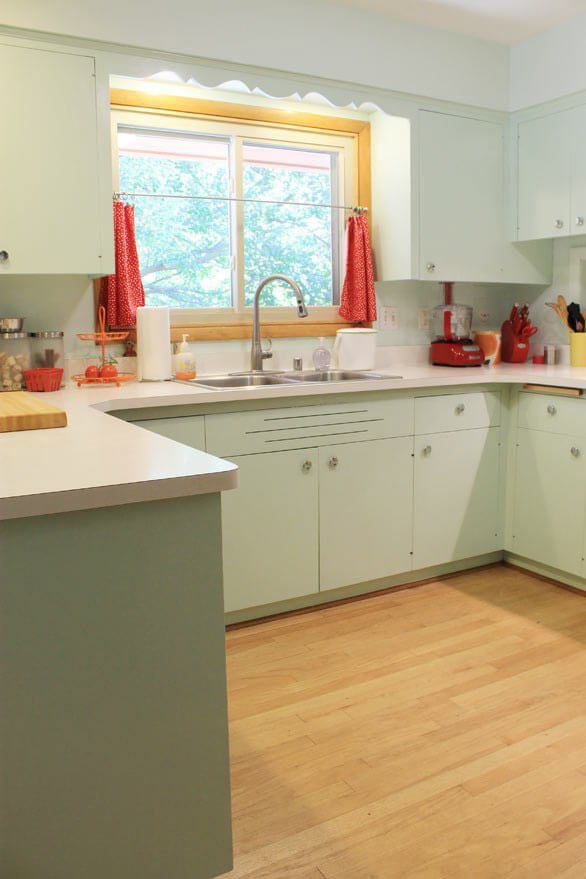 Let’s start in my kitchen. The room gets a lot of morning light since it faces east, but in the afternoon and evening, the amount of light diminishes. The cabinets were originally a medium oak color, but they were in bad shape, so I decided to patch and paint them during my mini kitchen remodel. The white ceiling and countertops really helped lighten up the space and I saw painting the cabinets as an opportunity to inject even more light into the room, so I chose “Mint Condition” LRV 73 for the cabinets and one shade lighter “Lighter Mint” LRV 81 for the walls.
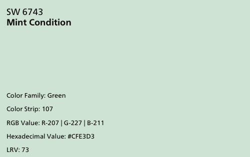
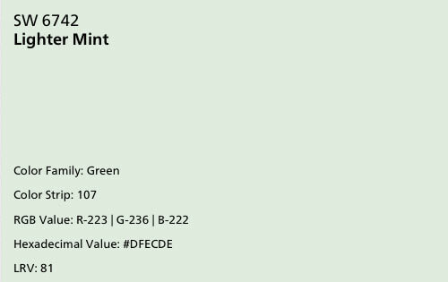
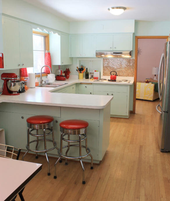 Choosing these high LRV colors has really helped to brighten up my kitchen during cloudy days and late afternoons.
Living and dining room
 My living and dining room are on the opposite side of the house from my kitchen with all the windows, including a giant picture window — facing west. Even on overcast days — like the day I took these photos of the space — this room is filled with light. The room is also quite large and open with many different wall angles, so I wanted my paint color choices to help to make the room feel cozy, bright and interesting.
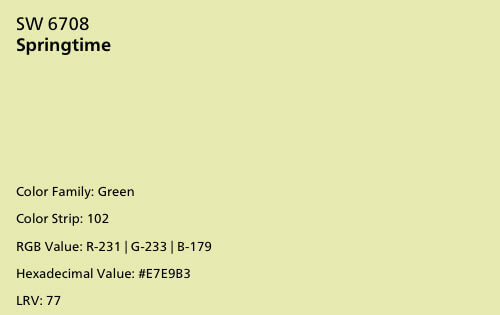 I ended up choosing three colors for the space: “Springtime” LRV 77 for the long window wall and the wall that goes through the entryway and into the den. I decided on this sunny, cheery green because I thought it would help bounce the light around the space and complement the orangey tone of the woodwork around the doors, windows and built in planter divider wall.
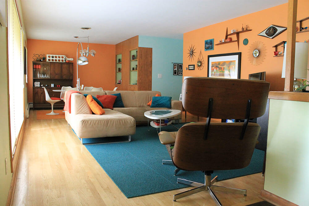 I didn’t want to paint all the walls this citrusy green because I thought during peak natural light hours, like late afternoon, the room would be overpoweringly bright, so I chose two accent colors “Waterfall” LRV 72 and “Outgoing Orange” LRV 40 to use as accent colors. Before my mini makeover of the kitchen, the kitchen walls were painted “Waterfall” and thus I carried the color through the hallway between the living and dining room where it peeks into both spaces.
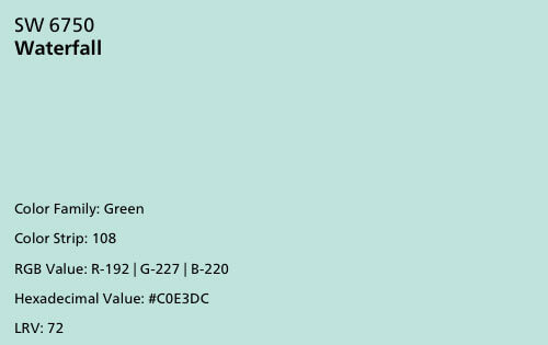
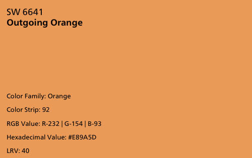
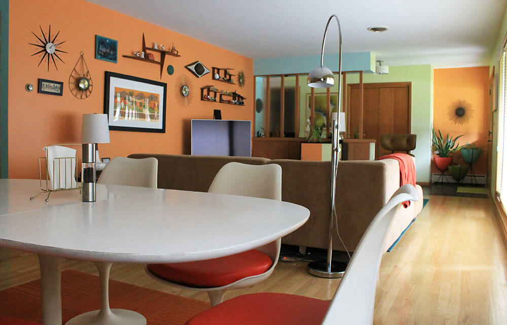 You can also see a touch of “Waterfall” on the small piece of soffit on the planter wall, a decision I made to repeat the color one more time in the room to help it make more visual sense. I painted the wall opposite the large bank of windows “Outgoing Orange” for a few reasons: 1) because I love orange and wanted it to be the color I saw while relaxing on the sofa, 2) because the orange color coordinated well with the medium oak paneling on the bottom of the planter wall and in the dining room, and 3) because adding a deeper, warmer orange to the space makes the room feel more cozy than if I had painted that wall the “Springtime” green color instead. I chose not to paint the entire room “Outgoing Orange” because I was worried it would be too overpowering alongside all of the trim and wood paneling. Now that I know about LRVs, I realize the “Outgoing Orange” with a lower LRV of 40, helps absorb the light from the wall of windows opposite of it and keeps the room from feeling too washed out. I also used the orange on the inset bit of wall just inside the front door as a way to accent the small niche of space.
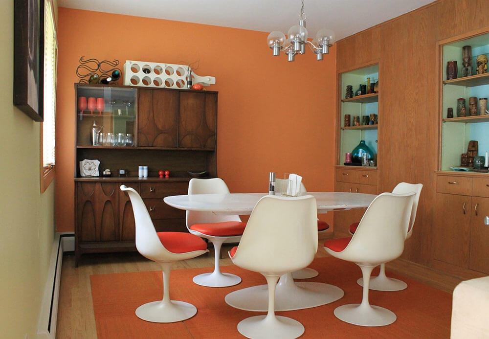 I wanted to create the same cozy feeling in the dining room, and since the wood paneling almost reads as orange, I felt that putting the “Outgoing Orange” on the back wall of the dining room made sense to help create a warm and inviting corner of the room for dining, plus I wanted my tulip dining set to really pop out and the orange wall color — plus the addition of an orange rug — helped create a nice contrast to the bright white table and chairs.
Den
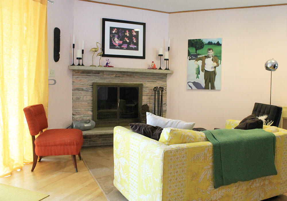 Even though I kept the wood paneling in the living and dining room, I felt that it was just too much in the small den with only a pair of patio doors to allow in natural light. I wanted a wall color that would really help light up the room — and coordinate with the quartz fireplace’s pink, purple and pale gray tones — so I went with a pastel pink. “Angelic” has a LRV of 75 — whereas the wood from before was probably closer to an LRV of 40 similar to the orange in the dining room — and changing the wall color really helped to make the space feel lighter and brighter.

Master bedroom
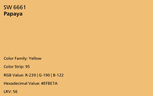
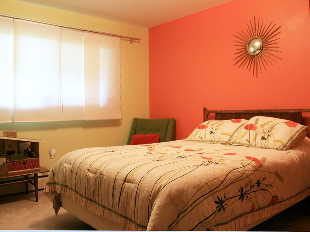
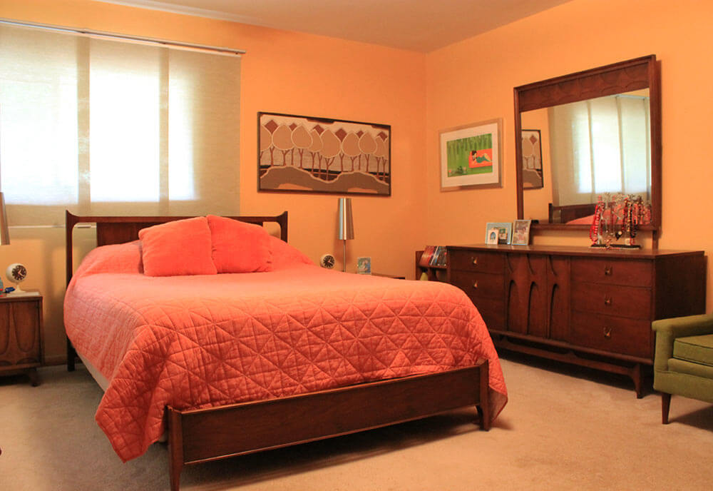 I wanted the master bedroom be a cozy retreat without being too dark overall, since my Broyhil Brasilia bedroom set is dark walnut. I also didn’t want to go with a very pale color since we have sheer curtains on the windows that let in a lot of natural light even when they are closed — we like to sleep in on the weekends! I ended up choosing “Papaya” LRV 56, which is right around the middle of the LRV scale and has been the right mix of warm and cozy without feeling too bright or too dark. The medium wall tone is a nice backdrop to the Brasilia pieces and allows them to pop off the wall more than a deeper, darker color would. I can see why mid range colors are popular!
Pam adds: After we initially wrote the story about LRVs, color expert Lori Sawaya (who we had linked to) clarified why it’s recommended that homeowners — perhaps, especially those who are just starting to develop their design skills — give mid-range LRV paint colors a try. Lori explained:
50% LRV as a guideline for residential interiors is about balance, visual ergonomics, and creating a human supportive environ. Mid-range paint colors tend to ‘average in’ among the other contents in the room, which means there are no harsh or super dramatic lines of contrast. The result is an atmosphere that’s easy to live in and colors that are easy to live with.
Master bathroom
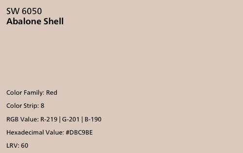
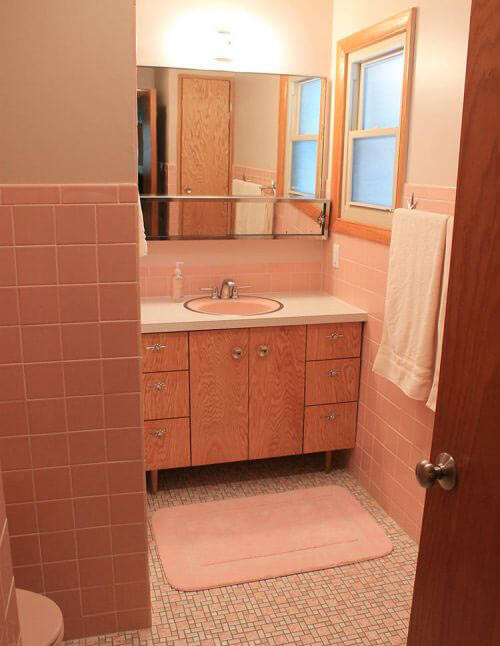 I’m sure you were all as shocked as me when colorful Kate chose a warm beige for the walls in my newly completed retro pink master bathroom, but this color plays so nicely with the salmony pink tiles and the block random floor. In fact, I chose “Abalone Shell” with a LRV of 60 because it was very close to one of the beiges in the block random floor. The value of this beige also is close to the pink wall tile, creating a cohesive feeling instead of a sharper divide between wall and tile that a much lighter or much darker color would create. Overall, the room has a very pleasing feel, partially because of the ‘retro botox’ effect and partially because it is in that mid range of LRVs that are easy on the eye.
Office
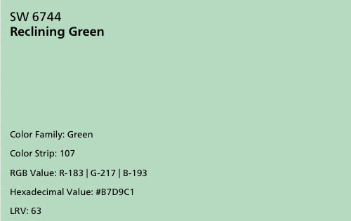
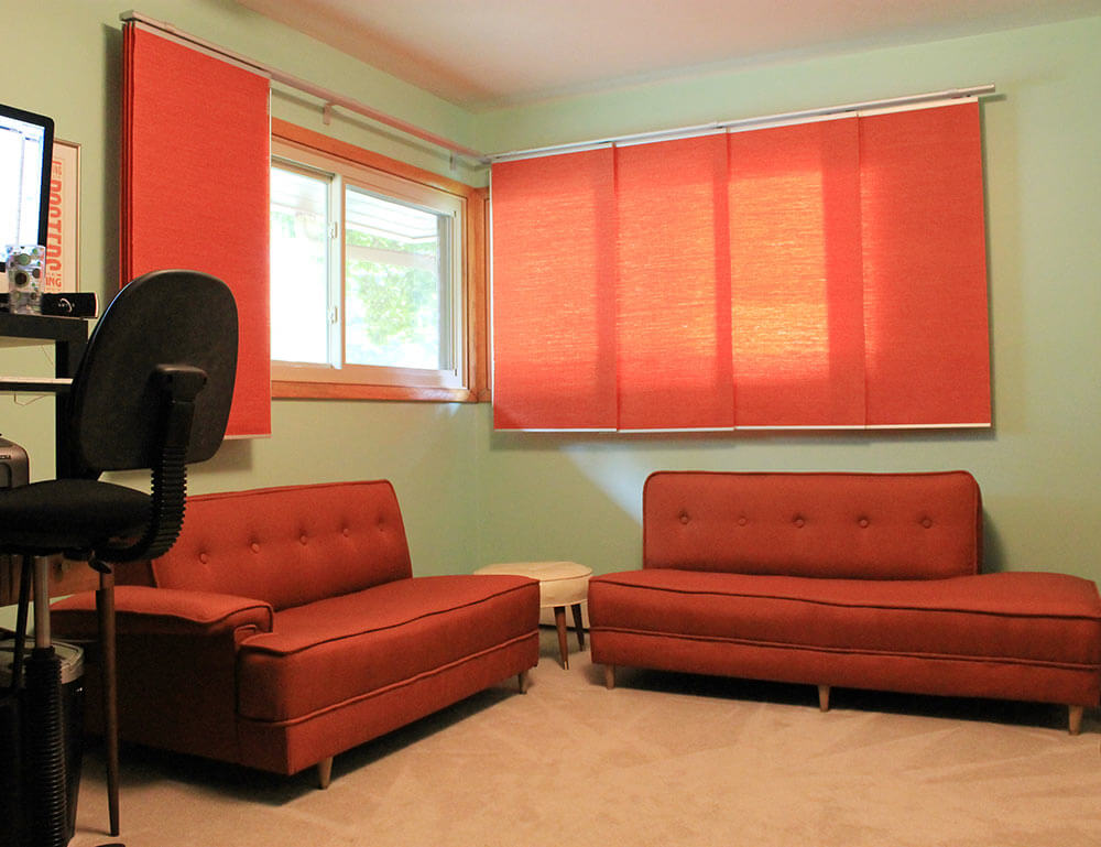 In my office, I wanted a nice, soothing color on the walls since I spend many of my waking hours in here while working from home. I chose a nice minty green — “Reclining Green” with a LRV of 63 — because I thought it complemented the wood trim and coordinated well with orange, which happens to be one of my favorite colors to decorate with, could you tell? I painted the room this color before I got the orange drapery and reupholstered the vintage sofas, so kudos to me for planning ahead.
Hall bathroom
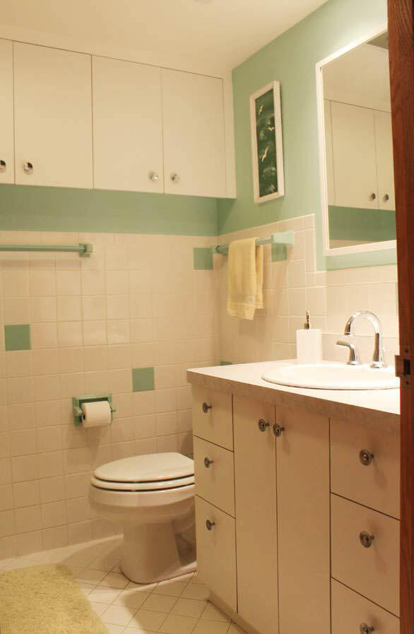 I didn’t know it when I bought the gallon of “Reclining Green” for the office, but this color was nearly a perfect match for the green tile and tub in my original hall bathroom. I decided that painting the few small bits of wall not already covered by salt and pepper white tiles with the “Reclining Green” would help the random green tiles feel more intentional and create an overall cohesive feeling to the space. It was a small change, but adding just a little bit more light absorbing color to this previously glaring white small space really helped it feel more visually comfortable.
Guest bedroom
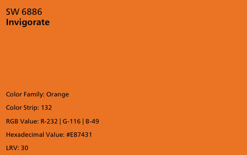
 When it came time to decorate the guest bedroom, I didn’t want to spend a lot of money on the space, yet I also wanted it to be versatile and a place where I could rotate furniture through as needed — I like to switch things up! Since much of my furniture and decor is orange and green already, I decided to recycle those colors in the guest room. I used leftover “Springtime” LRV 77 from the living and dining room on three of the walls and purchased a small can of “Invigorate” LRV 30 as an accent wall color. The room is nearly a perfect square so I felt that making a high contrast accent wall would help give the room a focal point and make it feel less like a square box. The darker orange accent wall also keeps the room from feeling too bright overall and interestingly enough, if you average the LRVs of the two colors — 77 and 30 — together, you arrive at a middle of the road 53.5.
Laundry room
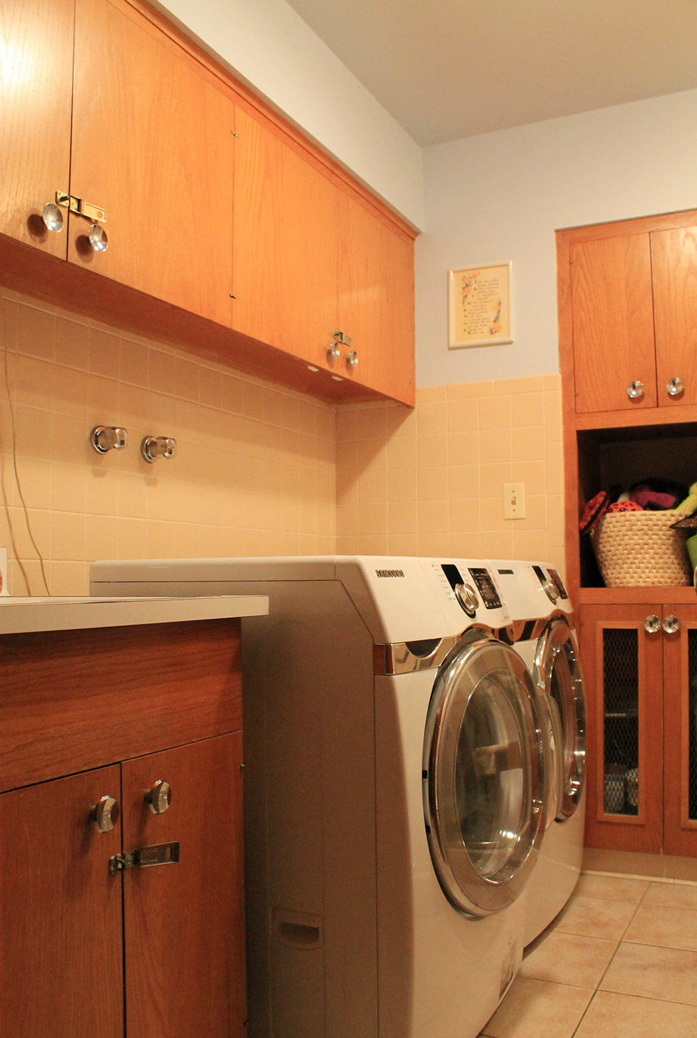
Of all the colors in my house, my least favorite is the “Mild Blue” LRV 66 that I chose for the few small wall areas and the ceiling of our cramped laundry room. At first, I chose this color because it is complementary to the peachy wall tile and the orangey wood cabinets — blue and orange are complementary colors on the color wheel. But after living with it for nearly two years, I’m not sure it was a good choice for the space. The laundry room receives little to no natural light and this color — though technically a blueish purple — reads as far too close to grey in most light. I had hoped it would feel more like a periwinkle, but I fear it is robbing the room of light, despite its high LRV of 66. For now I’ll live with it, even though the total painting time to change colors in this small space comes in at about two hours or work time.
 My color selection throughout the rooms in my home was successful despite having no prior knowledge of the LRV scale. I think the reason for my success was a combination of my years spent in art school learning about color theory and taking the time to notice how the natural light in each room changed throughout the day, to identify whether each room required a color to help lighten or darken the space. Learning more about the LRVs of the colors I use in my home has been fascinating — especially since it was after I have used my other knowledge of color and decor to decorate the spaces.


Zovesta says
Your house is GORGEOUS! It’s like a time capsule, but still livable in the modern age. But I admit, I’m not a fan of orange… aside from swapping orange for cotton candy pink, I think I could more or less just copy your entire home palette and be one happy camper! It’s perfect!! I’ve never thought about LRV before, but it makes sense, I’ll definitely have to consider it when putting together a home palette. Thanks for the post! 🙂
Juli says
Nice use of color. The SW 6533 Mild Blue is usually a fresh color, but in low-light situations, colors always appear more gray than usual. I suspect that’s what happened in your laundry room. Also, it is from a more muted section of the Sherwin Williams palette than the other colors you used – the 6500s are not as bright as when you get into the higher 6000s, like the 6700-6800 range. Those colors are clearer and a similar blue tone in that part of the deck would give the effect you’re wanting. But good job on the house!
Joe Felice says
WHAT–you don’t think wallpaper has LRV? Get with it, girl!
pam kueber says
Yes, I am sure it does – but the LRVs in paint come from actual testing on some sort of machinery. No numbers for wallpaper. The concept, which I now understand much better — still applies, though!