

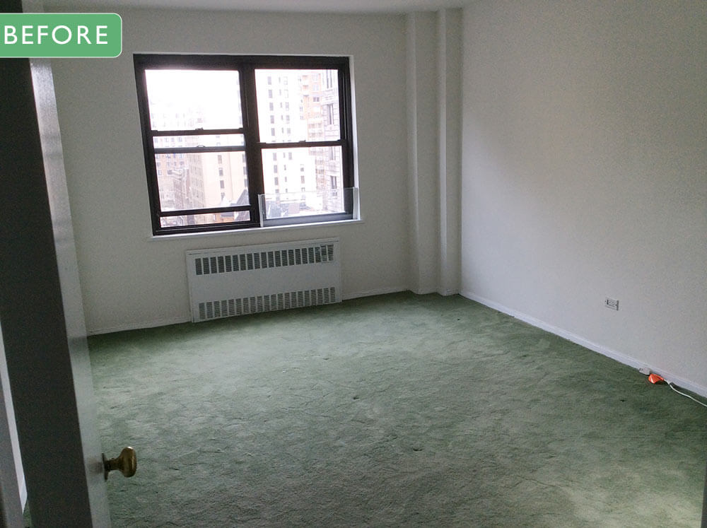

Back when I started the blog in 2008, several readers turned me on to Brini Maxwell — actor Ben Sander reimagined as a delightful decorating and entertaining diva. Brini (that is, Ben) had her/his own TV show for a few years, with a loyal cult following. It was great! While Brini’s take on style-makers presented as parody, there is nothing artificial about Ben’s talent for interior design: This man can put together an exciting room, and like us, he likes to up the challenge ante by finding and using lots of vintage materials. Now, amidst a continuing boom in retro decor, Ben has launched his own interior design business, with a focus on “20th Century-inspired statement interiors.” That means: Peeples, prepare your eyeballs — “statement interiors” are not for the design faint of heart. Today, let’s take a look at two “white box” bedrooms that Ben made over into sexy 1970s sensational.
Ben Sander’s interior design style
Before we jump to the after, an email Q&A with Ben Sander.
Tell us why you decided to transition from being a performer to interior designer?
I think second acts are fun, don’t you? I was lucky enough to have a potential client contact me to see if anyone associated with my television show did interior design. It’s always been a passion of mine — ever since I saw Auntie Mame, and her constantly redecorated apartment, as a child. Of course, I jumped at the chance. It was a dream of a first project — the client, who is an absolute doll — wanted me to do exactly what I love. He essentially gave me free rein. This doesn’t mean, however, that I’m done performing. I’m just adding to the repertoire.
How do you describe your style… your approach?
20th Century inspired statement interiors. I like the latitude that affords me. While my focus has certainly been the period between 1957 and 1976, I love the idea of capturing other eras of the 20th century. I recently worked with a client on a project that was very much based in the early 90’s esthetic of the Goodman/Charlton designed Duo line — all velvet and curves. It’s not my favorite period, but I understand it, and can work in it. I would love to do over an apartment in art deco or moderné, and ultimately, I’m coming around to some of the 80’s esthetics…
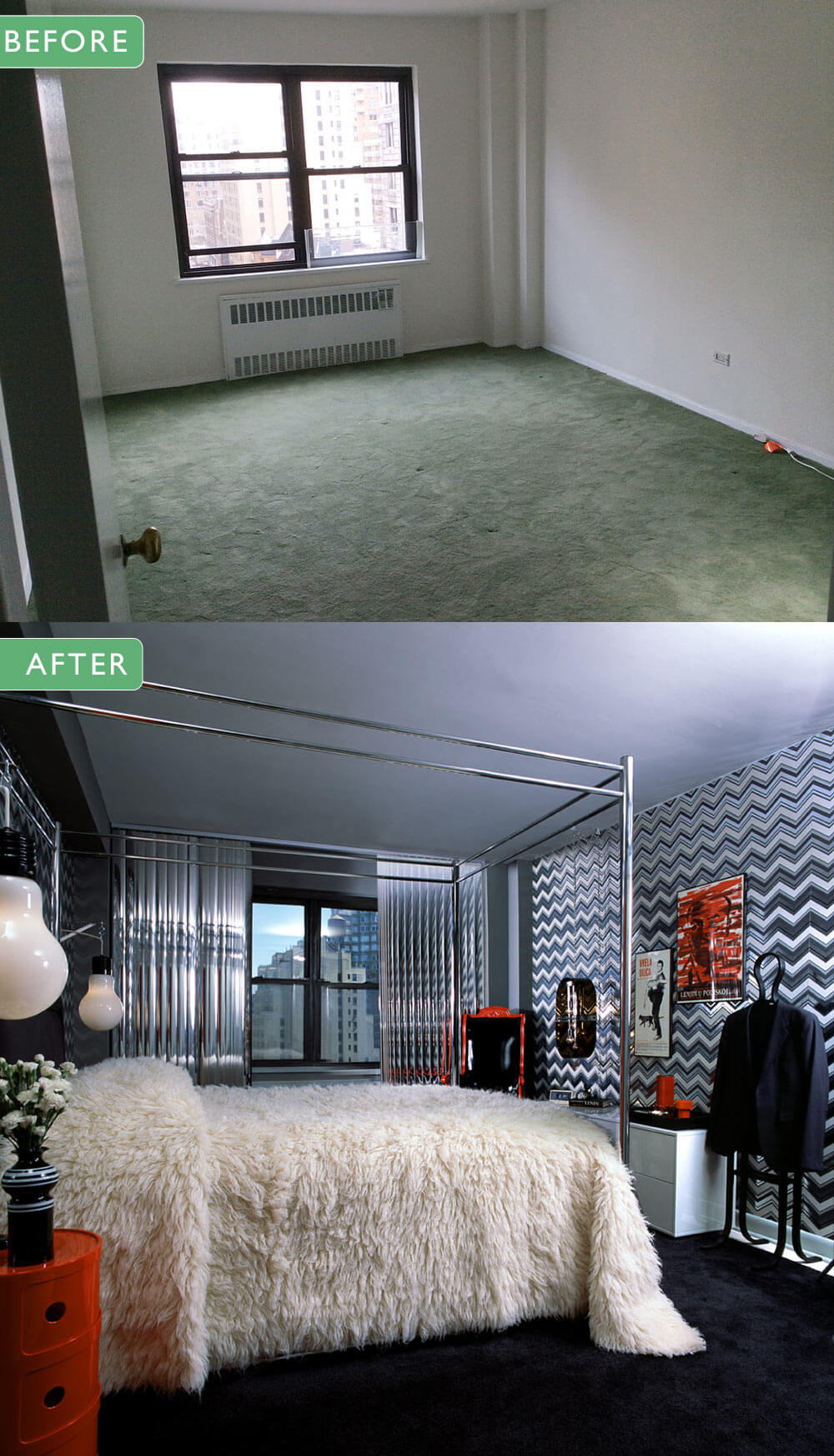
The master bedroom: Mylar, mirrors and chrome glamorous
And that blah white box, after? Ben tells us:
The master bedroom is dominated by a dramatic chrome four poster bed (found on eBay) dressed with a flokati rug (from Overstock.com) as a bedspread. The headboard wall and the wall opposite it are papered in the same chevron pattern from the hall, only in grays on a silver mylar ground. The window treatments are mirrored vertical blinds.
A flotaki rug as a bedspread! Dig those oversized light-bulb lights (they come up on ebay now and then, super cool). And mirrored vertical blinds — oh my! Notice: Statement interiors like those don’t need a lot of art on the wall, and be wary of clutter — each element is carefully chosen so that the whole maximizes the sum of the parts — it’s a room for neatniks.
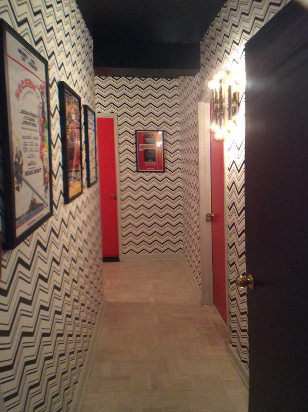
The master and guest suites both are accessed by hallways. I unified the halls by using the same black and white chevron wallpaper from York in both. The ceilings are black and the doors off the hall are red (in the master suite) and green (in the guest suite).
The guest suite: Vintage Vera Neumann fanciful forest
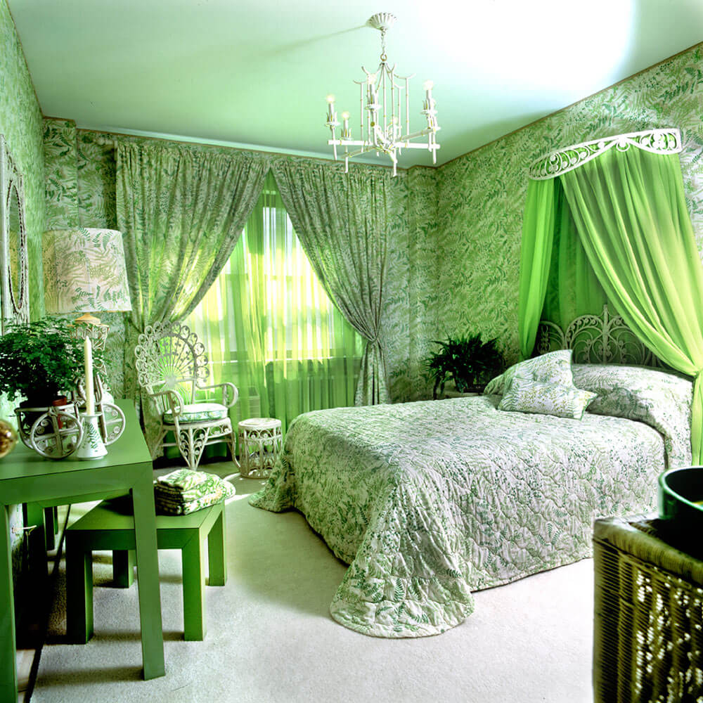
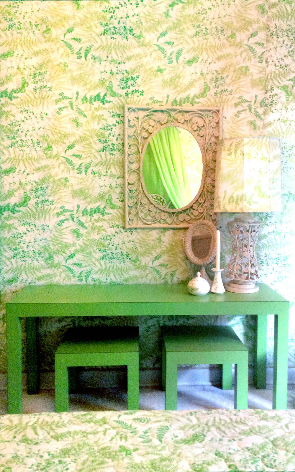
We love our vintage Vera Neumann, and so does Ben, who went VV Crazy in a Good Way in the guest bedroom. He tells us:
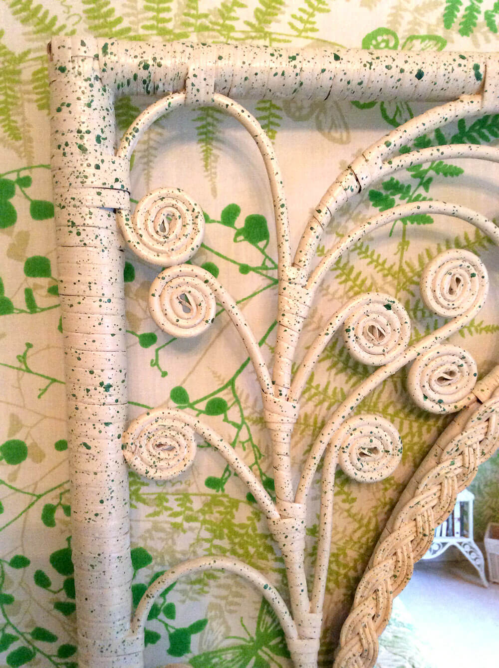
This is the guest bedroom. Because it’s not used every day, we could make it a little more fanciful. I used vintage Vera sheets in the Shadowfern pattern almost exclusively in the room. This worked out well because that particular pattern was everywhere back in the 70’s, so it’s quite easy to find on Etsy and eBay. It was also quite a bit cheaper than buying matching paper and fabric at a design house. I upholstered the walls in it, covered a lamp shade, made cushions and used it for window treatments. Because the pattern was so popular, they also made bed spreads in it, as well as towels (for the guest bath), and even a line of china, of which I used the candle holder and sugar bowl as accents. The furniture is all Victorian revival wicker from the 60’s and 70’s that’s been painted creamy white and flecked with green stain. I was even lucky enough to find a canopy for the bed. The formica parsons table was a thrift shop find that was used on my television show set.
What next for you… and what do you think is next for the world of interior design?
Right now I’m actively looking for clients. New York is a great market for working in interior design, but I’m also exploring Palm Springs, CA. It’s a natural fit for the kind of work I do.
As for interior design, I think the way a designer works with a client is changing somewhat. There will always be clients like the one I had for this job who want their whole place done over from scratch, but (and this is thanks to the internet, somewhat), I think there are more opportunities for consultation now. There’s a whole new breed of clients that just want some guidance and advice. That’s an exciting development, because it allows a designer to market to a whole new group of people, and it allows people who normally couldn’t afford to work with a designer the opportunity to take advantage of that service. One of the nice things about interior design that hasn’t changed is that it’s about relationships. If you do a good job for your client and provide value in your service, then you have a client for life. They’ll keep coming back to you for additions and revisions of the design, and also for new projects.
Thanks, Ben!
Tomorrow: A look at the kitchen and bathroom that Ben designed for the same apartment. Added bonus: They feature World of Tile tile!
Link Love:


Ethel says
Beautiful! It’s great to see some authentic Seventies design, instead of the mish mash of twentieth century stuff that people assemble and call Seventies. My granny had Lilly Pulitzer fabric in her guest rooms, used just like the Vera Neumann but much nuttier. Those Seventies rooms awash in loud, loose prints always feel like home to me.
Joe Felice says
Wow! Talk about eschewing greige! And here I thought I was the expert at that. The rooms are “fanciful,” for sure. gorgeous, but I’m not sure I could live in them for very long. Yet and still, I admire the designer’s creativity and boldness.
pam kueber says
But you will notice: Chevrons! The only time I’ve ever let them on the blog, I think !
Kate in CT says
I have died and gone to heaven. I had that white wicker furniture as a kid way back when. And Vera! The best. I am truly inspired for our upcoming home purchase.
Mary Elizabeth says
Lovely vision! Vera Shadowfern sheets, along with curtains I made out of matching flat sheets, were in my very first home–remember the hot dog stand washed up on the beach and made into a cottage?
Alex says
Its fun to see this style because in the 1970s people were not afraid of going bold. there were no limits back then the bedroom pictures look like covers for magazine they are that fantastic.