

 Laura wants to add color to the walls of her pattern-on-pattern-on-pattern 1957 bathroom — we looked at it here last week. But, with only brown and beige in all the patterns, what color should she choose? You know me: I always welcome a chance to promote: Wallpaper!
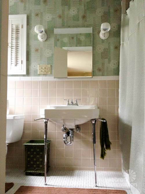
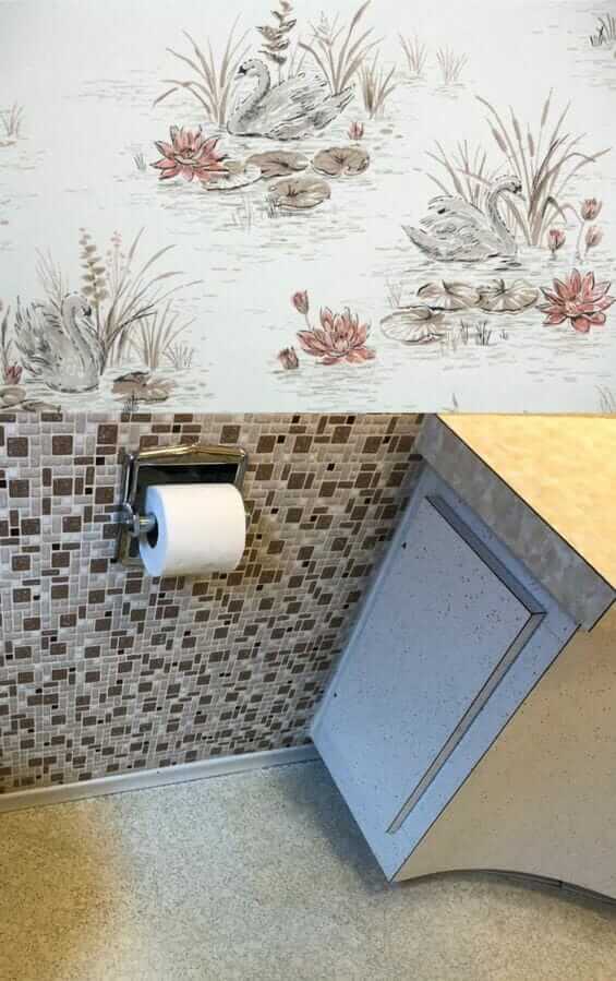
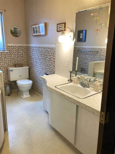 Above: Laura’s bathroom, walls painted a beige that looks to match one of the tiles in the mosaic wall. The wall color, and overall effect within the room, is nice. But: She is a fan of color.
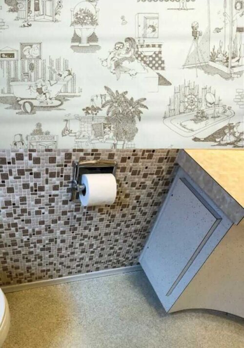
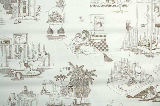 My first choice of wallpaper for the space (without spending, like, 80 hours doing research, which is what I’d do if it were my bathroom, ugh): A vintage 1970s wallpaper in a cheeky illustration design from Hannah’s Treasures that might be super fun. Mermaids! Toilets full of plants! A scuba-diving shower!
I recall that Laura said that two children, boys, use the bathroom — surely this would make them laugh and show off the bathroom to anyone and everyone who visited forevermore.
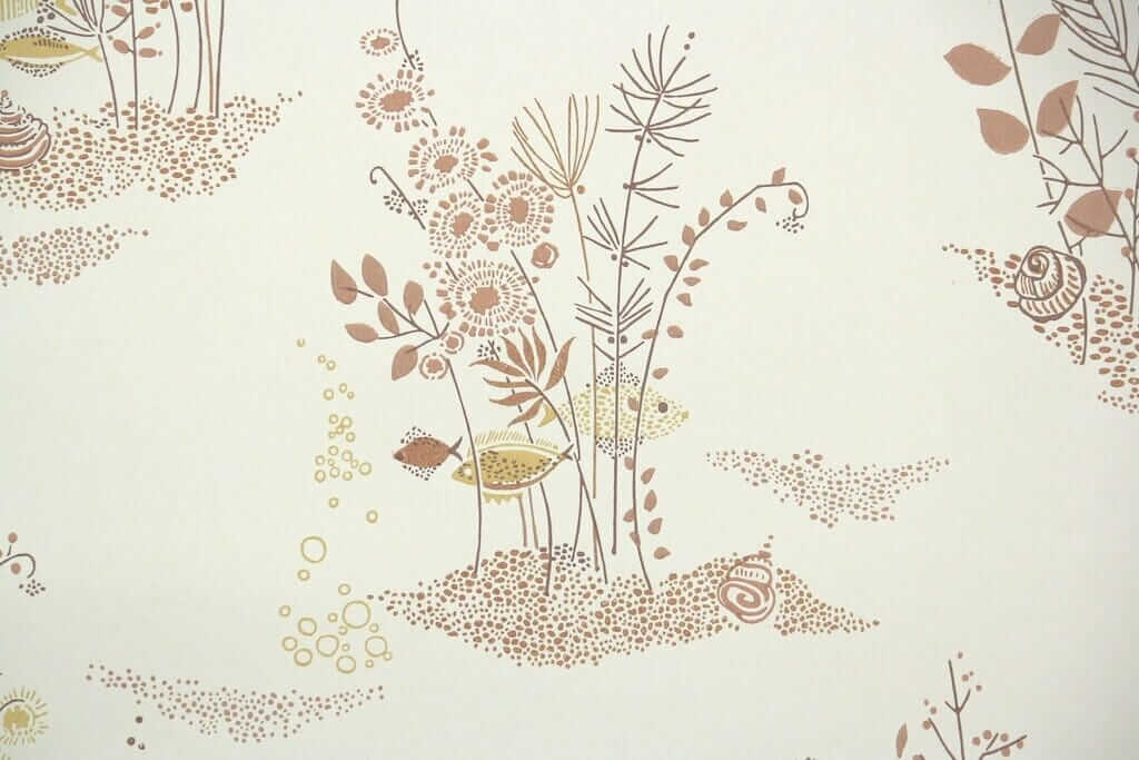
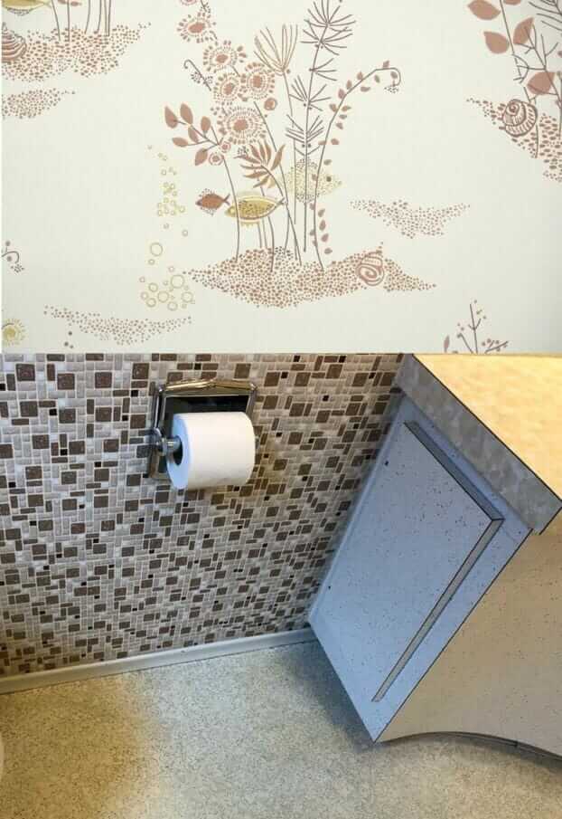 Should Laura paint or wallpaper the walls in her 1957 bathroom? Her bathroom is so densely patterned, I say: Just go with the flow and add more pattern — add wallpaper. Above: A more serene — but very atomically appealing fish under water scene wallpaper from Hannah’s Treasures.
 With any wallpaper, you need to be sure to see a sample first, to ensure the hues, scale and shapes — all of it — are correct. For example, I tried some other brownish patterned wallpapers, but the browns were too red or something, they looked clashy. Laura is an artist. She doesn’t need my help choosing a harmonious pattern, if she is game for wallpaper vs. paint.
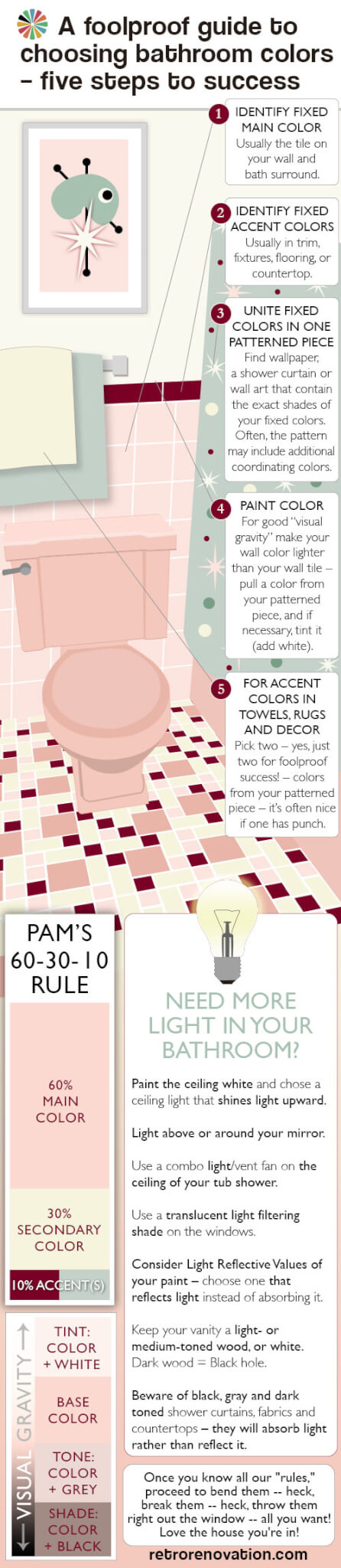 Choosing a single solid color-color (of the rainbow, not a neutral) for Laura’s bathroom is so difficult because there are no color-colors in any of her existing patterns, which are so dominant. And one of the first possible rules of pulling together a pleasing decorative palette is: Where’s your pattern? It’s from there that you pull your secondary and tertiary colors. See my guide above — it explains all.
- Or how about, stencil a pattern on the walls instead? See this story about eight ways reader used stencils to get the ‘wallpaper’ look on their walls.
 If Laura really just wants to paint, I think what I would do is: Find large-scale artwork, or multiple pieces grouped together, that include her existing pattern colors plus one or more color-colors. Then, take your wall color from one of those additional colors in the artwork. Looks like her ceilings are pretty high. To get a color on the wall, like I said, I wouldn’t go too dinky with the art on the wall. It’s a Goldilocks situation. Not too big, not too small, with the artwork, to sneak the color color from it, in there just right. You know, the mobile is so pretty, you could do it with that if its elements were the correct colors — that is, brown, beige, black — and your extra color color. Perhaps: Minty green… a seafoam like in the first vintage wallpaper in my own beige bathroom?
That said, I’m still liking, way better, the idea of tone-on-tone-on-tone color and pattern in this bathroom. Sticking to the more narrow color palette gives the crazy pattern mashup serenity. Like: It’s very clever — decorating genius — if you can cram pattern everywhere and still have it feel — calm.
 One more wallpaper idea — this one looks like it could cleverly sneak a rosy red into the room. This shade of rose red is sooooooo 1950s perfect. Howdy, Hannahs!


Lori K Oliver says
Blue surf mural. https://www.pbteen.com/products/wave-rider-wall-mural/?catalogId=90&sku=2043693&cm_ven=PLA&cm_cat=Google&cm_pla=Decor%20%3E%20Murals&cm_ite=%5B%5BPLA%5D%20-%20Good%20Desktop%5D&gclid=CjwKCAiA8vPUBRAyEiwA8F1oDNdoeolMu_VjUoRfow6KeomPlmOIFvRYVzxjDMNgShAALzTs6a6YaBoCTdAQAvD_BwE&kwid=productads-adid%5E209795474136-device%5Ec-plaid%5E325329305651-sku%5E2043693-adType%5EPLA
carol says
Since it is a boys bathroom- I think you should go with a bolder color. I think the rosy red in the bathroom or yes, an orange would complement the tiles.
Jon Ritt says
Definitely paint … could be stripes. Vertical stripes would be welcome contrast/complement to tile. Should be predominant blue, could have white or cream to lighten it up. Blue works so well with browns/tans/beiges — kind of opposite on the “color wheel.”
Rick Holt says
I don’t like any of the wallpaper choices you’ve featured for Laura’s bathroom. I would have liked to see a 50’s Automaton print with some color or something that looked like colorful 1″ vintage tiles. I guess it depends on her taste. I too like color and fun. She could also add a border of ceramic tiles above the tiled area; maybe in a black or burnt orange. Just have fun with it!
akd1953 says
What not a metallic paint that matches one of the tiles? I think wallpaper would be too much as the tiles are small and busy.
Jo-Ann says
I do love wallpaper but in that bathroom with the fairly busy small tiles I would go with a solid colour. And I think a mint green or light turquoise would give it a pop of colour which the bathroom needs. If choosing wallpaper I would go with something like a grasscloth which looks almost solid.
Evan Degenfelder says
I’m so NOT a fan of wallpaper (having had to remove so much of it in home restorations) that I would vote for paint. A compliment of brown, a blue/blue green/aqua-ish tone.
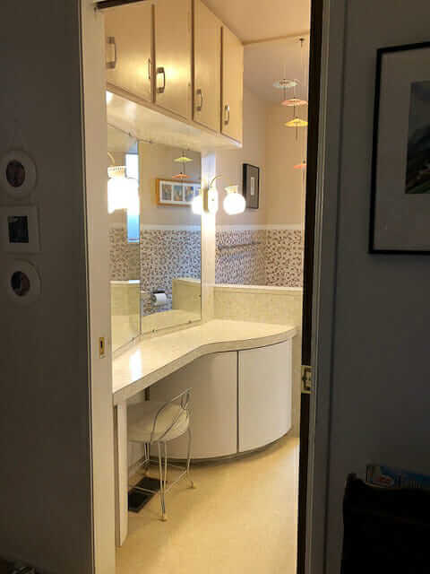
I’ve just never cared for wallpaper especially in damp environments like baths and kitchens. I really REALLY like that vanity!
DJ says
When I’m decorating, there are two questions I ask before making any kind of decision: 1). How will I look in this room? And, oh wait, that’s the only question that really matters. Because I believe a room is like an outfit, and therefore, you should decorate with what looks good on you, and then the outfit -and room- will make you feel better. So for me, no yellow, orange, tan or brown tones, as I’m a winter and need cool colors to compliment my skin tones. Luckily, I’m drawn to colors that look good on me, as I have strong vanity genes. 🙂
So when we were faced with a house with two bathrooms that had been remodeled with brown and beige and a low budget to work with, I painted the walls plum to bring out the pink tones in the bronze fixures (love my bronze fixtures!) and tone down the tan/beige in the flooring and counters. The guest bathroom is a deeper plum than my bathroom (I went more dramatic for the smaller room), but they are both on the smokey/dusty plum side and compliment the brown tones well. Plus, I look good in plum! So when I look in the bathroom mirror, I don’t look jaundiced or have even darker undereye circles than usual, which is what the wrong colors can do to people. The plum also looks good with our honey/amber wood trim and doors, which was also a factor. So I would totally suggest trying out some plum tones to see what might work with your brown and beige colors. And finish off with a leopard print seat cover for that awesome vanity stool! (Plum goes well with leopard, and that glam bathroom just calls for a touch of leopard!)
While I love and appreciate some wallpapers, I cannot live with it. Too much print doesn’t work for me; it drives me crazy. I need calming “white space” in my house. I also can’t live with it because I’m a recovering mold victim and wallpaper is a no-no for us in any room (it’s the paste as well as the paper). But framing a period wallpaper print to use as pictures in the bathroom would be darling.
I love that bathroom so much. I can’t wait to see what you do with it! And don’t forget the leopard!
DJ says
After thinking about it, I’d go full-on glam with the decor. Plum walls with framed vintage Hollywood or cosmetic posters/ads (with glass front; the paper will be fine as long as you use glass and keep the fan on when bathing), and I’d still add that touch of leopard. Maybe a painted border in gold, if she wanted to go all out. I think I read her boys will be using the bathroom as well, so throw in a James Bond movie poster (with Aston Martin) to make them (and you!) happy.
I am so jealous of that bathroom! The fun, the vanity, the amazing storage- it’s perfect!
Kathy Kenez says
To me, this bathroom cries out for bold color. I’d go with a turquoise/aqua or dark green background wallpaper with some kind of bold botanical print that includes brown. The print should be large scale to balance the small scale of the tile pattern. If no wallpaper, then turquoise paint.