

 This blog has been around so long (12+ years) that I don’t talk about “basics” much anymore. I covered those, like: 10 years ago! So here’s an essential basic worth a reminder: Where to get the best recommended midcentury modern and midcentury modest paint colors? Rebecca wrote to ask — and my answer remains “the tried-and-true very first answer.”
Question:
Rebecca wrote: Hi Pam, I’m working on an exterior welcome sign and need a good recommendation for a lavender paint color. Do you have a favorite that you could recommend to me? Sincerely, Rebecca
Answer:
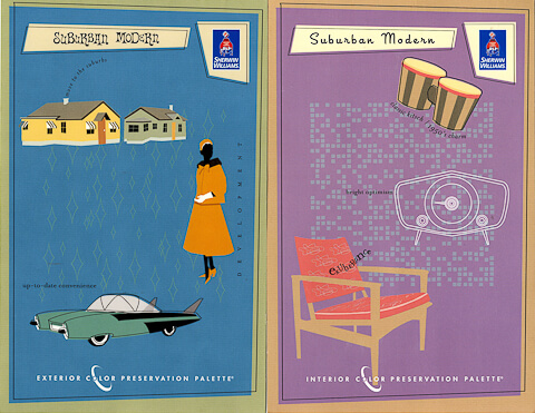
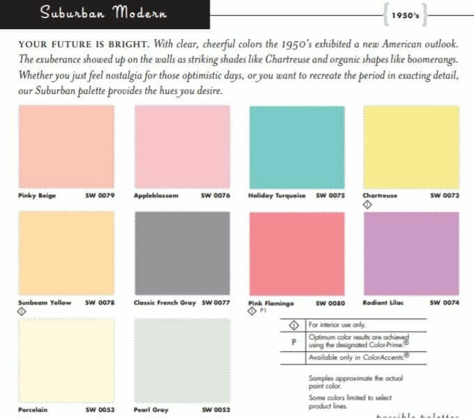
My very favorite midcentury paint collection remains the Sherwin-Williams Suburban Modern Paint Collection. It was the first one ever available — original story: Sept. 26, 2007 — and far as I can tell, the colors are all pretty darned authentic to midcentury 1950s or so.
I have used these colors on my own walls — and ceilings — in my head, I’m counting five different colors I remember using — and have always been happy with them.
That said: It’s like as a soon as midcentury modern boooooomed, Sherwin-Williams stopped making the collection cards. So you gotta dig for them.
Good news, though, we dug for you, and a few years ago, Kate made a list of all the colors … how you get 8.5 x 11 color cards (be sure to register as a PROFESSIONAL)… and there are links to the original brochures too. Here ya go:
All that said, if you want to try other historic paint colors, see this story, 20 historic paint color collections available today.
And, all my stories about paint and paint colors are in Decorate/Paint subcategory here.
Good luck, Rebecca! Send photos when you are done!


ChicagoB1GRed says
Here’s current link to their Sub modern collection:
https://www.sherwin-williams.com/homeowners/color/find-and-explore-colors/paint-colors-by-collection/exterior-color-schemes/suburban-modern
I’m looking for a really knockout color for front doorof an all white flat roof pad. Suggestions welcomed!
Pam Kueber says
No — the link you provided is not the link for the original SW Suburban Modern paint color collection.
See this story >> https://retrorenovation.com/2014/02/24/sherwin-williams-suburban-modern-paint-palette-swatches-secret/
ChicagoB1GRed says
My bad. Interesting how they rebrand collections using different colors. I wonder what their source is for the new one?
Pam Kueber says
Ugh, I will guess their source for “the new one” is what is popular…. today.
Dcgrl says
This thread is timely since I’m staying to get quotes on painting my 1957 brick ranch. (Not the brick, just the insets of wood siding above and below the windows) All the Google shows are brick ranches that have been painted completely over in gray or cream. I think my house was originally a colonial blue, at least that’s what’s peaking through the chipped paint on the threshold. I like the idea of replicating it if anyone has any ideas.
What about a door color?
Pam Kueber says
What about a colonial blue door?
Darren M. says
I have heard about this “Robin’s Egg Blue”, but SW doesn’t list it in their brochure. Does anyone know where to find a color that is appropriate for a MCM color palette?
Lindsay says
What would you recommend as a wall color for a large living room? I don’t want it to be too overwhelming, but I really like color. Everyone keeps saying to go with white and decorate with colorful things, but I’m so tired of white!
Pam Kueber says
It really depends on the overall palette. Question: Where is your pattern? In a rug? In a drapery? In pillows? Start with the colors there.
Joe Felice says
The biggies, of course, were aqua, turquoise, robin’s-egg blue, mamie pink, salmon, red, buttercup yellow and daisy yellow. And then came the variations on these.
Phyllis A. Craine says
Sherwin-Williams now has a collection called “Color Through The Decades” that may be helpful as well, it basically covers the entire 20th century as well as current decades.
paul perakos says
Rebecca,
The double front doors to my 1961 Mid-Century split level were originally painted lavender. When I restored the house 4 years ago, I went with Benjamin Moore color called Lavender Secret but went 50% darker. It’s a great lavender, not too pink, more on the grey side.
Scott says
This may seem really obsessive, but I wanted to be so sure I was going completely authentic, I pulled my colors from actual vintage objects like Boontonware plates (picture me sitting at the paint counter at Home Depot surrounded by plates and paint chips until I eyeballed the exact matches) and Maio paintings. I found my dream living room color on a 1969 Ford automotive paint chart, Aztec Blue, a gorgeous light turquoise.
Pam Kueber says
Scott, you can be assured that here, we truly understand “really obsessive” — we admire it!
Gerri says
Pam, Do you know of named wood stain colors that were used in the 1960’s for kitchen cabinets? I finished stripping white latex off my birch plywood cabinets and I can see some of the remaining stain, There is a TV commerical for Nerdwallet, whatever that is, and there is a wonderful midcentury kitchen (with coppertone appliances) that I would love to copy or get close to. I bought a sample of American Walnut stain but not sure about the color. Any recommendations would be appreciated. Thank you!
Pam Kueber says
Hi Gerri, I don’t know the answer to this one… I know the color you are talking about, but not sure of the stain. Have you tried… natural?
Gerri says
The most of the birch is sanded down to its natural light state at this point. I guess I could try natural but that may give me a more scandinavian look. I’ll get some more stain samples and see what I can find. Gerri
Pam Kueber says
Amber shellac with a water-resistant varnish on top also may get ya where ya wanna go. See: https://retrorenovation.com/?s=amber+shellac
Gerri says
Okay that is a great idea! I also found on a blog that General Finishes makes wood dye and it can be diluted with water to get the color you want. The blogger used light brown diluted with water on a new pine bookcase and topped it off with poly. Good ideas all around!
Bill says
Go ask Sherwin-Williams and Minwax at their websites. I’m pretty sure they only had a few standard color wood stains that were intermixed with each other to obtain various tones. The painters often did that at the job all the time as a way to get rid of leftover stains which makes matching an old stain tone recently uncovered quite a headache.
I’m pretty sure you’ll need to apply a pre-stain wood conditioner to the birch. S-W and Minwax should have info on that. I was a paint contractor for 30 years and builders used birch for painted cabinets and hardwoods for stained cabinets.
Maria says
As someone who grew up in the mid century modern/modest era I can attest to how great these colors are. All are very familiar from my childhood.
I’m trying to get up the courage to paint my kitchen floor chartreuse, to pair with my pink appliances.
Gwen says
Maybe the entire floor doesn’t need to be chartreuse. 😉 (seems like that would be difficult to keep clean looking). Could have another neutral color (grey or brown?) with chartreuse as a patterned accent.
Katy McCoy says
I love that idea!