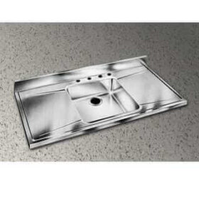
Retro kitchen sinks: Great 50s style choices


It’s Mac to the rescue again with some nice choices of cast iron porcelain-enameled sinks for the kitchen. The first two sinks pictured are both from Mac the Antique Plumber, which says that the same same supplier has been making them for 70 years. I believe them. I salvaged four (yes, four) similar sinks circa 1963 recently, and will install one in my upcoming kitchen reno.

The stainless countertop sinks are both from Elkay. I recently saw the first one in an ad from the 50s – it appears to be virtually unchanged from then.

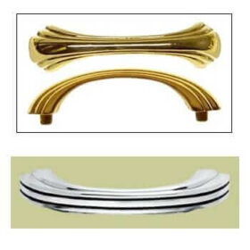
Retro kitchen cabinet pulls and knobs: Atomic, streamline and deco


Some of my favorite pulls and knobs:

  • Photos with gray-green background: All from Rejuvenation Lighting.
  • Gold pull: From Mac the Antique Plumber — but go for the chrome instead!


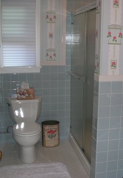
Tile for your 50s style kitchen or bath

bathroom-girls-cropped.jpg
It was very difficult to find tile in the correct 50s shades. My best source: A Canadian-based company, Olympia Tile, had a selection of 4.25 x 4.25 “Maple Leaf” tiles in appropriate shades. Good news, their distribution network in the U.S. is growing. Go to olympiatile.com to see where you can buy this tile. No photos online – watch this site and I’ll post my bathroom pics at some point.

Colors I used in my bathrooms: Heron Blue and Fawn Beige. I used the 4x4s for field tile and for edging, trimmed them with a basic United Ceramic white 2×6 from Home Depot. I used Olympia’s matching 2×6 cove base to meet the walls with the floor. Note, we installed the cove pieces flush with the floor tile (rather than ‘sitting on top of it’ — but struggled because the room was not perfectly square (by a long shot.) This is a trade-off decision.

Other colors I like in the Olympia line: Primrose (yellow), Teal Blue and Lake Blue, Salmon (would be great with black or grey trim) Terra Cotta, Bone and four shades of Grey – Thunder, Platinum, Silver and Tender (my favorite.)

This tile was all very inexpensive. Note, I bet you can go much higher-end — to a Waterworks or Ann Sachs — and probably get a better selection of colors. However, this will be at a much much higher price.

Finally: For my floors, I used American Olean Chloe, a “pinwheel” pattern evocative of the 50s, with the gloss black dots in one room, and with plain satin white in the other two. To be honest, I prefer the all-white. Use warm grey sanded grout — it’s a nice look. You must seal the grout, though – an arduous (but worthwhile) task.

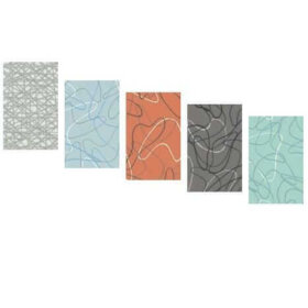
Boomerang laminate from Formica


Update: Almost all of these designs are now discontinued.
See my up-to-date stories on all retro laminates here: Kitchen/Countertops Category.

UPDATE (Oct 2011): Click over to –> this story to get an update on all three sources for boomerang laminate.

The countertops I removed from the two vanities in my 1951 bathrooms were both laminate, edged in metal. One – a soft aqua tinged green – imitated a really beautifully, nubbly linen weave. I could not identify any current laminate to replicate it in either style or color. (Greens really differ in popularity by era, I’ve found.) In the other bathroom, there was a marbleized pink — and I found a good match for this one (see below).

Ultimately, these are the best choices I found for bathroom laminates:

- Wilsonart Bleu Windrift – a light, marbleized blue. Special order.
- Wilsonart Tearose Illusion – this is the pink marbleized laminate described above. Special order. UPDATE: Glamorluxe Nancy reports that Wilsonart is saying this is discontinued. I presume that means all three colors. Argh.
- Wilsonart Beige Illusion – also shown above. Special order.

Now, you can also get Formica 1950s replicas for the bath or kitchen. They all look terrific:

- Formica Boomerang – in four colors, shown above.
- Virrvarr – in two colors, light blue and white. This is a reproduction of a popular European pattern. I think it’s terrific, and may use it in my upcoming kitchen reno if the salvaged aqua-with-gold-fleck counters I’m hoping to use don’t work out.

Other details:

  • I edged my bathroom countertops with the laminate, simple square edge. My husband the neat freak again begged me not to use the metal edge. I think this worked out fine, it certainly is ‘softer’ than the metal. I’ll do a future post on where to find metal edging.
  • The original countertops had a special piece of metal molding, a narrow T molding between the edge of the counter and the tile that ran up the wall alongside it. I saw at my local lumber store, this was still available. I skipped it.
  • I ordered a high-gloss finish, although I think matte or a soft gloss would be fine and certainly less likely to scratch.

Finally — if you really don’t want laminate and prefer something more durable, I recommend you look at Caesarstone, a solid surface material. I thought their “Blizzard” was beautiful, a bit off white with some nubble but not overwhelming or a major contemporary statement. You could design around it.