

![]()

I thought I had died and gone to heaven…I fell off my chair…when I first saw that Bradbury & Bradbury, long renowned for its gorgeous art wallpapers for Victorian and Arts & Crafts homes, has introduced a line of mid century modern wallpapers. I’ve known this company for 15 years, since I began restoring a house when I lived in Michigan. My neighbor Donna did her whole Victorian house in their paper, and it’s breathtaking. Now, we can have great vintage reproduction wallpaper for our mid century jewels, as well! Look at these 40s papers — they are so sweet and beautiful, I can’t decide which I like best. Stephen Bauer, artistic director of Bradbury & Bradbury, gives us the inside scoop on why he chose each of them:
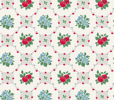
Apple Betty: “The most delicate of the 40s papers,” he says, “it’s probably the most suited for dining rooms as well as the kitchen and nook. And who doesn’t like a big helping of Grandma’s apple betty?”
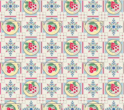
Tea Pot: “Well, this is a real company favorite. It has that beautiful selection of colors found in so many postwar kitchens and kitchen accessories. And if cuteness were criminal, this paper would be public enemy number one.”
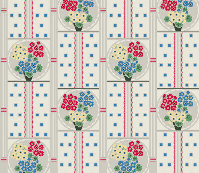
Geranium: “A real ‘late deco’ paper with the very common scallop feature found in (and on) 40s homes. A botanical charmer.”
Sunnyside: “With its metallic silver highlight on the lattice work, this paper is always bright and positive. Who needs coffeee in the morning?? Hard to ‘walk with your blues on parade’ with this pattern to greet you every morning!”
And…Scallop Trim: “It’s really a perfect complement to these papers, and such small ‘trims’ were very common in 30s and 40s decorating schemes. One version has a cream colored scallop that would work with any of the papers, and one has a metallic silver that really looks great with ‘Sunnyside’ in particular, (which also has silver in it.) One caution: Always hang the scallops with the curved side down, or it won’t smile at you anymore!”
Thank you, Stephen! For samples or to order, go to Bradbury & Bradbury’s website.
Tomorrow – the 50s papers, including Stephen’s insights on them!
And,be sure to see all my wallpaper posts for the full range of alternatives.
![]()


Cindy Carlson says
Please help!!! I did splurge and bought several different, wonderful, Geranium wallpapers plus trims, etc. to make my retro palace. Now I need to gather hints, warnings and any directions for hanging these precious patterns. Had I been patient and discovered reproduction, (stronger, prepasted, etc.) I would be finished already! HELP! YIKES! Not to mention we still need to recondition the 50s era steel cabinets-anyone want a great deal? Cindy
pam kueber says
Here’s how I hung my vintage wallpaper: https://retrorenovation.com/2012/06/19/how-to-wallpaper-a-wall-with-vintage-wallpaper/
Wynonna says
I love the Bradbury Wallpapers as well but find the cost way too high!! Years ago I was restoring an 1896 Victorian, and did some research on what style papers were used, and then went to some of the discount stores, Meijer’s, K-Mart, Wal Mart, Ect and did manage to find modern pre pasted papers and borders that were very close to patterns used in the 1890’s.
Angela says
My small 1947 kitchen is original, I added a new VCT floor in jade and black pattern when I moved in. Someone put pale yellow plastic tile as the backsplash in the 70s. When I moved in, I painted the kitchen white with the cabinet fronts jadeite green and changed the 70s yellow update counter tops to red cracked ice formica. The yellow color isn’t bad, but some are cracked and I kind of want to replace it.
I’m getting ready to repaint in there, and add some cabinets to the other side (it’s a galley kitchen and I need more counter). Do you think I could use this wallpaper on the back splash instead of tile? I think it would be adorable! Anyone tried this?
Ngare Knight says
Hi Pam,
I have a great picture of me with my hair in victory rolls (and my friend has a beehive), wearing a 40’s frock and the above Geranium wallpaper that’s in my kitchen as a backdrop. Not sure if there’s an avenue for it in RR, I can send the pic if you like as it just looks so lovely!
I purchased a 1949 house (so it’s a curious blend of 40s and early 50s) that has some great original features (flamingo etched glass doors, a wrought iron ‘cage’ in the front, a welcome lamp, etc.). Unfortunately the kitchen has had an 80s revamp. The total retro renovation will take place when we have more money (I’ll have to get things shipped from the US- dreaming of steel cabinets- all of this will cost LOTS). But to tie me over I purchased wallpaper for the one wall that already had wallpaper on it, sitting above the plaster mock tiling (this was 70s wallpaper mixed with 80s cabinets…. just not my thing). Yes, it did cost me around $400 all up but the transformation is WELL worth it!
I can’t stress enough how amazing wallpaper looks, we now have it in my daughter’s room (Dandelion Clocks), my son’s room and the hall.
Thanks for your incredible work!
Regards,
Ngare
jane says
for people who are not able to afford a lot of wallpaper, dont forget, with wallpaper, sometimes less is more. You dont have to cover every wall surface with the stuff. Picking an accent wall , say a large wall without windows or doors, perhaps where your kitchen table is situated. Use the paper on that part and paint all of the other walls a solid color pulled from your wallpaper design. Some of these busy papers would actually be BETTER just on an accent wall. It can be overwhelming to walk into a room and see every wall surface covered with pattern. An accent wall would highlight the features and, I think make them more noticeable.
pam kueber says
You are absolutely right, Jane!
Jan says
You can often find edging in the Kitchen Collectibles > other category on eBay. Usually it’s in the original packaging and it has gotten really reasonable. 5-6 years ago it was sky high, but I think enough people have raided attics that it has become affordable.
pam kueber says
You are right, Jan. In the same vein, vintage shelf edging is fun: https://retrorenovation.com/2009/11/17/where-to-find-shelf-edging/
toni says
http://www.lakeforestkitchenlady.com has shelf edging. I bought a table cloth from her and a few samples were included in my order. It’s not the paper-paper we remember. At least the samples weren’t but they’d work.
toni says
I remember the Geranium or something very like it. I got goosebumps seeing it but the price nearly gave me a heart attack! I’d seen this paper and some others similar in my travels and knew I couldn’t afford them but when I saw them here I thought maybe I could. Nope. Not ever. $92 a single. WAY out of my price range. Not even eBay has affordable vintage paper. And anyway, I would NOT paper with the real vintage paper. It’s too fragile. Give me vinyl coated. Just not at 200 bucks a roll!
pam kueber says
toni, you just gotta watch ebay like an eagle. it does come up. if ebay’s widget is not broken, which it has been for 3+ weeks, i try to show rolls when they are available…. the other place to try: older wallpaper stores in your area… sometimes they have old stock around…
Pat says
I absolutely love this wallpaper, but the cost is just prohibitive for me!
pam kueber says
Pat, keep an active Search on ebay for “vintage wallpaper rolls” …. give it some time … and I bet you can find something!