

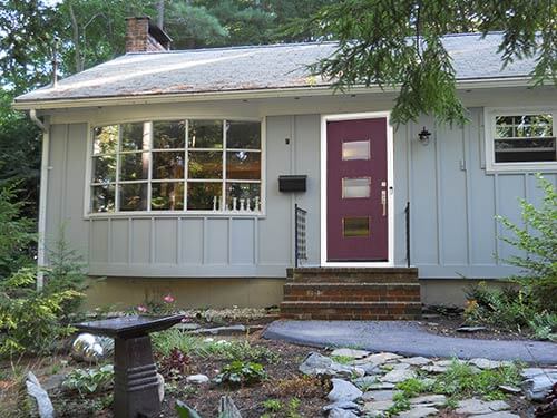
Reader Maureen’s lovely ranch home in the woods is in need of a front door makeover. She’s looked at all her options locally and decided that none of the available doors styles would complement her house like a mid century door from Crestview Doors. She has decided on a few styles and color choices, but needs our help to narrow them down and pick a winner.
Update: Crestview Doors is now closed. But over the years many more companies have come into this market. See our roundup story — 14 Places to Buy or DIY a Mid Century Modern Front Door.

Maureen writes:
I have been in my house 2 1/2 years. It is nestled in the woods on a dead-end street. The exterior was a jolting pumpkin/rust. Now it is painted a soft gray. I couldn’t decide on trim color (a darker gray?) or what to include in trim. So I left it white for now. I have simple window boxes to try to help those 2 awful little windows (I removed the unsuitable little shutters). I love the big bay window!
I need a good-looking door, full lite or 3/4 lite. I have seen the trend toward bright colors for doors, but I thought I would like something more serene. Maybe charcoal, black, or a lilac which is more the color of my birdbath. The ones available locally are more suitable for victorian, colonial or craftsman. Milano Doors are nice, but pricey! But I came across Crestview Doors and think these Mid-Century Modern styles might work! I like The Burbank, The Fortuna, and especially The Carlysle. I am thinking I would like contemporary/modern door hardware.
My style inside is a mix of antiques (buffet and round dining table) mixed with modern mirrors and accessories. Tables in the living room are slabs of marble on Ikea bases. My chairs are slipper chairs recovered in brick red leather. Sofa is dog-friendly khaki microsuede with burgundy piping. I guess I like a casual elegance!
Please help me with ideas for entry door style and color and hardware.
Thanks!

Using Crestview’s* very fun Door-O-Vision tool, I was able to apply all three styles of door to Maureen’s house — in the purple color she wanted. Maureen, I think you are absolutely right — you have a mid century ranch that is in need of a mid century style door. I also agree with you, that of the three Crestview door styles you mentioned, the Carlysle is best suited to your house. Since most of your windows — especially your front bay window — are more square than rectangle shaped — the square windows on the Carlysle door will repeat this square motif and make sense with the style of your home.
As far as door colors go — you mentioned painting your new door lilac. I think pale lilac would be too light and not create a focal point on the front of your house. Since you painted the house a light gray, and the trim is white, I would add some contrast and go dark for the front door. A charcoal gray door might be too blah — why not stick with the purple idea — how about a deep eggplant shade of purple. When you add the window boxes under your windows, you can then plant purple flowers (like petunias or pansies) in the window boxes to repeat the purple in other areas around the front of your house.
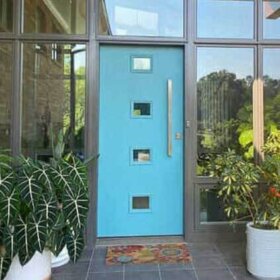
 I also looked at Sherwin William’s Suburban Modern paint palette suggestions and found a color palette that may work for you — though you would have to reverse the Westchester (darker gray) with the lighter Chelsea Gray on the palette — since the bulk of your house is already light gray. Using this historically accurate paint palette, you could paint your trim Westchester gray (or leave it white) and your door Stratford Blue.

 Regarding door hardware, Maureen mentioned she wanted something contemporary and modern. This handset by Baldwin — with a squared off design — would be a great modern touch to her new mid century front door. I would choose the Venetian Bronze finish (which almost looks black) so it will coordinate well with the black mailbox and metal porch railings.
So there you have it Maureen, I hope this helps you in your quest to find the perfect configuration of front door, paint color and hardware.

Readers — which door would you recommend for Maureen’s house?


Diane in CO says
The Carlysle is the ONLY door which relates to the big front window. The blue is highly unpleasant as someone else noted! The eggplant is okay, but go for a darker deeper shade of it, like Benjamin Moore C2 6446 Wicked.
As an architect, I would also consider redesigning the (too small) porch, steps and railings. That, IMHO, is a much much bigger factor than the door!
Grace Manasco says
This is not a modern home… it is a rustic-ish (most likely originally painted a brown or green) mid century… I’d go with a door in the same vein… like a door on some of those storybook ranch homes.
Maureen says
Absolutely, it is a 70, ranch, but my aim is to make it more elegant and avoid cute. And it was an awful rust color last year!!
lisa says
I agree with the Fortuna/Eggplant crowd. How about leaving the window trim white, but painting both under the eaves and the visible concrete foundation a dark grey? I think that would give the grounding the house needs to be painted such a light color. Would also bring out the pretty bricks on the stoop. You also might want to paint the downspout to match the grey of the siding — that’s not a design element you need to draw attention to, and it takes away from the great bay window. I like the hardware choice, but Baldwin is very expensive. I think you could do a less-pricey, more traditional handleset. That would go great with the wrought iron railings — choose black or very dark. Finally, a beefier porch light would be very nice.
Your garden is beautiful! Maybe at some point you can get a large planter for either side of the stoop. Olive or dark acid green would complement the eggplant door. Plant with dark foliage & purple flowers.
Maureen says
I love my garden!!: Bergenias and sedges, heucheras , hostas, and viburnums. I am so fortunate to have found this house, not .5 miles to downtown, but with woods and ledge abounding!!
You hit on my garden color theme: burgundy to coral pops ( including a burgundy gazing ball out of sight in pix), I add New Guinea Impatiens and caladium as annuals.
Sandra says
Agree about the Carlysle shapes, assuming no screen door.
What are those steps made of? Are they brick? Can you find a more magenta-ish color for the door to pick up the step colors? It would also warm it up a bit.
Also, as it appears you have shade all the time, and depending on what color you paint the white trim, and because the windows will read dark, I’d prefer a lighter color on the door. Not so muddy and dark as the eggplant. The blue is not quite right with that grey.
Andi says
What a cute house and fun (for us) style dilemma! I agree with Kate—the Carlysle is my favorite on your house. It repeats the square-ish bay-window panes, will allow a lot of light into the house, and overall seems to “fit” the house.
Second choice for me is the Burbank. The horizontal elements contrast nicely with the vertical siding on the house.
That vertical siding (which I love) is the reason I don’t care as much for the Fortuna. Somehow it’s too much of the same thing, not doing any favors for either the door or the siding…I think a moderate contrast with the siding is in order.
I LOVE the choice of a deepish, grounded shade of plum or eggplant. (Not a fan of that blue, it jars for me.) The plum shades that Kate shows pick up the colors in your brick stoop, as well, and makes a very harmonious whole. It’s a “wow” but a subtle “wow” if that makes sense. Harmony. Looks like it’s always been there.
The right shade of deep “British red” could also be stunning. A classic color with gray. But I like the plum/eggplant idea better for your house, and it’s a bit more unexpected.
Have fun with your new door—your house is adorable!
Maureen says
Thanks for your kind comments and ideas. I love the vertical siding alsoI have since added black to my option list.
Teresita says
I voted for the Carlysle. I love the squares that echo the window, and the vertical line of squares echoes the vertical stripes on the house.
As for color – i voted for the eggplant, but if it were my house i would go with a different front door color. I love the look of a bright red door, with black hardware. It would really pop against the gray. Other fun choices would be a bright lemony yellow (yellow and gray look so good together) or a bright orange.
If you don’t like bright bold colors, a soft pink or mauve would be cute and feminine.
Tas says
I like “The Fortuna” design for the door. I feel it’s somehow fitting with the current settings of the house. Also, at first I wanted the door color “stratford blue”. But later on, I found out that it’s more classy to have that “eggplant” color as the door color.
ChrisH says
The blue is an unpleasant shade. It’s difficult to imagine any setting where I’d care to see that particular blue. The eggplant is very nice against the gray. Easy decision.
The door has to be either the Fortuna (#1) or the Carlylsle (#3) The Burbank (#2) is an unfortunate looking door with the 3rd window placed too low. The 3 windows above the knob, each a little farther to the left might have been a good way to use the gun-slit windows. As it is the bottom window looks like a glassed in off center mail slot.
Carlysle picks up the shape of the bay windows and is not a bad choice, but there is something particularly elegant about the Fortuna. So, Fortuna, eggplant.
Kelly Wittenauer says
The next door neighbors where I grew up had the Carlyle style near a similar bow window on their house. The siding was horizontal boards painted about the same shade of gray as Maureen’s house. Their house had less trim than yours, and I don’t remember what color it was. White or a darker shade of gray, I think. They painted the door a rich red. It was gorgeous. And your black metal hardware would be stunning with red.
Brian T says
Lots of houses have windows with squarish panes. Few houses have interesting vertical stripes. I hadn’t even paid attention to the stripes until the Burbank door echoed them and created that nice rhythm.