Posts tagged as:

50s paint colors

A 1950 American Dream House

by pam kueber on November 28, 2008

1950 ranch house

These illustrations from the National Plan Service courtesy Indiana Coal & Lumber companay are idealistic – picture perfect – to be sure. Even so, they all include great little ideas to scrutinize and consider replicating in our own little jewel box 40s 50s and 60s ranches, colonials, capes, splits and contemporaries.

Heck yeah there is more…

{ 6 comments }

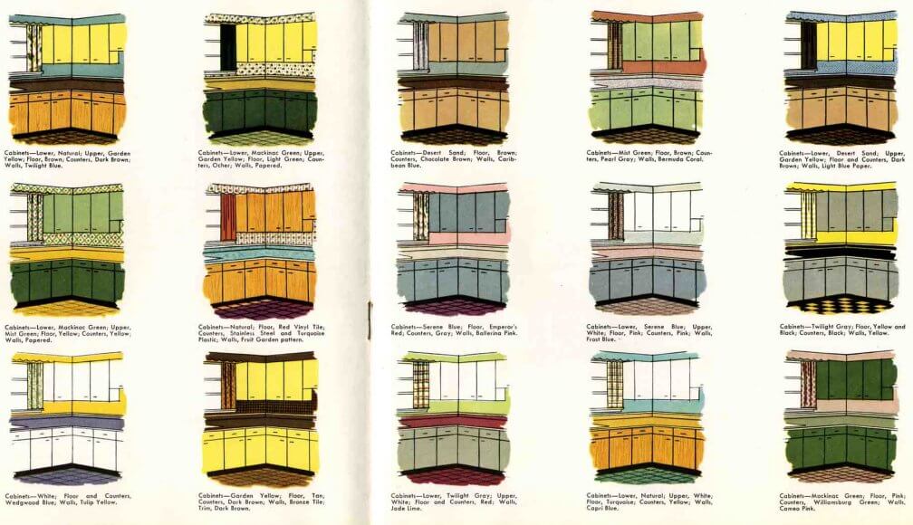
Retro kitchen paint color schemes from 1953
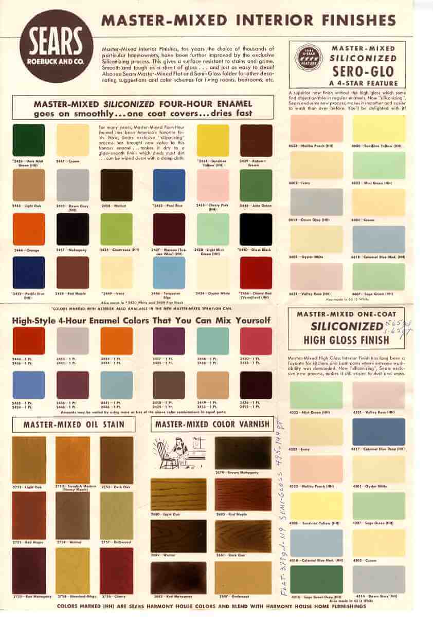
by pam kueber on November 8, 2008

50s paint colors

Following up on yesterday’s post about Nancy’s (popular!) kitchen project… and on our Monday blue Television Kitchen… here are kitchen cabinet paint colors straight out of 1953. Lots of good mix-and-match ideas.

Heck yeah there is more…

{ 3 comments }

Paint your garage door, 50s retro renovation style

by Pam Kueber on January 19, 2008

vintage 1955 garage doors ror ranch homes and colonial homes

vintage 1955 garage doors ror ranch homes and colonial homesThe winter is starting to feel like it will never end, here in western Massachusetts. I am not complaining – it’s very pretty, and the rush of spring is like no other. Even so, it feels like time for a BLAST OF COLOR from the 50s. How exuberant are these 1955 Crawford garage doors? To be sure, by ‘55 a family’s car was nearly as important as their house, it seems. So following that logic, why wouldn’t their garage door deserve the royal treatment, too?

P.S. Be sure to click the thumbnail for a really nice big image. I’ve learned a new blogging trick.

1957 Ford Thunderbird


{ 13 comments }

sears-vintage-colors-1.jpgsears-vintage-colors-2157.jpgVintage paint colors are a big issue for virtually everyone, so I’ll start out the new year with these 1950s and 1960s retro paint colors scanned directly from a vintage Sears Harmony House brochure that I bought recently. The scanner does a good job on most of the colors, with the dark pinks and reds only a little off. While these have some similarities to the Sherwin-Williams Suburban Modern palettes, there are many more choices. Look, for example, at Malibu Peach in the upper right — it’s perfect!

This chart is also great because it shows wood stains. No year printed on the piece, but I’ll estimate late 50s.

sears-vintage-colors156.jpgI’ve kept the actual color chart, below, sized as large as possible. For those of you on Internet Explorer, it probably looks funny in the main view – slides off the screen to the right. Just click once the image in a new window, twice to enlarge it further. I’ve also included the thumbnail to the left – sometimes this opens largest for best possible viewing, it seems. Note, this blog is best viewed in Firefox/Mozilla.

sears-vintage-colors156.jpg


{ 5 comments }