

 Call me authentic or call me lazy, but when looking for a paint color for an historic house, I look first to — historic paint colors. I noticed a variety of one-off stories, but no big list, so I did the research and found 20 historic paint collections available today. The list is dominated by way-back-time-machine colonial, Victorian and arts & crafts paint colors authenticated by museum-trained conservators … but for we 20th century midcentury design enthusiasts, there is a growing list of historically authenticated colors, too. Do you need “just the right midcentury off-white” to show off your art, for example? You can get a recommendation straight from Mr. Frank Lloyd Wright, as just one example. Click on through for the list of 20 historic paint color collections on the market today –>
Historic paint colors for 20th century midcentury homes

1. First up, The Guggenheim Collection from Fine Paints of Europe was introduced in 2011. This collection has two palettes. “Classical Colors” are color-colors derived from works of art at the Guggenheim. The “Gallery Collection” is full of neutrals, including whites and off-whites, taken from colors put onto the walls to display art: “50 hues favored by generations of Guggenheim Museum curators, artists, and designers—including Frank Lloyd Wright himself.” The Gallery collection, in particular, sounds pretty cool. Lots of people want to display art… artfully. So why not take the lead from professionals who must agonize and OCD over shades and hues and saturation like we can’t even imagine.
2. The Sherwin-Williams Suburban Modern Collection — with two palettes, one for interiors, the other, for exteriors — is a longtime favorite here at Retro Renovation. If you’re looking for classic 1950s pastels like aquamarine and flamingo pink and even pearl gray — go here, these are great colors. This Sherwin-Williams palette also had a wonderful avocado, harvest gold, beige and pinky beige. This company gets major props from me for being first on the midcentury bandwagon. Goodness, they were a lifesaver for me when I started my house 10 years ago.

3. California Paints in 2010 introduced a huge collection of 20th Century Colors of America, researched in partnership with the nonprofit Historic New England.
4. Pittsburgh Paints has the Fallingwater Collection — paints inspired by Frank Lloyd Wright, authenticated by the Western Pennsylvania Conservancy.
5. Frank Lloyd Wright’s 1955 paint palette for Taliesen, specified in Martin Senour paints, is shown in this artifact. If you can blow up the image enough to read the chips… then triangulate to Martin Senour formulas today, you’d have another authentic Frank Lloyd Wright paint palette.
6. Eichler colors — The Eichler Network has matched historic Eichler colors with Benjamin Moore Formulas. Go to pages 6 and 7 in this article to see the chips.
Historic Paint Colors pre-1950
 7. The National Trust for Historic Preservation has partnered with Valspar to offer a pretty big historic paint palette. “There are over 250 historic colors, documented from historic sites and places across the country, in the Valspar palette.” Price on this paint is going to be pretty competitive, I think, as this is a very accessible brand found at Lowes. I also think I have read that Valspar paint does well on a certain magazine’s annual quality tests.
8. Benjamin Moore’s historic paint palette has legions of fans.
9. Rodda Paint has an historic paint color collection.
10. Union Village has two very focused palettes of classic Early American paint colors. You can buy small cans if you are painting furniture.
11. Finnaren & Haley has an Historic Colors of America collection. Created in collaboration with the Society for the Preservation of New England Antiquities — which is now known as Historic New England, this collection of both interior and exterior paint colors from early America history. It seems to be the predecessor to the California Paints collection with Historic New England.
12. Finnaren & Haley also has Authentic Colors of Historic Philadelphia. There are 31 colors in this line, all uncovered from historic buildings and many authenticated by the National Park Service.
14. Duron Paint does Historic Charleston.
15. Historic colors of Spanish St. Augustine — St. Augustine is the oldest city in America, and the preservation community there has matched original Spanish St. Augustine paint colors to Benjamin Moore and Sherwin-Williams paint colors. So cool! Hey, aren’t you impressed how deep I dug for this story?

16. Fine Paints of Europe covers historic paint colors for Mount Vernon.
17. Fine Paints of Europe also gives us historic paint colors of Nantucket.
18. The Fine Paints of Europe team is all over the historic, with British Standards, too.: “470 colors… in existence for more than one hundred years for residential, commercial and military use. Broad range of strong full colors’ contains no pastels or off whites. Very useful for the specification of strong accent colors.”
19. Little Greene also has an English Heritage paint collection.
20. And, Fine Paints of Europe has a RAL collection of historic paint colors from 1925 Bonn, Germany: “210 distinctive ‘full’ colors first catalogued in Bonn, Germany in 1925. Colors were originally developed for commercial/industrial specification but have recently been rediscovered – broadly specified for smart, contemporary interiors.”
Wow, that’s some list isn’t it? I am quite proud of myself.
If you want to republish this list in part or entirety,
please email me for permission first.
This research and story are copyright Retro Renovation 2012.


Kitty says
You might also like Le Corbusier’s Architectural Polychromy: 63 shades that Le Corbusier created in two colour collections – in 1931 and 1959. “Each hue has its relevance and embodies specific spatial and human effects.”
https://www.lescouleurs.ch/en/the-colours/63-colours/
pam kueber says
Wow, thanks for the tip!
Bob Scott says
With Finnaren&Haley out of business, is there any information on the Historic Philadelphia colors, and anywhere they can be purchased now? I’m particularly interested in information on Independence Hall Ash and Independence Hall White. Any info helpful thanks. Bob
gw says
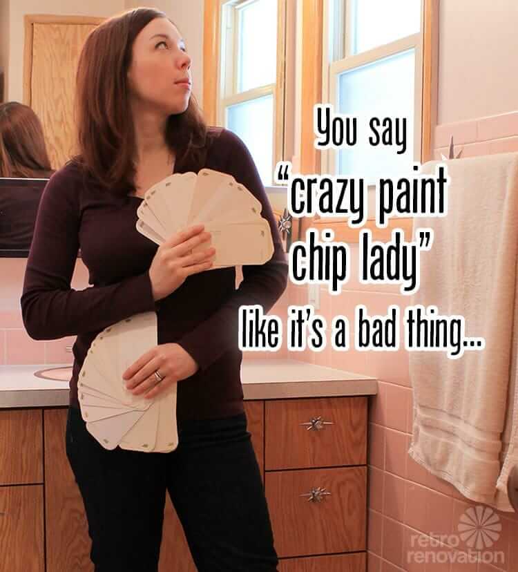
“You say ‘crazy paint chip lady’ like it’s a bad thing.”
Soon as I saw this I burst out laughing, thinking, “So it’s not just me!” Many thanks for this great comic photo and the many links. I’d print out the photo and put it up on my bulletin board, but would it go with the wall color…….hmmm…….
John Cox says
Hi
I am currently researching the advent and the history of the painted kitchen. My assumption is that the current trend probably started in the USA and I would be obliged for any assistance or pointers. Incidentally, I am extremely impressed with the breadth of your own research.
John Cox.
pam kueber says
Hi John, Thank you!
I don’t know the answer to your question, though. Certainly the answer lies in the history paint technology itself — combined with the history of kitchens… The cave people probably painted their kitchens!
John Cox says
Thanks Pam, I am looking at the history of just about anything paint or kitchen oriented.
John
Ed Ferris says
Duron has been taken over by Sherwin-Williams and no longer has an independent line of colors.
The Philadelphia colors are offered by a paint company that only does business in Philadelphia and adjacent states.
SW itself has added many inauthentic colors to the 2800-series, which was originally selected by Dr. Roger Moss. Worse, their changes in paint base have made all their colors grayed. Compare them to the building-supply store brands. I’m using Valspar on my two Victorian restorations.
The 1890 one was originally aqua with white trim. Doesn’t that sound 1950’s to you? But that’s what it looks like in the 1920 photo.
Scott says
Wow, some great resources to check into here. With the in-depth table legs feature and now this you guys are really outdid yourselves this week! 🙂
And love the crazy paint chip lady photo. Here’s another way to insure you get pegged as a foil hat person… set yourself up at the Home Depot paint counter with a couple of paint chip decks fanned wide open as you squint and study trying to match the colors of a few of your favorite Melamine cups and saucers.
Louis Fremont says
Fine Paints of Europe also has some beautiful products in high-gloss, almost mirror finish for interior walls. A bit out of my price range, but pretty striking stuff and I think it would work wonders for adding light and charming ambiance to any room.
Anne-Marie Cory says
When we purchased our 1969 split level, the wood siding was gray with purple trim. The lower portion of the house is yellow/tan brick splotched with black. Needless to say, the wood in no way matched the brick. I walked and walked and walked around my neighborhood and examined every house color around. Luckily many houses remain close to their original colors and my neighborhood has a diverse palette! We don’t have too many home owners who have opted for white/beige vinyl siding. Anyhow, we ended up using Sherwin-Williams mid-century colors in yellow, gold and green. It worked perfectly with the brick work below. My house once again matches itself, fits in with the neighborhood and remains true to its history.
pam kueber says
Sounds lovely. “My house once again matches itself” — I love it!