

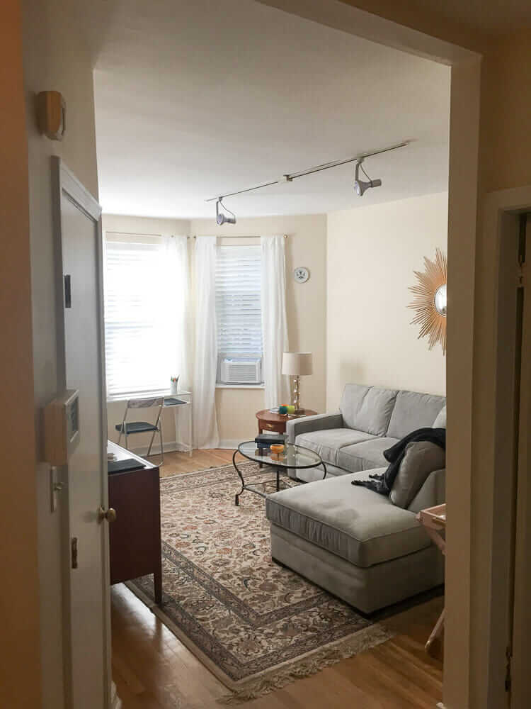
 I spent much of August helping weebit gather stuff for her law school apartment. Her style is not all-vintage, hunt-forever-til-it’s-perfect like mine. There’s a mix of old and new: contemporary-traditional, industrial, vintage finds, and stuff from Mom and Dad’s house. Because weebit wanted to be done by the time school started, once our “hunting for bargains” time ran out we finished with cheery filler-inner pieces that were easy to acquire and didn’t break the bank from the likes of Ikea, Home Goods, Pier One and Target. Indeed: The apartment is done, save for a few walls that need art, which she will pick up in her travels. She is now ensconced, very happy with the outcome, (and as you read this, wrestling Contracts, Civil Procedures and Torts).
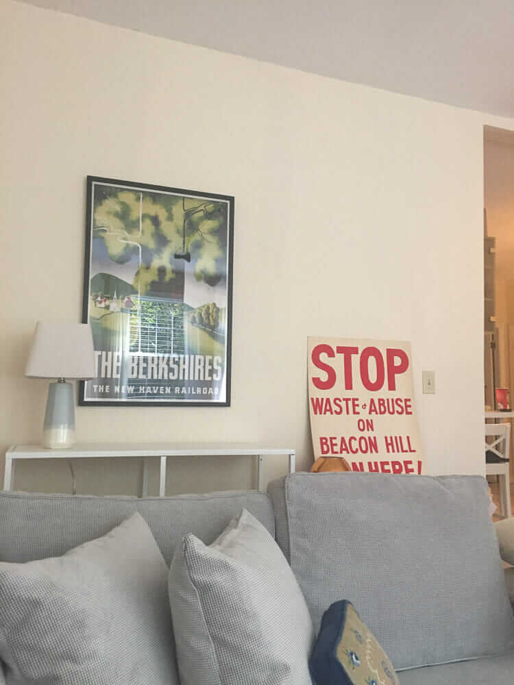
Since I spent mega-hours working on this project, I want to share out various “winner” ideas that surfaced. First up is one thing that we didn’t even have to think about: The paint color on the walls. We really liked it. It’s a vanilla creamy off-white custom color, from Behr. And I have the formula:

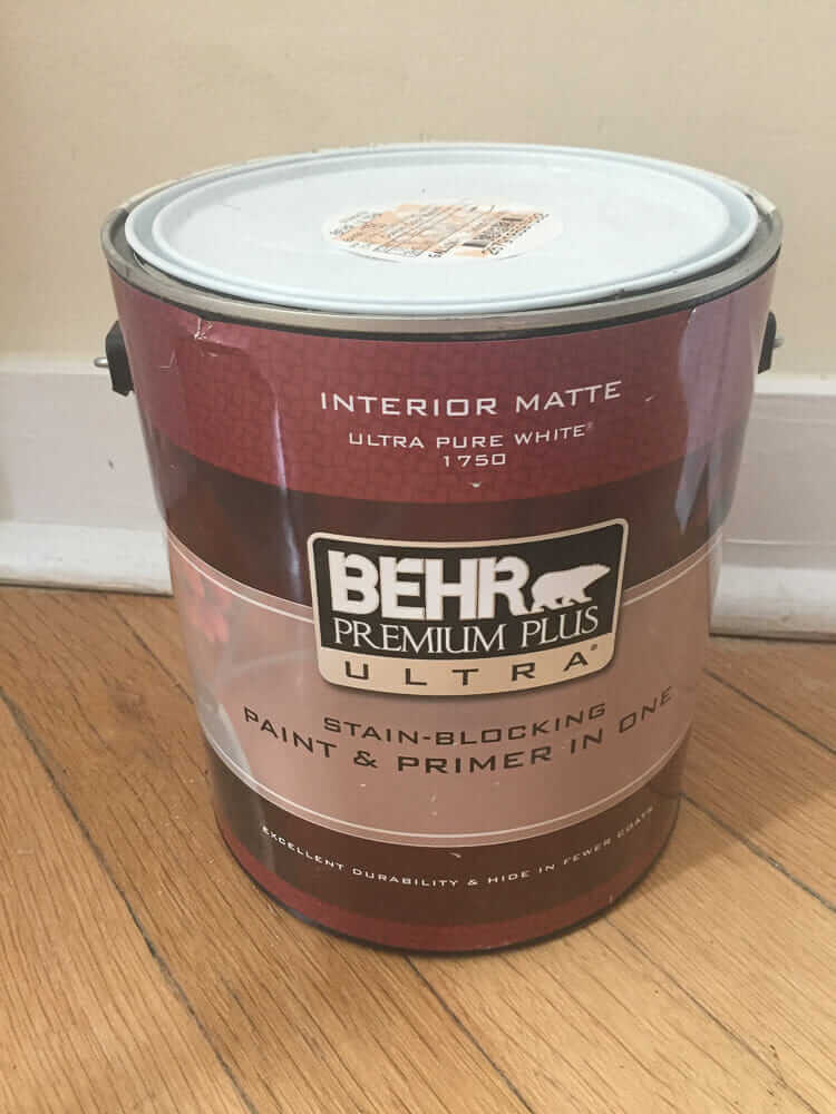 Here you go, although I don’t think the paint on the walls was flat matte, I think they pulled this gallon for some touch ups and specified the wrong finish. Get yee a nice eggshell finish.
It’s very difficult to photograph paint colors, because they shift with light, and well, I was using my iphone. But trust me: This is a good color. It has just enough yellow in it to make it a bit sunny, yet not so much yellow that the walls start bouncing off each other intensifying. I am not trained to read paint labels to deconstruct their formulas, nor can I dissect, on sight, what colors are in a paint. But I’d guess there’s also a little red (pink) in this color too… a bit of peachiness. Yes: Off-white peachy yellow, does that make sense? I need to give it a name. I pecked around a bit. It may be like BM Vanilla Ice Cream — the egg into the cream would add the orange, the vanilla would add a bit of brown/bronze/gold. Behr also has a vanilla ice cream, and while it’s a quite pleasing color, especially on that small bungalow, I think it’s even yellower than what weebit has on her walls.
This is a “glowy” color. It seems to have good light reflectivity, so on a sunny day, you don’t really need the overhead lights. At night, turn on a few 40-watt lamps and you are happy. Glowy.
Weebit is a millenial who has been acculturated to prefer gray walls. But she now has personal experience, with me standing over her to remind her: Off-whites are fabulous. She likes her walls a lot.


Kathy says
That is similar to my go-to color, Antique Ivory contractor paint from Menards. Has worked well in both my homes, circa 1903 and 1890/1926/1962 hybrid. Light enough to go with white, not yellowy or cream, but not stark either. Sort of in-between Benjamin Moore’s White Dove and Navajo or Swiss Coffee.
Marie A says
That paint color is exceedingly close to the color used through my 1967 late mid-mod house. I was used to wild colors (I moved from a house where I’d painted the kitchen lime green and the hallway various shades of purple) and I thought I’d want to paint once I settled in. But immediately began to love it. It IS glowy, which is great with my walls of windows, and always looks fabulous.
I’m so glad I’m not the only one who loves it. All the grays these days or the stark whites drive me mad!
DJ Sparkles says
I’m so jealous! My college apartments never looked that nice! I think her apartment even looks better than my house! 🙂
The college apartment I remember most was the one with the not-so-fabulous shag carpeting. I was “lucky” and got the bright yellow/harvest gold combo. The really unlucky people got the pink and orange shag. You tried your best not to get one of those apartments! There was also a slime green combo, because of course. I was one of the “civilized students” because I had a full set of living room furniture, a rarity. It was called “pillow furniture”. I bought the set from a friend for $150, which was a lot back in the dark ages . It was like Tinker Toys with big pillows for cushions, and unscrewed into easy pieces for moving. Ah, the 70’s!
Weebit is lucky to have such caring parents with such good taste. I wish her all the best in her new school and sweet new home!
Trish says
And, as your luck would have it, Behr paint always scores as “Best Quality” with Consumer Reports. This color looks perfect for my kitchen. Thank you for posting the color label. 🙂
Marquita says
Hi Pam,
Regarding translating the colour codes on the paint, I found this interesting conversation on Houzz: https://www.houzz.com/discussions/5094217/behr-color-codes
According to these folks, the paint is composed of CL=Yellow Oxide, IL=Brown Iron Oxide, and LL=Raw Umber.
It truly is a lovely colour.
Toni says
Give me her rug!
Pam Kueber says
🙂 A wool Karastan we bought circa 1992. We’ve had it in every house since. Now it’s in hers — and she loves it!
Also see: https://retrorenovation.com/2016/04/14/oriental-rugs-midcentury-living-rooms/
Brian E Parker says
My favorite white is Benjamin Moore’s “White Dove”
Partially because I like it.
Partially because it’s an exact match to the paint that the landlord used throughout my apartment – so it makes for perfect touch-ups!
Barbara says
Pamela, I was asking about what wallpaper paste did you use to wallpaper with in your entrance??
What is the name of the product?
You have said that you haven’t had any problems with your wallpaper peeling.
Pam Kueber says
Hi Barbara, I have used different pastes for different projects. I honestly don’t remember what I used in my entrance. If you are using vintage, I recommend asking the seller for their recommendation. Same as to new… Good luck.