

Stephen J. Bauer, artistic director and owner of Bradbury & Bradbury, kindly agreed to answer some questions about B&B’s new line of mid century wallpapers. I hope you find it really interesting…and fun. Hey, I’d sure like to have a couple of margarita’s with this guy! Thank you, Stephen, I owe you one!
1. Stephen, why did you decide to add 40s and 50s wallpapers to your lineup?
It was a pretty natural progression. The focus of historic preservation in this country has seemed to move chronologically over the last several decades: from the Colonial Williamsburg era in the 1970’s; to Pre-Civil War and Victorian in the 1980’s; and by the 1990’s the focus was Arts & Crafts. And now 17 years later, many Arts & Crafts homes have been restored, appreciation, (and prices) for prime bungalows have risen sharply, and now, at least I believe, people are looking for more affordable homes to restore.

So you look around now and wow, there is this HUGE inventory of Post WWII homes that still seem relatively “undiscovered” and FULL of charm and architectural features unique to those particular decades!
Well, let’s to get back to that original question; Why the addition of 40’s and 50’s papers? We are not a “Victorian” wallpaper company, nor are we an “Arts & Crafts” wallpaper company. We are an ART WALLPAPER company. So our interest is in manufacturing wallpaper that is equal to art, and from our perspective, really great wallpaper patterns are not the sole product of the 19th century or just early 20th, but we find fantastic (groovy) designs even into the 1970’s, when wallpaper design could still be really innovative. It’s ART to us, and we could no more ignore what came out of the 1960’s anymore than we could, say, the 1860’s. There are just so many terrific wallpapers out there!
2. How did you go about choosing the designs, colors?
That’s where it gets tricky. There were, as I said, so many great patterns produced, but not every one of them is iconic of a particular period. So we chose from our archive patterns that we felt gave a real feel for the 40’s and 50’s, without being stereotypical or trite. Our color choice is based on those archives’ original colorings or in some cases color combinations we know to have been used frequently in home interiors in those years.
3. How are they made?
By Oompa Loompas. Actually they are all hand printed using the silk-screen method of printing. This is done right here in our factory in Benicia, (not overseas anywhere). One color is laid down at a time, one repeat at a time, until the pattern is complete. It is a labor intensive method, but the result is essentially a serigraph art print for your walls. This is one reason we call ourselves an “art wallpaper” company, (that, and it’s already on our stationery).
4. Tell me about the “aesthetic” of 40’s wallpapers.
 Well the particular idea behind our choices from the Forties is the optimistic, cheery outlook of Post War America which greeted people every morning in their breakfast nooks and kitchens back then. I think many of these 40’s patterns are about the most “blissful” things ever done in our modest medium. They are just full of bright colors, (then available after the war again) and whimsical graphics.
They make me smile every time I see them because they remind me, (as it may many people) of Grandma’s house or the small cottages people moved into after the War as they began their young families. There were of course other things happening in wallpaper in the 40’s, for instance that very homespun sort of “Colonial” genre, along with the “Hollywood Tropicana” style that you see back then, but we chose to focus on these little cottage papers since I think the kitchen/breakfast nooks in these Post War homes is where homeowners are initiating many of their period renovations. I have to go now, I smell chocolate chip cookies in the oven.
5. What about the look of 50’s papers. And why the progression from the decade prior?
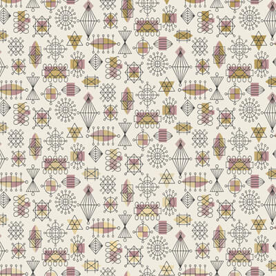
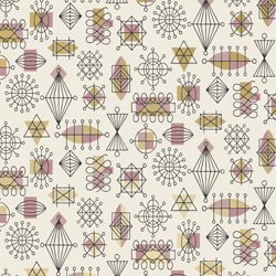
Now by the middle Fifties wallpapers got a little less bright but a lot more experimental. You start to see patterns really shrinking and becoming more “hand drawn” and less concerned about older stylistic conventions. They are much more in the “progressive artists” territory and they play much more with casual linework and shadow. They are great fun to look at because they are so unpredictable. Of course, manufacturers had to sell to the masses so books from that time do have the perfunctory “traditionals” but when they did allow designers more latitude they showed a lot more attitude.
Our “Atomic Doodle”, “Googieland” and “Boingo”patterns are perfect examples of this playfulness with linework and that more casual feel to patterning.
Why the progression? The 1950’s came right after the 1940’s.
6. How would you use these papers – which rooms of the house do they fit?
Well the Forties papers are specifically, as I mentioned, for the kitchen/nook areas, (and in some cases maybe adjoining dining rooms).
The Fifties papers would probably fit best in living room, dining room, and family room environments.
The pattern called “Island” is strictly for tropical “Tiki” styled rooms, (don’t imagine it in a kitchen or bathroom, unless of course it’s Tiki style…)
Most could go in any ranch home, (like my own).
The one called “Interlock” was intended for the most modernist of Mid-Century Modern homes.
Most of the papers would be very appropriate as an accent wall with stone, brick, paneling or just with the other walls painted the background color of the paper.
7. Wallpaper seems to come in… and out… of style. In the Forties and Fifties they were solidly “in”. Why? And what does that say about the time and the people?
Easy. People had terrific taste back then.
Ok, the real reason, I’m not sure. I tend to think it had to do with the changing demographic of families, in part.
In the late Forties and Fifties people used to invest in a home — by decorating it throughout — because there was a feeling that they would be there for a long time. It was their home.
But I imagine that over time people’s lives just got busier, their addresses changed more frequently and they just didn’t have the time, the interest (or even the landlord’s permission) to hang wallpaper in their dwelling. Also, stripping a room of ugly wallpaper has never been a very enjoyable past time, (which argues for more artistic wallpaper choices which are almost never removed) so I guess that’s also a factor.
And then, people like change. If you grew up with a profusion of mediocre wallpaper in your childhood home, you might long for clean painted walls later in life. If however, you have never lived with good pattern and color, the idea of doing so is probably pretty exciting. Good renovations can really illustrate the beautiful marriage of those two important ingredients to an interior that won’t grow bland with time.
8. Will we see more 40’s and 50’s papers in your line?
Absolutely. We’re looking forward to lots of positive feedback about these papers, and we are thrilled to produce even more if that’s what people want. We love to know what people are looking for and chances are we can probably make it. We had a few customers recently ask for a certain kind of Victorian set of papers and now it’s in the early stages of development. Be careful what you ask us for, you might just get it.
9. How do you feel personally about the period?
I’m a time traveler. I love just about anything that’s old, “vintage” and has a great design to it. My wife and I restored a 1930’s A&C bungalow when we were first married, then moved onto a 1925 Colonial Revival apartment building, finished it, and now are raising our sons in a 1961 ranch.
As with our other projects we are repairing and restoring what ever has been damaged by deferred maintenance and our neighbors think we’re a little weird to leave all these original features on and in our home unaltered, (you’re going to replace those old leaded glass windows, right?) It feels great to live in something that’s been brought back to its former glory instead of seeing it getting “remodeled” and its unique character “erased” for good.
That’s one of the things I love about my job is that I get to work with a great group of people bringing back to life printed art that has been “dormant” for decades and centuries. To see that in turn used to renovate and restore older homes is just “ice cream on the cake”. So, I love the designs of the Fifties, the Forties, (and right now I’m a little partial to the early Sixties)!
10. What didn’t I ask that I should have?
If you think of anything let me know.
![]()
Be sure to read all my wallpaper posts for the full range of 50s choices.


Joe Felice says
There were very-few attractive wallpaper designs. Ditto drapery fabric. The textile industry seemed to lag in inspiring designs compared to other industries, particularly plastic and electronics. Once we discovered how to mass-produce plastics and laminates, we really took off with that. Maybe this was a male vs. female thing back then.