

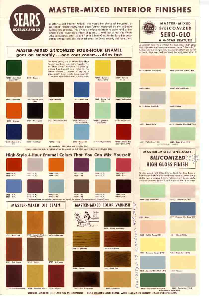
 Vintage paint colors are a big issue for virtually everyone, so I’ll start out the new year with these 1950s and 1960s retro paint colors scanned directly from a vintage Sears Harmony House brochure that I bought recently. The scanner does a good job on most of the colors, with the dark pinks and reds only a little off. While these have some similarities to the Sherwin-Williams Suburban Modern palettes, there are many more choices. Look, for example, at Malibu Peach in the upper right — it’s perfect!
This chart is also great because it shows wood stains. No year printed on the piece, but I’ll estimate late 50s.


jean kaczmarek says
Hello,
I am soon to be the new owner of a 1960 californian style House.
I’m looking for modern coastal neutral colors. And palettes.
Jean
pam kueber says
See our category Decorate/Paint — we have many historic paint color stories there. Congrats!
cheryl says
lol Yes I too was hoping for a larger image, but feel a bit demanding for saying so. I checked out all those swatches chosen by “historic experts” listed on another thread but those colors seemed sort of dreary to me, and are not the colors I see when looking at untouched original stuff. Not sure why the “historical expert colors” didn’t appeal to me…. But I’d much rather have something like this, which was actually printed during the 50’s.
Anyway, thanks for all your hard work Pam, much appreciated!
Andy says
Hello,
Is there anyway to get a really high resolution scan of this? Or does anyone already have one they might be able to share?
Andy
Eric Chance says
Hi,
Can you help me find Sears paint brochure(s) for Exterior Weatherbeater paints. Sears does not provide them any more.
Patrick B says
Hello Pam,
I am soon to be the new owner of a 1958 Ranch style House. I was hoping to find out about exterior paints and interior paints, to return my house to its original state; or as I like to say return my retro to retro. Any help from you would be greatly appreciated.
Thanks in advance,
Patrick
pam kueber says
Welcome, Patrick B, and congratulations on your new/old house. All paint info is in the navigation bar: Look two places: (1) in the Product Guide / Paint, and (2) in Paint – for all posts.
Jay Tedesco says
Dear Folks,
I would like to know if there is anyway to get an earlier stain fromsears reproduced. I do not know if you used another company to make it. It is called Cherry Mahogany and it maytches most Cherry cabinets I have come across. I had a small amount left and I had to use it to match the trim in my litchen to my cabinets. Please let me know if there is list of colors that I could take to either my nearest store or paint shop for a reproduction of this color.
Thank You,
Jay T
50sPam says
Hey, no problem, Femme 1. I actually have used Caribbean Coral – in my guest room / husband’s home office. It is a wonderful color! By the way, I’ve found that several retro renovators and I are on the same Twilight Zone continuum – glad to add you to the club!
Femme1 says
This is positively eerie, but I’ve just spent the past few days searching the web frantically for some 50s color palettes! And then here you are, Pam, to the rescue.
I got some advice from a friend who is an interior decorator; she advised me to paint my kitchen walls either a tomato or coral red, and that it would make my cabinets pop. (I was lamenting about my cabinets again.)
And then here you come again! In the top advertisement “Enjoy a New Color Thrill” (yeah, baby), there are my cabinets in the little inset picture of the kitchen. So I guess they do “go” with a 50s kitchen. (Remember I was lamenting a while back about the stupid mistake I made in liming my cabinets in the mid-90s?) And then I re-checked your Sherwin-Williams entry and found the perfect color for the walls—Caribbean Coral (an exterior color).
So, all I can say is thanks!