

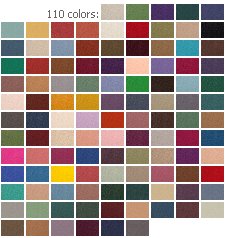
Have I ever mentioned that in my next life I want to be the person who picks out car colors? And gives the colors their names, too. I actually knew the head of car colors for Ford Motor Company when I worked there. I coveted her job. Next time around. Of course, there is actually a company called The Color Wheel Company. They sell this interior design color wheel for either $9 or $7 dollars (I think it may be on sale right now, I’m confused) including shipping. If you have anxiety about putting colors together — or, if you are really interested in learning more — this could be a useful tool that helps you try out some bolder things that you might not normally try.
READERS: What are paint colors that have worked out super well for you – brand/color – and for what rooms (or exterior)? And – have you put two colors together with unexpectedly awesome results? This kind of info is golden to share. Let’s hear it.


Shane says
Gavin – LOL no doubt! There were things in my house that I know weren’t maybe even in style. I agree with you about the cave so I’m going to stick with white. I am going to paint the baseboard and case molding and leave the 1/4 round alone.
I’m not some out of this world Jetson type either. I prefer the every day time capsule style you stated.
Shane
Columbus, Ohio
Nina462 says
Thanks for all the info–I’ve yet to paint my 65 ranch as it was move in ready. But next year I want to paint the living. It was originally panelled (I have pics), the young kids who had the house before, just slapped up some chalky off white on the panelling. It’s ok but is starting to chip right off…so next year I’ll paint. Most of the wood work is a pecan (med brown/reddish)..and a huge reddish brick fireplace. Oh, I have the wood beams in the ceiling that match the mantel….kind of a ‘lodge’ theme, I guess.
I once knew someone who’s job it is to pick Christmas themes for Target…this year white & gold; next year blue & silver…what a job, eh?
James says
Regarding painting the walls and ceilings the same color, I would agree that it is generally not a good idea, for the reasons cited by Gavin. However, in the 1952 cape cod-style house that I grew up in, the upstairs bedrooms were under the sloping gabled roof, so the side walls only went up about 2/3 of the normal wall height and then sloped upward to the peak of the gable. The walls at the gable ends were full height and there were dormers that broke up the side walls. In those bedrooms, my parents had used the same color (a light color) for the walls and ceilings and it worked well. Might be too “choppy” otherwise.
gavin hastings says
J.D. I would paint the upper wall a lighter shade of Ming Green.
pam kueber says
J.D., how about wallpaper like this: https://retrorenovation.com/2009/06/01/on-my-retro-radar-vintage-60s-dinette-sets-and-more/
J.D. says
Thanks for the tips guys!
I should have made clear though ANYthing but yellow. Yellow and green together, no matter what the shade(s) just don’t appeal to me. Spatter painting could be interesting, (seeing a reference photo would be great!) and I actually never really thought of using blue. I don’t know if I can go with navy, but maybe something a little lighter or grayer would look good. Doing a retro/vintage time warp isn’t always necessary, I’m okay with doing “contemporary interpretations” with vintage themes sometimes.
As far as ceilings go, I have never lived in, or for that matter ever even seen a house new or old that had white ceilings (except for the “popcorn” ceiling with gold metal flecks in the master bedroom of my parents old house). Maybe ceiling color is more of a regional thing than an era thing? I have been considering it for the bathroom though, it does have some advantages to be sure, just haven’t made a final decision yet. Thanks again everyone!
gavin hastings says
Shane!- I don’t want to monopolize this but, since you asked:
Do not paint your ceilings the same color as your walls (just my opinion)…if it was such a great idea; SOMEBODY would still be doing it today. Baseboards and doors are another story, and I have mine painted the same as the walls so that they would “disappear” and not become a focal point: Only the fireplace is traditional white.
I have a 10×10 office room with FIVE doors-they are the same color as the walls and they in fact, “go away” and become “wall” not “door”.
My house is a 2800 sqft cape and I am down to 3 wall colors. I did not want to go from a green box to a yellow box and then to a pink box. The idea was that eveything woud flow from one room to the next, naturally. Furnishings included!
I am a big fan of the museum homes in Historic Deerfield, Massachusetts. They were mostly done by the founder, Mrs Flynt. The tour guides will tell you that in each house she would “pick a color and RUN with it”. That became my motto.
Good luck, but I think if you paint your ceilings the same as your walls you could create a cave-like feeling. If I can ever figure out how to do it: maybe I’ll send some house pix to Pam.
(I’m not very retro…more 1950 Suburban “Father Knows Best” “Ozzie and Harriett” “Donna Reed” type)
One more thing…just because something is “just like it was in 1954” does not mean it was correct or in good taste.
Mick says
IM a HUGE beleiver in Vlaspar Paints, they seriously last forever. In my home, The room we call the “livingroom/lounge” is acutaly a covered screened in front porch, with shutters you can open and close to make it either a room, or just a breeze way. I painted it Valspar “Yellow Chimes” with the wood work being Starch white, and Using Valspar “Hot Rod Red” on the front door, and a Few accents. IT LOOKS FANTASTIC! Also the Yellow Looks great with Turquoise accents also. Anyways, TO keep with the 1940’s-50’s 90% of the Paint colors in my house can be found in the old MGM Technicolor musical exstravaganzas. Some of my favorties Including “Dreamy Chiffon Green”, “Radio City Music Hall Red” , “Shirley Temple Pink” and “Turquoise Stardust” : )
Shane says
Around here, it seems like painting the ceilings the same color as the room was popular in the ’50s. I’ve been told it was, and have owned two homes that proved it. My current ’54 model was ORIGINALLY (by the builders) spatter-painted. All rooms had a white base, but for ex. the bath was spattered with bluish-aqua, the LR/DR and hall was spattered w/gold, and the kitchen was spattered with rust. This includes ALL woodwork, except the 1/4 round at the floor and the doors. These were finished in that sweet, warm amber color (That I NEED to know how to recreate!).
Anyhow, my bedroom was painted by the first owners w/coral, ceiling and all. The LR/DR and hall were this aqua green. Again, ceilings (and baseboard) and all. Like what Gavin was saying.
So should I paint the ceiling too? I’m used to the white ceiling, but I’m trying to bring it back to 1954. Also, with the SW Pearl Gray LR and hall, and orig. aqua green in the kitchen and now attached dining room….so what the heck do you paint the rest of the rooms??!?!
Shane
Missouri Michael says
J.D. – Had to look up Ming Green to make sure that it was the color I thought it was. My first reaction was a light yellow as Pam suggests, but after thinking about it for a minute, I think I would do something more bold like a navy blue for the walls. I have always liked the combination of navy blue with that shade of green. I saw it in a bathroom one time, I just can’t remember where now. I like white ceilings as well.