

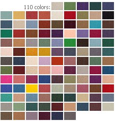
Have I ever mentioned that in my next life I want to be the person who picks out car colors? And gives the colors their names, too. I actually knew the head of car colors for Ford Motor Company when I worked there. I coveted her job. Next time around. Of course, there is actually a company called The Color Wheel Company. They sell this interior design color wheel for either $9 or $7 dollars (I think it may be on sale right now, I’m confused) including shipping. If you have anxiety about putting colors together — or, if you are really interested in learning more — this could be a useful tool that helps you try out some bolder things that you might not normally try.
READERS: What are paint colors that have worked out super well for you – brand/color – and for what rooms (or exterior)? And – have you put two colors together with unexpectedly awesome results? This kind of info is golden to share. Let’s hear it.


pam kueber says
Hi J.D., I’ll check out Pittsburgh’s color palette.
Meanwhile, my immediate response to a wall color for Ming Green is a shade of yellow. I am one for white ceilings. But that’s just a quick react. I think that green can also go easily with other colors… and you know how I feel about wallpaper, that’s my favorite. Seriously, having a color wheel and using it can really help in this kind of selection process.
James says
As for paint brands, pofessional painters that I have hired for projects always seem to push Benjamin Moore (BM)- and it is quality stuff. I have had good results with Sherwin Williams as well- but I believe they have different grades of paint.
As for colors that work together, when we bought our first mid-century home in 1994 (prior homes were pre-WWII), we had the daunting task of repainting and recovering every wall and floor in the house, as the house had been occupied by two chain smokers for decades (sorry, folks, cigarettes are one mid-century habit I don’t miss) who apparently never cracked a window. Yellowed walls and nicotine stains were the predominate design theme. Multiple paint coats were necessary- even with Benjamin Moore paints that we chose for the living and dining rooms. But we did not use Benjamin Moore exclusively. This was a 1962 colonial with some “modern” touches like cathedral ceilings and picture windows,and a pink bathroom. At the time, I found the Sherwin Williams paint brochures very useful in picking colors for the house. I recall that one brochure had suggested colors and color combinations specifically based on house style. One group of colors was classified under “Suburban Modern” (or some similar moniker) and that’s where we picked most of our colors: An aqua and cream for the family room, icy pink for the family bath and the laundry room. This was back in ’94 or ’95 and I have to believe Sherwin Williams was a trailblazer among paint retailers in even recognizing mid-century modern as a style worthy of color groupings.
J.D. says
By the way, from back in my younger days working in a hardware store, Pittsburgh used to be a great paint and still had a very vintage color pallet. I don’t even know if it is made anymore though. The original Disneyland was done all in Pittsburgh paint, the store I worked in still had the contract w/ Disney and lists or their off-the shelf colors and books w/ their custom paint formulas. Wish I had kept notes!
J.D. says
For being a former art major, I’m lousy with color combinations. On that sad note, I’m remodeling a bathroom this very minute, and using a vintage American Standard 1948 “Pembrook” set (Tub, throne and sink) finished in “Ming Green”
I’m doing white tile with a matching green border on the lower walls, any suggestions for paint color for the upper walls and ceiling? (BTW the tile grout will probably be brown.)
midmodms says
I have used Sherwin Williams paints and been very pleased, but like all paint brands they have different grades. The best is very pricy but worked for me in one coat. Except for the walls that were painted dark purple where we did have to use two coats. That was without a primer, so if we had been smart and primed first it would have worked.
Wendy, I’m also an artist and agree with your daughter. The best paints have a higher concentration of pigments as opposed to carrier (which is what makes the paint liquid). Paints for art are the same way. (I strongly advise anyone who is thinking of taking up art never to buy student grade paints, or any tube of any brand that says “hue”).
pam kueber says
I recently repainted a bedroom and tried the Benjamin Moore Aura. I was shocked when it was $60 a gallon. But I have to say, it really truly did cover in one coat. So in the end, I felt it was very much worth it — it saved considerable time, and money too. With the Sherwin Williams that I have been used to buying I always had to paint twice – and that almost always meant going into a second gallon which was like another $35-$40 even from SW>
Jane (aka) Elvis says
When I retire (6 months from now if the economic gods are happy) I will paint my exterior aqua! It’s a boring, medium gray now. I have white replacement vinyl windows, so trim and windows will have to stay white. The fascia boards and gutters are painted gray now, but I will paint them white, too.
Inside, we painted two walls of our living/dining room a soft sky-blue (Behr paint and no problems at all, BTW). The rest of the walls are off white, which makes a nice background for our collection of houseplants. The most unexpectedly successful color combination I have discovered is adding two intensely chartreuse pillows to my royal blue sofa. They pop (but in a great way!)
Annie B. says
Our wannabe rancho’s interior walls were covered with cheap-looking, very dark walnut colored paneling when we bought it. A coat of Zinsser primer on the paneling made a world of difference in achieving bright, stark white walls. The only downside was painting the grooves between the panelng’s “board’s”…….this had to be done by hand with an artist’s brush but was so worth it.
Gretchen S says
My favorite paint brands are ICI and Dunn Edwards. We’re not shy about paint color choices at our house. Recently we had a guest who liked one color so much (Pumpkin Face, ICI) that she went to the paint store the next day and painted her bedroom with it. I think certain oranges looks great with aquas/teals. Periwinkle and olive is another favorite of mine.
Paul M. says
My ceiling, floor, trim, etc., are white, but yellow and orange accessories would give the room a tropical look. Synergy is so bright that a “calming” secondary color wouldn’t be a bad thing.