

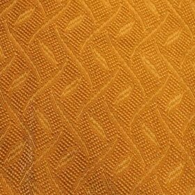
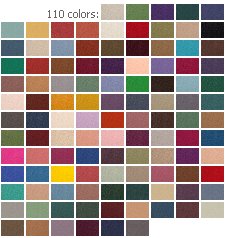
Have I ever mentioned that in my next life I want to be the person who picks out car colors? And gives the colors their names, too. I actually knew the head of car colors for Ford Motor Company when I worked there. I coveted her job. Next time around. Of course, there is actually a company called The Color Wheel Company. They sell this interior design color wheel for either $9 or $7 dollars (I think it may be on sale right now, I’m confused) including shipping. If you have anxiety about putting colors together — or, if you are really interested in learning more — this could be a useful tool that helps you try out some bolder things that you might not normally try.
READERS: What are paint colors that have worked out super well for you – brand/color – and for what rooms (or exterior)? And – have you put two colors together with unexpectedly awesome results? This kind of info is golden to share. Let’s hear it.


gavin hastings says
Help….So what are all you aqua people using as secondary colors? I have gone the grey/green/black route, but must say it is very….um….calm.
Paul M. says
Sherwin-Williams has a greenish turquoise called “Synergy.” It’s much deeper and brighter than a typical 1950s/1960s light aqua, but it’s great in small spaces. I love it in my bathroom.
Tut says
We’ll never again use Behr paints. We tried them many times (because I choose Home Depot over Menards for my tool and home improvement shopping) and each time the Behr paint had huge problems covering the old paint. It always took 3 or more coats, and I’m not talking about something hard like covering black with white. Even the “cheaper” paint they sell at HD (Dutch Boy? I forget) is better paint. So now we’ll either go to Menards (only for paint) or Sherwin Williams.
Jeanne says
I haven’t painted anything in my new (old) house yet, but I want to do a medium gray in the living room/hall – similar to the Sherwin Williams “french grey” from their retro nostalgia color brochure. BUT, I am a Benjamin Moore snob! I will take chips to the paint store and have them match my colors with Benjamin Moore paint. At my last home I was really happy with a Martha Stewart color “glass green” that I had matched with Benjamin Moore paint and used in my kitchen. It was a very pale, pale turquoise. I had also matched a Tiffany box to paint my small computer room, but later wished I used a lighter tint of the color, as it was overpowering.
gavin hastings says
A few weeks ago, my sister called my house “Faded Glory” ! Ouch!
gavin hastings says
I too love Benjamin Moore-with Pratt and Lambert as a close second. Am I the last of the oil painters? BM makes a paint called Dulamel Eggshell that has become impossible to buy. It gives a true, hard, almost flat finish that you just cannot find in a “plastic-y” latex. In true chic 40’s 50’s style I have matching walls and woodwork.
I admit to a “problem” with color, so I have a more or less monochromatic scheme. The livingroom/dining/hall/foyer and bath are all in the same green-y blue aqua gray that they were in 1962. I like it, but….ZZZZZZZZZZ.!
Shane! says
P.S. the kitchen/dining area will be the original aqua green. The Sherwin Williams color is from their historic preservation set.
Shane! says
I’m going with a few colors from Sherwin Williams. I’m thinking of doing the LR in Pearl Grey. My exterior is the original cedar siding and has only been painted one color – blinding turquoise! LOL (it’s covered with siding now). I want to do it in either dark blue or dark green. The gables will be light yellow. The front of the house also has an area for color contrast and it will be light yellow too. The trim around the windows will be white. This is correct for my neighborhood (although most of the houses have been redone), as I have color photographic proof.
My neighbor, Mrs. James, is 90 and is the original owner of her house. It’s very well-maintained cedar and the exact color it was in ’54! She gave me a B & W from the winter of ’54 when she and her husband were looking at the new houses. So the pic shows the neighborhood with the houses built with no windows or doors yet, and country all around it! LOL I’m going to blow it up and hang it in the LR when I’m done!
Wendy says
*Note to self: proofread AFTER my first cup of coffee!
Wendy says
Benjamin Moore paints. I’ll never go back to cheap paint again, and my couch was $30, so you know I’m a cheapskate! It costs about 50% more per gallon, but it covers so darn well I have yet to need a second coat (if I prime). And the brush/roller loads like a dream. But the best part is the depth of color, which always surprised me. My daughter the artist says its has to do with lost of different pigments or somethings, but every wall has a slightly different color throughout the day. I encourage everyone to try one of the high-end paints in one room.