


 The Retro Renovation 2012 Color of the Year is Bitossi Rimini Blu, a shade named after the famous, rich, deep glaze on Italian-made Bitossi pottery designed by Aldo Londi around 1959. Also known as Cobalt Blue, this is a classy, retro color that “plays well” with a wide variety of other shades, including orange, gold, avocado, brown, red — it’s very versatile. To demonstrate, I roamed all around my house on Saturday and took photos of art and accessories that that incorporate this color. Note, in this study, I have been pretty liberal about the what goes in this color family. It’s all good. Read on for a festival of blue — 28 photos in all.
 I have two bona-fide Bitossi Rimini Blue vases. Chippy of World of Tile had them in her stash. Over the months, we have become good friends, and she sent them to me. In return, I am giving her free advertising on the blog. This photo was taken in natural light. I did dial up the “black” in Lightroom a wee bit. Note: I retouched most all the other photos as well, improving the exposure and dialing up the contrast and black and, in some cases, the saturation. My photos as taken were a bit washed out because I was using an automatic point-and-shoot camera, and it was a pretty sunny day. What I mean to say is: Cobalt blue is a rich, high-saturation color. No “low chroma” greige here. It is an assertive color.
Following are my studies. First: Framed textile art from the 1960s, I went nuts with this, due to my exceptional visual intelligence:


Painting study — I purchased this painting when I lived out in the country about 20 years ago:


A little bit of a Joan Miro poster from a Museum of Modern Art exhibit that I went to in 1986. I am feeling old writing this story:


Framed vintage needlepoint mimicking a Chinese Ancestor painting. I bought this piece cheap last year and layered it into the tablescape sitting in the arched, mirrored built-in cabinet in the dining room:


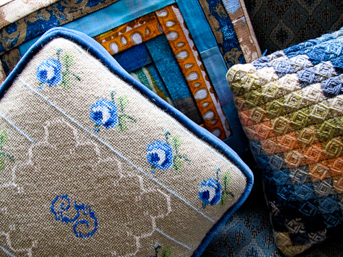
A study in blue from around the house: Pillows, figurines, glassware, in vignettes and tablescapes collecting lots o’ dust here ‘n there:


Michele says
Oh I see now it’s third from the top too… hmmm pillow cover? It looks like entrelac but I dunno :/
pam kueber says
Yes, it’s a close of up the bargello stitching that you can also see on the actual pillow near the top…
Michele says
Thank you. The crazy thing is I just learned what bargello stitching is… I haven’t seen much of it though, so I didn’t recognize it 🙂
Michele says
We love this color in my house! Love the photo inspiration post too. I have to admit, I’m kind of freaking out about the yarn-thing third pic from the bottom… What is it??? I’m in love with the pattern, and I can’t figure out if it’s crocheted or knit or something else! I would love to see more pictures of that too… srsly obsessed, it has some kind of spell over me 😀
Laura says
Somewhere in my life I remember upholstery in this blue shade. I loved it. Maybe the late 60s early 70s. It seems like it came before harvest gold and avocado green. Maybe along with orange.
Jay says
Pam, thanks for sharing the “blues”. Especially liked your WOT vases. I’m a sucker for cobalt blue and dark green glass & pottery. Always on the lookout at antique malls. You have a great eye for color!
Brian GadgetSponge says
Love cobalt! It’s hard to keep it at bay sometimes when picking color palettes.