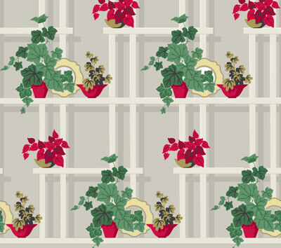
From the category archives:

dining room

Vintage Vera Neumann table linens – reproduced today

by pam kueber on September 21, 2009

vintage-vera-neumann-tableclothThanks to reader Adam who wrote to let me know that vintage Vera Neumann designs were “rediscovered” a few years ago, and that some of her original designs are now available again at places like Macy’s. Right now, Macy’s has three table linen lines available on their website. At the left: Turning Leaf. Maybe it’s time to think ahead to a Merry Retro – Thanksgiving. Two more styles — both on sale as I write this — after the jump. Heck yeah there is more…

{ 8 comments }

Peasant Provincial line – by Drexel

by Pam Kueber on October 7, 2008

Readers still looking for major furniture sets like dining rooms and bedrooms should remember to keep your eyes – and heart – open for traditional furniture from the postwar era. This stuff is far less “popular” today than “modern” sets — but how can you linger over the lines of this 1955 Drexel Peasant Provincial and not agree how beautiful it truly is? I love the stain on this wood as well. And – you will be able to buy it for a song! (eBay photos – listing come and gone.)

If you have a Cape or colonial-ranch, all the more reason to consider traditional-style furniture, which is sympathetic to the lines of your home.  With this particular set, I see a tone-on-tone small print wallpaper by Thibaut to go-with. But, you can take this set any number of directions – it is very versatile.


{ 3 comments }

This vintage dining room set is up on Last Day ebay – but I love it so much I have the feature it down here for posterity. I’m hammering away at this issue right now: Mix up your decor! This set is so eclectic – the color, the scalloped table edge, the upholstered chairs with their unusual back – it’s probably not what you would go looking for – but it would be smashing nonetheless. Keep you mind open and your interior, delightfully unpredictable.

{ 3 comments }

vintage 1952 oneida silverware

So what kind of vintage flatware do retro renovation readers prefer? I am going to be tied to the computer all day Saturday – so send me an email and/or photos and I’ll post them throughout the day. We did this with dinnerware a while back, and it was lots of fun.

Me? I use vintage Coronation stainless that my grandma Aggie Kueber gave to me shortly after I was married. I also bought a complete second set a year or two later, when Oneida reintroduced it for a time. I recently checked with the company, and the only “true” vintage pattern they still offer today is Revere – a very colonial pattern. You can also find complete sets on ebay – there are some real beauties.

Owning and using vintage flatware every single day is one of the greatest ways to be in touch (ha!) with the period!

vintage 1952 oneida silverware

{ 0 comments }

Continuing the theme of the week, another great interior to scrutinize and learn from.

1952 living room dining room by Armstrong

1950s living room dining room by ArmstrongThis 1952 living room dining room comes courtesy the interior designers at Armstrong Flooring. To be sure, this company had a massive influence via their advertising in establishing the postwar look. Seems like they were among the first to figure out that if you employed interior designers to finish a whole room — especially as it was a new look for America — it would be lots easier to sell the pieces — starting with the floor. Heck yeah there is more…

{ 6 comments }

danish modern heywood wakefield contessa linedanish modern heywood wakefield contessa line

This Danish Modern take from Heywood Wakefield is beautiful, don’t you think? Again, the company is so well known for its iconic blonde furniture, we forget they were a full-line manufacturer. This ad for their new, 1959 Contessa line says there are 45 pieces in all, including for the bedroom.

A pretty vignette, altogether — and notice the walls, which I peg as grasscloth. I put grasscloth in a similar colorway in my living room, dining room about two years ago, and we love it. I’ll do a post soon on this very classic and versatile wall covering option.

{ 7 comments }

1953 Raymond Loewy Arvin dinette set

vintage retro dinette set1953 Raymond Loewy Arvin dinette set

Anne & Gary have a lovely house in Oregon and updating it in true retro renovator style! They have a blog — now on the blogroll — and did a post on their dinette find recently. I love it! While, the popular chrome-edged ‘diner’ style tables and chairs are really great, there’s also lots of room in our decorating arsenal for the more elegant styled dinettes like Anne & Gary’s “Virtue Brothers” model.

Separately, I’d been on the watch for more dinette alternatives, and found this great 1953 ad for Arvins. This set was designed by Raymond Loewy — one of the most influential industrial designer of the era.

Along with Saarinen tulip tables – it’s great that there are a variety of possibilities for our kitchens and dinettes!

Thanks, Anne & Gary, for sharing! And, I’ll be doing more posts on your house moving forward, as you have a lot of interesting things going on!

{ 8 comments }

Mitzi’s dinnerware

by Pam Kueber on December 19, 2007

bgbowls2.jpgI received a number of emails from readers on their everyday dinnerware. Here’s what Mitzi of Vintage Goodness is into:

Hi Pam, I wanted to throw my 2 cents into your discussion about dishes… I am a die hard Corelle fan. It is lightweight for easy washing (no dishwasher here, unless you count me!), it is almost impossible to break, there are tons of patterns and coordinating pieces (especially with Pyrex, my other favorite), and it is pretty easily thrifted. ;)

I actually started out with an all white set my mom gave me that was what she used when I was a kid, so it has sentimental value as well as being tough as nails. A couple years ago I scored a huge set of Butterfly Gold, which was what my grandma used, for $5 at a sale. I put the white dishes away and used the Butterfly Gold until I opened my eBay store – then a big chunk of it got sacrificed for the sake of inventory. So now I have a mix of my original white set and the Butterfly Gold set… see why eclectic is my favorite word? hehe

Anyway I can’t imagine using anything else, though I do hope to someday be able to switch patterns again! I’ve attached a pic from my store of some Butterfly Gold cereal bowls.

Talk to you soon!
Mitzi

Thanks, Mitzi! I love the graphics on this Corelle. No question, this stuff is indestructible!

{ 3 comments }

salem-biscayne.GIF

fiesta-harlequin.JPGhallcraft-fantasy.JPGfranciscan-starburst.jpg

harvest-time.JPGFemme 1 asked last week what kind of dinnerware I used. And the answer is: Blue Heaven (pictured at the bottom.)

To be honest, I don’t know much about it, only that it was made in the 60s. I found a whole bunch at an estate sale about two years ago, and after my kitchen was renovated, pulled it out and started using it. We like the atomic graphics a lot, it’s got a nice weight, and it’s not too chippy. And, we have found other pieces around here, quite easily and affordably. I recently bought 8 cool matching glasses, about 8 ounce size, for $12.

That said, Femme 1 also sent me her favorites. And I love those, too — especially the Salem Biscayne in the top photo. This is wonderful! Here’s some of what Femme 1 had to say, starting out in response to my note that I also have a lot of Stangl:

“I adore Stangl! The pattern I picked out for my (ahem) first marriage (in the 70s.) was that blue spongeware stuff. I sold most of that on E-bay a few years back. I love Golden Harvest, but I have just a few pieces; I’d like to have more, but I had to restrain myself because I collect about five different patterns of dinnerware already: Biscayne by Salem (from the 50s through the early 60s) is my everyday stuff. It must have been a really popular item because now it’s incredibly cheap and I find it everywhere in thrift shops… Eva Zeisel’s Hallcraft Fantasy; Harlequin (the cheaper younger brother of Fiesta); Ben Seibel’s Harvest Time by Iroquois…and good ole Franciscan Starburst.

Plus I have tons of odd and ends of stuff I just really love (like Bauer bowls and Redwing Golden Viking).”

Thanks, Femme 1 — keep the comments, thoughts and ideas coming!

And readers: What are your “everyday” dinnerware favorites? Send me your jpegs, and I’ll feature them, in the new year. Send to: Pam@RetroRenovation.com

blue-heaven-glass.JPGblue-heaven-plate.JPGblue-heaven-place-setting.JPG

{ 4 comments }

Stephen J. Bauer, artistic director and owner of Bradbury & Bradbury, kindly agreed to answer some questions about B&B’s new line of mid century wallpapers. I hope you find it really interesting…and fun. Hey, I’d sure like to have a couple of margarita’s with this guy! Thank you, Stephen, I owe you one!

1. Stephen, why did you decide to add 40s and 50s wallpapers to your lineup?

It was a pretty natural progression. The focus of historic preservation in this country has seemed to move chronologically over the last several decades: from the Colonial Williamsburg era in the 1970’s; to Pre-Civil War and Victorian in the 1980’s; and by the 1990’s the focus was Arts & Crafts. And now 17 years later, many Arts & Crafts homes have been restored, appreciation, (and prices) for prime bungalows have risen sharply, and now, at least I believe, people are looking for more affordable homes to restore.
bb-pullquote-4.jpg

So you look around now and wow, there is this HUGE inventory of Post WWII homes that still seem relatively “undiscovered” and FULL of charm and architectural features unique to those particular decades!

Well, let’s to get back to that original question; Why the addition of 40’s and 50’s papers? We are not a “Victorian” wallpaper company, nor are we an “Arts & Crafts” wallpaper company. We are an ART WALLPAPER company. So our interest is in manufacturing wallpaper that is equal to art, and from our perspective, really great wallpaper patterns are not the sole product of the 19th century or just early 20th, but we find fantastic (groovy) designs even into the 1970’s, when wallpaper design could still be really innovative. It’s ART to us, and we could no more ignore what came out of the 1960’s anymore than we could, say, the 1860’s. There are just so many terrific wallpapers out there!

2. How did you go about choosing the designs, colors?

That’s where it gets tricky. There were, as I said, so many great patterns produced, but not every one of them is iconic of a particular period. So we chose from our archive patterns that we felt gave a real feel for the 40’s and 50’s, without being stereotypical or trite. Our color choice is based on those archives’ original colorings or in some cases color combinations we know to have been used frequently in home interiors in those years.

3. How are they made?

By Oompa Loompas. Actually they are all hand printed using the silk-screen method of printing. This is done right here in our factory in Benicia, (not overseas anywhere). One color is laid down at a time, one repeat at a time, until the pattern is complete. It is a labor intensive method, but the result is essentially a serigraph art print for your walls. This is one reason we call ourselves an “art wallpaper” company, (that, and it’s already on our stationery).

4. Tell me about the “aesthetic” of 40’s wallpapers.

bradbury-bradbury-40s-papers.gifWell the particular idea behind our choices from the Forties is the optimistic, cheery outlook of Post War America which greeted people every morning in their breakfast nooks and kitchens back then. I think many of these 40’s patterns are about the most “blissful” things ever done in our modest medium. They are just full of bright colors, (then available after the war again) and whimsical graphics.

They make me smile every time I see them because they remind me, (as it may many people) of Grandma’s house or the small cottages people moved into after the War as they began their young families. There were of course other things happening in wallpaper in the 40’s, for instance that very homespun sort of “Colonial” genre, along with the “Hollywood Tropicana” style that you see back then, but we chose to focus on these little cottage papers since I think the kitchen/breakfast nooks in these Post War homes is where homeowners are initiating many of their period renovations. I have to go now, I smell chocolate chip cookies in the oven.

5. What about the look of 50’s papers. And why the progression from the decade prior?

Now by the middle Fifties wallpapers got a little less bright but a lot more experimental. You start to see patterns really shrinking and becoming more “hand drawn” and less concerned about older stylistic conventions. They are much more in the “progressive artists” territory and they play much more with casual linework and shadow. They are great fun to look at because they are so unpredictable. Of course, manufacturers had to sell to the masses so books from that time do have the perfunctory “traditionals” but when they did allow designers more latitude they showed a lot more attitude.

Our “Atomic Doodle”, “Googieland” and “Boingo”patterns are perfect examples of this playfulness with linework and that more casual feel to patterning.

bb-boingo-turquoise.jpgatomic-doodle-in-pink-250.jpggoogie_turq_250.jpg

Why the progression? The 1950’s came right after the 1940’s.

6. How would you use these papers – which rooms of the house do they fit?

Well the Forties papers are specifically, as I mentioned, for the kitchen/nook areas, (and in some cases maybe adjoining dining rooms).

The Fifties papers would probably fit best in living room, dining room, and family room environments.

The pattern called “Island” is strictly for tropical “Tiki” styled rooms, (don’t imagine it in a kitchen or bathroom, unless of course it’s Tiki style…)

Most could go in any ranch home, (like my own).

The one called “Interlock” was intended for the most modernist of Mid-Century Modern homes.

Most of the papers would be very appropriate as an accent wall with stone, brick, paneling or just with the other walls painted the background color of the paper.

7. Wallpaper seems to come in… and out… of style. In the Forties and Fifties they were solidly “in”. Why? And what does that say about the time and the people?

Easy. People had terrific taste back then.

Ok, the real reason, I’m not sure. I tend to think it had to do with the changing demographic of families, in part.

In the late Forties and Fifties people used to invest in a home — by decorating it throughout — because there was a feeling that they would be there for a long time. It was their home.bb-pullquote-3.jpg

But I imagine that over time people’s lives just got busier, their addresses changed more frequently and they just didn’t have the time, the interest (or even the landlord’s permission) to hang wallpaper in their dwelling. Also, stripping a room of ugly wallpaper has never been a very enjoyable past time, (which argues for more artistic wallpaper choices which are almost never removed) so I guess that’s also a factor.

And then, people like change. If you grew up with a profusion of mediocre wallpaper in your childhood home, you might long for clean painted walls later in life. If however, you have never lived with good pattern and color, the idea of doing so is probably pretty exciting. Good renovations can really illustrate the beautiful marriage of those two important ingredients to an interior that won’t grow bland with time.

8. Will we see more 40’s and 50’s papers in your line?

Absolutely. We’re looking forward to lots of positive feedback about these papers, and we are thrilled to produce even more if that’s what people want. We love to know what people are looking for and chances are we can probably make it. We had a few customers recently ask for a certain kind of Victorian set of papers and now it’s in the early stages of development. Be careful what you ask us for, you might just get it.

9. How do you feel personally about the period?

I’m a time traveler. I love just about anything that’s old, “vintage” and has a great design to it. My wife and I restored a 1930’s A&C bungalow when we were first married, then moved onto a 1925 Colonial Revival apartment building, finished it, and now are raising our sons in a 1961 ranch.

As with our other projects we are repairing and restoring what ever has been damaged by deferred maintenance and our neighbors think we’re a little weird to leave all these original features on and in our home unaltered, (you’re going to replace those old leaded glass windows, right?) It feels great to live in something that’s been brought back to its former glory instead of seeing it getting “remodeled” and its unique character “erased” for good.

That’s one of the things I love about my job is that I get to work with a great group of people bringing back to life printed art that has been “dormant” for decades and centuries. To see that in turn used to renovate and restore older homes is just “ice cream on the cake”. So, I love the designs of the Fifties, the Forties, (and right now I’m a little partial to the early Sixties)!

10. What didn’t I ask that I should have?

If you think of anything let me know.

logo2.jpg

Be sure to read all my wallpaper posts for the full range of 50s choices.

{ 1 comment }